Tele-consequences Live Drawing 09/03/18

To continue to improve my drawing skills, I participated in the Marks Make Meaning exhibition in which myself and a group of illustration students collaboratively drew with artists across the world. Our themes to draw around were mind map, shared garden and mega hotel (the image above is from the later).

My takeaway from the one day project was how differently people interpret themes and what they draw from them. For instance as we worked on mega hotel it turned more of a metropolis and later something quite apocalyptic as our Irish artists who we were collaborating with began to blank out everything they drew with black.

As our tutor Paul told us, it often isn’t the drawing which is the final outcome of session but the video produced – I agree with this statement as the collaborative aspect can be truely seen in the video. During the mega hotel session myself and the other artist began crossing out each others marks which can be read playfully or aggressively – in the moment it felt like a game but watching the video we are both placing our marks with vigour and speed.

I really enjoyed the session in that it was fun to participate but also interesting to step back and watch others do their thing. Overall, I’m happy that I put myself forward for it as it’s something  I wouldn’t normally consider doing, however it really helped to conquer the fear of the drawing as the final outcome. It has made me consider that I should be recording my experiments more to see if I can gain different/multiple outcomes from them.

Plumpton College Drawings 09/03/18

As part of this term I am taking it upon myself to push my own boundaries in drawing.  I think it is natural to continually draw the same thing, however so my practice doesn’t become stagnant  I am trying to put myself out there and draw from life more often. So, when given the opportunity to draw at Plumpton College I was eager to join in.

Drawing in the stables was a calming environment and you could really get a sense of the horses you were drawing and trying to incorporate some kind of personality into that. I particularly liked drawing portraits of the horses, as they have a challenging face shape to contend with. Also, their eyes are human like which conveys a lot of emotion.

I am happy with my outcomes of the day, I drew a lot more than I usually do when drawing from life. Next time I would like to incorporate a few more materials maybe collage and pastels as I think adding some colour to the drawings would’ve pushed them.

Lithography, Session 5: 06/03/18

For this session I had the opportunity to begin inking my first colour onto the plate, this was a step I was really looking forward to as I was growing conscious that my plate would print differently to how I imagined. However, I stuck with my plan to use contrasting colours which would create a colour in the overlays. Therefore, I mixed a pale yellow up – the mixing process was easier than I imagined. I used an opaque white to create a strong base which would contrast the white paper.

The printing method was a quick progress, the plate must remain wet while inking up the plate on the bed of the roller. I found that watching the ink settle into the green photolitho plate was satisfying. The yellow ink came out how I imagined but didn’t have the impact I wanted. I hope that once I eventually put on the second layer of blue it will have more depth to it and compliment the composition.

As part of the session we swapped colours with the partner we were working with on the roller, so I got the chance to use a pinkie red colour which really showed the detail better. I enjoyed the look of this colour more in many ways.

Also, as part of the session we were encouraged to investigate printing with photocopies, I’m looking forward to trying this method as I think it will create a more haphazard print which has an authentic quality. I’m hoping that I will be able to work over my planned print with one of these to create a contrast between the rational and irrational.  Furthermore, these work well with using collage and building an image which I think would work well to make a looser and busier print.


Dada Project: Initial Briefing

I feel that the Dada project has come at a great time in the course, it feels like a bit of a breather to invest some time in an art form which is slightly out of my comfort zone. Initially I wanted to create a Dada poem, I enjoy the thought of creating something in an haphazard method without decision making. Yet, when I cut out all of the words and put them in a bag I was getting uninteresting sentences. This was a set back but I thought in true Dada fashion I would film these mistakes and see if I could get anything to develop from it. I’m really glad I did this, it was encouraging to see my process visually and be able to reflect on it again and again. It was also motivating as it felt like the mistakes weren’t time wasted but time gained in doing something differently.

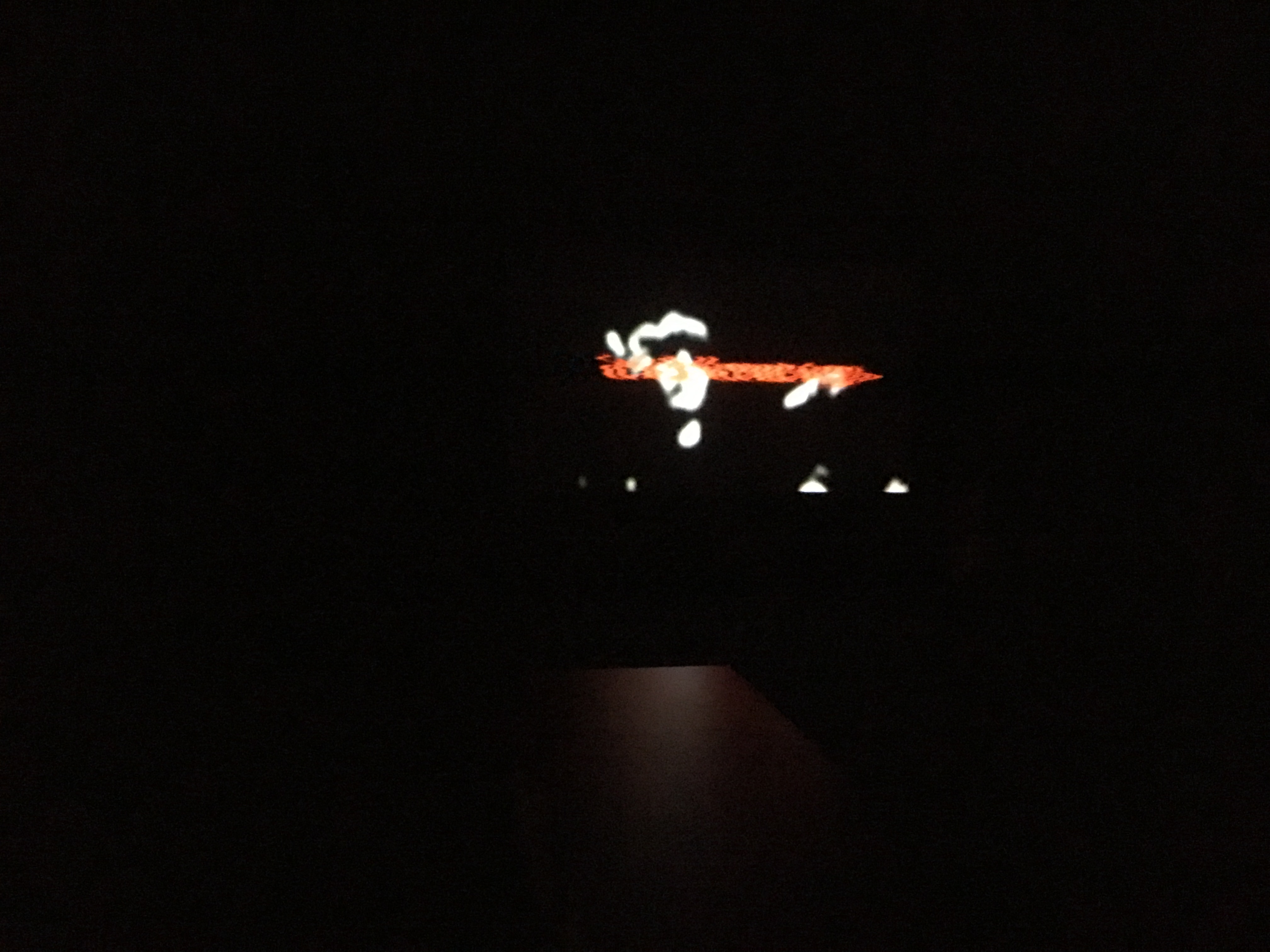
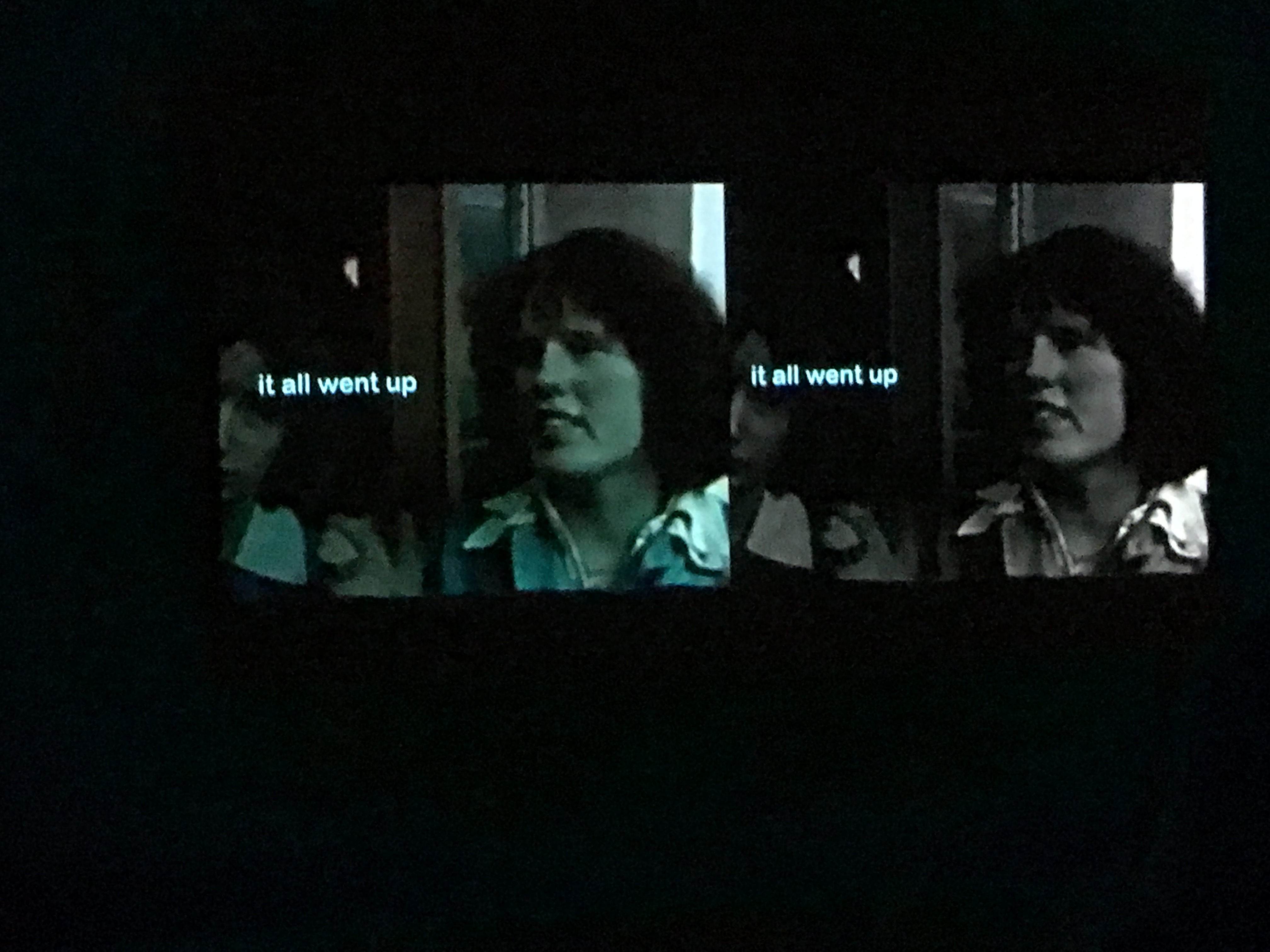
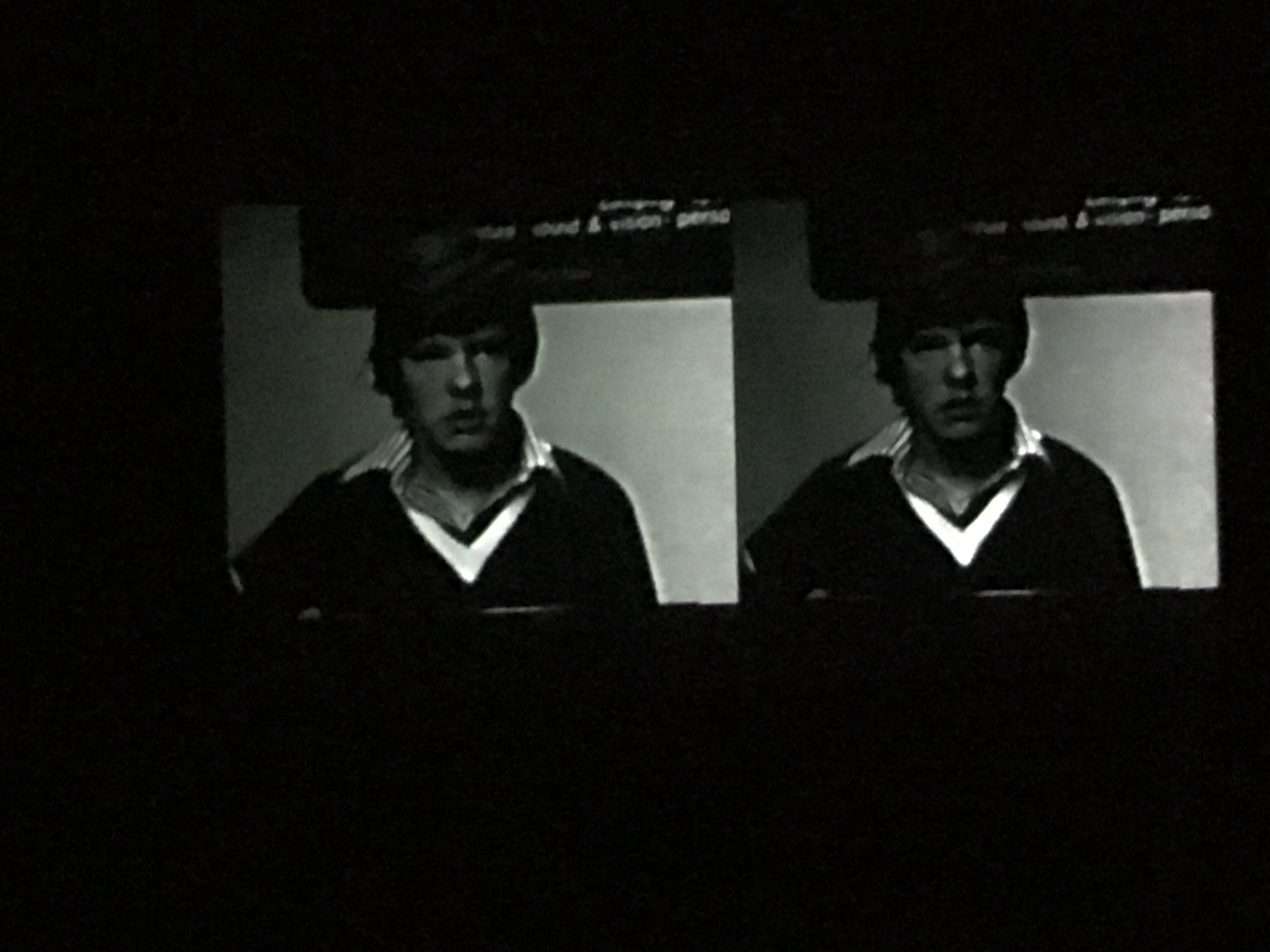
After making this step I felt like maybe I would make video work which helped to describe this process I was going through. I had recently gone to see an video exhibition at the Tate Britain by Elizabeth Price: The Woolworths Choir of 1979 (below are some images taken by myself, unfortunately they aren’t brilliant due to low light).


Here is a snippet from the video by Price.

The Tate describes Price’s work as “Elizabeth Price describes her films as moving ‘from something that looks like a PowerPoint lecture, to something that looks like an infomercial to something that feels like a cinematic melodrama’. For the Turner Prize exhibition, Price is presenting her video installation THE WOOLWORTHS CHOIR OF 1979 2012. Comprising three parts, the video brings together distinct bodies of material into a dissonant assembly; photographs of church architecture, internet clips of pop performances and news footage of a notorious fire in a Woolworths furniture department in 1979. The film weaves together existing archives of text, image and sound to create video installations that drift between social history and fantasy.”

I like how she compare her work to a PowerPoint lecture as well as an informercial, while watching her work it does have this feel about it. Price only slightly alludes to what her work is really about – personally I felt like the video was an insight into her brain making connections between thoughts, some were tenuous others were elaborate. This insight into her process is what I would like to combine into my own work, I think it shows the artist as sensitive and vulnerable presenting a side to themselves that isn’t always seen in something final. This is not to call Price’s work ill formed, it is actually a video piece that has been on my mind since I saw it. I felt it was provocative and intriguing, I wanted to uncover more – this is what I would like viewers to see in my own work.

Text and Context 5: Collecting Archive Material

Below are PDFs of scanned images from Collins Guide to the Insects of Britain and Western Europe by Michael Chinery and The Insects by Peter Farb and The Editors of LIFE.

SKM_C364e18022818420-u2mikw

SKM_C364e18022818440-28icdqd

I’m also considering having a montage of Metamorphosis for the title sequence below are some clips I’m thinking about using.

Below is archive footage of The Beatles fans at the height of Beatlemania.

Text and Context 4

As part of my research for Text and Context I am looking into different animation styles, to hopefully help me determine what would work for my own animation.

Firstly, The Metamorphosis of Mr Samsa by Caroline Leaf. Honestly, when I first watched this video I struggled to identify what Leaf was using to create the pastel/chalk like appearance of the movement in narrative. I researched further and realised it was sand. She proclaims that she focuses on using a simple image because one can make an image so intricate that it is then impossible to animate; this rings true as I often push my drawing abilities to then realise much of it is lost in the animation process.

An example of how Caroline Leaf creates her work.

Text and Context 3: Group Tutorial

I was unsure as to what to expect when I went to my group tutorial on Text and Context because I still felt that I was in the beginning idea stages of my project and was feeling slightly uninspired. I had formulated my idea for the project while deliberately having a stupid conversation with my boyfriend – I remember saying you’re good at coming up with silly ideas lets talk about The Metamorphosis until we come across one. We did come across one, and I think the joint revelation of the idea is what makes it very like and unlike me at the same time.

I decided to make Gregor Samsa a beetle (as in the story he is just an insect, its not a huge leap to consider him as a beetle), I am going to carry out the story in a fairly similar way to the original particularly focusing on the apple hitting Gregor’s back, however the main change will be that Gregor won’t die he will run away just in time. This is where the story takes a turn for the absurd and utilises word play. Upon leaving the house Gregor in his desperate panic bumps into someone, this someone happens to be Ringo Starr of the Beatles, he believes that Gregor is exactly what they’re looking for in their new direction. He later becomes the manager of the Beatles and they create Apple Records (a nod to the apple in his back).

This story was all chance and humor, which I really enjoyed but I had no idea how it would go down in a tutorial because it isn’t the type of stuff I am usually interested in.

The tutorial really helped me get out of my inspiration rut and was suggested the following videos:

I had seen Diary of Edward the Hamster before, however had never thought of it in the context of my own work. I really love this video and I think what makes it is the voice over. When making voice overs in the past they’ve been more of an after thought however, with this in mind I think they need to be in the forefront of my thinking. As a voice over can help present a mood or a characterisation which it does so well in this video.

https://www.youtube.com/watch?v=Sfh1PaSRq3k

Jeremy suggested The Paper Cinema as a method to retain a hand drawn element in animation. It also plays with perspective, therefore one drawing can become many frames. I took it as example of how to work smart not just work hard. As animation is notoriously laborious, so saving time while creating an interesting and original technique is something to consider.

This last one is a funny one The Rutles, a spoof of The Beatles, their use of found film to create the ambiance of The Beatles is something I might replicate.

Lithography, Session 4: 27/02/18

As planned in the previous session I wanted to finish planning my plates ready for printing next Tuesday. I decided to stop working on my bottom layer as it was already busy, and I didn’t want to overwork it. So, I started the top layer, for this one I wanted it to be more illustrative and evoke something like my Cuckmere Haven landscape print made in the second session. Therefore, I moved back to stick and ink which I felt worked well previously, it gives an opaque thick line, while also having movement and unpredictability.  I drew directly onto the tracing paper to work with urgency and to not overwork it, as I find personally when ink is overworked it loses its integrity.

My plan for this layer was a blame game between people (shown physically by pointing fingers and smirks), over who’s job it is to look after the environment and planet. The composition ends abruptly with a crying child, who is eventually going to suffer the most under the strain of global warming. As part of the plate I consider adding areas which would change colour when printed on top of the bottom layer. For instance, I planned the bottom layer to be yellow and the top blue, this would make any overlaps green. So, I added some textual sections to the collage which would create these overlaps.

We then learnt how to expose the plate using UV light, this was a new process which I feel will be beneficial to the progress of my practice. Next, we washed, dried and gummed the plates ready to be used in the next session.

After this session, I feel accomplished in my achievements and am looking forward to choosing colours which will work in the overlaying process I envision.

Manifesto: Evaluating the project

To evaluate this project thoroughly I have to talk through the problems that also occurred with it. Firstly, I jumped into the project head first with creating visual content with the view of making it into a print, this was exciting for me but it meant that I missed out on a lot of the research which was very important to this project, as if my facts weren’t right then I was still creating a misconduct of facts.

It felt like I was going around in circles trying to get my print to incorporate into new work, and knowing that the services for that type of print wouldn’t be available for the rest of the semester I was feeling a bit stumped. In some ways it was as though I had made a final outcome before a project. It was an awkward start to the project and I was left feeling unsatisfied.

So, I started working from the beginning I researched my topic, had some fears that a climate change denier was an outdated term and that people had fully learned from their mistakes. But, found some more recent evidence that now people aren’t denying so much that climate change is a thing but more they are denying that it’s happening to avoid having to think about it. This made me consider what type of format would appropriately present this concept.

As talked about in my previous post I had been considering making a calendar. However, I also had my eye on possible creating another animation, yet I felt this may be slightly overwhelming with two other animation projects for myself (Rap ‘n’ Rhymers and Text and Context). I also considered that I could possibly make a clock and record it working and going through the motions of scare tactics towards climate change deniers. But, this felt a bit too abstract for something which is supposed to be a clear communication of a topic.

So I stuck with the calendar idea and ran with it. Through researching first hand around Brighton and at the Tate Britain (previous blog posts) I identified that I wanted to make something with transfer techniques to create a degrading quality to the images. This I felt would show the fleeting nature of how our earth is being treated and how nothing is permanent no matter how hard someone can try and believe so.

Also through the mark making that is naturally created through the technique it presents a struggle and strength of something trying to break through and create its mark.

Overall, I am pleased with how this project has gone – I would have like it to include more initial drawings and thoughts how the technique I was using prompts immediacy and trial and error on the page. I’m proud with how this project has gone because I wasn’t looking forward to it. However, I overcame my fears and created a practical, functional final piece.

Some downfalls of the final outcome is that to print it successfully I needed to have it imposed and therefore it needed 28 pages, however due to the fixed nature of the calendar format I had to add in extra pages where they were unnecessary. This has ruined the affect of the calendar, however I have tried to DIY fix it. With some extra time and thought I could have possibly overcome this.

Manifesto: Trying out new techniques

Over the days I’ve had some trials and tribulations with finding the right technique for this project, I wanted to do something with collage and found images. But, I felt like simple collage was too basic and something I’ve done before, I wanted to push myself.

Tetra-Pak printing

Tetra-Pak printing appealed to me because it was reusing juice bottles made of Tetra-Pak this material is versatile. I like how it included recycling as this project would benefit from a positive portrayal of how to use recycling in everyday life. However, it was difficult to create, first you cut into or mark the shiny side of Tetra-Pak with a scapel or pencil, ink it and wipe off the excess. Then, after putting this through a printing press it should come out successfully. But, mine just didn’t they were light and blurred and unidentifiable. It was annoying but I was more into the actually Tetra-Pak (or the “plate”) after it was inked up. They looked cool and have a distressed look – I think I will more likely use this them than the actual prints.

Acetone printing

Now, acetone printing was a complete experiment for me and I was so glad that I attempted it. I used a cheap nail polish remover (which actually didn’t have any acetone in it? Confusing) with print outs you could create a strong print with mark making over the top. I was inspired to do this techniques after seeing Robert Rauschenberg prints in the Tate Britain I like the overlay technique and it personally I think it instantly says that the artwork is a social commentary as it’s direct photos of people, also it has a newspaper quality to it which already reuses a sense of the mundane which people respect and listen to. It in many ways demands attention.

Rubbings

I quickly did some rubbings of trees and urban spaces, interestingly you can barely tell the difference between them. I wanted to make them so that I had the opportunity to create some texture in my pieces. But, upon doing them I think they will be left unused, they look too similar and aren’t fully identifiable as anything.