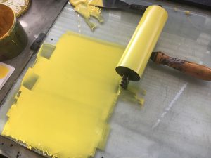
For this session I had the opportunity to begin inking my first colour onto the plate, this was a step I was really looking forward to as I was growing conscious that my plate would print differently to how I imagined. However, I stuck with my plan to use contrasting colours which would create a colour in the overlays. Therefore, I mixed a pale yellow up – the mixing process was easier than I imagined. I used an opaque white to create a strong base which would contrast the white paper.
The printing method was a quick progress, the plate must remain wet while inking up the plate on the bed of the roller. I found that watching the ink settle into the green photolitho plate was satisfying. The yellow ink came out how I imagined but didn’t have the impact I wanted. I hope that once I eventually put on the second layer of blue it will have more depth to it and compliment the composition.
As part of the session we swapped colours with the partner we were working with on the roller, so I got the chance to use a pinkie red colour which really showed the detail better. I enjoyed the look of this colour more in many ways.
Also, as part of the session we were encouraged to investigate printing with photocopies, I’m looking forward to trying this method as I think it will create a more haphazard print which has an authentic quality. I’m hoping that I will be able to work over my planned print with one of these to create a contrast between the rational and irrational. Furthermore, these work well with using collage and building an image which I think would work well to make a looser and busier print.


