DEVELOPMENT AND IDEAS FOR SEMESTER BOOK
I was really looking forward to making a physical book to really showcase what I had made over the semester. After going to many bookbinding sessions I felt confident that I had skills to show off. The sessions meant that I didn’t have to reign my ideas in.
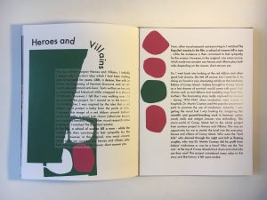
Firstly I made some collages to work from. I really enjoyed using these graphic forms and working a bit bigger (A3) made it feel freeing. I was inspired by Sister Corita Kent for these layouts – using bright colours and bold forms.
Below are my own layouts – I stuck to a plum and green for my colour scheme.


For the actual content of my semester book I wanted to keep it simple – an overview of what I was proud of as part of the semester. This really took the pressure off and I really enjoyed making the book it felt like a way to celebrate my high points. For myself I wanted the book to mimic a keepsake, something wholesome and tactical. Therefore I messed around with the size of the document for quite a while. In the end I opted for a size under A4 this meant that it felt easy to hold in your hands. With the added hardback covers it feels very tactile.
I chose to emboss the front of the book with two dancing feet – since first year this has become a bit of a sign off/logo of mine. I’m really happy with how the bind turned out. Overall I am very pleased with the semester book outcome it was a learning curve and I can’t wait to make next semesters.


