
INTRODUCTION TO PERFORMANCE PROJECT
Upon, beginning this project I was unaware of how fun but also how much hard work it would be. Working within a group is very rewarding and I surprisingly really enjoyed it, however sometimes communication was difficult. This project really stuck with me for a number of reasons; it’s something that I have never done before or even thought I would be interested in, it’s made me consider more options for illustrations and it reminded me of analysising texts and how rewarding it can be. I’ve always loved finding hidden meaning in texts and looking at Sredni Vashtar brought this all back to me.
I chose to be in Set Design and specifically props, I feel like I worked well in the group.
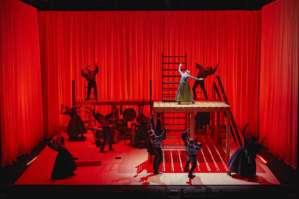
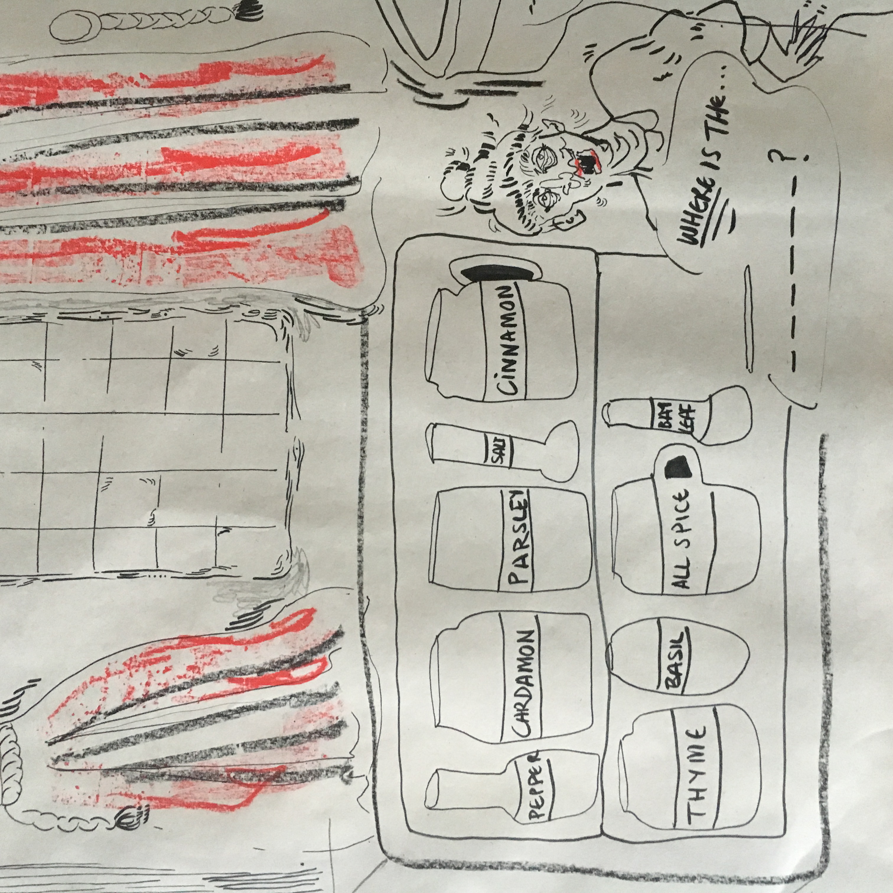
Below are my initial sketches for the interior set (kitchen, bedroom), I went with a Victorian theme – open fire, china set, big heavy curtains inspired by Jane Eyre’s Red Room (shown below). Jane Eyre at times is quite a Gothic text, also in the beginning Jane is in a similar position to Conradin. She is confined against her will by the adults surrounding her.

MORE INSPIRATION
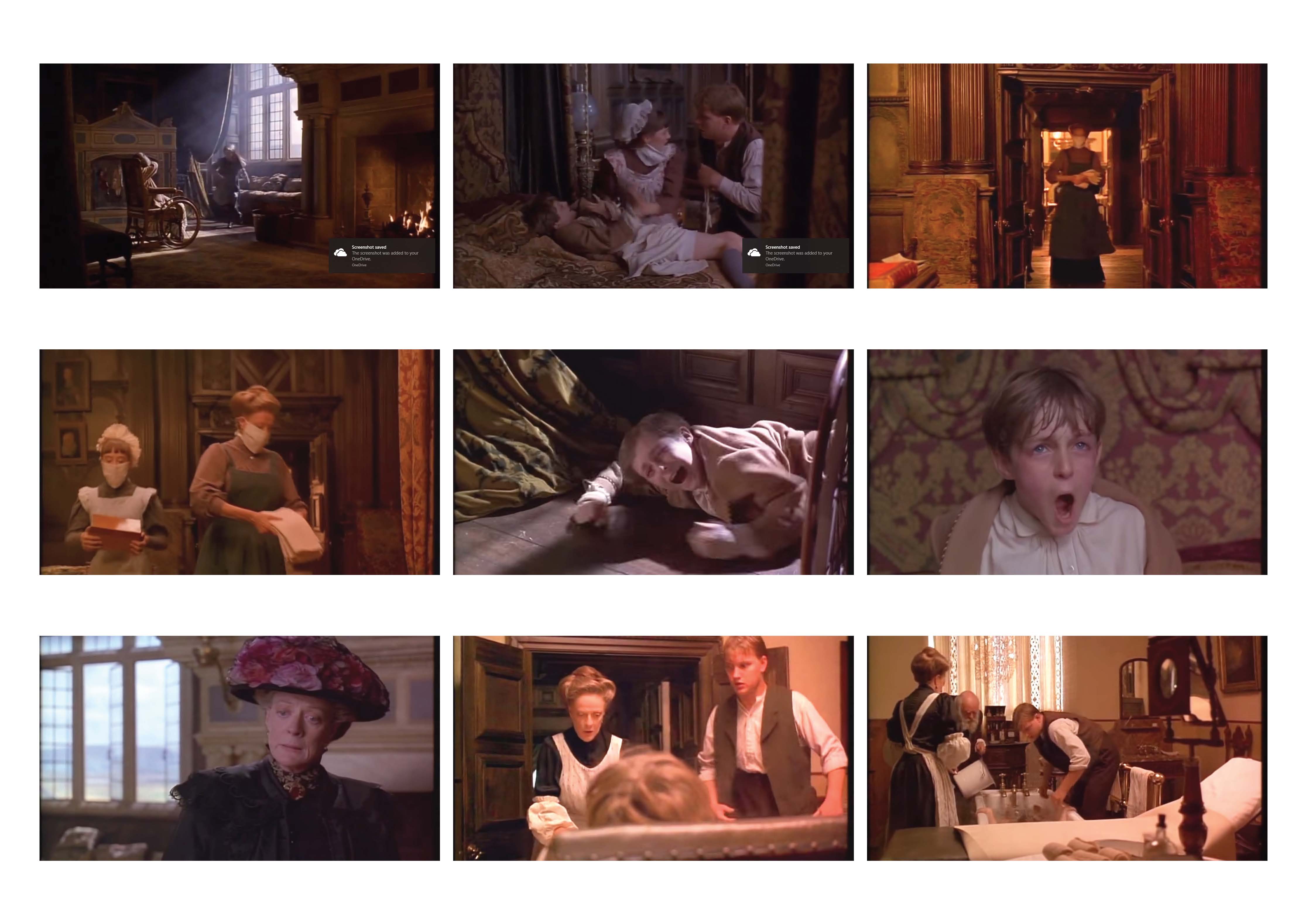
As well as Jane Eyre, Sredni Vashtar gave me instant flashback to ‘The Secret Garden’- in the sense that central to the story is a child who is supposedly “sickly” like Conradin. Similarly the set design in this room, is heavy, thick and dark to mimic the atmosphere of the room. This is something that I wanted to apply to the set design of Sredni Vashtar.


DIARY OF THE PRODUCTION
After delagating duties between us all and deciding who wanted to be in costume or set, I set about to work on a mock up set design. This design was actually left unused, however it prompted the discussion which I think was an important first step.

Next, I worked at capturing the colour scheme we had been discussing. Sredni Vashtar has two very split stage components. This is the shed and wondrous ritual scenes on one side while the other side is monochrome, moody and dark. I created the digital drawing below to visualise this. I used straight marks on the ritual side to show that despite it being colourful black does not overpower it.
I think this was good visual piece of communication, it helped to identify if we were all on the same page and answered a few questions.
We had a presentation of our ideas that went down well with the rest of illustration.

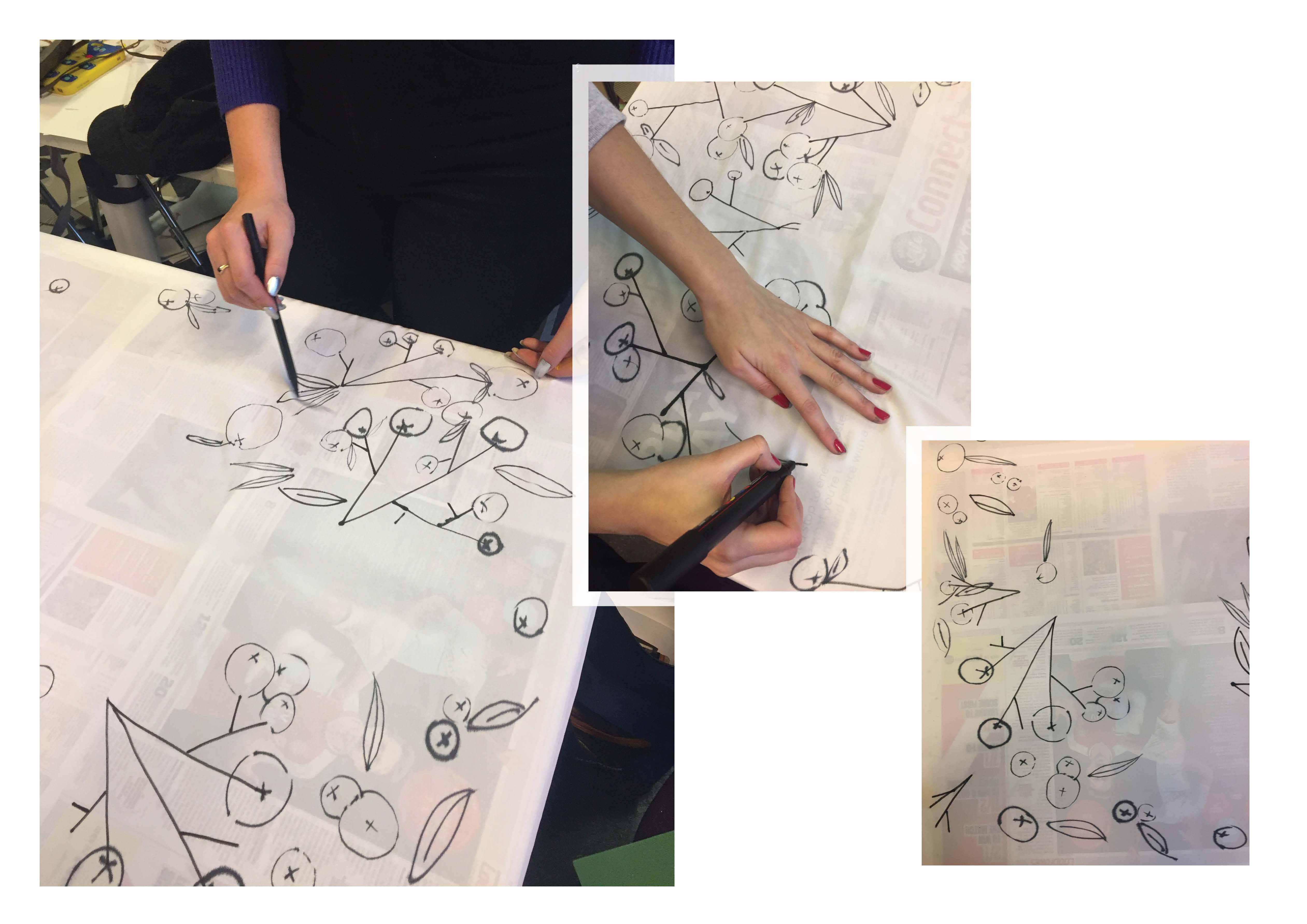
In props we often worked on things together at the same time to speed up the process. Here are three of us working on a table cloth design, we are using a pattern of “red berries” as a nod to the ritual scene but in the “wrong” place of the kitchen. By doing so we are foreshadowing future events through the use of props.
We worked really hard as a team and I think it paid off, the props worked so well. Especially the shrine scene – we used them to act as a shrine pouring out from under the shed, representing how free Conradin’s imagination was when it came to the power of Sredni Vashtar.
 As a final send off to the project I drew Sredni Vashtar and framed him to be part of the shrine scene. Looking at everyone’s drawing styles as part of the shrine was really satisfying – everybody had their own interpretation but they looked so complete together.
ASSISTANT TO STAGE MANAGER
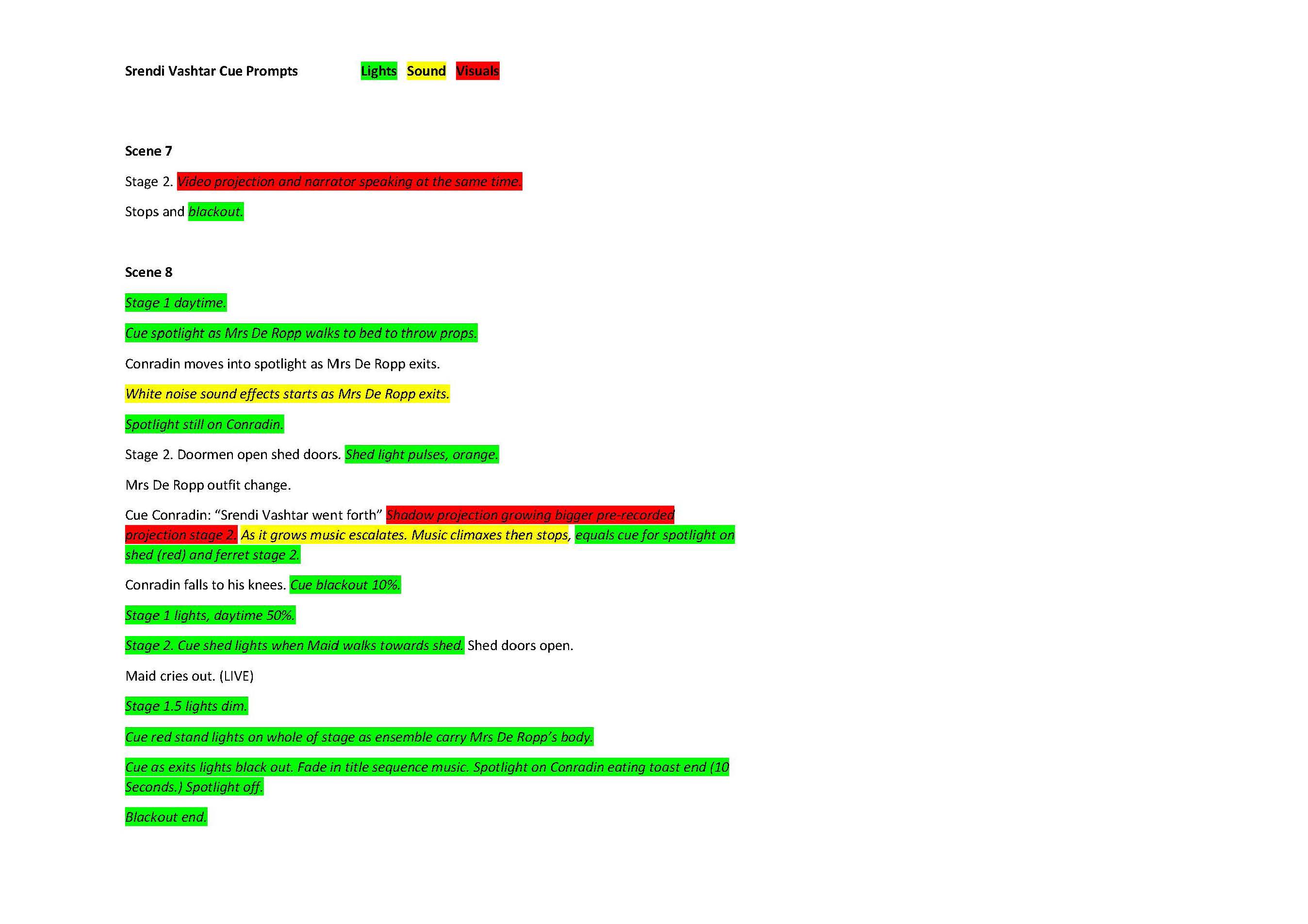
As the play started getting into action the prop department was getting less busy so I offered to help my friend Connie Wright in making a cue sheet for all of the lights, sounds, and visuals. I really enjoyed this as it showed how the play was going to come together, also Connie taught me a lot about how the lights would help with the atmosphere and really transform the space we had (which it did).
This I could then report back to the props team, it led us to realise that we needed more for the garden space as it wouldn’t be lit in the same way as the two main scene (shed and interior). Therefore we decided to make more plants and flowers to make the space flow.

 INSPIRATION FOR A ZINE
As I got more involved in the play I wanted my own personal response to it. My inspiration for this was the play itself and how we interpreted it. I had recently been reading Retro: The Culture of Revival in which it mentioned Aubrey Beardlsley, I looked him up and was so enthralled by his illustrations, I love the mystery and sense of atmosphere behind them. Also I really enjoy the monochrome colour palette, it shows a real dedication to the art – as each illustration says something different to the last while using similar processes. I enjoy the variety of them.
Furthermore, I like how he draws people, leaving the head small while enlarging the body creates an unnerving perspective on the human body. I think it works really well and also felt it would compliment Sredni Vashtar. PLANNING THE ZINE FORMAT
I was keen to carry through the religious imagery which has been used throughout the play, so had an idea to make the book long and thin to mimic a hymn book. Almost as though Conradin had made it himself to worship Sredni Vashtar from.
Due to printing errors this became impossible, so instead I created a card sleeve and tracing paper belly band to give it the appearance of being long and thin. This worked really well and I was impressed by the final look of the zine. I think it met the criteria I set for myself. I was dedicated to finishing this zine despite it not being on a brief which I think took good initiative – which drives me forward to becoming a independent practitioner.
 MONOPRINTS
I wanted to create more monoprints as I really enjoy the process. The outcomes were great they ended up looking like eerie gravestones – which fit the gothic theme of Sredni Vashtar. I wish I had used them physically in the zine however I didn’t want to overwhelm the format and decided to keep it simple. FINAL PAGES OF THE ZINE – IMPRESSIONS OF A PLAY

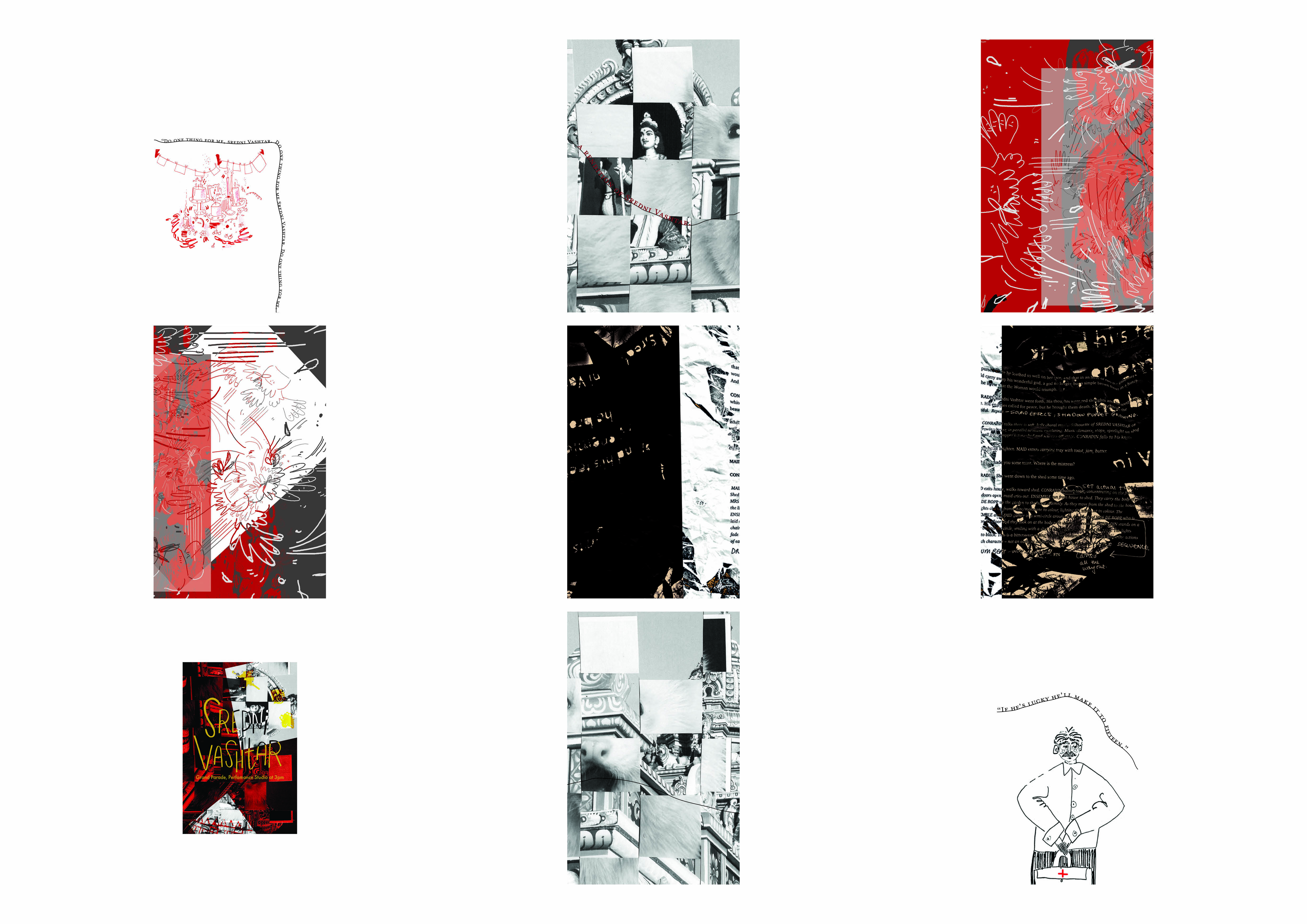
 FINAL POSTER DESIGN FOR SREDNI VASHTAR
For the poster I wanted to create something which represented a coming together of the themes in the story in a mysterious way. So, I used collage to literally weave them together – I think this was really effective.
I used red as a stand out colour to mimic the stage design during the ritual scene, against black and white like the interior.

EVALUATION
This project really pushed the boundaries which made me do the same. I loved the gothic nature of the play which I didn’t even really think was a genre I enjoyed- I think I liked the atmosphere it created. Watching the play was so rewarding, knowing that we had put the whole production on in such a short amount of time made me consider what more I could do. I loved being in the prop department as it felt like the thread surrounding everything in the play. I feel like our concepts were well formed and consistent throughout which I feel was important.
As for my zine, I’m proud that I completed it and that I worked around the problems I had when trying to print it. I really enjoyed making it and indulging in black line work for once. I wanted the illustrations to be simple but convey character and feeling. I think I achieved this especially on the toothache page where Mrs De Ropp is side eyeing the ferret behind her know that something is going on and she needs to get to the bottom of it. It was also fun to try a more sequential narrative, normally I make a free flowing narrative. However, I felt that despite the play being fleeting moments in my memory to flesh it out in the narrative. If I could go back I would make drawings during the play as I feel like this would add some of the energy from the play to the zine.
Yet, I feel like it is a well formed final outcome with some of my best illustrations this semester.
