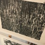
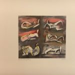
To broaden our understanding of lithography and help the growth of our personal prints, we investigated a selection of prints from the private print rooms at the Tate Britain. These prints spanned across many different process methods, time periods and styles, it was interesting seeing them all together and making comparisons. Earlier lithographs, especially those created during the war, were more realistic and accurate using the dramatic quality of a lithograph to achieve stunning portrayals of planes catapulting through the air. These captured the atmosphere and narrative of wartime which appealed to British propaganda.
However, as the time periods moved on the lithographs utilised colour to present sprawling landscapes, and later still employed textural mark making and simplicity to create abstract work. Lithography became less of a method to record and more a method to express in which way the artist felt fit.
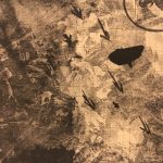
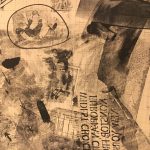
My favourite piece from the private exhibition was by Robert Rauschenberg, it was a monochrome collage using photographs, drawn graphic symbols, text and many other pieces of reclaimed imagery composed on top of graph paper. The effect is curious, its reminiscent of a newspaper but without rational. Similar photomontage pieces by Rauschenberg are described as having “a loose, poetic manner, creating an impression of visual flux that allows the viewer to free-associate” (Tate Text Panel on Almanac 2004). I think this is a fitting description of the lithograph as its use of printing medium allows layers of memorabilia and memories to be caked on creating confusion and wonderment in the viewer. This method has inspired me to create a third layer on my print and to experiment with my prints further.


