Anna Piaggi 6

Essay style and reference guide-

In today’s lecture we discussed and worked on the ways of creating a well written essay. For me I find this very helpful as I have a hard time with writing essays and generally struggle with academic writing. Even simple tips such as the presentation and layout of an essay help me get a better understanding of ways to make a better essay. I also think this is a good reminder as I find myself losing marks over small mistakes so it’s good to remind myself of small details.  We went overusing quotations, second hand or indirect questions, removing or adding text from quotations, footnotes, citations, bibliographies. As well as using the correct footnotes/bibliography depending on the sources such as books, websites, videos, and so on.

Anna Piaggi 5

In the same lecture we also went through some tips for the 1000-word analysis we will be submitting.  During the PowerPoint I noticed a slide with some key words, I wanted to find the definitions so that I would be able to use these words in my analysis and sketchbook effectively.

Cultural lens- “Looking through a cultural lens means stepping back and considering the cultural implications of policy and practice for all members of our community. Our perspectives, values, and viewpoints are formed by the context in which we grew up as well as the ones in which we live.”

https://spptap.org/significant-disproportionality/cultural-lens/

Ethics – “moral principles that govern a person’s behaviour or the conducting of an activity.”

https://languages.oup.com/google-dictionary-en/

monochrome- “a photograph or picture developed or executed in black and white or in varying tones of only one colour.”

https://languages.oup.com/google-dictionary-en/

posture- “the position in which someone holds their body when standing or sitting.”

https://languages.oup.com/google-dictionary-en/

composition- “creative work, especially a poem or piece of music.”

https://languages.oup.com/google-dictionary-en/

heritage- “a special or individual possession; an allotted portion.”

https://languages.oup.com/google-dictionary-en/

zeitgeist- “the defining spirit or mood of a particular period of history as shown by the ideas and beliefs of the time.”

doppie pagine- double page spread

Anna Piaggi 5

Hello,

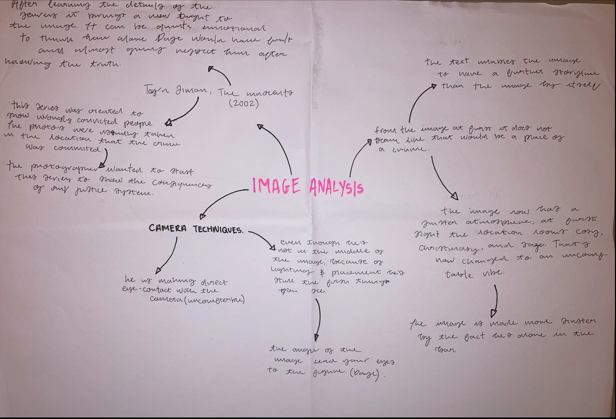
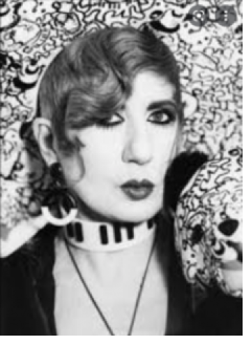
In today’s lecture we look at analysing and deconstruction an image of Anna Piaggi. To start I while going through the PowerPoint I made a quick spider diagram of some of the first things I noticed when I saw the image. For me the interior and Piaggi’s hair were the most eye-catching parts for me. A bit further into the lecture we were asked to do a more in-depth analysis of the image in small groups we were asked to do it first without research and then use our phones to get more information around the image. From the analysis we did today I want to take that and research in a lot more depth. I think by doing this I will be able to get as much out of this image as possible to ensure I can create an editorial page that showcases this information.

Anna Piaggi 4

Prynhawn da,

For this blog I wanted to just write about another design I made. For this I wanted to do something like what I created previously, I felt a lot of inspiration from the last task, so I try creating more. For this design I wanted to keep it black and white to make it different from my last design. Firstly, I wanted to start like I did with my last design my finding an image that is eye-catching to me. I then have found images from a magazine that are portrait like my Piaggi image, like the background of Piaggi ‘s image I have added white designs on my magazine images. I found this a bit boring, so I decided to add some shapes to fill the empty space, to add more texture I did this by embroidering thread on the page.

Overall, I didn’t like this page. I felt it was important to include this even though I don’t like it as I still like some parts from it. as I want to start Thinking of different ideas for my editorial page, I think it’s important I reflect on my good and bad outcomes. I would want to take the use of thread and embordering on my page, I thought this was a great way of adding texture and making something that little bit more interesting. I also liked the doodles on the backgrounds of the image this is something else I would want to take for the editorial page.


Anna Piaggi 3

Hello hello,

In this lecture we were asked to make a collage, drawing or illustration inspired by Anna Piaggi. To start I struggled a little with the direction I wanted to go with this task as it was one of the first creating tasks. I think I spent a lot of time look at other people’s work and seeing what they were making whist I think I need to have more confidence in what I am doing. As I was struggling, I thought the best was to get inspiration was to just use google and Pinterest until I found something that I thought I could turn into something. I ended up finding an image on google of Piaggi, the picture caught my eye as I loved her outfit. I also thought it was an image that really captured her iconic features such as the hat and cane.

For this task I wanted to create a collage. I used the magazine supplied and found prints, textures and colours that looked like the image. I wanted to try recreating the image using shapes, I cut out the parts that stuck out to most the biggest and overlap like in the original images.  To go into further detail, I wanted to explain each section. To start I added a big green cut out this is to resemble Piaggi’s cain. Piaggi was known for having a cane to accessorise her outfits, this was one of the main reasons I was drawn to the image. I wanted to have this as the focal point of my collage because of how much it related to Piaggi’s personal style. When I found the image in the magazine, I thought the illustration resembled a cane so felt that made it fit.

Behind that I added some block colours that I could see in the image. I didn’t see any importance in this part but wanted to use these to generally just add a more interesting shape to my design. These yellow and grey cut outs are to show her yellow bag and her trousers.

The next shape in the pencil illustration, I wanted to add this as for me I thought the colours matched her jacket and I liked the idea that the pencil represents her arm, and it connects to her being an artist.

The next square I found had a design that looked like the pattern from her jacket. As I have already put a lot of details of her jacket, I arranged this to just be in the background. over the top I thought the image needed some more texture, so I got some different shades of blacks and greys to weave them to add something a bit more eye-catching.  As well as a smaller block of text as I thought adding any more colours would be too overwhelming.

Finally, a drew and cut out magazines to show the background of the original image. To make it more personal I also added an ‘S’ to represent myself being the creature of the collage. Think this made it clearer it is a reconstruction of the original image.

To conclude, I am happy with the outcome of the collage. I think that it has a lot of unexpected detail in, and I have used the information about Piaggi from today’s lecture throughout the task. I love how minimalist the design is as this is not my usual style, but I found it refreshing. To improve I would personally have more confidence in my work and try not compare my work to others.


Anna Piaggi 2

Hello again,

For my first part of my research on this assignment I wanted to do find out about Anna Piaggi’s personal background to put into my digital sketchbook. I feel this would give me an interesting outcome when it comes to re doing my editorial page as I will be able to add personal parts. I also find doing background research gives me more depth around the person. I wanted to research things such as Anna Piaggi’s childhood, her iconic looks and pieces of work, her background working in vogue and investigate my favourite work pieces from her. I also think this would be a great thing to start my sketchbook with.

Anna Piaggi 1

Hiya!

This is my first blog of my resubmission of the Anna Piaggi work. I wanted to redo my blogs for the resubmission as I wanted to use this space to reflect on my mistakes from the first time I submitted this project. After looking at the feedback and having completed more assignments I feel that I have a much better understanding of how I need to improve. I feel that my first mistake was a lack of research, now that I know how to gather research and use it effectively, I will be able to achieve a stronger outcome. Throughout these blogs I have added my original work as well as adding more blogs after reflecting on my feedback.

visual promotion


BLOG 1- lecture


in todays lecture we were put into groups to complete profile, we were given a name and a age range and then asked to create a personal profile. my group was given the name ‘Zest’ and are target audience was 18-25, we decided to create a really colourful outcome as we felt that worked well with the name. we were able to get very creative with the type of person that would be interested in this brand.

we also made a grid for all our social media’s, as our target group was young we felt Instagram, Twitter, Tik-Tok and Pinterest were the most relevant for this audience and brand. we filled out each box with something we would post or do for each social media platform.

for Monday decided to add a GIF to our instagram of lemons splashing into some water, we felt this was appropriate as we have a big theme of lemons and yellow throughout our planning. we thought lemons worked well with our name zesty so this GIF would be appropriate. we were also planning to post a tweet with all our manifestos and values as a brand. on Tik-Tok we were planning on posting an advert with different people spraying ‘zest’, we want to have different races and gendres to show anyone can wear this product. Finally, on Pinterest we will be posting our macro boards to show what inspires our brand.

On Tuesday we will be posting an instagram of our product in grass captioned as “everyone that wants to smell zesty”. on twitter we will be including info on our sustainable brand, on Tik Tok we will be talking about our scents secrets and on Pinterest we will be showing our summer mood boards.

On Wednesday we will be posting instagram reels releasing the date of our live (Friday), twitter will also be realising the date of our live. on Tik Tok we will be doing a GRWM and finally Pinterest we will be showing our quotes and GIFs of us unpacking the perfume.

on Thursday we will be adding a Instagram story telling our followers when and where the best places are to wear our perfume. on Twitter we will be announcing a live for Friday (tune in to our Friday live). on Tik Tok we will be showing BHTs of the factories and how the product is sustainably made. on Pinterest we will be be showing our motives boards.

Finally on Friday we will be having a Instagram Live showing our product with our brand ambassador. on twitter we will have a poll asking if our followers have attended our livestream. on Tik Tok we will be showing our CEO at our pop up shop showing the followers around the venue. and finally on Pinterest we will be showing our favourite lemon themed recipes.

I found todays lecture fun, I was able to work with a group of people I haven’t before this allowed me to meet new people as well as hear their new ideas. I think this lecture will help give me inspiration for when I have to do this for my own Sub brand.


BLOG 2 –RESEARCH – CREATING A SUB BRAND

To start my research for my own sub brand I wanted to look for definitions for certain words I have seen throughout the brief and my research. I wanted to do this so I would become more familiar with the things I need to be looking for to create a successful sub brand.

VISUAL PROMOTION – “Visual marketing is the use of images, videos, and other pieces of multimedia content to strengthen            your brand and communicate with your target audience”.

VISUAL IDENTITY- “Your visual identity comprises your logo, imagery, typography, colours, and creative design”.

TRENDS- “a general direction in which something is developing or changing”.

KPI- “short for key performance indicator”.

VISUAL CULTURE- “the world around you (local/global)”


zine

photoshoot one – pre production

For my photoshoot one I am focusing my photos on male gender norms to achieve this I am having my male model wear drag makeup. For this photoshoot I collaborated with Evan (my model) I let him take most control in what style he wanted to do and what he felt most confident in. before the shoot I did some research into the kind of make up I want to have and worked with Evan to see if he had ideas to add or if he felt we could improve the look.

when researching I was mainly inspired by 90’s glam as well as editorial looks. some artists I looked at were Alexa Demie and  Donna Davy, I was mostly inspired by their extravagant looks of sharp eyeliner and deep colours. Alexa Demie is a well known actor but inspires me mostly for her courageous make up, she mostly uses dark colours but can be occasionally seen adding colour or glitter to her looks. I wanted to focus on Demie’s neutral looks as I feel those colours will look best when I edit my photos, which I’m planning on doing in black and white.


(images from Alexa Demie’s instagram)

Donna Davy is well known for working as a make up artist on the show Euphoria, I took a lot of inspiration from this show as I love the aesthetic and the make up is always different and out going. I think Donna Davy’s looks are a lot more colourful than I want to attempt but a lot of the structure was inspired by her work.


(images from Donna Davy’s instagram)

another makeup artist me and Evan looked at was Crystal, Crystal is known from the season 1 of RuPauls drag race uk- season 1. I felt it was important we looked at a drag queens make up look as that is what I am inspiring to do. We are planning on making the look extremely extravagant by gluing Evans eyebrows and making them longer to completely transform his face.


(images from Crystals instagram)