SEE BELOW LINK FOR PDF OF MEDIA PACK – DECADE MAGAZINE.
Sketchbook Bibliography
Exhibition
Simryn Gill. My Own Private Angkor. 2007. Series of Framed Photographs. Singtel Special Exhibition. National Gallery Singapore.
Mona Hatoum. Impenetrable. 2009. Installation made with steel and fishing wire. 300 x 300 x 300 cm. Collection of Yuz Foundation. Singtel Special Exhibition. National Gallery Singapore.
Arno Schidlowski. Inner Skies. [n.d]. Series of Photographs. The Photographer’s Gallery.
Print
Sara Jane Hoar. Talking Fashion. Photocopy of Pg – ‘Classic Chic is Timeless’ 2002.
Charlotte Rivers. Mag-art, Innovation in Magazine Design. Photocopy of p12. 2006.
Raymond Dorn, How to Design and Improve Magazine Layouts. p103. 1976.
Jeremy Leslie, Mag Culture – New Magazine Design, p 124, 2003.
Martin Dawber, New Illustration with Type, p40, 2010
Daniel Blanco, Lettering Beyond Computer Graphics, 2009.
Magazine
Robin Muir. Vogue 100 – A Century of Style. Photocopy of Pg 149 (David Bailey. Two Females Modelling Coat Range.1966) Print.
Collage by Georgia MH. Vogue Dec 18-Feb 19 Issues.
Law Magazine, Issue 6, p 12
Law Magazine, Issue 6, p 39
Law Magazine, Issue 6, p 20
Rebels Magazine, Issue 4
Puss Puss, AW18/19
Noble Rot, Issue 19
Yes & No, 02:02
Little White Lies No. 79
Dazed, 519
Sunday Girl
Avant
Considered
Online
Screenshot by Georgia MH. Trend forecast by WGSN. [2019]. Online. www.wgsn.co.uk
Screenshot by Georgia MH. Mae Sweater Product Page. Weekday. [n.d]. Online. www.weekday.co.uk
Screenshot by Georgia MH. Kimomo Mid Blue Jeans Product Page. Monki. [n.d] Online. www.monki.co.uk
Screenshot by Georgia MH. Short-Sleeved Jersey Top Product Page. H&M. [n.d]. Online. www.h&m.co.uk
Screenshot by Georgia MH. ASOS Design Cotton Mini Shirt Dress Product Page. ASOS. [n.d]. Online. www.asos.co.uk
Screenshot by Georgia MH. Vegan 101 Product Page. Dr Martens. [n.d]. Online. www.docmarten.co.uk
Adam Friedman, Project 6: Sara Cox London AF0064jpg, 1997, The SubCulture Archives. Web. www.thesubculturearchives.com
Adam Friedman, Project 6: Dionne at ‘Back in the Club’ London AF0022.jpg, 2001, The SubCulture Archives. Web. www.thesubculturearchives.com
Rebecca Lewis, Project 9: Young Mod Woman, [n.d], The SubCulture Archives. Web. www.thesubculturearchives.com
Gregg Segal. 7 Days of Garbage. Series of Photographs. 2014. California. Web. www.gregsegal.com
Pinterest
Anon. Think Pink #AltuzzaraPS18. Revolving Style. [n.d]. Pinterest
Ian Berry. Marilyn Monroe. Denim Art. [n.d] Pinterest.
Ian Berry. Charismatic Jean Headshots. Denim Art. [n.d] Pinterest.
Anon. Esc Traffic Jam Berlin 1989. Viral Nova. [n.d] Pinterest.
Eugenia Loli. Jungle City. Surrealism Collage. [n.d] Pinterest.
Guillame Chiron. Giant Humans Overtake. Collage. 2018. Pinterest.
Steve Madden Shoe Ad – ‘Young & Modern’ 2002. Pinterest.
Steve Madden Big Head Commercial – ‘Nordstrom’. [n.d] Pinterest.
Steve Madden Big Head Commercial – ‘The Lotus’. [n.d]. Pinterest.
Anon, This will all Make Perfect Sense One Day. Yellow typography. [n.d] @Rhudeawakening. Pinterest.
Steefan Audrey, ‘Miss Helen’, Recycled Wood Portrait. 2015. Pinterest.
Steefan Audrey, ‘Mister Alexander’, Recycled Wood Portrait. 2015. Pinterest.
Mood Board 1:
Jai Odell. Fashion Photography. [n.d] Pinterest.
Alexandra Nataf. Yesterday’s Tomorrow, Unconditional Magazine. Fashion Photography. 2016. Pinterest.
Alexandra Nataf. Vanessa Ante by Nataf, The Edit Magazine. Fashion Photography. 2018. Pinterest.
Anon. Close Up White Pocket. [n.d] Pinterest.
Kasia Rei. Illustration. 2015. Pinterest.
David Cortes. Product Photography for Refinery29 Magazine. [n.d] Pinterest.
Anon. Hair & Makeup for Calvin Klein S/S 11 NYFW. 2011. Pinterest.
Denim Mood Board:
Rebecca Spencer. Nina Lisa supermarket shop. 2018. Instagram @rebeccaspencer_photography. Pinterest.
Kevin Jude. New Girls New Looks. V Magazine. 2018. Pinterest.
Takay. Julia Cumming by Takay. Marie Claire. 2016. Pinterest.
Harley Weir. Rihanna Cover. Dazed Winter 2017. Pinterest.
Ava Nirui. Matthew Adams Dolan SS16. Dazed. 2016. Pinterest.
Anon. Zara Denim Editorial. Zara. [n.d]. Pinterest.
Front Cover Mood Board:
ID, Rihanna, Spring 2015. Pinterest.
Paper, Paris Hilton, Winter 2015. Pinterest.
Life Magazine, 1965. Pinterest.
Interview Magazine, Andy Warhol [n.d] Pinterest.
Rebels Magazine, Issue 4 She is Fierce, 2019. Pinterest.
Polyester, Issue 3, Pinterest.
YouTube
Screenshot by Georgia MH. The Winter 2017 Stella McCartney Campaign Film. 2017. Stella McCartney. Online. YouTube. www.youtube.com
Screenshot by Georgia MH. Steve Madden Commercial. 2009. Tommy Kane. Online. YouTube. www.youtube.com
Screenshot by Georgia MH. 2117 – 100 years of Chore Coat, 2017. Law Magazine for Carhartt. YouTube. www.youtube.com
Behance
Anna Kozdon. December 2016. Flat Design Illustration. 2016. Behance. www.behance.net
Anna Kozdon. August 2017. Flat Design Illustration. 2017. Behance. www.behance.net
Instagram
Small Triangle Bikini Top, @SUGRCOATD, 17 Feb 2019. Instagram. www.instagram.com
Be the Bigger, Badder (Kinder) Person, @themayfairgroup, 1 Mar 2019. Instagram. www.instagram.com
Lucy Coward-Whittaker, Harriet 2, Line Drawing Illustration, @lucycowardwhittaker, [n.d] Instagram. www.instagram.com
Lucy Coward-Whittaker, Cesca, Line Drawing Illustration, @lucycowardwhittaker, [n.d] Instagram. www.instagram.com
Due to the sustainable aspect of my magazine, I have decided to print it on recycled paper. However once I carried out my test print, I found that the original colour blue which I chose as the background on the front cover was very bright and overpowering. After refining the colour, I decided to choose a darker more grey toned blue. I am happy with this decision as it looks more professional and dosent distract from the image or typography. The title of the magazine is in font Impact, which is a header font throughout the magazine. However after receiving back my test print, I refined the header by making it slightly italic. This stands it aside from the regular typography inside the magazine as well as creating a more edgy look to the cover.

Online portfolio: https://gmoorehemsley.wixsite.com/portfolio
Instagram: @gmoorehemsley
CV
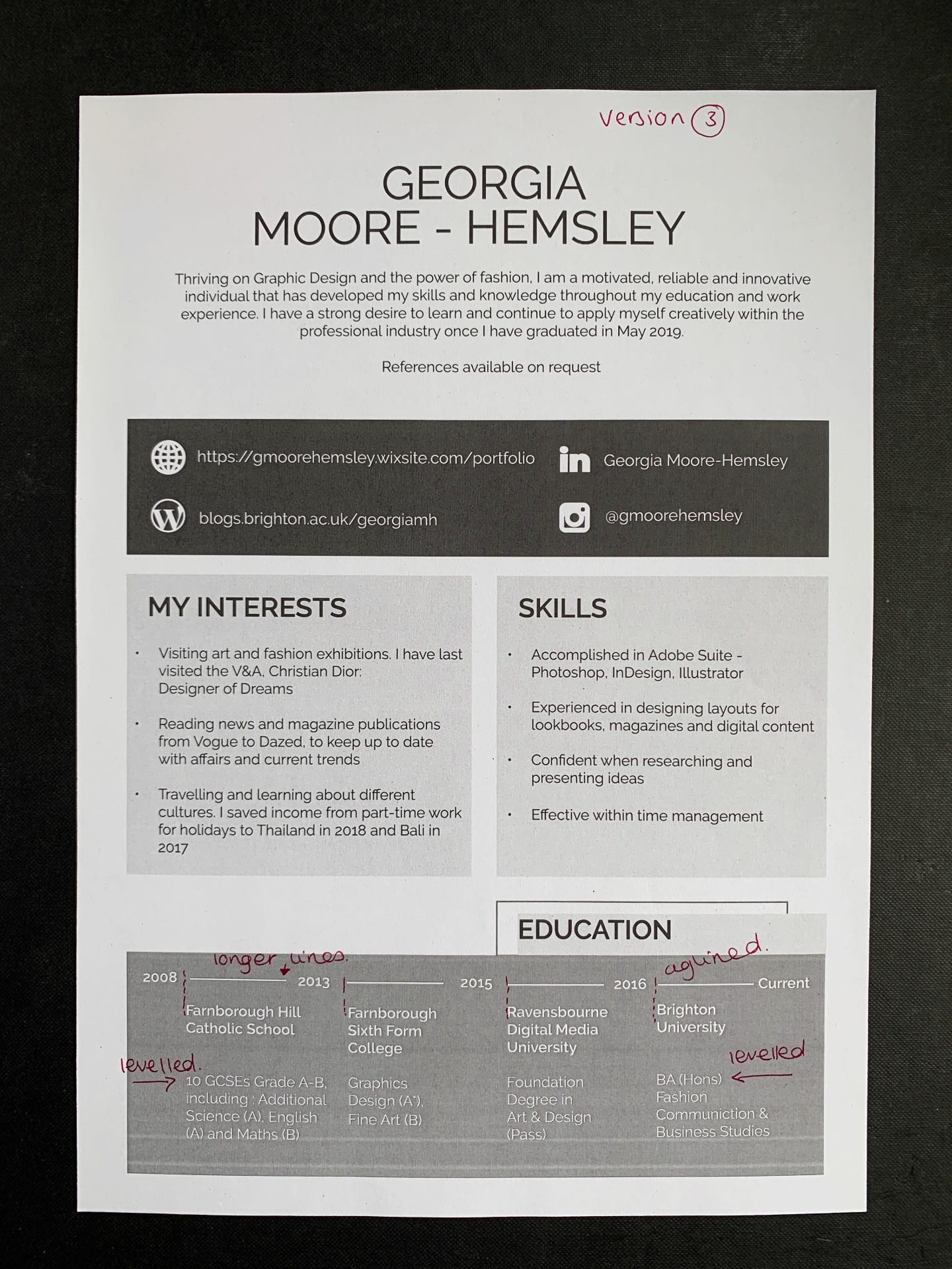
I have redesigned the layout of my CV numerous times, as I found it difficult to be able to reflect who I am as a person and brand myself. My experimentations follow:


I have designed my CV in a more creative layout and have branded myself with colours and a minimalist style which I feel represent me best and are relevant for a range of brands. I have used the font Raleway. I found that by printing them out I was able to engage with the size and spacing more effectively. I made three refined versions by carrying out this process.


To make my online portfolio more engaging I have created a stop motion video of my final product in year 2 : Neighbour Magazine, and my FMP final product: Decade Magazine. I am happy that I chose to present the magazines in a stop motion format, as it is a more snappy and attention grabbing format.
Also to present the social media experience which I am carrying out for Phoenix Magazine, I have created a short film of my executing the Instagram page. I believe this is also a fresher approach than uploading a still screenshot of my work for the company.

As I will have two magazines to present, I am going to deliver my work within a styled box. I have created pages to separate my work, titled with the name of each project. As I found it useful to print my CV out, I did so again with these when refining. My three developments follow:
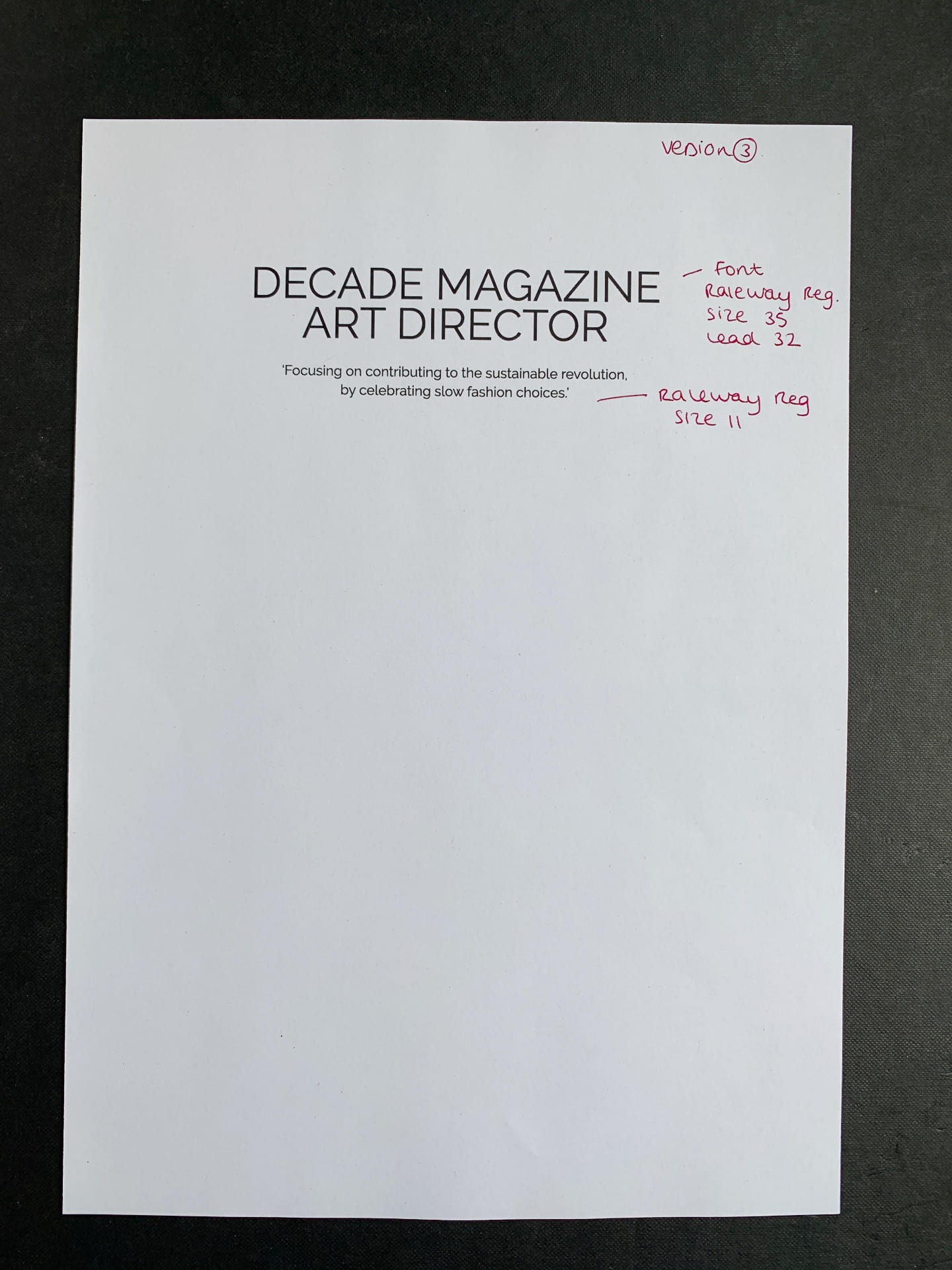


I have used the font Raleway, which I used in my CV and online website, throughout my Portofolio, so that my branding is consistent throughout.

To present my work experience carrying out the social media at Phoenix Magazine within my portfolio, I experimented with using a mockup in Photoshop to create an iPhone on the Instagram page.
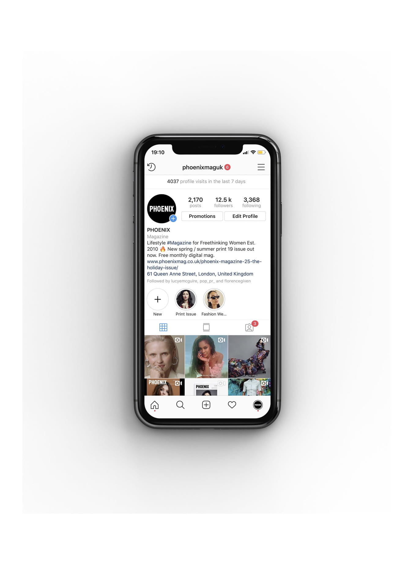
However upon reflection, I do not feel it is needed to be presented in the phone mockup. It looks less bulky without and flows better with the style of my portfolio.

I have also included a Database of companies that I would like to apply for and why they would appeal to my work. At first I found this quite difficult, but once I saw what my strengths and weaknesses were in my work, it was easier to apply it to which companies I would suit.
Using the Timeline tool in Photoshop I have created these GIFs to be used on the magazine instagram @decademaguk.
They are quick paced and bring a new technique to my work.


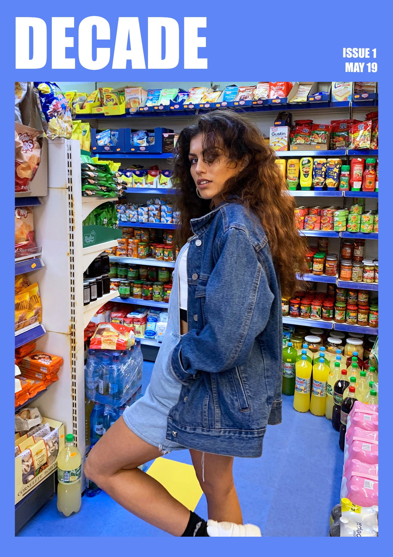
Having experimented with different layouts for my magazine I have chosen this to be my final outcome. I have chosen the blue background as I feel that the white does not represent the brand well, and the pink gives of girl only connotations when in fact the magazine is unisex targeted.
I have also changed the name of the magazine from Eternal to Decade. I have done this because Eternal sounded more high end and better suited to a older audience, where as Decade sounds more youthful. Decade can also be interpreted for the meaning of ten years, or decading material. Both relevant to sustainable fashion.


Upon reflection, I have decided to redesign the Stitch It Bitch spread as the spring coloured buttons were too much of a ‘pretty’ aesthetic, when I want the magazine to have more of a street style look. I have created the redesign by focusing on the word ‘bitch’ and the connotations which come with it.
Inspired by Anna Kozdon, I created flat design illustrations recreated from three photographs of female models which I have taken throughout the project. Having experimented with illustration in my first Swap not Shop feature, which I was not completely satisfied with, I thoroughly enjoyed this digital technique and outcome.

I have refined the final layout by:
– Using two of the three illustrations to create more space
– Adding highlight colour to red dress to create depth to illustration
– Adding dashed stroke around typography to reflect imagery to word ‘stitch’
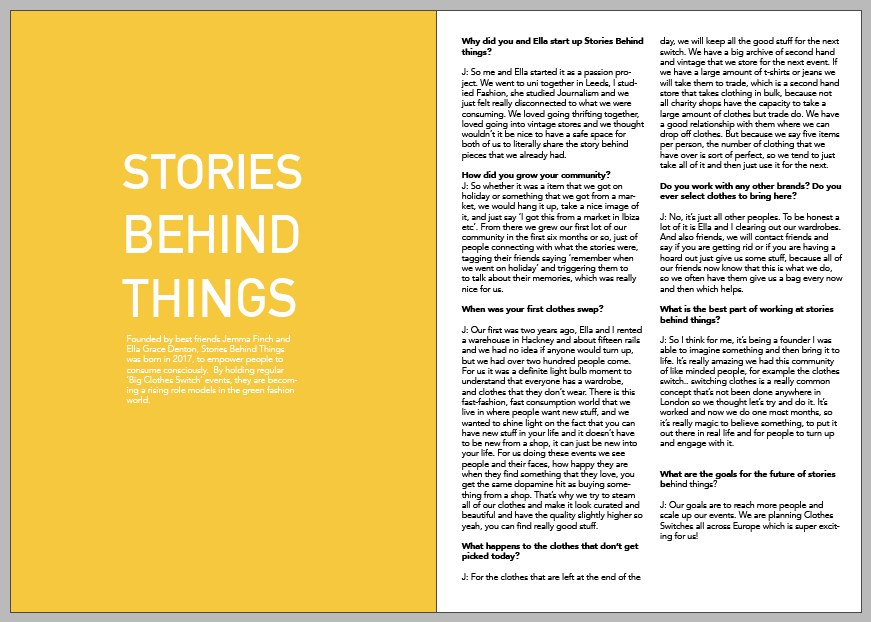
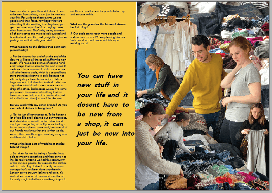
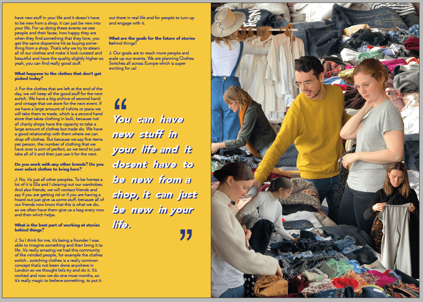
Now I have developed my magazine further I am not sure if the illustration which I created for the ‘Stories Behind Things’ feature is of the same tone to the rest of my magazine. Once taking out the collage, I created these experimental spreads, consisting of one collage, the interview and a pull out quote.


I began to create a page of typography as another way of illustrating the feature. I took these photographs of my clothes and created an alphabet previously yet had no use for them in the magazine as of yet. I am keen to use the phrase ‘Swap Not Shop’ as the previous title, ‘Stories Behind Things’ was the name of the company running the event, yet it did not easily communicate to the reader what the feature is about. I developed the alphabet into upper case letters, as it is clearer to read and more eye catching.


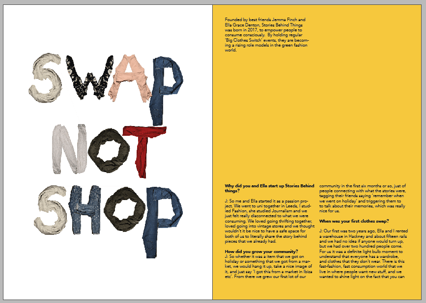
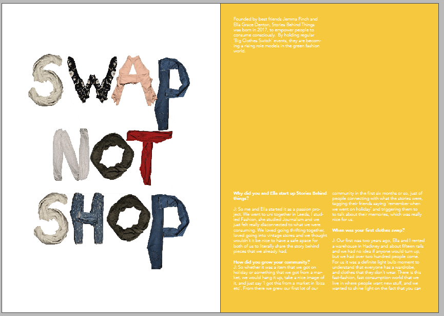
In order to experiment with different textured backgrounds I scanned a cotton t-shirt, and a creased piece of paper. Due to the letters in the typography being of a range of colours and patterns, I want to keep the background plain and of a white/grey scale.


After deciding that the typography looks best in this format and background, I developed further by changing the repeating letters S and P, from other items of clothing. I increased the saturation and brightness of all layers so that there is a higher contrast against the paper.

FINAL PAGES:

In the magazine I would like to include the HP Reveal App feature, where when scanned a video guide on ‘How to Sew a Button’ plays.
Layout Experiments:


Due to the scanned buttons not being very clear, I refined the development by taking a photograph of them instead so that they are more vibrant and of a better quality. I also changed the title of the feature from ‘How to Sew a Button’ to ‘Stitch It Bitch’, which targets the slang language which my target audience would use.


How to Sew on a Button video:


Inspired by Guillame Chiron, Jungle City I have scanned in a processed material such as a black bin bag and a juxtaposing object of yellow flowers and green leaves. I have chosen to use these as I hope that the audience begin to ask questions on sustainability as soon as they begin the magazine. It also creates a effective contrast in textures. Also likewise in Chiron’s collages, the model and flowers are not in proportion of each other.
At first I envisioned this design to just be on a single page, however decided it looked better over a double as all the images are large, the light space created by the graph paper creates balance.
ADD FINAL CONTENTS AND COLOUR SCHEME **********