MAKING A WEBSITE 2
https://a-house-is-a-home.webnode.co.uk
Making a website requires a lot of skill, patience and time, which I have now learnt as I’ve been attempting to make one to complete our final outcome of placing all of our work onto an online platform instead of in real life, to adjust to the current climate of the coronavirus and online outcomes. I volunteered to make the website as I feel like I haven’t done it before this in depth and the skills would be beneficial within my personal professional module as well as generally in real life on placements and working.
We chose a website out of all internet platforms as we feel like this suited our concept most; this is because we were inspired mainly by films and 1940s which would fit on a website as this is the most traditional online platform. We didn’t need anything too modern like Instagram to actually showcase our work, as it brings a different sort of social element to our work but ours fits well on a website as its’ a simple way to collate all work onto a simple platform for viewing with less interaction; the interaction will be in the questionnaire.
When trialing the website, in order to really try and not only make an appropriate looking website, but also to test my skills and enhance my learning, I used a few different website makers to see what suited the style of our concept, as well as my skill level because I knew this could be difficult, as people do pay people a lot of money to make their websites quickly and effectively.
WIX
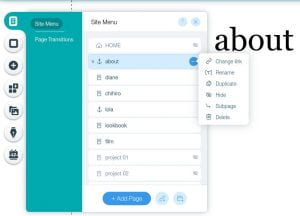
Wix as a website maker was recommended to me by a friend, plus I’ve seen a few people in class use it before for different projects so I thought it would be appropriate to attempt to use for our website. The navigation was easy and it had a link on th e side to explore through each page on the website so you’d be able to click on a page and sort out the settings through this bar, like font, size, positioning, colour, headers, pictures, links, words, videos, layouts
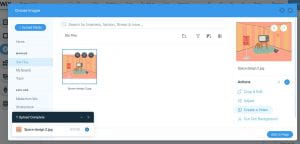
 etc. However these were the options when I clicked on it, and I didn’t really understand sub pages or the need for duplicate page at this point so I was lost by this as I wanted the website design to be very straightforward. Soon I realised the icons on the far left were where I could insert pictures and videos.
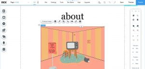
I found wix to be really difficult and the results were looking a little too bare, not put together right and inconstant in terms of design and better suited to someone with slightly more experience of making a website. The actual style of the website looked okay after moving titles around and enlarging fonts or making them smaller, more italic and in fitting with our aesthetics but I honestly could not work out the more technical side of applying pages well and adding imagery that suits the style of the site.
I’ve been having a lot of struggles with software and equipment since corona virus as I would usually use the library for things like these as my laptop is very slow, therefore when using Wix, a lot of it was quite technical and there were a lot of elements to the website which often meant that it always refreshed and lost data or took too long to launch or edit, therefore I found Wix too time consuming for the project and aimed to move on to an easier format.
I moved onto trying Cargo (forgot to screenshot a lot of my process but I will try explain), which is a well known portfolio website recommended to us by the teachers for the other part of the project, however, I came to realise that I only wanted our website to have a very simple navigation, clicking on the pages which will take you to the characters, the look book or the film, which I thought should work very easily in Cargo to lay it out like a portfolio will each outcome as a different page. Looking through all the templates they had, I was shocked at how most of them were quite niche and complicated, but a few were too boring with a lot of white space or had arranged their portfolios so that each image was quite small, as if you had a lot of work for each project, whereas we just wanted a few images per page. Attempting to add images as backgrounds, replacing the template images on the page, clicking on each page and seeing what’s the homepage, amongst many other things, proved to be incredibly and very surprising difficult as I thought portfolio websites should be the most straightforward of them all!
I tried a third website maker called Webnode after searching for an easy and straightforward website maker on a news article from The Guardian. Searching for a simple layout, where I could place a row or column of pages to click on and place a few images with text in each page with an easy navigation, I clicked on one a few pages down and began. My screenshots are not uploading but I had to switch to my phone to edit this website as my laptop wasn’t working again. I chose a simple design where the sides had the pages navigation, you would click on each page and it would take you to a page editing layout where you would click either a blank page, online store type page, blog, photo gallery, about us or contact page so I adjusted each page for the use of it. I changed all the fonts easily and moved them so they were on the top left and in a cursive, italic font in pink, to make the design of our project link to the aesthetic of the website.


