Month: May 2020
FINAL EVALUATION OF PROJECT
In terms of professional and personal development I feel as I have progressed further as a creative due to the exploration and research I have undertaken in this project as well as the fact that the general working style of this project was fairly out of my comfort zone; as I don’t usually create three-dimensional work. However this gave me the opportunity to learn a variety of new skills that I will take forward into my future practices, placements, future uni projects and graduate jobs.
In terms of research, exploring types of mediums and artists that I’m not usually surrounded by, allowed me to expand my understanding of different styles of art, for example, looking into Melanie Martinez music videos had such an impact on the entire progression of our project due to her very strong concepts of childhood, nostalgia and ageing reflected in her style of video which heavily incorporates props and extravagant set design, which are topics I don’t usually research into for projects however aligned with our work beautifully.
Due to the ever-changing nature of this module in line with the current social affairs of the coronavirus, my working style had to adapt which proved to be quite difficult, as I had to change from working in a close group setting with access to camera equipment, university software, lighting equipment as well as physical props to then changing all of my outcomes to online platforms or altering them digitally for the new revised final outcome that we had remotely. Although struggling at first, I began to utilise my phone when my laptop couldn’t perform effectively by creating a mood boards using photo editing applications and creating my sketchbook within my blog, which opens me up to the possibility of using an online platform in the future for a final outcome which is an essential skill for contemporary art in terms of layout as well as just being able to communicate with a large crowd and creating a interactive design.
Teamwork was an essential factor for this module, as we had to support each other during the beginnings of the lockdown, with the class room teaching becoming unavailable and transforming into online teaching, we adapted our usual meetings from in person to calling on WhatsApp or Microsoft teams as a group. Previously, we had struggled as a group to bring ideas to life, and to create actual outcomes for the first half of the project, however, we still met up often to discuss ideas and we all made several new boards some of which are on my blog that helped us progress and visualise ideas further. I felt the support from everyone in the group equally as we negotiated between us and divided up roles to suit each person; which led me to creating the website as I volunteered in order to gain a new skill. My role was to collate all the work and create a website, someone else as well was the complete the film that they had started as they were confident with editing, another was to compile our work into the PDF, and another was to compile the illustrations into a look book.
Learning new skills is something I did struggle with without the added support of a classroom however, I overcame this by researching tutorials on how to create a website, which was my role for my group post lockdown, which worked in my favour as I now know how to make a website with basic skills using a website maker, which will prove in handy for my future endeavours and reflected in the fact that I have made a website for my online portfolio too.
MAKING A WEBSITE 3
https://a-house-is-a-home.webnode.co.uk
Due to the simplicity of the naviagtion, the overall feel of the website and the way I could edit it easily, I stuck with Webnode to be the website provider of our online space.
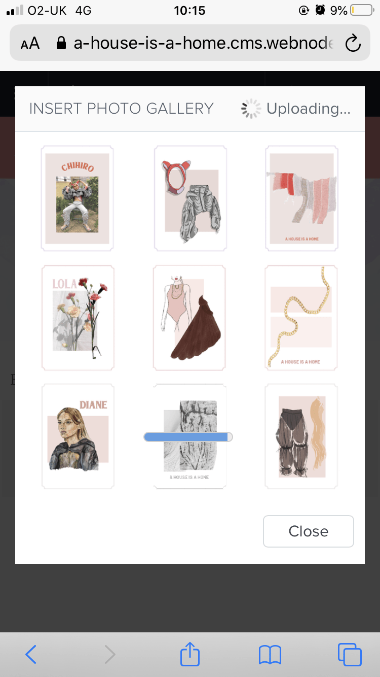
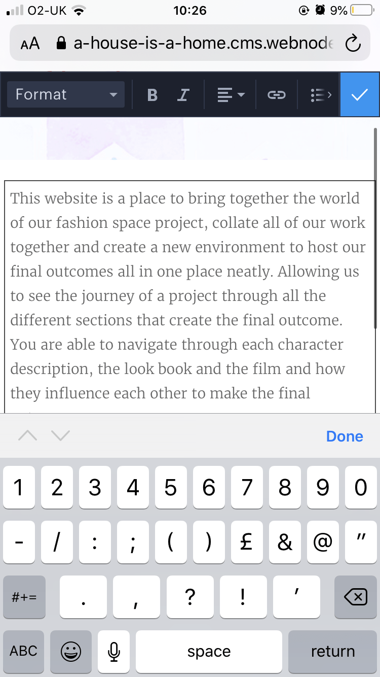
These are all screenshots of me editing and navigating the website on my phone which I had to do because my laptop wasn’t working so well and had to take matters into my own hands, After struggling a lot with making a website previously I was very lucky that this website had such an easy navigation to edit on an iphone which I will definitely keep in mind for future practices!
Each page was allowed to have a certain style which really made it so easy to make each page exactly what you want, for example there was an option to make this page a photo reel, easily displaying a large array of photos that they laid out for you as a template, however where did go wrong was that as a shortcut I clicked on making one of the pages into a blog post as I thought it was displayed in the same way however it was created so that there are different blog post on the page and then you click on the blog post and that brings you to the page where I aimed to have them visible straight away, and it took me awhile to understand how to change the page because in the end I had to delete and start again which pushed me back even further in regards to time. However I’ve learnt my lesson and I need to look more thoroughly into the website layout and instructions.
It was really easy to add in images, take out images or add a text and change around the pages with this website maker compare to Wix or Cargo which I really struggled before! I was so happy that I was able to navigate making a website at the end and although I am so happy with how the website looks it’s very easy to find what you’re looking for and it brings all of our work together in a nice sophisticated manner, for me personally I do wish I had more advanced website making skills or a better computer to edit a really good website because I found it so interesting as you could literally code an entire website yourself and make it exactly how you want which I know would be helpful for the future however for the time being I’m happy that I found this website to use.
MAKING A WEBSITE 2
https://a-house-is-a-home.webnode.co.uk
Making a website requires a lot of skill, patience and time, which I have now learnt as I’ve been attempting to make one to complete our final outcome of placing all of our work onto an online platform instead of in real life, to adjust to the current climate of the coronavirus and online outcomes. I volunteered to make the website as I feel like I haven’t done it before this in depth and the skills would be beneficial within my personal professional module as well as generally in real life on placements and working.
We chose a website out of all internet platforms as we feel like this suited our concept most; this is because we were inspired mainly by films and 1940s which would fit on a website as this is the most traditional online platform. We didn’t need anything too modern like Instagram to actually showcase our work, as it brings a different sort of social element to our work but ours fits well on a website as its’ a simple way to collate all work onto a simple platform for viewing with less interaction; the interaction will be in the questionnaire.
When trialing the website, in order to really try and not only make an appropriate looking website, but also to test my skills and enhance my learning, I used a few different website makers to see what suited the style of our concept, as well as my skill level because I knew this could be difficult, as people do pay people a lot of money to make their websites quickly and effectively.
WIX
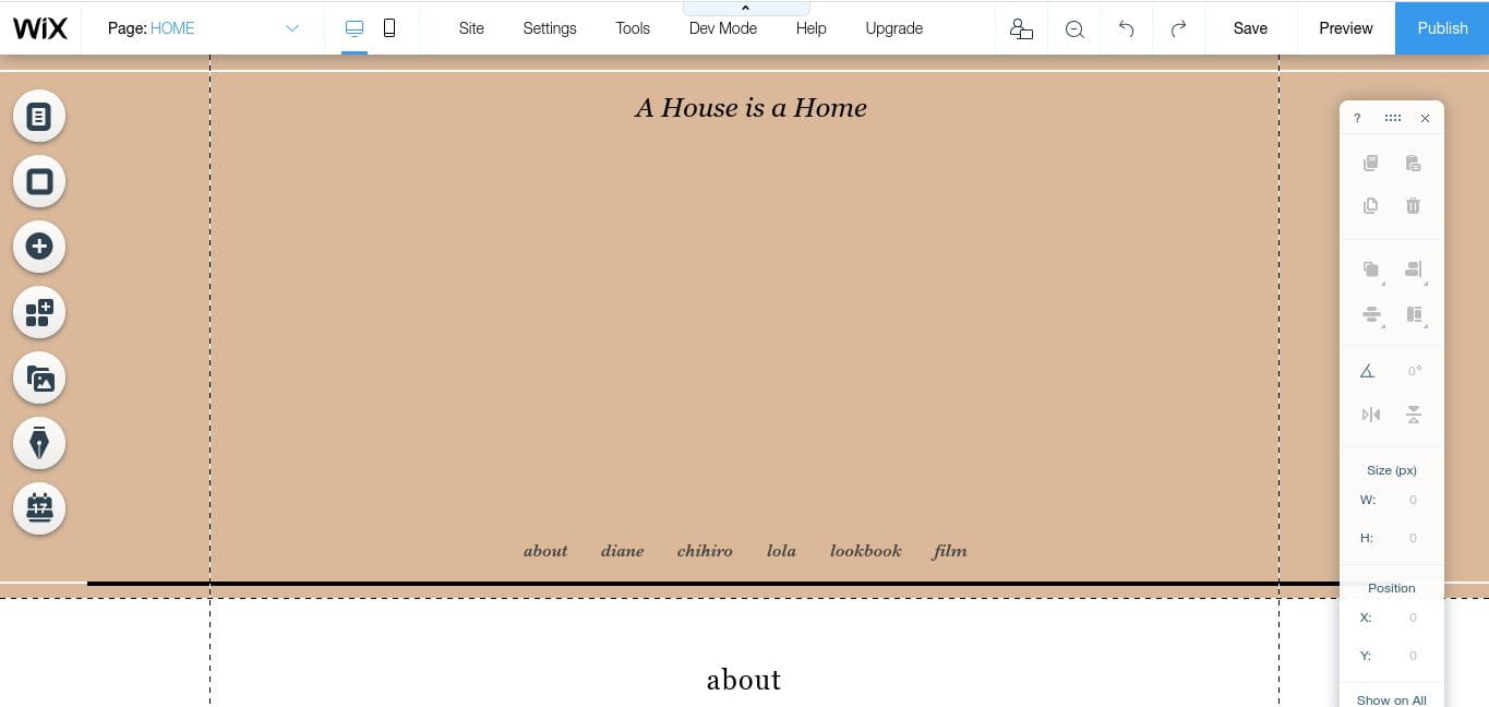
Wix as a website maker was recommended to me by a friend, plus I’ve seen a few people in class use it before for different projects so I thought it would be appropriate to attempt to use for our website. The navigation was easy and it had a link on th e side to explore through each page on the website so you’d be able to click on a page and sort out the settings through this bar, like font, size, positioning, colour, headers, pictures, links, words, videos, layouts
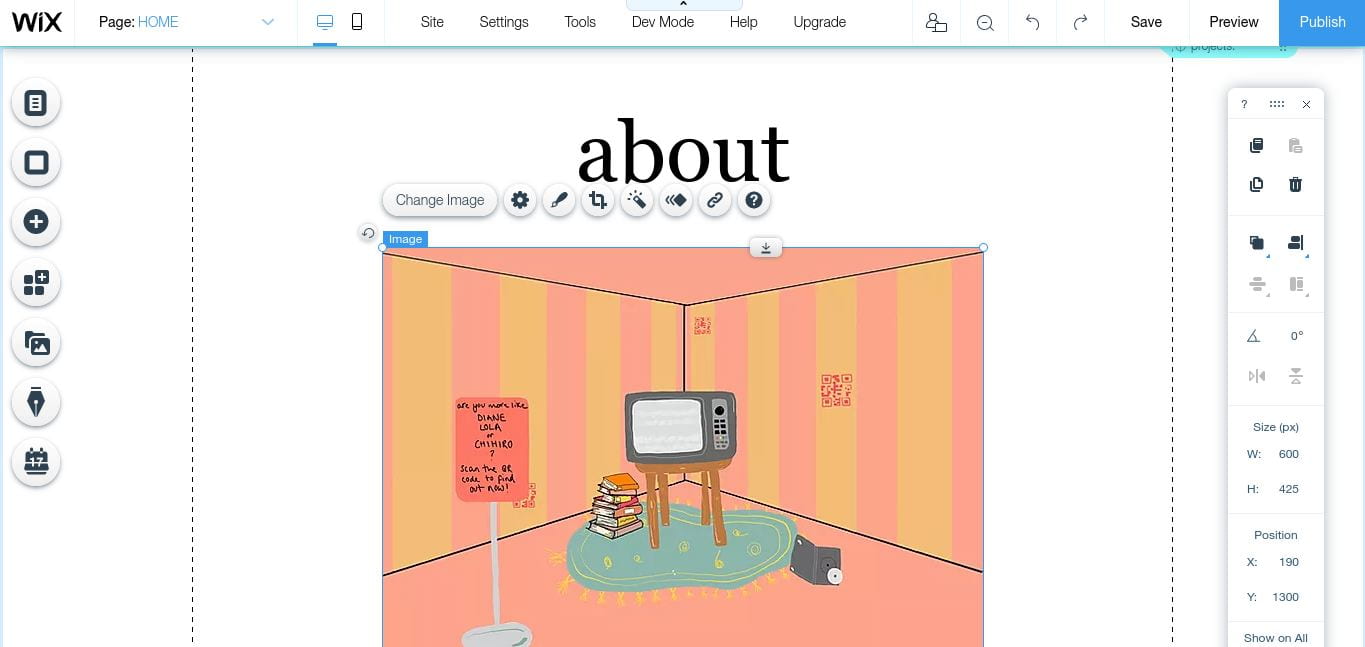
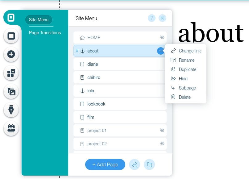 etc. However these were the options when I clicked on it, and I didn’t really understand sub pages or the need for duplicate page at this point so I was lost by this as I wanted the website design to be very straightforward. Soon I realised the icons on the far left were where I could insert pictures and videos.

I found wix to be really difficult and the results were looking a little too bare, not put together right and inconstant in terms of design and better suited to someone with slightly more experience of making a website. The actual style of the website looked okay after moving titles around and enlarging fonts or making them smaller, more italic and in fitting with our aesthetics but I honestly could not work out the more technical side of applying pages well and adding imagery that suits the style of the site.
I’ve been having a lot of struggles with software and equipment since corona virus as I would usually use the library for things like these as my laptop is very slow, therefore when using Wix, a lot of it was quite technical and there were a lot of elements to the website which often meant that it always refreshed and lost data or took too long to launch or edit, therefore I found Wix too time consuming for the project and aimed to move on to an easier format.
I moved onto trying Cargo (forgot to screenshot a lot of my process but I will try explain), which is a well known portfolio website recommended to us by the teachers for the other part of the project, however, I came to realise that I only wanted our website to have a very simple navigation, clicking on the pages which will take you to the characters, the look book or the film, which I thought should work very easily in Cargo to lay it out like a portfolio will each outcome as a different page. Looking through all the templates they had, I was shocked at how most of them were quite niche and complicated, but a few were too boring with a lot of white space or had arranged their portfolios so that each image was quite small, as if you had a lot of work for each project, whereas we just wanted a few images per page. Attempting to add images as backgrounds, replacing the template images on the page, clicking on each page and seeing what’s the homepage, amongst many other things, proved to be incredibly and very surprising difficult as I thought portfolio websites should be the most straightforward of them all!
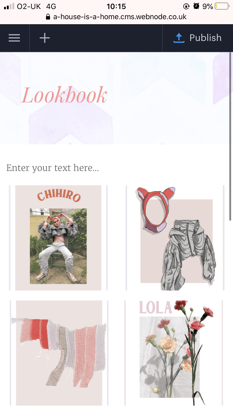
I tried a third website maker called Webnode after searching for an easy and straightforward website maker on a news article from The Guardian. Searching for a simple layout, where I could place a row or column of pages to click on and place a few images with text in each page with an easy navigation, I clicked on one a few pages down and began. My screenshots are not uploading but I had to switch to my phone to edit this website as my laptop wasn’t working again. I chose a simple design where the sides had the pages navigation, you would click on each page and it would take you to a page editing layout where you would click either a blank page, online store type page, blog, photo gallery, about us or contact page so I adjusted each page for the use of it. I changed all the fonts easily and moved them so they were on the top left and in a cursive, italic font in pink, to make the design of our project link to the aesthetic of the website.
MAKING A WEBSITE – IDEAS
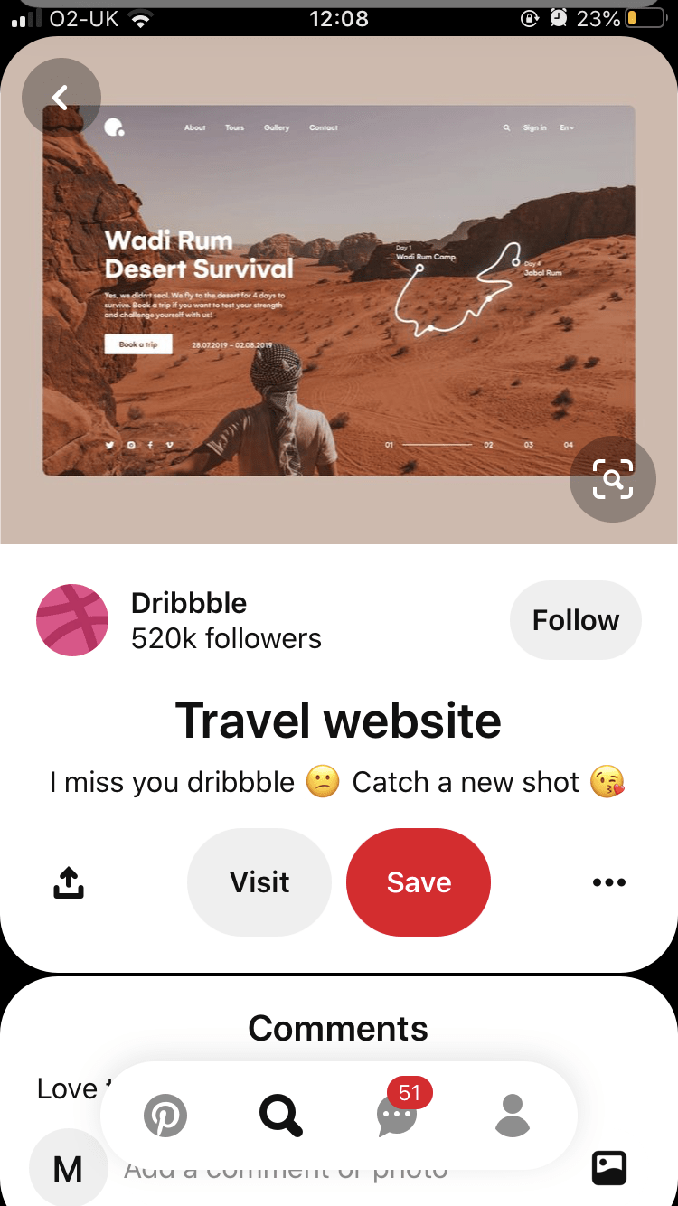
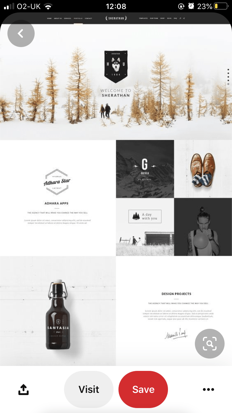
I knew Pinterest would be a good source to find aesthetically pleasing and simple website ideas because a lot of people use as a portfolio or lots of people showcase their work there which is easy accessible for me. I was very inexperienced in making websites therefore wanted to look at something very simple however I couldn’t use any of these templates directory on the website makers I would be using because they were completely separate which I forgot about as the ones on Pinterest were more for buying a domain/ progressional businesses or blogs which I wasn’t doing at this point.
These images show a simple yet soft colour palette as I didn’t want anything too dark, too highly contrasted or heavy for our online platform as this didn’t respect our constant themes and colour palette. They also have simple navigation and look pretty straightforward to have an explore, both essential traits for this website.