Looking back to my statement of intent, I’ve developed and grew into my concept a lot more than I ever anticipated, I think the previous foundations and research I had done for my dissertation.
Unfortunately I was unable to go to Amsterdam in the end as of work commitments, I feel this would have allowed me to see first hand how women feel working in the sex industry and take interviews away from that experience to build a stronger basis incorporating it into my final concept of the Female Gaze.
On the surface this project doesn’t relate however I came up with the idea of looking into the Female Gaze when looking through Glamour magazines rebranded first issue and it occurred to me that we judge and look at other women the way men do. Scrutinising over lumps, bumps, spots who wears what the best and looks the ‘hottest’ when in reality we should be encouraging each others flaws and imperfections. As more times than not other women struggle with the same issues making them more normal and natural than ‘unsightly’.
I found that when looking closer at the Fashion industry women are continually portrayed through the Male Gaze, especially in retail advertising and marketing. Encouraging women to buy into a life where men find them attractive and they fulfil the female beauty ideal.
This is where I got my start point from combining that with my interest in Playboy magazine that I focused on for my dissertation I felt I had a strong starting point.
The exhibitions I discussed in my statement of intent I did visit however didn’t necessarily feel once I had developed my idea beyond the statement of intent, they seemed not irrelevant but to be going down a different scientific path than the one I was looking at with gender studies.
With my gant chart I checked back to it to reference and make sure I hadn’t missed anything/was keeping on track however I did not meet the majority of deadlines and in the end ignored the time like all together. I found it was mostly unrealistic time deadlines which just weren’t attainable.
I feel there are definitely areas of my project that I could improve on and have gone more in depth, doing more photoshoots and incorporating a larger variety of illustrations in my final.
I am however extremely pleased with my exhibition board as I wanted to create a minimalist artist wall as if in someones living room, adding an additional plant to give it more depth and aesthetically pleasing look.
I found this project challenging at times however I think I handled all that it had to throw at me creating a consistent, coherent brand identity along with work that I’m proud of.
I’ve tried to keep a consistent brand identity throughout my portfolio, website, instagram and business cards. I wanted coherent designs that would be recognisable as my designs, with my final project I also tried to keep a similar design theme so it would be noticeable while still relating to my most recent project.
The issues I had throughout this project were all with printing, the unpredictable nature of print compared to digital is unfortunately you never know how it’s going to look unless it’s physically in front of you printed. This is what brought the majority of the problems with my work.
With my business cards I’m really happy with my final prints however the original copies were unfortunately too light therefore basically illegible, the card and soft touch paper changes the way the ink appears and is printed. This usually isn’t taken into consideration when you’re ordering online as you do the proofing and if you’ve never printed on that style/paper before you’re going into it quite blind.
I’m really pleased with how my final business cards turned out as I feel they follow my aesthetic and have a concise simple design on the back which includes the important information. It’s also legible which is a major plus!
Similar to my business cards I had a massive issue with the printing and delivery of my portfolio which unlike the Business cards unfortunately wasn’t able to be rectified in time for the deadline. This really upset me as I’d left myself what I bought was enough time for a contingency plan if anything went wrong with the printing. How wrong was I!
The printing for my illustrations looks really good and I’m really pleased with the impact it gives however the photography is just absolutely horrendous, the yellows take over the photographs with the rest of the photograph being completely over exposed and loosing all detail.
Unfortunately due to a issue with the delivery they arrived late and aren’t able to be rectified and reprinted until the Wednesday after my deadline which is frustrating but there’s nothing more I can do.
The front page of my portfolio is absolutely ridiculous as well, you can BARELY read any of the writing and the pink background has been printed EXTREMELY light. When talking to customer services at newspaper club they apologised and admitted to there being faults on their part with the printing not my files.
I’m reasonably pleased with my website as I feel the minimalist feel is very much my aesthetic, however I do wish I had a more developed website due to financial reasons however I went with a free template that I edited and changed myself. In the future I want to build on this and develop my website paying to get a personal theme design specifically for me.
With my instagram with t being quite fresh and new I need to build a bigger following which I plan to do with sponsored posts and Facebook advertising. I’m pleased with the aesthetic and design I went for as I feel I utilise the grid layout and make it my own. I want to continue posting with hashtags to build a stronger presence. Using the Instagram business tool it already allows me to see the interactions and follow the engagement, allowing me to make improvements and continue doing what works well.
Overall I’m pleased with the majority of this project, unfortunately I’m quite disappointed with my final outcome for my portfolio as I feel this was the most important element and it doesn’t do my work credit or promote me in a good light. Other than that I think I have a strong brand identity with a simple minimalist aesthetic alongside my bold illustrations.
My website isn’t necessarily my ideal format however I am pleased with progress I have made with it.
Due to having a blog I already had a hosting plan which is free to add additional websites to as long as you have already purchased the domain.
Using format and other portfolio websites would have given me my more aesthetically ideal appearance however due to my financial situation this was not an option.
My website is a wordpress site, which gives me freedom however with images and the arrangement of them it’s quite restricting especially depending on your website theme. Mine unfortunately I haven’t yet bought which again limits me to what I can do and how I can present my work through it.
I do however like the easy navigation and simple menu, with the subtle colours I think the initial page as you first go on has got a impact and represents me well, using my current work and an image which I’ve feature heavily throughout this project to keep a consistent and memorable impression.
From my research I followed the minimalist styles with little writing leaving it up to the visuals which I much prefer, it lets my work speak for itself without any distractions .
I want to improve the portfolio areas, after you chosen on the main main menu I’m not keen on the following menu with the categories of my work. I don’t think it looks its sleek and professional as the rest of my website which is frustrating. I also wish my images had the full width of page however I still like the arrangement and layouts I’ve used on each section.
With my instagram and portfolio I have used the same small logo icon in my profile photo on my portfolio instagram and again in the address bar of in the webpage, continually keeping a consistent brand identity.
Website:
http://www.LaurenMoody.co.uk
Well printing, what can I say.. you just never know.
I ordered my Portfolio with Newspaper Club (love them, really good company) BUT I don’t really know what to make of the printing. I’m not a photographer so I’ve never been as fussed as the photographers I know over printing quality, I still want a good quality but I’m not as bothered if some detail is missing.
But omg some photos have just printed so over exposed and some are just contrasted to the high heavens.
I knew it was always a risk printing on newspaper, I’ve NEVER done it before but it always looks so good and I wanted something different yanno.
The regret now.
Okay not regret, I still like the aesthetic, but the front cover you can legit not read my name, my contact details are practically illegible and I don’t have enough time left to reprint!
IT’S LIKE THE BUSINESS CARDS ALL OVER AGAIN.
But this time I don’t have the safety net of time, there is a week until my deadline but it’s cutting it too fine to get it reprinted, the customer service said it could potentially arrive Tuesday and they didn’t specify if they would be covering costs or me.
Reflecting on all the printing I’ve done this project, it’s so hit and miss, you really just don’t know how it’s going to go until you print it. Due to all the different companies/printing processes I’ve used I just haven’t had time or money to do test prints on everything.
The only think that has smoothly printed is my FMP outcome which wooooo looks great print quality wise.
With newspaper printing, you really have to take into account the colours, you think you’ve used a bright enough colour, wrong, you have not it will not show up.
I don’t regret getting a newspaper portfolio, it’s a bit different not just generic photos in a book, but boy oh boy do I wish the quality was different it doesn’t necessarily show my work it’s best light lets say.
I think for my future portfolio’s I’m definitely going to do a test (number 1 rule) and try using block colours, less photography work.
There’s photos with basically NO DETAIL?! HOW?!
Newspaper Club have said they will reprint my portfolio free of charge however it will be too late for the deadline, which is really frustrating as I purposefully ordered the portfolio to arrive a week before incase I needed to reprint and for it to be delivered in time. Because of an issue with the delivery company I didn’t get the newspaper today which has really just made it impossible.
I have the original print to submit for the deadline but the print quality is absolutely atrocious for the photography which is not what you want when you’re trying to demonstrate how good your work is!
Well I am happy.
The printing quality IS SO GOOD!
I was so worried, especially as my portfolio is printing on newspaper and then this as a hardback bound book I was like so many things can go wrong SO MANY.
But alas I’m please, the wrap around image looks sick and I really like feel and quality of the book. I do wish my spine was bigger but that’s due to the amount of work put in the book, not the printing company ha!
The back cover I really struggled with designing as I didn’t want to have a photograph as I thought it wouldn’t compliment the illustration on the front. I also wanted to reinforce the way the book follows the figure down the body by having the front cover as the lips representing the top/front and then using an illustration of the bottom of the body. The only illustration I thought worked well was the purple bum illustration as it showed the back of the body and lower regions plus isn’t too explicit. The purple I felt really complimented the off white that the colour of the book is however I could have considered doing writing on the back. I wanted to keep it simple and make people intrigued to look inside therefore I decided not to write a blurb or have any words but FEMME on the front.
On reflection I do think that having a small amount of writing on the back may have had a larger impact and more professional feel to it.
Well oh lord these were an absolute mare.
I decided for my design I wanted to use one of my own illustrations, not only to showcase my work on my card but also to keep a theme, as FEMME the cover is an illustration and my portfolio cover is an illustration (albeit a different lip illustration) there’s a coherence and common theme. Therefore my choosing a cropped version of the lips seen on FEMME when exhibited it portrays a conformity and can be recognised as my work.
The illustration printing was really nice, I chose a soft feel paper to give a more luxurious feel which I’m really pleased with but omg the reverse side printing WHICH IS THE MOST IMPORTANT is really really bad.
Printing is so unpredictable, it looks one way on the computer and completely different on paper!
The writing is so light SO SO SO LIGHT, I also had an issue with my illustrator and had to use photoshop to design the back which meant instead of it being made up of vectors it’s pixels which has also affect the quality but unfortunately that couldn’t be helped.
I used Vistaprint (such a good company, always has discounts and offers and really good customer service) and they were more than happy to reprint (woooo), I’ve edited the text on the back enlarging the font and making it darker, I also changed it from saying Fashion Communications to Art Direction as I decided to put that in the uni book as my specialism to make it again uniform.

Original reverse side of card

New improved reverse side of card

Front illustration design on card
My other options for the image on my business card are below, I chose not use these as I wanted to use the same illustration as the cover of FEMME as felt at GFW and the exhibition the consistency will be recognised and associated to me making me more memorable.


I do however like all these options and in the future I would get additional cards printed using at least one or two of these images. I think having more than one option enables you to portray yourself differently depending on who I’m giving the card to.
Well as if, as if it’s all come round this quickly, I feel like it was only just March last week.
So this is the last part, the final chapter if you will.
And it’s all coming down to timings I really should have worked out the time to get stuff printed about a week ago but lol I didn’t and now it’s all steam ahead, I’m finalizing the layout of the book so I can send to print at the very very very latest 6th May. Which omg is pushing it so much, I tried to follow my gant chart and keep timings all steady but I really should of tried harder because it really has come down to the last .
The book takes an estimated 10 days to print so I am cutting it so very fine, once it’s sent off however I need to send my sketchbook off to print and my portfolio. They have an estimated 5 days so thank you lord I have time.
I’m pleased with my book layout so far, I’ve tried to keep in very minimalist focusing on the illustrations and photography.
I’m very unsure of how it’s all going to come together, as it’s a mixture of photography and illustrations I’m not sure how well it flows or if it makes sense to the viewer.
I wanted to try and portray the female form in so many different ways so it didn’t just become monotonous but had variations and an interesting range of techniques.
I think I possibly allowed my creativity to rule and not necessarily my head, I have continuously questioned keeping it purely visual however I don’t know how I could of really incorporated text other than how I already did in my illustrations. But I also think when you’ve looked at something for so long you need fresh eyes and a fresh perspective to help your mind look at things from a different angle.
I don’t know if it really portrays the message of the female gaze, I just wanted it to be from an angle where it’s a truthful depiction of women through both illustration and photography. As in both practices women are so heavily misrepresented and bodies contorted to conform to the female ideal.
Hopefully it will make sense and flow.
Following on from my website research I decided to also look at how they artists presented themselves on social media.
I looked at a couple of the same artists as previously, comparing the coherence of how they display their work and aesthetic on social media where it’s a lot more difficult o be creative and unique showcasing your personality due to the conformity and basic layout each persons account must have.
Alongside these I looked at agents and companies who represent creatives and how they post on their instagrams. Using the grid design to their advantage.
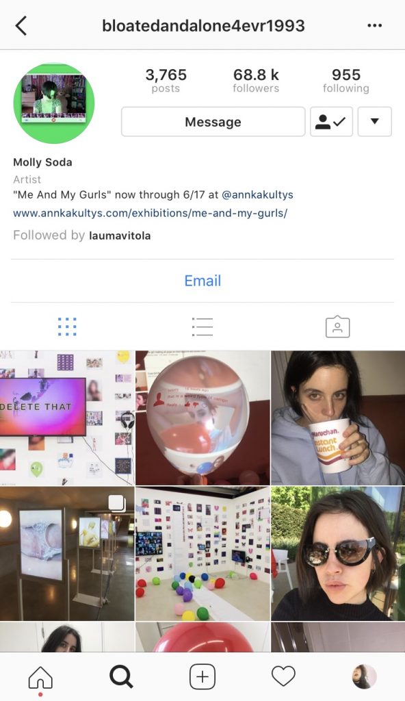
Molly Soda
Molly Soda’s is quite interesting as I a mixture of her personal life intertwined with her work. This is get her style and I feel really promotes her work and her approach to art. I feel however it’s not as professional or obvious she is a fully fledged artist as even though it follows her brand identity, it’s not as clear what’s personal and what’s work.
Her grid has no layout she clearly posts as she wants, letting the photos speak for themselves with no clear format design. She also has an instagram handle that is not her name therefore difficult to search and not an obvious name you would search for when looking for her profile.


Maisie Cousins
Maisie Cousins sticks to a simple biography including her representation and website which I think is important, the simplicity of it allows for easy navigation being clear this is her work account. There’s no obvious grid format but have a satisfying appearance, she doesn’t just share a single image but by sharing multi-image posts she allows more visibility on one post.
I think the simplicity of her bio is important with the multi-image posts as you’re able to get more exposure on a single post. If you were to pay for an Instagram sponsored post using the multi-image is a more affordable way to maximise exposure with only paying for one post.


Laura Carlin
Laura Carlin has no Instagram presence, she has a decent following considering she has no posts however does have a biography which states her website and dialling area. This is not something I will take inspiration from as I feel it’s not taking advantage of the free exposure you can get through Instagram if you use it the correct way. Carlin is reasonably well known artist however doesn’t utilise Instagram to further her reach or presence.

Aesthetica Mag
Aesthetica Magazine have a clear format, maximising the grid creating satisfying and clear layout. By using the 3 photos width of the grid to post multiple photos all relating either in their aesthetic or from the same artist/editorial/feature it gives enough of an insight into that work to create intrigue.
I really like the thought in the layout of Aesthica Mags Instagram as I think it gives it depth and creates an originality to a layout that’s very uniform. Doing this format isn’t completely original however doing it well and using images together that work is what really brings this style to life.


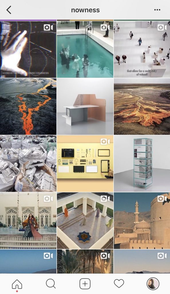
Nowness
Nowness tend to post a lot more videos compared to static art, they don’t necessarily use their grid to display a clear format style however they do take into consideration the tones/colours/brightness of their photos subtly arranging them to give a satisfying aesthetically pleasing layout. When posting Nowness decides on a theme or genre which will then foreshadow the following so many posts following that concept. I like this style as it’s something different and not often done on Instagram, using it almost as online instalments of artists as if a gallery changing the exhibition every weekly.


Bernstein & Andruilli
Bernstein & Andruilli are agents representing various artists, they use the grid layout similar to Aesthetic Mag by posting 3 images across the grid width that all relate to each other and work well together. This allows for a lot of different styles of work to be posted but to not have a chaotic jumble feel to it. Mixing different aesthetics together which doesn’t allow for the work/artists to be appreciated or seen as their own entity. Bernstein & Andruilli give each artist their own row which I think also shows a fair representation of each, allowing each the same amount of space and exposure.


Machine-A
Machine-A is similar to Bernstein & Andruilli in the fact they’re agents representing artists however the similarity ends there with their Instagram styles. Machine-A doesn’t have a clear style or format when it comes to showcasing the artists they represent. They don’t have a set way in which they posts, just posting artists randomly and only usually doing one post per artist at a time. The overall grid is quite nicely presented, giving a pleasing arrangement, the mixture of work following no themes or concept in their posts, I don’t like inconsistency and randomness is the layout of this grid. I think as they’re showcasing a variety of different artists work they should make the difference in Work and each artist clearer. They don’t let each artist be seen in their own right which I don’t feel gives them fair representation.


Summary
From my research I want to try and stay simple but have a original personal touch, I want to focus on my grid layout leaving my biography quite simple with just my website and location. I want to incorporate a structured layout which doesn’t necessarily appear effortless but more memorable.
Well boy has this been long overdue but I have final come to a decision for how I’m going to present my ‘magazine’ dun dun dunnn..
*drum roll*
Coffee Table Book!
Well I don’t know what else to call it, but I’m going for a hardback image wrap book.
I’m going to get it printed with blurb as it’s a really reliable company and I’ve printed with them before and the result was brilliant.
As I’ve FINALLY decided how I’m going to present my work, I don’t have a lot of time to put it together.
I’ve been looking at what I could use as my front page, as I’m following this project on from my first project I really like the original front page design but I do need to have other options so I’ve done four options that I would happily use as the front cover.

I really really like this illustration and think with the juxtaposition of the pink background and feminine lips with the harsh bold ‘FEMME’ I think this is a strong option for my front cover, with using the pink background this will mean the entire book will be this pink and could clash/limit my options for the back cover which could be an issue.

I love love love this option, I really like the way the illustration intertwines with the letters. I also like the way the title isn’t at the top of the page but the centre drawing the eye in with the illustration above it. The issue with using this again is that it was the title page of my brief 1 project and with this project being a lot more developed and advanced I don’t want it to hold reminders of the previous project.

I really like how shocking and in your face this option is, with the colours all complimenting each other and the bold outline of the illustration reinforcing the harsh text is really quite satisfying. This main issue with this option is the explicit nature of the illustration but part of me likes the fact it could be deemed inappropriate.

This is the most abstract option for the front cover with the use of shape and colour being very different to the other options. I like the addition of the illustration to this option and the grey colour scheme I think would work really well as a wrap around colour for the book. The title is aesthetically pleasing in its arrangement with the off centre positioning and alignment with the darker box. With the monochrome colours of this cover I don’t think it’s bold enough or as eye catching as the other options.
I decided to go with..
*drum roll please*

I chose this one as I really like the bold eye catching nature of the illustration and the three dimensional effect of the layering of the text. The options to use this illustration as business card designs/postcard designs or even portfolio to create a consistency and brand identity.
I don’t usually put my experimentation into my sketchbook which is weird because first and second year I always showed the full journey and process, but I think after my placement it made me work differently.
With brief one I didn’t show ANY experimentation and even in the project my sketchbook doesn’t have a lot of what I went through with processes and colours but I thought to make up for that I’d include and record it all through my blog!
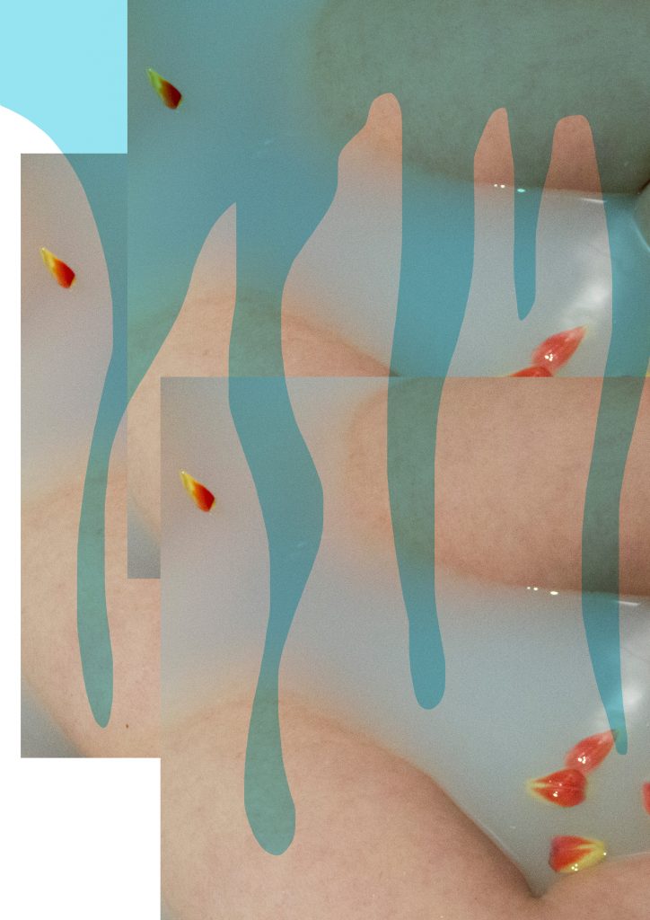
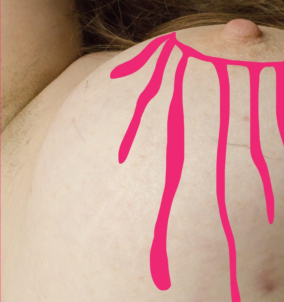
So below I’ve included some of the experimentation I had for my illustrations but decided not to use in my final outcome, some of the reasons I decided not to use them was because I preferred the original unedited versions.


