This shoot turned out somehow different to how imagined but not in a bad way, I always forget how difficult it is shooting in a bath while getting the correct poses and body shots without getting a bloody great tap in the corner!
I really liked how this shoot turned out however especially with the addition of the tulip petals. This is the most colour in any of the shoots I’ve done, and the block primary colours are normal shades I would use in my illustrations which I think provides fresh contrast.
The reflection of light against the water worked really well and created the ethereal vibe I was going for which I’m really pleased with. 
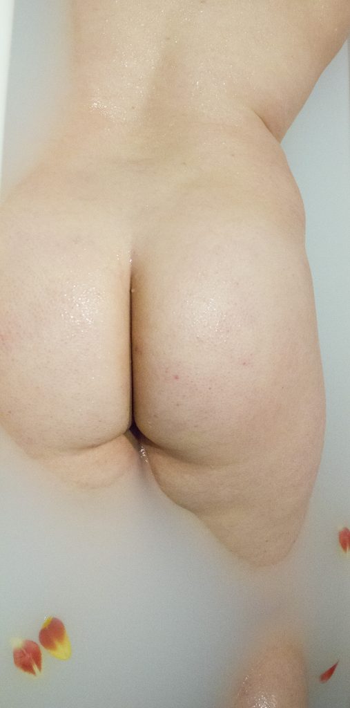
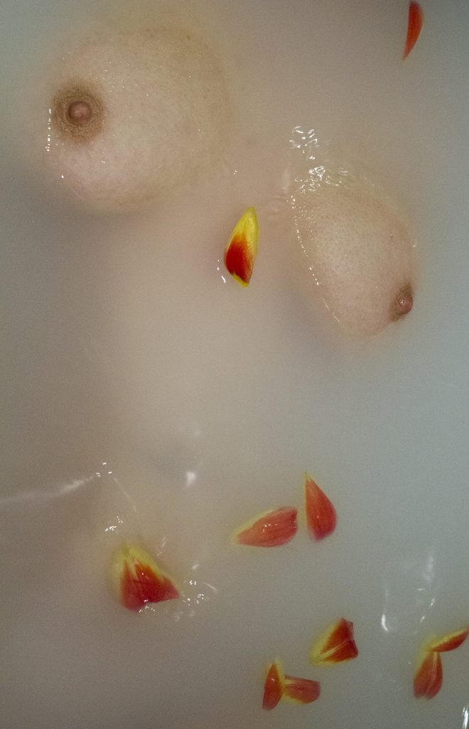

I tried to get more abstract style angles and close ups compared to Fleur as I wanted less predictable photographs of the female form included in my final outcome, highlighting troubled areas.
Well, this photoshoot was an absolute flop.
I had such high expectations of this one, I thought it would end up being the most featured in my book/magazine. But oh no, absolutely not it is not good.
The lighting, absolutely not.. the copper leaf, absolutely not..
It all just looks a little bit amateur, and the way the copper leaf appears when painted on skin is not what I wanted.
I think the brushstrokes were too thick and did need to be thinner looking back the photographs. The shimmer that the copper leaf created gave a delicate finish however everything else was just wrong.

This was the only photo in the end that I decided I would use as my final work as I did want to include at least something from this shoot as the concept I felt was quite strong for what I wanted to portray.
While taking photos with the copper leaf I did also take some general just nude photographs which were intended for illustration purposes however I ended up finding them stronger photographs than the actual planned photographs!


Once you get out of uni it’s all about jobs jobs jobs, the stress of applying and trying to find someone to actually hire you above alllllll the other graduates!
Below I have 11 companies who I will be applying to after uni, I chose to include companies I already I have connections or close relationships with which gives me an advantage over other applicants.


With my portfolio I’ve always done this big ass A1 or A2 folder with those glossy dreamy sleeves that give your photo that additional lushness.
BUT I wanna change it up, I want something else I’m not a photographer nor do I really need a portfolio for the jobs I’m hoping to go into after uni, but I still want to display my work nicely and professionally.
I’ve looked at various different ways to present it, looking at a magazine option, hardback book option (which I’m not very keen on as I’m thinking of doing that as my final outcome and I don’t want them to be too similar), and newspaper. I think as I’m not a photographer I don’t really want leather A4 portfolio book with the laser sleeves as that’s not my aesthetic alongside the fact I don’t promote myself as a photographer.
I would look to get around 10 copies of the portfolio purely for interview circumstances where I could leave it, and also GFW to be able to give away to potential recruiters who are interested.
Magazine
The difficulty with doing a magazine layout would be the vast amount of work I’d need to include to make the spine large enough so it didn’t look pathetic. I would only be including around 20-30 images so I would need to bulk it out with either writing or title pages.
The glossy sheen and appearance of a magazine would however look quite slick and give a professional appearance, with the paperback style it would be easy to handle and look through.
To print a magazine I have compared three websitesMixam, PixartPrinting and Blurb comparing the quotes from each for 10 copies.

Mixam gave a variety of different options and finishings to help calculate a quote and indicated that you are offered this much control over your magazine. The price I feel is a reasonable quote.

Similar to Mixam, they gave you a variety of options however their price is nearly double but with a different finishing as the gloss finishings was not given as an option.

Blurb doesn’t give you a quote for your specific preferences, estimating an extremely low cost for the magazine for one copy. Until you begin creating the mag you are unaware of the final cost, which can become a pricey option.
For magazine printing I would definitely go with Mixam as the options and transparent pricing makes it easy to budget and know what you’re expecting.
Hardback Book
Hardback is quite a formal way to present your work in my eyes and I’m not sure how effective it would actually be. For a portfolio I don’t really see that as I way I want to represent myself. I looked at BookPrintingUK, Blurb and Mixam comparing the prices of 10 copies, hardback image wrap, matte finish where the option and standard delivery.

This website was probably the most professional in terms of book printing with the vast amount options and the fact they include a draft print and delivery in the price quoted. This however is absolutely out of my budget and no where near affordable.

Unlike on the magazine price estimation, the hardback book section gave me options which it then calculated the price for a single copy. This is a more affordable option, plus as it starts at 20 pages I know that a lower number of pages is an option unlike the BookPrintingUK where there was only an option of 50-100 pages. For 10 copies this would be extremely expensive but as a single printed portfolio this could be an option.

This is the most affordable option with 10 copies coming in under £100 including delivery. The options are also quite extensive giving a variety of different finishes which doesn’t reflect the economic pricing of the book. If I was to print a hardback I would most likely use Mixam, even though Blurb are very trustworthy and I have used them before the difference in price for 10 compared to what blurb would be is massive making Mixam and affordable alternative.
I don’t think I would go for a hardback book as it’s not the feel I want when someones looking at my work, I want it to feel tangible and in a way humble. With a hardback book you’re immediately coming across pretentious as if you deserve to be published therefore you’ve self published.
The finishing would be beautiful but I don’t think it’s the impression I want to give.
Newspaper
I really like the idea if a newspaper printed portfolio as it has quite a basic but original feel to it. The size and the way you have to hold a newspaper is quite personal as you end up holding it up and looking directly into it. You have to be aware of what you’re otherwise it fall apart, so you have to pay attention to what you’re doing and be involved in it.
I like this idea as you’re manipulating the person looking at it to be completely involved in it and your work.
I looked at NewspaperClub and PrintOnPaper comparing the cost of 16 pages with 10 copies.

PrintOnPaper also offer an additional 15% discount to students making the final cost £39.10 which is £10 less than Newspaper Club. This price however is not including delivering. I have never used or heard reviews from this company before therefore I’m unsure on the quality, with printing on newspaper being such a risky option to print on it’s difficult to know the quality without receiving samples.

Newspaper Club are the more expensive option however the send out samples showing the print and quality type of the papers. This is something which I think is important when printing on a paper you’re not used to. The price for this does include shipping which is quicker than PrintOnPaper, therefore even though slightly more expensive without any student discount the delivery and free samples are what would make me more inclined to use this option.
Summary
Comparing the different printing options and prices alongside thinking about my own work, I think I would happiest going with a Newspaper print as I think although done before it is quite original and a quirky way to represent your work. As a lot of my work is illustrations I think it will create impact alongside the side and personal way you have to look through it. Whether hunched over it on a table or holding it up.
I’m really struggling with what kind of thing I’m going to do for my final outcome, I’ve looked at various different artists like Molly Soda, Petra Collins contrasted with Ayana V Jackson Zanele Muholi to try and get some inspiration as well as going to V&A, National Portrait Gallery and Serpentine Gallery to expand my research and look at completely different artists to my project and artist research.


The thing I’m worried about most is just what I’m gonna produce because I know it’s about quality not quantity but I feel I can’t just have a couple of printed out illustrations I need something bigger, a more solid piece of work.
Looking into presented work, especially looking the curation of Ian Cheng’s Emissaries I like simplistic minimalist presentation, I’m a sucker for a white frame and clean finish. I have looked into potentially printing in a magazine style with different types of binding, depending on the amount of pages I’ve looked at either a stab stitch bind, perfect bind and saddle stitch.
I have however been thinking about if I would want it printed as a magazine as I want my outcome to be more visual. I know that by making it visual I may lose part of my rationale and what I’m trying to portray to the viewer. However due to it being about the Female Gaze, I want it evoke thoughts and emotions which the viewer has come to on their own.
I don’t want to inform them of the Female Gaze and opinions that are already circulating with articles, I want them to interpret it for themselves.
I do think I need some writing though otherwise it’s going to make no sense, especially if it’s all visual.
I’m gonna look more into different printing techniques I’m just getting really stuck on how I’m going to present my work, I’ve not had an epiphany yet unfortunately.
I do want to have more than just a book for my final exhibition, so I’ve been thinking about framing a couple of images in addition to the book/magazine/zine whatever I end up deciding.
So I’m quite pleased with how this shoot came out, I think the lighting and angles of the body work really well.


I found editing these photos quite difficult to make them look like they have all came from the same shoot and not doing whacky exposure things on one compared to highly contrasted on another.
The noise on these photos are also a bit of problem, I’m worried with printing because of the natural lighting they’re going to appear grainy. I knew this could potentially be an issue and I do I actually prefer this aesthetic, in a way I feel it makes the photos look more natural and less edited, similar to a film camera.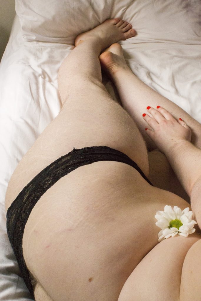
I think I could of gone further with this photoshoot, I kept underwear on as for this one I wanted a sense of modesty and concealment, this shoot is about embracing your femininity and owning what society deems unsightly. I think I should of got more poses and more zoomed in photographs, highlighting specific areas of the body and making them slightly abstract. I think having more like this would have worked really well and added additional depth.

So I didn’t really know what to look at for my portfolio as you don’t really tend to see other peoples portfolios unless looking at uni or at your friends, so I started by looking at various artists websites to try and get ideas and inspiration for my own website.
Below are a couple I looked at and analysed taking away the positives that I might want to use on my website alongside the negatives which I don’t necessarily think works well.
Laura Carlin
One of the first artists I looked at was Laura Carlin, I looked at her work because similar to mine it’s a mixture of different specialisms.
http://www.lauracarlin.com/about/


The minimalist aesthetic of Laura’s website I really like, I find the simplicity allows her work to really stand out. By not distracting the viewers eye it doesn’t take anything away from the her work. The slide format Carlin uses to present her images allows each piece of work to be observed individually and appreciated. The 3-dimensional effect used on each piece of work adds another element to the portfolio making it much more tangible and interesting, even though it’s a simple white background the addition of the shadow really adds depth.
This style and format is something I really relate to and think could work well for my work, with the white background and standard simple font, it allows for the work to speak for itself and the colours to really pop and draw your eye into the detail. As I use pale colours with my illustrations I feel a white background would work well to allow for them to have more impact.
Ronald Dick
I looked at Ronald Dick’s website as I found it was quite a different aesthetic to mine and other websites I’ve looked at.
http://ronalddick.com


Ronald Dick’s portfolio is very sparse in terms of the amount of work he displays, showing his most recent on his personal website and his larger portfolio on his agents website


I prefer the style of his agents website as the clean finishes and uniformity of the size of images it’s a lot easier to look at. The background Dick uses on his website is quite aggressive and detracts from the work, the size of the images are too large resulting in the full image not always fitting completely on the screen unless you have a large computer screen.
Molly Soda
Molly Soda doesn’t use a conventional style with her portfolio which is partly to do with the fact she only exhibits her work online therefore her website isn’t about displaying her work but reinforcing her aesthetic and making it a piece of her work in itself.
http://mollysoda.exposed


The informal nature of Soda’s website is what I really respect, for her style of work and the way she pushes boundaries and concepts. Having a black background it allows for all the emoji’s, gifs and work to stand out, with the organised chaos of Soda’s website it has no clear structure or layout follows in her style however makes for a confusing set up. It doesn’t allow for each of her artworks to stand out on their own or for you to really know where one starts and one ends. It is very much a chaotic jumble of work which I don’t think would work with my work as it doesn’t have a clear flow or any clean blank areas giving the eyes a more satisfying arrangement.
Maisie Cousins
https://www.maisiecousins.com
Maisie Cousins using a very simple slide theme for her website, Cousins using format which is a portfolio designed website hosting service they create themes specifically for displaying your work. I did look into format when building my website however due to my host and the fact my website is built by wordpress I’m unable to use formats themes or migrate my site to them without a large price tag.


Having the simple menu down the left handside and photography taking up the majority of the webpage maximises the space and immediately draws attention to the photographs. The slide feature allows her to showcase a large amount of photos very quickly and immediately. Without the arrows or buttons however you must swipe on your mouse pad to move the images which I do think is obvious but I don’t think having small arrows wouldn’t hurt. The colour that each of the option on the menu changes when you’re on that page ensures easy navigation on the website alongside the simple menu. I definitely think having the simple menu with the highlighted sections works really well and something I want to incorporate into my website.
Francisca Pageo
http://franciscapageo.es/Photography
Francisca Pageo’s website has a variety of different on, combining her photography and illustrations. I looked at her website as I found the variety of her work is similar to mine.


Similar to Maisie Cousins website Pageo highlights which page you are to help with navigation which I think is quite an important feature. Pageo however doesn’t use a slide theme however groups her projects by date or name of project, to them see the entire you click on the photo and there are the static collective images. You can scroll manually through the photos without opening the projects page up, changing the initial image until you reach the last one of the section. Pageo’s about page is the longest I have read which I don’t think is necessary as I feel some information she has included in this area can be separated and made more concise and manageable in other sections of the website. I enjoy how static Pageos website is, it’s quite basic in that sense with no sliding illusion or anything moving, just a manual clicking slide show or static images on a page which to an extent I think works well but I think sometimes as we live in such a digital age you need a little bit more.
Summary
I feel minimalist style is definitely the way forward for my website, I’m also going to look into creating shadow definition on my illustrations to create a similar effect to Laura Carlins work as I think it really works well to create the illusion of it being 3D. I like the slide format as well however as my website is a wordpress site the affordable themes are very limited to the designs and features that they offer. To get a theme with a slide format would be a bit pricier which at the moment I unfortunately can’t afford however it is something I would look to do in the future and develop my website into. I do also like the way that Francisca Page displays her work, with a photo displaying the theme of that collection of photos allowing you to choose whether you want to look at the entire collection. All of the websites I have researched none of them feature an introduction or About section on the initial front page apart from Laura Carlin, with majority of them leading straight into the work which I understand and do think it’s important to have visuals immediately however I do think an about section is quite nice as an introduction.
Bibliography
“About + Contact”. Laura Carlin, 2018, http://www.lauracarlin.com/about/. Accessed 19 Mar 2018.
“Ronald Dick”. Shotview.Com, 2018, http://shotview.com/artists/ronald-dick. Accessed 19 Mar 2018.
“Ronald Dick”. Ronalddick.Com, 2018, http://ronalddick.com. Accessed 19 Mar 2018.
“DO I SEEM MORE PROFESSIONAL TO YOU?”. Mollysoda.Exposed, 2018, http://mollysoda.exposed. Accessed 19 Mar 2018.
“Maisie Cousins – Grass, Peonie, Bum”. Maisie Cousins, 2018, https://www.maisiecousins.com/#0. Accessed 19 Mar 2018.
“Photography – Francisca Pageo”. Franciscapageo.Es, 2018, http://franciscapageo.es/Photography. Accessed 19 Mar 2018.
Well the time has come, it’s shoot time.
I think I’m gonna do three shoots, from all my research I’ve come up with three themes.
Are you ready?
We’ve got a bedroom situation going in one, I’m going to add in the addition of a flower or multiple flowers. I want this to reinforce the femininity of the photographs. I want to have an array of photographs of various areas of the body that are deemed sexually arousing/erotic and take a natural photo showing their unfemininity if you will. The hair, the stretchmarks, the skin tags, the rolls of fat, the things deemed most unsightly. I want this photoshoot to have an ethereal almost feel to it.
For all of my photoshoots I’m going to use natural lighting, I want it to feel natural and personal.
The second I’m feeling water, also an inclusion of flowers in this one. Creating an opaque water to only show parts of the body that are protruding out. This should hopefully emphasise the figure, drawing attention to certain areas of the body. I’m hoping the water and light will reflect giving me a really nice effect across the body.
For my final idea, I thought of something quitter (quite literally) stretchmarks with my liquid copper leaf, painting over the mark on the skin leaving a beautiful copper shimmer. I want to do this to convey the message that imperfections are to be celebrated and that they are beautiful. It will be on selective parts of the body, having a zoomed in aesthetic.
I’m hoping these all work out well as I want to show a variation through the photography for my final project, so fingers crossed!
So Girl on Girl is so perfect for this project, the variation of artist’s featured alongside the depth and diversity of the work is just ideal for my research.
Can’t stop, won’t stop talking about it.
As this is just early days (she says 2 months in) for my project and I haven’t really found my feet yet in regards to my final outcome or even experimentation. Because I’ve looked a lot at photographers I am quite inspired to do a couple of photoshoots.
I like how intimate a lot of the work I’ve been researching is, not necessarily in a erotic way but an intimate personal connection. I want to take this forward and develop on this concept through some photography of my own.
I would like to use a film camera in an ideal world just as it adds another layer of intimacy. I don’t know why and I don’t know if it’s just me that feels that way, but having the photograph so raw and unedited gives it an element of vulnerability.
I’m not sure if I actually will use film, it’s been a while and I’ll have to brush up on EVERYTHING, but I would really like to include it.
In terms of my first photoshoot, I’m hoping to just experiment with the body and manipulate it into different shapes to create more abstract photos. With the editing I want to crop them down to make you have to look at the photo for longer to understand what it is, not know immediately by just a glance.
I hope to have my photography like this as I feel bodies especially women’s bodies deserve so much more appreciation for what they are.
I’m trying to get on it with research from quite early on so it gives me inspiration and ideas earlier so I can start piecing together my final outcome.
I want to look at books not just artists to give more depth to my project, for my dissertation I looked at Playboy which I’ve already started doing my research on, I want to continue looking at Playboy but incorporate more books. I think Naomi Wolfe The Beauty Myth will lend itself very well to this project, alongside Simone De Bouvoire the Second Sex, this is a more social studies literary book however I think it’s good to do varied and more academic research as well.
I’ve also looked into some other gender studies books including Gender, Nature and Nurture by Richard A. Lippa which discusses how nature informs societal roles and how each gender assumes their stereotypical role.
As I’m hoping to narrow down my focus onto The Female Gaze comparing that to the Male Gaze and looking into the fundamentals surrounding Female Gaze, theories, social studies, feminist writings but also writings that contradict and disagree.
I’ve began looking already into the Three Waves of Feminism, I think I need to study this and research this more, especially disagreements people have with the most current Third Wave. During my first project (Creative Research) I focused on the Woman’s Marches, I think this is very much relevant to this project.
This kind of research where I’m not just focusing on the creative side of my project but delving deeper into academic references will help round my project off and give me a better understanding of what I’m doing and why I’m doing it.