Recto v. verso

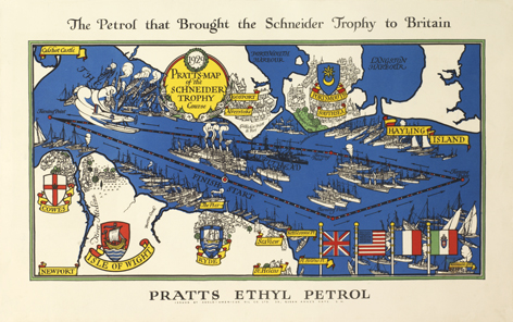
Going back to how marks and details at the verso of a print or a piece of original artwork can be just as interesting as the finished piece on the recto, I have a really lovely example for you. Above you can see Gill’s Schneider Trophy poster from 1929 and I thought I would show you the verso too.

Personally I absolutely adore the printed image on the back, but then I do have a bit of a thing about old advertising images! I wonder if all of the posters were printed on this type of ‘headed’ paper or if this particular piece was a test run that was printed on paper they were reluctant to waste?
