THE MEANING BEHIND THE ELEMENTS OF MY ZINE – IMPERFECT
(AD138: FASHION ILLUSTRATION AND IMAGING – IDENTITY AND THE BODY)
I thought a good way to reflect on my final piece and the journey I took to get to this, it would be good that I talk through each element in detail. I think, although art is personal and should be left to interpretation so that it can feel more personal to its audience, especially for a project like this, I want to really discuss my thoughts and personal reaction to this zine.
So let’s start with the name:
As I have mentioned previously, I really like the way in which the title of the zine can be interpreted in many different ways such as ‘Perfect’, ‘Imperfect’ and ‘I’m Perfect’. I think it makes it interesting in the way people may thing its called ‘Imperfect’ until they read it and understand the message that we are all perfect. Furthermore, I think that it is cool that it is a talking point amongst my ‘audience’ as to what it is. All in all, I really love the name and I think it really defines exactly what I want to portray through my artwork in my zine.
The front cover.
I chose to do two different front cover images and also binding styles. Now I know that this is completely unconventional, however, as I looked at more and more zines, and zine-makers blogs and book binding addicts, I found that a lot of them bind them themselves, and they’re all slightly different. I LOVE this element of hand bound books/zines, because when you hold one and flick through, you really feel that someone has put their all into making it special and unique. I understand that considering I have only made two physical copies, that it just seems like I couldn’t be bothered, but I think that if I was to mass produce ‘IMPERFECT’, then they would all look completely different, yet still hold the same information to empower someone. I don’t know why, but this aspect of my zine really pleases me, especially as I put a lot of thought into it.
The chapter cover pages:
What I mean by these, is the image of the girl, photographed in black and white (Photographer unknown) and hand developed by me. I had a lot of fun developing these and experimenting with revealing and choosing not to reveal certain elements of the image. The reason that there are four of these images throughout the zine, all different, is that each image gets clearer, stronger and shows more and more. I felt as though this symbolised the way in which my reader grows and becomes stronger and more empowered as they go through the story of my zine. I really like this touch as it creates familiarity and repetition through my zine which is important when creating something like this. I like it even more because I think these images really bring a story forward to the reader and more and more meaning behind the themes and artwork that feature within the zine.


Empowered woman, empowering women.
To further and follow these chapter front covers, I wanted to add in my ‘strapline’/’slogan’ in a different way to most magazines. I wanted it to follow the images of the woman getting stronger and really remind the reader to be empowered and strong and remember how perfect they are.

My first ‘article’:
I wanted to start my zine off really smoothly and slowly with some gorgeous images of women loving themselves, being happy with their bodies. I really love these photographs and the way in which they are edited as I believe they really show beauty, femininity and girl power.


I really like the togetherness of the two female models, just relaxed and happy within themselves.
(More information about the photoshoot, concept and editing of the images in blog posts ‘GIRLS (photoshoot)’ and ‘GIRLS (photoshoot editing) )
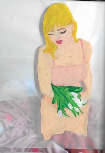
The tulips:
Following this, I really wanted to carry on with this vibe and tone of the magazine and focus more on the illustration side of things, show the less intimate parts of the girls, but focus more on the femininity of the girls. I love the way these illustrations and photographs turned out as they really embody what the whole zine is about.


FEMALE PARTS
Following from this, I really wanted to involve the discussion about female genitals, periods and body hair in a way that really dismisses the strange ‘we-don’t-talk-about-this’ attitude that society, particularly men have.
As I wanted to do with the rest of my zine, I want to take what is beautiful and natural and amazing about a female and really emphasise its beauty and show that is really is something to be proud of and call ‘beautiful’ and ‘perfect’.
I decided I wanted this chapter to be varied in media and I really wanted there to be a textural and tactile element to it.
Therefore I created the female genitalia using hand knitted pieces of material and pearls, two of the mostly ‘womanly’ things. I also wanted to create really cute and diddy illustrations really combatting the strange phobia people have of natural body hair. I also used photography and the symbolism of a flower as a period and also a pomegranate as female genitalia.
All I wanted to do within this chapter of my zine was to create beautiful imagery and take away the horrible way it can be portrayed my SOME men. (‘Some’ being the KEY word as I do NOT want to shame men as my zine looks to empower all<3 )


(For some reason, the colours within these images have changed as they have been added to my wordpress media library, please see the IMPERFECT ZINE at the end of this blog post)
BODY IMAGE
After having experimented with oil pastels to portray the female form, I really wanted to do some illustrations from life, of some close up curves and undulations of the female form. My concept behind this was to remove the identity of the body parts, and just have them as shapes being depicted with beautiful tones and hues of pink and just be beautiful. I really believe this proves the beauty that lies within the female form, no matter how it is to a personal woman. She is beautiful in every way.


The Back Cover:
I wanted the back cover to be simple and follow the theme of the zine, (with the same background as the inside front cover) and I wanted it to feature a giveaway that I feel represents the message of my zine. I made little credit card sized tokens that have the name of the zine on ‘IMPERFECT’ and also the word ’empowered’ as a reminder to remember the messages of the zine, no matter how long ago they read it. I thought it would be a really sweet giveaway to have as it really carries on the message that my zine was trying to show.

My thoughts and reflections of my process:
I am really happy, most of all, with my progress where illustrating is concerned. I really found illustration a daunting prospect and did not think that I would enjoy it as much as I did.
Furthermore, I feel as though this project has really helped me to work hard and all the time to get a project finished. I think that having to make two physical copies, with my idea of having a really hand rendered zine was a large task, but I am really proud of how I did and that I managed to make them.
A thought I have had is that my illustration style really developed and improved throughout the course of this project and I am so happy that it did. However, I do feel ‘sad’ that I did not manage to fit it into my zine to the extent I wanted. This was because I did not feel that my style fitted with the feminine, elegant and beautiful theme of my zine. I do believe though that I will never lose this developed style and I would like to carry it on further. Having to decide against portraying a certain style of mine was an important lesson to learn because as an artist/illustrator, you have to be able to embody more than one style and be versatile and make the right creative decision to fit the tone of the brief.
My Final Zine –
All work by Kynza Kendall-Jones