Search results for: Max Gill

Max Gill conservation – day 2

Day two is over. We have managed to finish everything that was brought over to the studio at the end of last week – no mean feat of 26 objects in two days! Admittedly however, there were a fair few that only needed to be flattened but the whole experience was not for the faint-hearted. All of the pieces are looking absolutely fantastic! I took special joy in mechanically surface cleaning pieces that were especially dirty – it really feels like bringing a piece back to life and letting it breathe again!

With conservation, while you need to do what you can in the time you have been given, ethics in every decision that is made need to be taken into careful consideration prior to treatments. All of the Gill pieces that needed flattening were able to take the flattening method of the heat press – this is where the combination of heat and pressure is used to relax the paper fibres. The heat press is used by placing an item between two sheets of silicone before pressing down. The silicone acts as a barrier and protects the paper from heating up too much. This method of flattening was chosen due to the time restrictions we were working under. A more traditional method is to humidify a piece, for which there are several methods for, and to flatten it under boards, placed between layers of blotter and tissue. These are generally left overnight to take effect after a few changes of blotters, depending on the humidification method used and the wetness of them.

One of the more challenging piece on day two was the ‘Atlantic Charter’ map, a pen and ink original from 1942 that I mentioned in an earlier blog entry. This has a selection of small pieces of paper attached to it that were coming loose and a dent running down the middle as the piece is constructed from two separate pieces of paper adhered together.

Conservation, University of Brighton Design Archives, Sirpa Kutilainen
The two pieces of paper adhered together to form the Atlantic Charter map created a dent running down the centre of the piece. prior to surface cleaning and flattening

First thing to do was to remove the more loose pieces of paper on the piece. Roosevelt’s signature was coming loose from its edges and was very easy to remove by gently lifting it off the back with the aid of a spatula and bone folder. The same was done with the date piece, ‘1941’. The paper used on these two pieces was identical, slightly thicker and more sized compared to the paper on which the original artwork was created on and on which Churchill’s signature sits.

Adhesive stains, conservation, University of Brighton Design Archives, Sirpa Kutilainen
Adhesive stains left behind by the Roosevelt signature and the ‘1941’ date piece

The adhesive used to adhere these pieces onto the artwork has left bad yellow-coloured staining behind. This kind of adhesive stain is very difficult to remove, and the best that could be done was to scrape off the residue from both the artwork paper and the reverse of the small pieces themselves. There was a fair layer of adhesive applied and below you can see a sample of the yellow residue that started to come off the piece on which the signature is on, slightly lessening the strength of the colour of the stain.

Adhesive residue, conservation, University of Brighton Design Archives, Sirpa Kutilainen
Scraping away adhesive residue from the original artwork
Adhesive residue, conservation, University of Brighton Design Archives, Sirpa Kutilainen
Adhesive residue coming off the verso of the Roosevelt signature piece

All of the loose pieces were adhered back to the original using 20% wheat starch paste. We needed to test the adhesion power on the loose papers before making the decision that this was good to be used. Wheat paste is very widely used in both book and paper conservation in differing strengths – in book conservation wheat starch can also be mixed with potato starch for added strength. In conservation when adhering loose pieces back onto originals or when repairing, the use of a proper adhesive is absolutely essential. It must have sufficient strength to maintain adhesion for an indefinite period of time, have no tendencies for discolouration and be easily reversible; meaning that it should be possible to remove a repair with minimum effort and damage to the object. Wheat and rice starch pastes has been tried and tested by time as Japanese mounters have used both of these for centuries. Methyl cellulose is another adhesive that can also be used in paper conservation.

Pasting, conservation, University of Brighton Design Archives, Sirpa Kutilainen
Pasting the Roosevelt signature back onto the original artwork with wheat starch paste

On this Atlantic Charter map of Gill’s, Churchill’s original signature was on different type of paper and is still very well adhered to the backing paper by the original adhesive used. We did not remove this but simply adhered the slightly curling edges back to the paper by using wheat starch paste. After all of the pieces were secured back to their original positions, they were placed under weight and blotter to dry.

Pasting, conservation, University of Brighton Design Archives, Sirpa Kutilainen
Pasting the curled up corners of the original Churchill signature with wheat starch paste

Some of the objects had to be cleaned using the sponge rather than rubber. This is due to the fact that the size used in some papers had a waxy surface to it, on which the rubber would not take to well at all. Gelatine has been widely used as a base for paper sizing in Europe, the use of it starting in Italy in the 13th century. A size can be spread onto the surface of the finished sheet of paper or added into the pulp during paper making processes.

Rubbers, conservation, University of Brighton Design Archives, Sirpa Kutilainen
Rubbers cut to size to be used in different types of areas in mechanical surface cleaning

Where a Mars Staedler rubber can be used, it is usually cut to different sizes to be able to do different types of areas on a piece. As I have mentioned before, grated rubber is also widely used in mechanical surface cleaning in paper conservation. Below you can see a corner of one of the Max Gill pieces, where surface staining is very obvious, but where there are also original pencil lines along the margin of the paper. These pencil lines are obviously a part of the original artwork and special care needed to be taken to surface clean the corner from any unwanted stains but to not erase the pencil marks. As an alternative to grated rubber, a slice can be cut off a block to create a sharp edge to enable the use of a more solid piece to clean with that can reach right up to the pencil line. A thinner slice of rubber can also be used to gently brush over the pencil line to remove surface dirt.

Mechanical surface cleaning, conservation, University of Brighton Design Archives, Sirpa Kutilainen
Mechanical surface cleaning around original artists’ pencil marks

As you can see from the image above, this corner of the ‘Cable and Wireless Great Circle’ map has the added, rather large ink stain in this particular corner. I imagined that perhaps Max knocked over an ink well while working on this piece!

Max Gill conservation – day 1

Day one of the two days of conservation scheduled in with myself and paper conservator Melissa Williams is now behind us. The work was delivered to the conservation studio on Friday and we started working on them early this morning and by the end of the day had a very respectable percentage of them done. We made a decision to start with the ‘easier’ pieces – these were categorised as such due to the fact that Design Archives’ volunteer Suzie Horada had surface cleaned some of them prior to getting them in the studio and others that were generally in great condition.

From the pieces we worked on today I thought I would highlight a few things that needed to be taken into consideration while working, first of which is a great example of being aware of what is at the verso of the objects.

Dirt removal, conservation, University of Brighton Design Archives, Sirpa Kutilainen
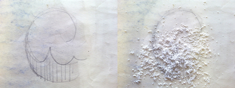
On the left the sketch prior to surface cleaning and on the right using grated rubber to clean over the sketch without effecting it too much

The image above is the from the verso of Max Gill’s ‘Cable & Wireless Great Circle’ map – a watercolour original from 1945. The recto was mechanically surface cleaned with a sponge due to the fragile nature of the watercolours, but the majority of the back could be cleaned with a block of rubber – apart from the areas in which Max had ‘sketched’ with a pencil. First I cleaned around the area as close to the pencil marks as possible with a block of rubber. After this I used grated rubber to clean up over and around the sketched area to make sure that removal of the sketch itself was minimised. The results from this method won’t look as ‘clean’ as using a block or more solid piece of rubber but considering not much pressure can be applied to a pencilled area when surface cleaning, using grated rubber (or a sponge) is a very effective method.

Surface cleaning, conservation, University of Brighton Design Archives, Sirpa Kutilainen
After using grated rubber to clean over the sketched area

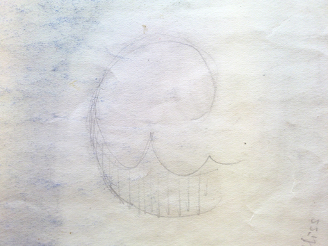
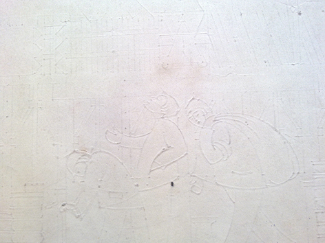
Pencil marks are not the only thing you can come across on the reverse of objects that need to be taken into consideration when cleaning items. Below you can see an example of the verso of one of Max’s unfinished pencil and ink pieces for the Glasgow Empire exhibition of 1938. In this one his pencil marks on the recto were so heavy that they had created these beautiful indentations on the verso – special care needs to be taken in cases like this as these areas should not be flattened by applying too much pressure. This would lead to losing all this detail and despite the fact that they can be found at the back of an item, the ‘information’ is just as important and often just as interesting. In these instances, the best way to mechanically surface clean is to use a sponge and go over the areas carefully.

Conservation, University of Brighton Design Archives, Sirpa Kutilainen
Pencil mark indentations at the verso

Two of the original artwork pieces we worked on today had tears in them ‘repaired’ with magic tape. As the adhesive used in tapes like this is not good for the condition of the paper in the long run, the tape pieces were carefully removed with the help of a hot iron and tweezers. The tears these pieces held together were then repaired with heat-set tissue, which is not only very easily reversible but much more sympathetic to the originals as they gain age.

Tape removal, conservation, University of Brighton Design Archives, Sirpa Kutilainen
Removing a scotch tape ‘repair’ with the aid of tweezers and a hot iron

In cases where a piece had a small corner missing, one was ‘created’ for them. This is done by repairing as much of the corner from the verso of the piece, but also adding a smaller piece of heat-set tissue on the recto of the object, as close to the edge of the tear to minimise visible repairing.

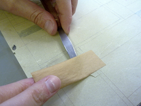
Another item worth mentioning is a watercolour piece on tracing paper, entitled ‘Plans for Ship building’. This had been repaired by using brown tape pieces at the verso to hold together several tears along the edges of the object. This type of tape is similar to the one used by David Cooper in the final framing of the objects – the tape has one side that becomes tacky when wetted. In this instance, the tapes appeared to be relatively old ‘repairs’ as the nature of them was dry enough to make the removal of them relatively easy to perform with a small spatula. All of the tears were again repaired from the verso using heat-set tissue.

Brown tape removal, conservation, University of Brighton Design Archives, Sirpa Kutilainen
Removal of a brown tape repair

A couple of the pieces also appear to have silverfish damage. These are little silvery crawling creatures that have been around for 400 million years and are usually a symptom of moisture problems. Silverfish feed on a lot of human foods but also create destruction with paper products, glues, starches, sugars and even fabrics. Silverfish prefer darkness and the ideal conditions for them to flourish are at 75-95% relative humidity with temperatures between 21-26c. On paper, silverfish do not like inks and in a lot of cases they will destroy paper around any inked areas. Damage from silverfish usually appears very irregular and notched and the size (ie the coating) of the paper has been grazed.

Silverfish damage, conservation, University of Brighton Design Archives, Sirpa Kutilainen
Silverfish damage as seen from the verso of one of the Gill items

This particular Gill item has now been repaired from the verso with heat-set tissue to avoid further damage and rips to the effected areas.

Despite the hectic nature of today, I am very much looking forward to tomorrow and getting on with the more ‘complex’ objects from the exhibition selection being conserved by myself and Melissa.

End of an era

The Max Gill exhibition at the University Gallery has now finished. It is a somewhat sad feeling seeing all the artworks wrapped up and the walls of the gallery empty (if only for a few moments). From reading the comments book in the Gallery, it appears that the public very much enjoyed the experience of the exhibition too. Here’s hoping the works will get a new lease of life at another venue as soon as possible! The MacDonald Gill digital resource created to compliment the exhibition has now been officially published. As an extra part of the resource, I have created a section within it inviting you, the ‘general public’, to share your stories and experiences with the works of Max Gill and becoming a ‘living’ part of the resource. Should you wish to contribute, there is a simple form for you to fill within the resource.

University of Brighton Design Archives, Sirpa Kutilainen
The rolling shelving being disassembled in the ‘old’ storage area

The building works here at the Design Archives are moving swiftly on despite a few hiccups along the way. We are now at day 20 of the move and during this time the collections within our ‘old’ storage area have been carefully packed by the movers and are stored temporarily elsewhere in the building. We are currently at a stage where almost all of the major building works have been finished and the removal and reassembling of the rolling shelves is taking place. The builders have done a great job in re-inventing our new storage area and the Link51 archival shelving team have, for the past two days, been busy taking down the rolling shelving from the old storage area and moving it to the new space, bit by bit. Once this has been completed, all of the shelving surfaces will need to be thoroughly cleaned before the collections get put back in. We are hopeful that the move will be finished on schedule before the new term starts.

University of Brighton Design Archives, Sirpa Kutilainen
The new storage area before rolling shelves are installed

While all of this has been going on, myself and Suzy Horada have been making the most of the students’ summer holidays and have spent considerable time in the photographic studio continuing the digitisation of the ICOGRADA poster collection as mentioned in my last blog post. To date, we have managed to digitise around 200 posters in total. This is a great asset added to our internal database and eventually another great addition for our area on the Archives Hub. We are going to continue this major digitisation effort at least well into next week, which also sees colleagues returning from maternity leave and longer holidays – The Design Archives will be operating a full house again.

Icograda poster (detail), University of Brighton Design Archives, Sirpa Kutilainen
Poster for the Jolie Madame Boutique (Swiss), from the ICOGRADA collection. (Detail). Catalogue number GB-1837-DES-ICO-3-30-68.

The latest

Max Gill exhibition, Grand Parade Gallery, University of Brighton Design Archives, Sirpa Kutilainen
Entrance to the Gallery, University of Brighton

So, the Max Gill symposium and exhibition opening have taken place and the show is well and truly up and running. I have been looking at people within the gallery when I have walked past the space, and it has been wonderful to see them really studying the works. The symposium on the 22nd of July, 2011 was a great success. It was eye-opening and very interesting to hear so many different papers given from a wide selection of points of view. The private view that evening was very well attended and it was wonderful to speak to so many people about the show and how it came to be.

Commonwealth War Graves Commission Headstone, Max Gill exhibition, University of Brighton Design Archives, Sirpa Kutilainen
Commonwealth War Graves Commission Headstone from Formelles, France. Headstone for an unidentified soldier. The stone was designed by Sir Edwin Lutyens and described in the Kenyon Report, ‘the headstone should normally be 2ft. 6in. in height, 1ft. 3 in. in width’. The epitaph ‘A SOLDIER OF THE GREAT WAR KNOWN UNTO GOD’ was written by Rudyard Kipling. The lettering is ‘Headstone Standard Alphabet & No.4’, designed by Max Gill. Commonwealth War Graves Commission.

As August is well on the way, it is strange to think about the amount of work and effort that went into putting the show together when the team are now busy organising the taking down of the show at the end of the month. I thought I would take the opportunity to post up a few photographs from the exhibition for those of you that might not get a chance to visit but would like to see a glimpse of what the space looks like.

Max Gill exhibition, Grand Parade Gallery, University of Brighton Design Archives, Sirpa Kutilainen
A small corner of the extensive exhibition

Things here at the Design Archives have remained steadily busy, as they always tend to despite the summer holidays. After months of planning and organising, we are currently in day three of a seven week project upgrading our archival accommodation for the parts of the collections we currently hold in a store room next door with the Screen Archive South East. The project has been carefully planned by a team of people from different areas within the University and the building works are taking shape slowly.

Icograda collection, posters, University of Brighton Design Archives, Sirpa Kutilainen
A selection of the larger format posters from the ICOGRADA collection, measuring at 1280 x 900mm

The new storage area will remain on the same floor but will have environmental controls installed, which is going to greatly improve the conditions in which the collections are housed. We are currently concentrating on working out the optimum way in which to store our over-sized posters, of which there are just over 100. These are the largest objects we have in our collections with the dimensions of 1280 x 900mm. These, and a selection of other posters from the ICOGRADA collection, will also be catalogued, surface cleaned and digitised by myself and our ex-volunteer-turned-summer-employee Suzy Horada in the coming weeks. A small selection of them also need to be repaired as edges have become torn with time.

Icograda collection, posters, University of Brighton Design Archives, Sirpa Kutilainen
One of the more beautiful finds within the ICOGRADA collection ready to be catalogued, cleaned and digitised

We moved the posters from the store to our ‘main area’ yesterday and had a chance to see some of them in greater detail for the first time. There are some really beautiful, colourful posters within the stacks – I can not wait to have a closer look at them as we start to work more closely with them. I will also be writing more about the upgrade in our storage as the works get on the way – these are rather exciting times indeed!

Taking shape

Highways of Empire (detail), Max Gill, University of Brighton Design Archives, Sirpa Kutilainen
A text detail from ‘Highways of Empire’ (1927) poster that caught my eye and made me smile

Last Tuesday marked the finishing point for all of the conservation work that myself and Melissa Williams have been busy with for the forthcoming Macdonald Gill exhibition. The last piece we worked on was the alternative ‘Highways of Empire’ item I wrote about in an earlier entry – the mounted on plywood version of it will be making its way back to its owner.

Max Gill exhibition, Grand Parade Gallery, University of Brighton Design Archives, Sirpa Kutilainen
Laying out the case items before glass panels get placed on top

The project has now slowed down from my part, but the gallery is busy with the activity of hanging up the work and filling the cases. As this week draws to an end, I have had a chance to reflect back on the past seven or so months that I have had the privilege to be a part of the exhibition team. By being involved with this project, I have taken on many new conservation and digitisation challenges that will all continue to feed into my work and forthcoming projects here at the Design Archives. It has also been an eye-opening experience to be involved with the ‘behind the scenes’ side of putting together a major exhibition of archival objects. Other challenges within the team have varied from the logistics of coming up with a narrative and deciding which objects to include in the exhibition to ‘smaller’ tasks such as picking up paint colours for the entrance wall and cases. I have luckily also had the chance to indulge in my love of maps by working literally very closely with some of the pieces to be shown at the exhibition.

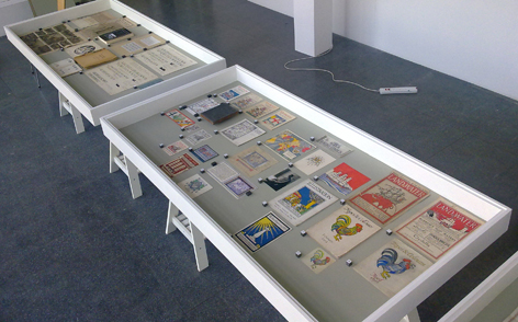
Max Gill exhibition, Grand Parade Gallery, University of Brighton Design Archives, Sirpa Kutilainen
Detail of some of the case items in the exhibition

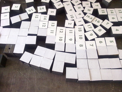
The case items are being put in their rightful homes by Andrew Haslam and Philippa Lyons as I type this, and the gallery is taking shape. For the case items that have needed weighing down, a nice detail has been added. Instead of using glass weights or photo corners where needed, Andrew Haslam came up with an idea to use typographic spacing material for letter press printing to weigh corners down. These objects are little lead squares also referred to as ‘4x4s’ and they seemed a very natural choice to use.

Max Gill exhibition, Grand Parade Gallery, University of Brighton Design Archives, Sirpa Kutilainen
Typographic spacing material for letter press printing used as weights to make sure all objects are flat within the cases. They are also used to number the items.

This of course then proposed a conservation issue – using a lead weight directly on top of archival materials is not ideal. To avoid the lead touching the paper directly, we have created little squares from archival paper. These have been placed on the lead and work as a ‘guard’ between the weight and the works, protecting the originals. The works in the cases are also numbered in this manner.

Max Gill exhibition, Grand Parade gallery, University of Brighton Design Archives, Sirpa Kutilainen
Still wrapped up and waiting to be hung. This particular piece is one of the very few facsimiles used in the exhibition. The original piece: Painted wind gauge map panel, Lindisfarne Castle, Holy Island, 1913.

The gallery technicians David Cooper and Steve Mace are very busy putting the works on the walls. I have been in and out of the gallery today watching it all slowly taking shape and I can not help but walk around the space with a smile on my face – I am so pleased and feel very lucky to have been a part of it all.

With technical help from Michael Wilson, I am also in the process of building a digital resource to go alongside the exhibition. As a part of this, I am aiming to launch an area within it built solely on people’s personal experiences of or with Macdonald Gill’s work. If you feel like you have a story you would like to share and therefore become a part of this project, I would love to hear from you!

The exhibition opens next Friday 22nd of July and will be launched by Peter Barber, Head of Cartographic and Topographic Materials at the British Library. It continues at the University Gallery until the 31st of August, excluding the August Bank Holiday Monday.