Coca-Cola, the brand
Coca Cola is one of the world’s biggest brands, ranked third behind only Google and Apple in 2017 according to a poll conducted by Interbrand. One of the ways in which Coca-Cola maintains such a large market share and a dominant position, is through the use of well known celebrities who endorse the product or products being sold, such as England footballer Wayne Rooney.
Websites and their functions.
In this modern day and age, it is essential for large brands such as Coca Cola to have a website that attracts large volumes of traffic and promotes the wide range of different products in the juggernaut of a company which is Coca-Cola. When looking at a website’s pro’s and cons, it is a good idea to use the framework ‘The Online Consumer’s Hierarchy of needs’. (Valacich, et Al 2007)
The three different, but interlinked, categories of characteristics are:
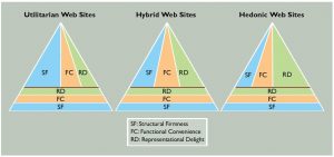
- Structural firmness- meeting the user’s most basic needs and website performance in general.
- Functional convenience- the site’s use and ease of navigation.
- Representational delight- the way in which a website can stimulate and engage a user, such as video or audio links.
These three categories, need to be met in a way which is minimally acceptable, which is called the ‘Zone of intolerance’, just like in Maslow’s hierarchy of needs (Maslow, 1943) where the basic needs have to be fulfilled initially.
Valacich, et Al, 2007. also state that there are three types of different websites, which all meet different user requirements and serve different purposes. The three categories they are divided into are:
- Utilitarian websites- problem solving websites for example a building or bill paying website
- Hedonic websites- entertaining websites which engage the user and should have an element of fun or pleasure attached.
- Hybrid websites- Support both the needs of engagement and problem solving, a mixture of both Utilitarian and Hedonic.
Coca-Cola’s UK website analysed
Structural firmness– with the size of the brand the website, as expected meets the basic needs for a user with a secure experience for the user.
Functional convenience– Coca-Cola’s website is very easy and simple to navigate, with clear headings and images which user’s can click on to access different pages on the website. In addition to this there is a search bar where questions and queries can be typed.
Representational delight- The website itself has a red background colour which is identical to the company’s colour, with a consistent layout throughout the website, and the use of video links throughout the website, as seen below.
Overall, the UK Coca-Cola’s site is a cross between a Hedonic and Hybrid website, with an entertaining experience throughout the website and also provides plenty of information on the products offered.
References
http://www.coca-cola.co.uk/videos/8-frequently-asked-questions-about-coca-cola-ytfjuowbxckvw
http://www.independent.co.uk/news/business/news/apple-most-valuable-brand-iphone-7-google-coca-cola-a7345501.html
https://www.google.co.uk/search?q=coca+cola+image+with+celebrities&tbm=isch&tbo=u&source=univ&sa=X&ved=0ahUKEwiW9ZTZgozXAhXDEVAKHc0xCVEQsAQIJw&biw=1440&bih=826#imgrc=ex2laGTqp3Ac7M:
Valacich, J.S., Parboteeah, D.V. and Wells, J.D., 2007. The online consumer’s hierarchy of needs. Communications of the ACM, 50(9), pp.84-90..
https://www.google.co.uk/search?q=utilitarian+website+hybrid+hedonic+webs&source=lnms&tbm=isch&sa=X&ved=0ahUKEwiH2tGwiYzXAhUNmrQKHRdYDHYQ_AUICigB&biw=1440&bih=826#imgrc=nR-sexJErw2NLM:

