Author Archives: Shannon Hurley
viva voce
Freak Show Title
Play Project
Visual Synopsis.
Rap & Rhymers
Stop Motion.
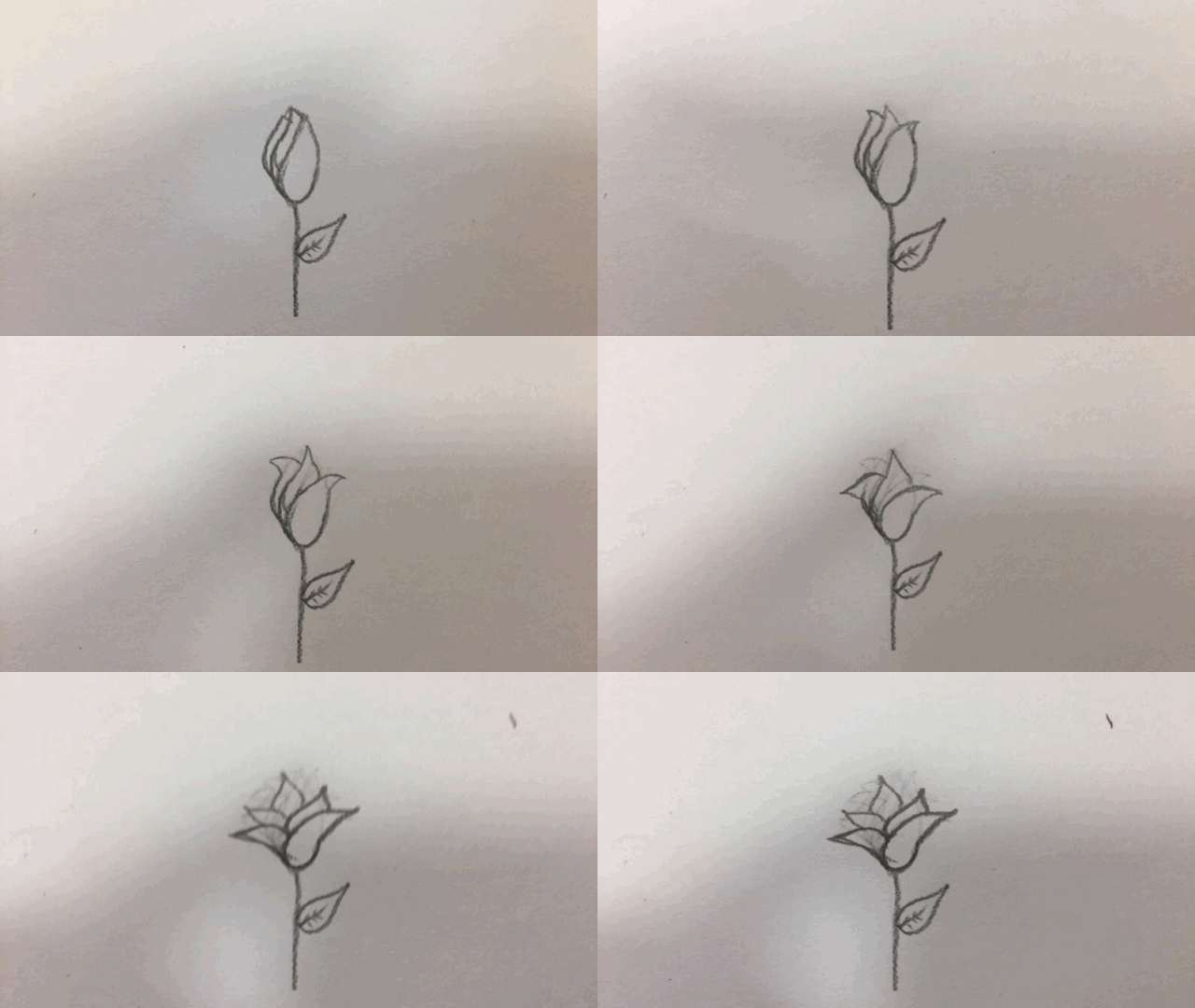
These are a few stop motion animations that I made during a drawings workshop. This was the first time that I had ever made and sort of animation. This process was a lot of trail and error however I think I had some positive outcomes I started out using just pencil and the when I got more confident I started to use colour. If I was to use this process again I would use some equipment to keep my phone in the same place so all of the individual frames line up although the amateur quality of some o the animation work quite well in my opinion.
Calligraphy.
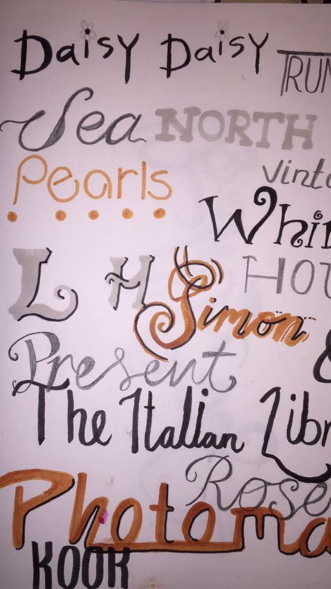
For this drawing project I went out to the north lanes and photography all the different shop signs that I thought would be interesting to try and recreate.
This is a page in my sketchbook of quick interpretation of some of the shop signs I saw. I chose to use a verity of different pens for this page. I wasn’t very happy with the outcome of this page I think some of the fonts worked really well but I hadn’t experimented with enough pens and font to find what compliments each other.
I used a dip pen and ink to create these and I was happy with this outcome as I gained a better understanding of the types of dip pens worked of the different fonts. I also enjoy using the bright vibrant colour.
This is what the grop had accomplished by the end of the season. It was interesting to see other people’s interpretations and approach to this drawing exercise.
Christmas Cards.
Performance Project.
Character Design
first designs:
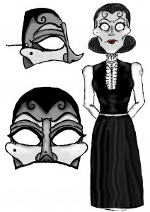
After the talk that I and the rest of the character design team had I chose to work on the character of Mrs DeRopp. We decided a theme for all the characters that they would look quite creepy Tim Burton style approach. So I created these preliminary designs For Mrs DeRopp to show to the rest of the group and to chose which features work best.
Once we narrowed it down to the best two as a group I did a digital design of the character and also a design of the pantalone mask that I would use as a reference when making the the physics mask.
We decided to go with the choice of the pantalone mask so it wouldn’t restrict the movement of the actor mouths and also the voice would be clearly heard. I built up the mask using cotton wool instead of newspaper so it would not be too heavy and it is easy to mold into shape and paint.
Poster Design:
This is the poster I created for the production. I choice to use the coloursceme that we used in the actual production. I used the text and design of the ferret I changes the colour of the text so it would stand out more and I used the ferret over the whole poster as a ghost like figure. I decided to base the poster around the shrine of Sredni Vashtar because it is a big part of the performance without revealing too much but just enough that it’s intriguing.
