For this drawing project I went out to the north lanes and photography all the different shop signs that I thought would be interesting to try and recreate.
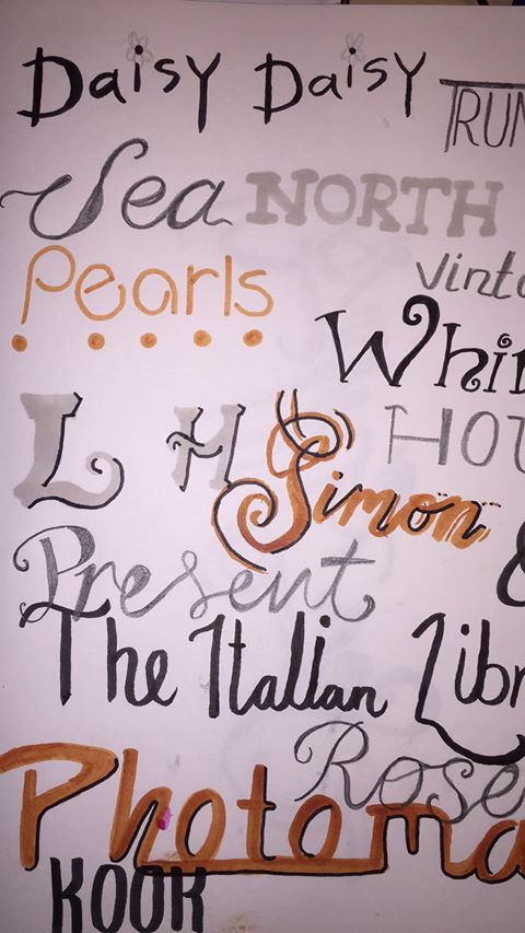
This is a page in my sketchbook of quick interpretation of some of the shop signs I saw. I chose to use a verity of different pens for this page. I wasn’t very happy with the outcome of this page I think some of the fonts worked really well but I hadn’t experimented with enough pens and font to find what compliments each other.
I used a dip pen and ink to create these and I was happy with this outcome as I gained a better understanding of the types of dip pens worked of the different fonts. I also enjoy using the bright vibrant colour.
This is what the grop had accomplished by the end of the season. It was interesting to see other people’s interpretations and approach to this drawing exercise.


