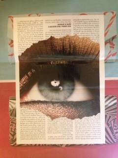
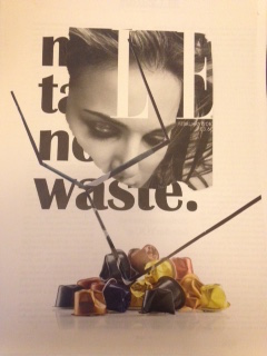
Collage work

Monday 2nd February

Today we had the pleasure of meeting Aaro, one of Jules’ ex students who conducted a collage workshop which I felt was really useful and got me thinking about layout a lot.

My favourite outcomes:

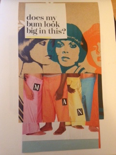
1. This one is all about women worrying about how they look to others rather than whether they like what they are wearing.

IMG_8954


2. This one represents how it’s all about the accessories and not about model. The bag is the main focus.

FullSizeRender


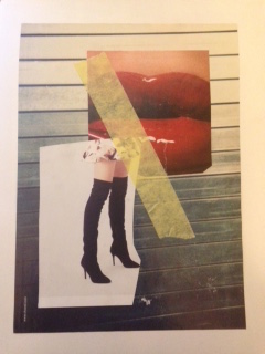
3. This collage is saying that women are exposed and looked at as possessions and are lusted for their legs,v and not themselves.
IMG_8956


4. Here I was looking at the idea of playing with the content. ‘You think you’re reading me, but really i’m reading you.’ Stating that women sometimes aren’t given enough credit for what they can and do, accomplish.

IMG_8958


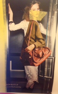
5. Finally, I was looking this idea of waste. How that we diet and try so desperately to alter our bodies to fit the ideal of healthy and good looking.
IMG_8955

Looking at Layout

Friday 23rd January

Today we had the pleasure of meeting Joao and with him we went though the basics of how to use InDesign as well as looking at how different magazines use layout and typography within them. I found the session extremely useful and informative and feel that the skills taught during these session will be of great use.

Joao went through the ‘Grid System’ and explained how it is used throughout the industry to create the desired layout. He explained that text boxes with simple squares with lines in them like a notebook, and an image has a big cross in them. He then went on to explain that the gutter is extremely important and that when making a book it can be crucial as you need the right amount to ensure the pages fit together in a way that the content doesn’t get lost within the seam.

Further more went through the idea of editorial flow and how pages need to make sense as you go thought them. The bleed were told is normally 3mm as you always overlap the page to ensure that you don’t get a white border around the edge of the page.

I addition to this he showed us example of parallax scrolling which I thought was brilliant and extremely clever. The idea of scrolling down but not actually scrolling down many pages is genius! I loved the animation of it all and the fun aspect it possess.

And finally he listed many different magazines that we should have a look at such as:

-VOLT
-ANOTHER MAN
-GENTLEWOMAN
-FANTASTIC MAN
-PURPLE
-P MAGAZINE
-VISIONAIRE
-HEART