Reflection on my project

Reflect on my development and overall project, looking at how i could have improved and what i would change if i were able to go this again.

Doing a project based on K-pop was a big risk as its not widely known or used within the course as a main source of inspiration. However i have a personality trait that means if i fa

ll in love with something i want to show it to as many people as possible so they can also understand and grow to love it. This is how i have felt with Korea, from the culture, food, fashion and music through the years. I hope i have showcased a side of Korea to a new audience that are now able to see the beauty within.

  • Photography and video footage at higher quality

Something i wish i was able to carry it out again is the photography aspect. Through the years at university i have not been a strong photographer, however for FMP i wanted to push my self. However due to the nature of the project i wasn’t able to photograph TEN to the quality i would have hoped for during the show.  If i was able to go again i would be more organised and get permission from the venue to bring in a camera so i could get higher quality footage, as i have seen HD content from other fans at shows.

For example: This is my photo edit from the show. Due to my distance from the stage i believe i did my best and have used me editing skills to make them work as best as possible while sticking to my theme and concept for the album.

And this is a ‘Fan Site’ photography.  This is better quality due to the camera used, however it will also be a factor of closer seating which is luck of the draw.

Fan site – Neoculture Syndrome. https://www.facebook.com/tenchittapon/posts/1981575872142291


  • More in depth research on culture for the concept

Due to time restrictions and being worried about not being able to complete all i wanted to within the deadline, i rushed over research about culture. I did a huge amount of research for my dissertation that was all about South Korea, marketing and  idol impact, so i would have liked to showcase some of what i found within the sketchbook. However the change of concept into culture and the connection fans have to idols happened naturally throughout my development of the project. So i didn’t have a specific dedicated research section on culture, i just used what i already knew and leant through dissertation research and knowledge i have picked up being into Korean culture over the past couple years.

For example some key points;

On page  17 within the book ‘Contemporary Korea No.1 – the Korean wave – A new pop culture phenomenon’ it talks about culture.  

” Ancient Koreans absorbed Buddhism, Confucian teachings and Chinese traditions. More recently, Korea began to absorb American lifestyle and education, European philosophy, and Japanese modernity.”  

On Page 70 of within the book ‘Contemporary Korea No.1 – the Korean wave – A new pop culture phenomenon’ it talks about culture.   it talks about SM marketing tactics. 

“At Paris conference, SM entertainment founder and producer Lee Soo man descried his company’s strategy as “culture technology” 

In the same book it talks about the rise of the Korean wave and how much impact its having world wide on trends.

Page 97 ” new trans cultural flows like Korean wave are challenging the western centric nature of contemporary pop culture and contributing to a more comprehensive understanding of globalisation.”

Within the book ‘Korean culture No.7 – K-fashion – wearing a new future’ it talks about the brand endorsements that Idols partake in.  

https://issuu.com/kocis9/docs/20130327k-fashion_en_0728


Page 17 ” the fashion world has begun partnering with local entertainment agencies: E-Land with SM, Reebok with JYP Entertainment, Chile industries with YG entertainment.” 

I consumed and researched a lot of information for dissertation but never really documented this clearly for this project. I think a lot of my ideas have had in depth thoughts and clear reasonings but it may not have come across as clear through the process.

  • Longer album insert

For the final album insert i ended up having a strong amount of pages however i would have liked to develop on this more as K-pop albums are as thick as some books/magazines. Something i would have needed for a longer album insert is a higher achieve of photographs and graphics. I think due to time restrictions and changes in circumstances meant time was cut short for the chance to photograph different elements to showcase the concept, therefore i made the best with what i had.

An example of the thickness of the albums
  • More teaser image content

Teaser images are big in K-pop when an album is coming up to release, there is usually 4 photos given to fans to showcase the concept ideas. I created a poster to go with the album and to act as a teaser image. I would have liked of created more content around the idea of teaser images. However the photographs i had taken of TEN during concerts where not at a high enough resolution to work as posters for teaser images.  I believe i created a lot of work around the album that could be used as images for teaser posts. Which i have showcased in the press pack and instagram edit.

  • Higher quality video

Something i spoke about within my sketchbook was the use of graphics text with the  footage. I struggled with trying to figure out how Adobe after effects worked, i worked hard to try to create a professional ending credits to the footage which i am happy with, proud that i was able to develop of my skills.  However adding in text through out the video is something i wanted to aim towards but could not achieve.

The video i have created showcases my video editing skills in a variety of ways. I believe i was able to make the best of a situation, with the footage not being at a high quality. I worked with this and the idea of NCT’s retro style to bring together a teaser video.

This is an element i’m not so happy with.  I feel like their is a lot of room for improvement, this was the part of the project i struggled with most. I experimented a lot with video editing in the research module and loved it there for took the idea into FMP. However i believe that i held my expectation to high for the final product which i why i struggled with creating the video. Especially due to all the changes and adaptations i went through. 
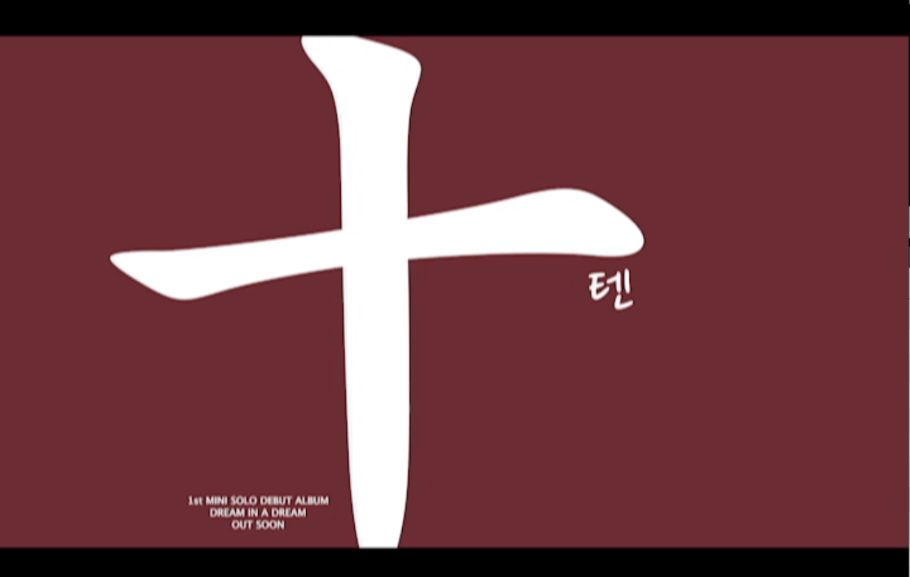
All the files for the different processes i went through to create the correct video.

Colours

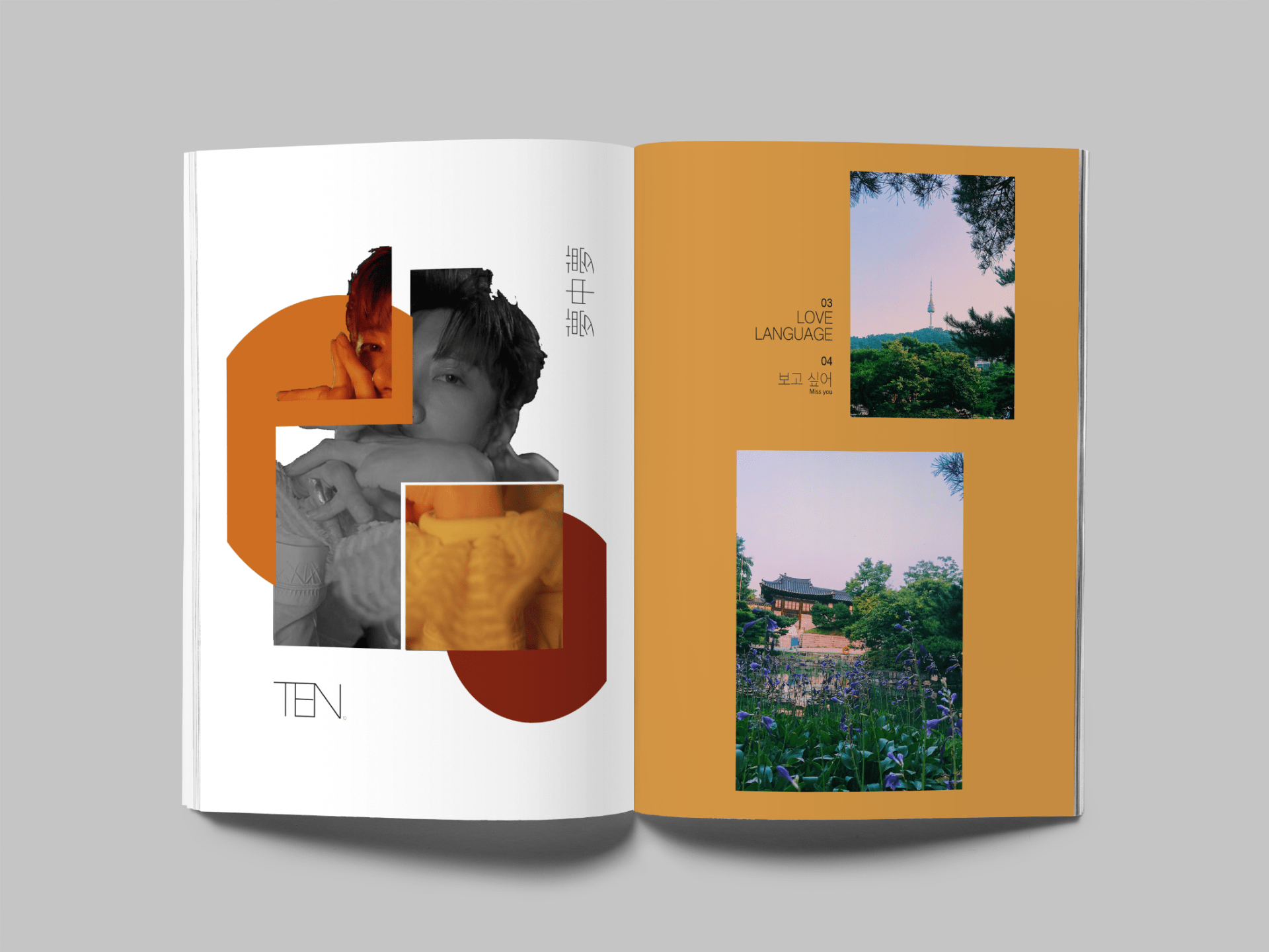
Looking at the colours for the album schedule. I used the colours that connected with the photos from Korean and of TEN from the show. I want the spreads to connect through the use of colour there for i chose the colour palette that stands out on each page but for it to also flow as a whole piece. Having this palette created shows all the colours together, and it shows that they work together through tones and brightness. These colours showcase the colours seen across Korea and the photos i have included. Its warm selection and connects with the album cover and concept of richness and culture.

Colour scheme palette created with – https://coolors.co/

I re worked the colours on the spreads as i had feedback from Chris saying the colour needs to match the message. Looking back at it, the colour was dull and didn’t stand out there for i reviews the palette and changed it to a brighter orange which i think has a happier vibe to it and works with the lyrics of the song. It so works a lot better as it makes the Korean text stand out more for an easier read.

I also brightened up the yellow on the following page again as i looked at it again from Chris talking about conveying the message. The brighter yellow represents the sun and summer time, which is what the photos are all about. The beauty of Korean landscapes and the strong colours seen within the flowers and sky. The brighter yellow also still works with the collage on the paring page. The page feels brighter and makes the pictures stand out more.

Reflection – PR

When researching into what was needed to be included in my press packs about the album launch i had areas i needed to include.

First was information all about the artist. Which is what my first pack is all about, making sure i covered all areas on information on who TEN is. Looking at his genre, tours, how long he has been in the business, target market and marketing. I think i hit what i wanted to do with the pack. I have had family members who are not aware of who TEN is to read over the pack to see if i covered everything and to see if the pack flowed well. I wanted to make sure that those who did not know TEN would be able to read the information and have a wider understanding of who is as an artist. I can confidently say that i believe this works and it serves its purpose.

I then went and researched into what needs to be included in the press pack about the album proposal. When i was creating the pack i used the information i found through Pandadoc.com as a way to create my contents page, as this gave me a strong start to make sure i wasn’t information about.  Some of the research i was looking into started to become a bit more business pack relevant and i didn’t want what i was creating to become to formal, i wanted it to be easy to read and pleasing to the eye. Therefore i make sure to try add these elements in but in a more of a overview style.

Even though i follow TEN and SM Entertainment i made sure to still do some research into them to further my knowledge and be able to look at this from a non fan perspective but more from a business side. I made to sure to look into who SM manage, how they promote and who would be the competitors for TEN, to make sure my proposal worked well with the system SM has in place. I think this is important as it meant i was able to look into these elements when i was looking for inspiration and ideas for my the album launch and designing process as i wanted to make sure what i was creating would fit into the K-pop current market. I think someone i could have done better was putting down more information about Kpop and the artists through the sketchbook, this is something i struggled with as the research i was carrying out wasn’t focused on the actual side of k-pop as its something i see everyday, where as others are not familiar with it. There for i feel like i should have documented my research better as  i think a lot of the information with the pack i have forgotten to document within my sketchbooks due to me just knowing specific information.

I think a task for me to do, is go back and make sure i add in the missing information as blog posts to show where the information as come from.

However i do think i was able to include all i wanted within the press pack, from the proposal, to the schedule and marketing tactics. I also had people read through the press pack all about the launch to see if they were able to understand and visualise the idea that i had put in place and others said it was easy to follow and understand, having enough information to tackle all areas but not packing out with to much text as it’s designed well and was still visual. Which as my goal, i wanted to make sure it hit all the information points but not be overwhelming to read.


RE WORKED VIDEO

After i got feedback from those around me (bellow) i went back and re worked the video edits to blend the elements that were liked most and create a more final piece. I have spoken about the process in my sketchbook.

Aamina – Kpop fan and  Photographer – early 20’s

Like the fact that video clips move with the beat drop, advice to slow down some clips so it works with the smoother beats.

Some of the same shots are repeated too often.

Like the talking segment, should be added to the other video as it created a build up.

 Likes the shorter video as it as more elements and different editing, but the speech should be added in as she think she other ones  starts to abruptly.

 Add in other clips of him with other members, talking and playing around, other performances with the group to showcase different  sides of him, adds more depth.

Jess – Sister – non k-pop fan but has art degree – late 20’s 

Likes the mix of footage being up close and far away.

 Likes the soft fade and hazed effects on clips works well with song titl

 Not sure if the split screen style with the film boarder might be worth editing it out for those clips

Add in 4 screens (likes this element from the research project videos)

Likes the speech at the start, makes the video seem more personal. Take away the bye as it

Transitions are well times to the music

To many shots far away, not that clear of footage. Maybe use them less or with the split screen style.

Christine – Family – Uni lecture – Like all the editing work – early 50’s

Liked the sorter edit as it kept attention – like the split screen style

Wasn’t a fan of the talking at the start, as was hard to hear. will have to look into increasing volume.

Chris – Uni tutor – is not a big fan of the VHS style boarder as it takes away the attention from the editing that has gone into the video. This is something i have also thought as well as it not working with the style of TV i have chosen to add the footage into. Therefore i will experiment with editing it  out to see what its like and see if the same effect is given off. As i want to keep that vintage feel and have that element of the video being personal.

I have kept the boarder around the beginning speech as its something people really liked and the fact is makes the footage look more personal which is something i have wanted to carry on through the video with the new concept. However i did take the boarder off for the rest of the video as i do agree with Chris with it not working when added to the TV screen as well as taking away from the edit itself.

This is the version without the boarder.

Then i added the footage back into the TV style i had created previously that matches with my research as style that was widely liked and gave the footage more character.


My Video edits

The videos i have created are from the footage i got from the show. I am now trying to edit and see what works with effects and styles i am choosing.

Trying to see if i’m adding in to many effects, does it work? asking other for feedback. Now i need to figure out what the perfect length, perfect effects, transitions to work best for a teaser and promotional video that i want as a piece along side the album launch.

The ones i have attached are to give an idea as to what i am trying to finalise and correct to make a video i am proud of. I think i have elements in each video that i like, such as the fading, overlaps footage and split screens. The TV screen style works well with the NCT127 aesthetic and works with the fact that my footage from the shows is not at the best quality due to me filming from far distance however i think it can work with the VHS style in mind.

Something i need to work on is colour editing, transitions and smoothness of the videos. Something isn’t connecting which makes for a harder watch, doesn’t draw people in as much as i hope.

The original footage

I will still be working on this as its not perfect.


Reflection – change in course due to lock down

Trying to produce final major project through the virus and lock down has been incredibly hard when i have felt so de motivated to complete work when my mind is else where.

The change in teaching hasn’t been the best for me either as i suffer with social anxiety and video calls are something that bring out my panic attacks, therefore i have missed out on tutorial slots for about 4 weeks now, and my tutor hasn’t been able to adapt to this and suggest other methods of communication. Emails are sent back and forth with bare minimum responses and only half the questions answers or not having correct work looked at. I feel like i’ve has less contact time then most students and have been left in the corner with many answers not answered. The lack of responses puts me on hold and i cant correct or understand where i am at with my work without tutor feedback.

Not being able to have contact during easter break seems silly now as we are only given 10 mins a week with tutors anyway and since we are all under so much stress of having to change ideas so close to the deadline having a weekly catch up is needed.


Album insert – Graphic ideas

Due to having to re think how i can present my idea for the physical album. I have searched and looked for ways to showcase my album and the insert to look as clean as possible and something thats a bit different to handing in a PFD.

A friend of mine graduated last year from the university and is now studying a graphics masters and i went and asked for help on ideas and how i could carry out something i had seen on instagram  from  the  Vogue  Korea  account and  the  Exo  account.

I then went onto https://mrmockup.com/ to look at the different mock ups available  to work with to have the effect i want to the final piece.

Ones i like are;

  • Open Magazine Mockup
  • Magazine Mockup
  • Magazine PSD Mockup
  • Book Perspective Mockup

I also went onto https://graphicburger.com/mock-ups/ to find other options the ones i likes are

  • Hardcover book 2
  • A5 magazine mock up

Looking at CD mocks up on https://covervault.com/


The instagram posts that gave me this idea.


MOVING FORWARD

NEXT STEPS

  • Find Dancer/model
  • Look at video editing skills
  • Location scout
  • Styling ideas
  • Album art work – Look into other solo k-pop acts and what their covers are
  • Ideas for choreography – find studio to practice in – document process

This week i will be focusing on these ideas to try and prep for the video and photoshoot elements as this will be testing my skills and ideas the most within my project.

Story Boarding – Research

Research Notes From the Book – The Anatomy of Story by John Truby

  • Comic strip look
  • Key elements pointed out
  • Shot by shot noted
  • Details on the set in each frame
  • The people needed in each scene

Tips

  • Keep them simple
  • Easy to follow
  • Keep in mind the overall task
  • Visuals over text for each frame

Step 1

  • Figure out the key scenes
  • What are the important moments
  • Note the changes in location

Step 2

  • Create a narrative
  •  Make sure it is in chronological order

Step 3

  • Add in the details for each shot

Step 4

  • Explain whats happening in each moment
  • What emotions needs to be expressed

(Write the story bored in enough detail that someone could create the video)

1 – Come up with the story concept

2 – Write the premises in one sentence

3 – What is the hero, desire purpose of the video

4- Make it visual and fun. Not just an advert that packed with information.

5- Relate the the target market; Speak in their language, get into the persona of the buyer

6- Make sure its easy to follow

7- Finish with a CTA (Call To Action)

Note book – ideas for what i want to be apart of the teaser video i am creating 

Having a list like this created makes the creation of the video easier to start. It makes sure i have a good starting point and understand how to create a video fit for marketing purpose. It helps me focus and make sure i am able to follow a step by step guide so i am hitting all the points needed.

Testing video editing

While focusing on creating a dance piece to go along side my album proposal for TEN i have created two video edits with a dance element. I chose a dance piece as this is one of TEN’s strengths and a reason he is so loved by all fans. Ten is known for his dance skills and stage presence. There for i believe creating a dance piece to go along side the album for a teaser style video makes sense due to his passion in the area. This video would also meet the expectations of the target market.

Bellow i have attached the videos i have edited to try and see how editing works when dancing is involved and making sure the 8 count dance fits with the beat of the music its-self.

Something i need to focus on and learn is adding text into videos as mine look unprofessional and unfinished, this not making a big enough impact on the viewer. This will be something i will watch tutorials on to understand in more depth. Something i think i do well it making sure the video edits works with the beat of the song which gives it a nice flow.

First i created an edit for BTS’s new song Black swan as this was a song i connected to and imaged my self dancing to as it hold emotions i connect with. First is the video i grabbed the footage from, Starting at 2:41. Second is my edit for the new song. Using a different song to create my video. Doing this meant i had to become aware of the beats, editing the clip to fit with the rhythm of the music and lyrics, learning to crop, cut and change speed/duration on clips to fit best with the music.

Bellow – first is the original video then its my edit for TENS song New Hero’s as this is the song ill be focusing on for the final piece. Again the change of song was a way i had to begin to understand how movement and editing was important to make it flow and connect. Ten is in the white.