WEEK 3 – ANALYSIS – TASK 2 – PANTONE PERIOD RED COLOUR
PANTONE – PERIOD RED COLOUR
As I was still feeling lost (or overwhelmed) with where to go with my research, I decided to focus back on the area of graphics, which is where my heart lies. In order to do this, I thought it would be appropriate to browse reputable graphic design websites for news in the industry to see how contemporary graphic design is evolving which led me to Dezeen.com
What struck me to the article was the image of the Pantone colour ‘Period Red’ with the illustration on the colour sheet. This struck me because most of the other articles were about different types of craft or branding but I loved the idea of a worldwide company discussing something like periods which are usually fairly ‘taboo’ but becoming more and more discussed lately. As I’ve discussed in previous blog posts, I was interested in artists like Linder or the HATE zine which create an open discussion on topics such as sexuality, periods, bleeding etc. which, as a natural part of life, I do find fascinating when it’s explored creatively. However, I found it particularly interesting coming from a company like Pantone which is usually incredible neutral on topics like that, considering they’re well known for their colour matching which doesn’t necessarily allow them to voice their opinions as it would seem unnatural, however by doing this they’re reaching out to potentially a different audience than the people who are interested in artists like Linder or who read the HATE zine as they’re usually seeking out art like that.
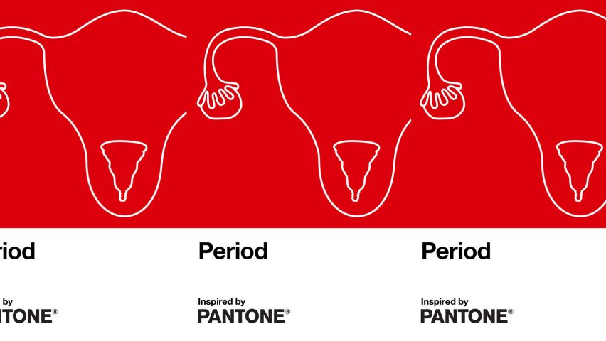
The illustrations to accompany the colour compliment the style beautiful as they’re simple line illustrations depicting a womb as a repetitive pattern and therefore makes the whole collaboration playful and friendly to their audience. It allows the topic to be spoken about in a safe and comfortable way rather than showing graphic images, although I wouldn’t be opposed to this as it’s natural, coming from a stylist approach, I feel like they succeeded in breaking the stigma and opening up a discussion in the way that people hide and get embarrassed or awkward about these sort of topics and pushes the normalization of it in a wider design context.
“Enough is enough, it’s 2020. Isn’t it time periods stop being considered as a private affair or a negative experience? Isn’t it time we call out people that try to perpetuate the stigma surrounding periods?”
I’ve discussed this previously in my blogs but the above quote feels inspiring to me as I should ask myself more questions when approaching a topic instead of simple researching things with no aim as it allows me to explore different solutions and answers in a more creative manner to expand my own thoughts and understand all the different possibilities out there. Topics like feminism etc are of course very important to me and I should incorporate this into my work more.
