WEEK 3 – ANALYSIS – JOHN STEZAKER
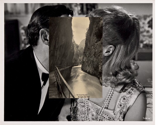
John Stezaker – John Stezaker, Pair IV, 2007, Private Collection. © The Artist
I will be exploring one piece of work by John Stezaker in depth with general context to his work from an interview as previously, I had spoken about an entire exhibition as well as a whole magazine and therefore wanted to investigate something in slightly more depth to expand on my critical analysis skills. This was another collage artist recommended to me by one of the tutors based on the direction that my work was going in so far. I’ve gained my research from this using the Mousse Magazine website, an interview with him by Laurent Dalaye Gallery as well as looking at his exhibition at The Whitechapel Gallery online.
John Stezaker states in an interview that in the 70s, he personally felt as if the idea of conceptualism within art had been overdone, looking at concept over image had been “exhausted” which led him to focusing on showcasing the images that he wanted to portray. His images are simplified for this reason compared to collage artists like Linder who create something purposefully unconventional and distorted whereas Stezaker creates imagery, which is still surreal, but simplified and focused on the images rather than the concept, like Linder does.


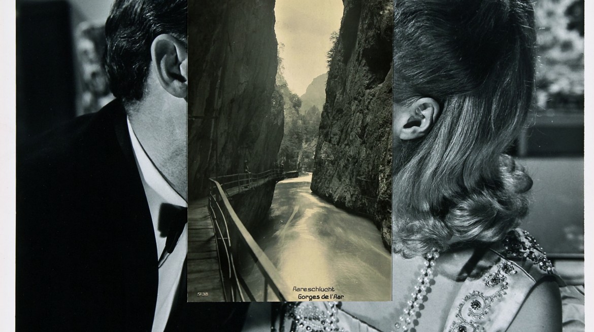
This image shown by John Stezaker is called Pair VI as he makes a few of these and places them in a series. Even the name of the piece highlights that the people in the image are secondary, as they aren’t given faces, names or a context behind it considering their most prominent features are hidden and therefore it could be anyone. Interestingly, Stezaker usually using famous film stills, vintage postcards and book illustrations as the feature for his work. The process is incredibly simple by placing an image on top of another to distort it and give it a new meaning, however finding the perfect image to place over the original would take time to find. Shape is an important factor within Stezaker’s work due to the fact that the image on top, of a lake and mountains, allows the rest of the shape of the people’s faces to be taken up by the mountains. This brings the image together as a whole and connects the two pictures together otherwise it would seem like a randomly placed image over the top. The shape pf the mountains directly line up with the tops of their heads and the man’s neck as well as the girl’s hair which is cleverly placed.
Although Stezaker states that he places image over concept, erasing the people’s faces made me wonder what other meanings this piece could have. I felt as if it could potentially tell a story of how two lovers could have become strangers, they are facing each other technically however their faces are removed and could have had any facial expression underneath, yet we are made to think they looked really close and happy. He pushes the boundaries of representing a connection between two people as another meaning could be that these two people have a strong relation to each other as images of water are shown which has a constant flow within a water cycle, and therefore could be a metaphor for their love. Similarly, he could have just placed the image as it fit on top and he wanted to relate the connection between humans and nature in terms of shape and form.
