Archive of ‘My Work’ category
Well I am happy.
The printing quality IS SO GOOD!
I was so worried, especially as my portfolio is printing on newspaper and then this as a hardback bound book I was like so many things can go wrong SO MANY.
But alas I’m please, the wrap around image looks sick and I really like feel and quality of the book. I do wish my spine was bigger but that’s due to the amount of work put in the book, not the printing company ha!
The back cover I really struggled with designing as I didn’t want to have a photograph as I thought it wouldn’t compliment the illustration on the front. I also wanted to reinforce the way the book follows the figure down the body by having the front cover as the lips representing the top/front and then using an illustration of the bottom of the body. The only illustration I thought worked well was the purple bum illustration as it showed the back of the body and lower regions plus isn’t too explicit. The purple I felt really complimented the off white that the colour of the book is however I could have considered doing writing on the back. I wanted to keep it simple and make people intrigued to look inside therefore I decided not to write a blurb or have any words but FEMME on the front.
On reflection I do think that having a small amount of writing on the back may have had a larger impact and more professional feel to it.
Well as if, as if it’s all come round this quickly, I feel like it was only just March last week.
So this is the last part, the final chapter if you will.
And it’s all coming down to timings I really should have worked out the time to get stuff printed about a week ago but lol I didn’t and now it’s all steam ahead, I’m finalizing the layout of the book so I can send to print at the very very very latest 6th May. Which omg is pushing it so much, I tried to follow my gant chart and keep timings all steady but I really should of tried harder because it really has come down to the last .
The book takes an estimated 10 days to print so I am cutting it so very fine, once it’s sent off however I need to send my sketchbook off to print and my portfolio. They have an estimated 5 days so thank you lord I have time.
I’m pleased with my book layout so far, I’ve tried to keep in very minimalist focusing on the illustrations and photography.
I’m very unsure of how it’s all going to come together, as it’s a mixture of photography and illustrations I’m not sure how well it flows or if it makes sense to the viewer.
I wanted to try and portray the female form in so many different ways so it didn’t just become monotonous but had variations and an interesting range of techniques.
I think I possibly allowed my creativity to rule and not necessarily my head, I have continuously questioned keeping it purely visual however I don’t know how I could of really incorporated text other than how I already did in my illustrations. But I also think when you’ve looked at something for so long you need fresh eyes and a fresh perspective to help your mind look at things from a different angle.
I don’t know if it really portrays the message of the female gaze, I just wanted it to be from an angle where it’s a truthful depiction of women through both illustration and photography. As in both practices women are so heavily misrepresented and bodies contorted to conform to the female ideal.
Hopefully it will make sense and flow.
Well boy has this been long overdue but I have final come to a decision for how I’m going to present my ‘magazine’ dun dun dunnn..
*drum roll*
Coffee Table Book!
Well I don’t know what else to call it, but I’m going for a hardback image wrap book.
I’m going to get it printed with blurb as it’s a really reliable company and I’ve printed with them before and the result was brilliant.
As I’ve FINALLY decided how I’m going to present my work, I don’t have a lot of time to put it together.
I’ve been looking at what I could use as my front page, as I’m following this project on from my first project I really like the original front page design but I do need to have other options so I’ve done four options that I would happily use as the front cover.

I really really like this illustration and think with the juxtaposition of the pink background and feminine lips with the harsh bold ‘FEMME’ I think this is a strong option for my front cover, with using the pink background this will mean the entire book will be this pink and could clash/limit my options for the back cover which could be an issue.

I love love love this option, I really like the way the illustration intertwines with the letters. I also like the way the title isn’t at the top of the page but the centre drawing the eye in with the illustration above it. The issue with using this again is that it was the title page of my brief 1 project and with this project being a lot more developed and advanced I don’t want it to hold reminders of the previous project.

I really like how shocking and in your face this option is, with the colours all complimenting each other and the bold outline of the illustration reinforcing the harsh text is really quite satisfying. This main issue with this option is the explicit nature of the illustration but part of me likes the fact it could be deemed inappropriate.

This is the most abstract option for the front cover with the use of shape and colour being very different to the other options. I like the addition of the illustration to this option and the grey colour scheme I think would work really well as a wrap around colour for the book. The title is aesthetically pleasing in its arrangement with the off centre positioning and alignment with the darker box. With the monochrome colours of this cover I don’t think it’s bold enough or as eye catching as the other options.
I decided to go with..
*drum roll please*
I chose this one as I really like the bold eye catching nature of the illustration and the three dimensional effect of the layering of the text. The options to use this illustration as business card designs/postcard designs or even portfolio to create a consistency and brand identity.
I don’t usually put my experimentation into my sketchbook which is weird because first and second year I always showed the full journey and process, but I think after my placement it made me work differently.
With brief one I didn’t show ANY experimentation and even in the project my sketchbook doesn’t have a lot of what I went through with processes and colours but I thought to make up for that I’d include and record it all through my blog!
So below I’ve included some of the experimentation I had for my illustrations but decided not to use in my final outcome, some of the reasons I decided not to use them was because I preferred the original unedited versions.


This shoot turned out somehow different to how imagined but not in a bad way, I always forget how difficult it is shooting in a bath while getting the correct poses and body shots without getting a bloody great tap in the corner!
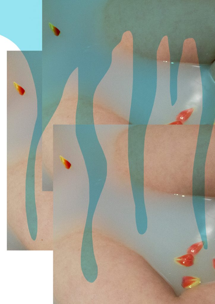
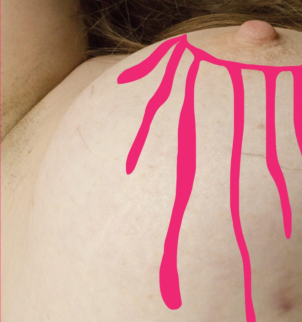
I really liked how this shoot turned out however especially with the addition of the tulip petals. This is the most colour in any of the shoots I’ve done, and the block primary colours are normal shades I would use in my illustrations which I think provides fresh contrast.
The reflection of light against the water worked really well and created the ethereal vibe I was going for which I’m really pleased with. 
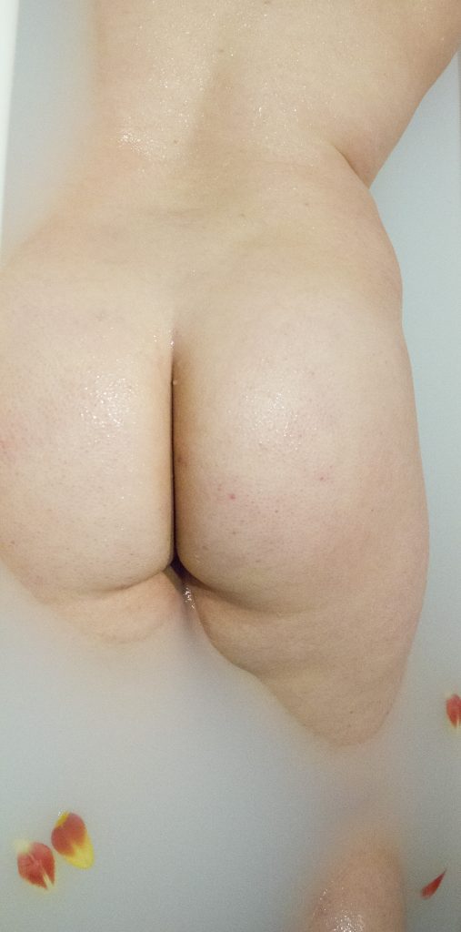
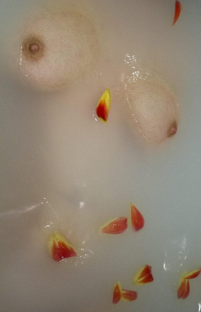

I tried to get more abstract style angles and close ups compared to Fleur as I wanted less predictable photographs of the female form included in my final outcome, highlighting troubled areas.
Well, this photoshoot was an absolute flop.
I had such high expectations of this one, I thought it would end up being the most featured in my book/magazine. But oh no, absolutely not it is not good.
The lighting, absolutely not.. the copper leaf, absolutely not..
It all just looks a little bit amateur, and the way the copper leaf appears when painted on skin is not what I wanted.
I think the brushstrokes were too thick and did need to be thinner looking back the photographs. The shimmer that the copper leaf created gave a delicate finish however everything else was just wrong.

This was the only photo in the end that I decided I would use as my final work as I did want to include at least something from this shoot as the concept I felt was quite strong for what I wanted to portray.
While taking photos with the copper leaf I did also take some general just nude photographs which were intended for illustration purposes however I ended up finding them stronger photographs than the actual planned photographs!


I’m really struggling with what kind of thing I’m going to do for my final outcome, I’ve looked at various different artists like Molly Soda, Petra Collins contrasted with Ayana V Jackson Zanele Muholi to try and get some inspiration as well as going to V&A, National Portrait Gallery and Serpentine Gallery to expand my research and look at completely different artists to my project and artist research.


The thing I’m worried about most is just what I’m gonna produce because I know it’s about quality not quantity but I feel I can’t just have a couple of printed out illustrations I need something bigger, a more solid piece of work.
Looking into presented work, especially looking the curation of Ian Cheng’s Emissaries I like simplistic minimalist presentation, I’m a sucker for a white frame and clean finish. I have looked into potentially printing in a magazine style with different types of binding, depending on the amount of pages I’ve looked at either a stab stitch bind, perfect bind and saddle stitch.
I have however been thinking about if I would want it printed as a magazine as I want my outcome to be more visual. I know that by making it visual I may lose part of my rationale and what I’m trying to portray to the viewer. However due to it being about the Female Gaze, I want it evoke thoughts and emotions which the viewer has come to on their own.
I don’t want to inform them of the Female Gaze and opinions that are already circulating with articles, I want them to interpret it for themselves.
I do think I need some writing though otherwise it’s going to make no sense, especially if it’s all visual.
I’m gonna look more into different printing techniques I’m just getting really stuck on how I’m going to present my work, I’ve not had an epiphany yet unfortunately.
I do want to have more than just a book for my final exhibition, so I’ve been thinking about framing a couple of images in addition to the book/magazine/zine whatever I end up deciding.
So I’m quite pleased with how this shoot came out, I think the lighting and angles of the body work really well.


I found editing these photos quite difficult to make them look like they have all came from the same shoot and not doing whacky exposure things on one compared to highly contrasted on another.
The noise on these photos are also a bit of problem, I’m worried with printing because of the natural lighting they’re going to appear grainy. I knew this could potentially be an issue and I do I actually prefer this aesthetic, in a way I feel it makes the photos look more natural and less edited, similar to a film camera.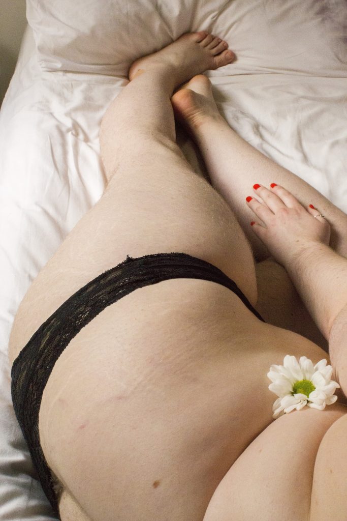
I think I could of gone further with this photoshoot, I kept underwear on as for this one I wanted a sense of modesty and concealment, this shoot is about embracing your femininity and owning what society deems unsightly. I think I should of got more poses and more zoomed in photographs, highlighting specific areas of the body and making them slightly abstract. I think having more like this would have worked really well and added additional depth.

So I had an idea and just sort of went with it, because I’m just at the beginning (kind of ) I haven’t started doing my own work yet so while I’m trying to figure out where I’m going I thought I’d start doing some life drawing classes… why not???
I didn’t really have a point of reference in terms of where I was going with them or if I’d even use them I just thought why not start doing something.
I’m gonna continue doing it throughout my project as I want to work on my drawing skills and also potentially incorporate them into illustrations/life playing around with techniques and finding what’s aesthetically.
I’ve put a wee few photos below to show my initial drawings, I’ve tried to play around with styles keeping some simple and others using shading to get a feel for the aesthetic I’m going for. I like life drawing because in a small amount of time you create a large body of work.
What I think halts my creativity is trying to look too far ahead trying a create ties and links between things that will link naturally. However by overthinking it stops me mentally which is what messes with time scales and organisation, by doing these life drawings it’s helping me stop stressing as much about what I’m going to create.


So after getting rid of all those predetermined views and assumptions on Playboy I’ve had time to look through the editorials and view them in such a different way than at the beginning.
This has enabled me to have so many more ideas of where to go with the project and what direction to take it in. As I’m very passionate about feminism and the power of women I want to incorporate this into this project in some way and not lose sight of it.
I’ve just started looking at a book called ‘Girl on Girl’ and oooooooo it is brilliant, it’s exactly what i needed to start getting a basis of research of artists looking into the portrayal of women not necessarily in a sexualised way but just the way women creatives represent women.
From Girl on Girl I think I’m definitely steering more towards the Female Gaze and not the Male Gaze, which is quite exciting!