The Best Way To Present And Position Your Call To Action (CTA)
You may be thinking:
What is a successful CTA?
What does it look like?
Does your current CTA work effectively to draw your customers attention?
Where should a CTA be place? Above the fold? Below the fold?
Using AIDA on the bottom on the page?
Surrounded between all the clutter on your website?
This blog post explain’s any questions and problems to do with CTA’s on your website. I will be looking to explore the different forms, language and appearance of effective and ineffective CTA’s. Looking at the DO’s and Don’ts.
Let me explain:
What is a CTA?
A CTA is known as a Call To Action, which is a button or can be presented as a link that is placed within a website aiming to aid potential customers to fill out forms, buy products or book/purchase a service. Hubspot Academy (2015) states that there should be a direct link amongst the content on your website and what the customer purpose is to find. The landing pages should contain implausible deals within it that customers find attractive enough to push them to fill out a form. A CTA can be seen as an action used to persuade customers to, gain a free consultation, book a service or make an appointment.
What then are the characteristics of an effective CTA?
1.They are Buttons
According to Smith (2017) CTA’s are Buttons:
They should not be considered to contain long chunks of text
- They are not Hyperlinks!
- They are not Black holes!
However, the CTA should be considered to be so irresistible that it should not be hard to make it more than just a ‘button’.
 THIS IS WHAT I MEAN! ONE CLICK & ONE ACTION CTA’s should not have long paragraphs!
They are for customer to be able to complete an action which you have set them. Smith (2017) says that customer don’t want to read long chunks of text or click on an unknown hyperlink, as they wouldn’t be aware of what they are in for. Thus, wouldn’t complete the action.
Smith (2017) notes the brain partakes a ‘circuitry and although the brain has ‘elasticity’ to contain new and more information, it does not like doing unfamiliar things. As humans, we all have certain ways of doing particular things. Such as if we were to go on a journey to university/work and there were road works going on. We would look for an alternative route, but wouldn’t be happy with disruption and change. Similarly, Smith (2017) states the same holds for CTA buttons. since using the internet, we have been trained to click on buttons. thus we see a button our instinct is to click it.
Hollister- https://www.hollisterco.com
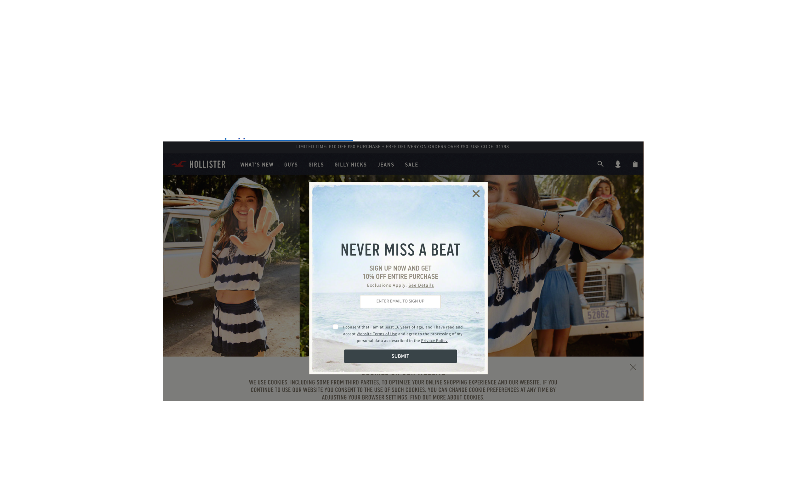 Although customer want a CTA which excites them, they want something to click on. Hollister using a limited amount of CTA’s such as ‘Shop the trend which engages customers to check out the new fashion line and a CTA ‘never miss a beat’ to get customer to sign up to receive 10% of their purchase. But this is a long process to sign up to receive only 10% off. However, their website is limited with buttons, and there isn’t a clear call to action. As well as this I don’t know if I want to click on to the new trend then suddenly the CTA pops up trying to make me sign up. In conclusion Smith (2017) states ‘buttons are what make people click and conversions happen’.
LESSON ONE: USE CLEAR BUTTONS
2. Eye catching
Though one may instantly believe that the attractiveness of a CTA depends upon its colour, font or size, in actual fact this is not the case. One extremely important factor of any CTA is its ‘verbiage’, notes Smith. Short, sharp and snappy language is what an effective CTA is built upon.
Though it may be assumed that the biggest appeal of a CTA is its color, font or size – In actual fact it is not. The verbiage is a vital factor of any CTA – the shorter and snappier the language is, the more sharp and effective it is for it to be more eye catching (Smith, 2017)
Komal Beauty uses a Wix template, it has a nice background, nice background song and all images load to a high quality. The problem with the website is that the call to action is so dull that its actually non-existent.
What does Komal beauty website look like, and what is the problem?
So here is a screen shot of the landing page and Contact page….  Looking closely at the landing page, between all the vibrant colours, texts and images, the only CTA Komal Beauty has is the ‘contact’ link. The link takes you onto the contact form where customers can leave their name, email, number and a message in order to book an appointment.
What has Komal Beauty done wrong?
Analytically, the landing page of this website is very weak given there is nothing eye catching which is going to be grabs customer’s attention. Not only are prices or offers not seen to inform customers about the treatments that are available but there is also no call to action such as any ‘click here’ or ‘book appointment’. However, there is a contact option which arguably is not striking enough as there are no imperatives or commands. Unlike any of the above examples, the CTA on ‘Komal Beauty’s’ website states ‘contact’. Now I am not being unenthusiastic, however the phrase ‘contact’ doesn’t actually cause any fireworks to happen. There are no imperatives and no commands.
What is meant by imperatives and commands?
I have no intention to tell you need to portray yourself as a dictator.
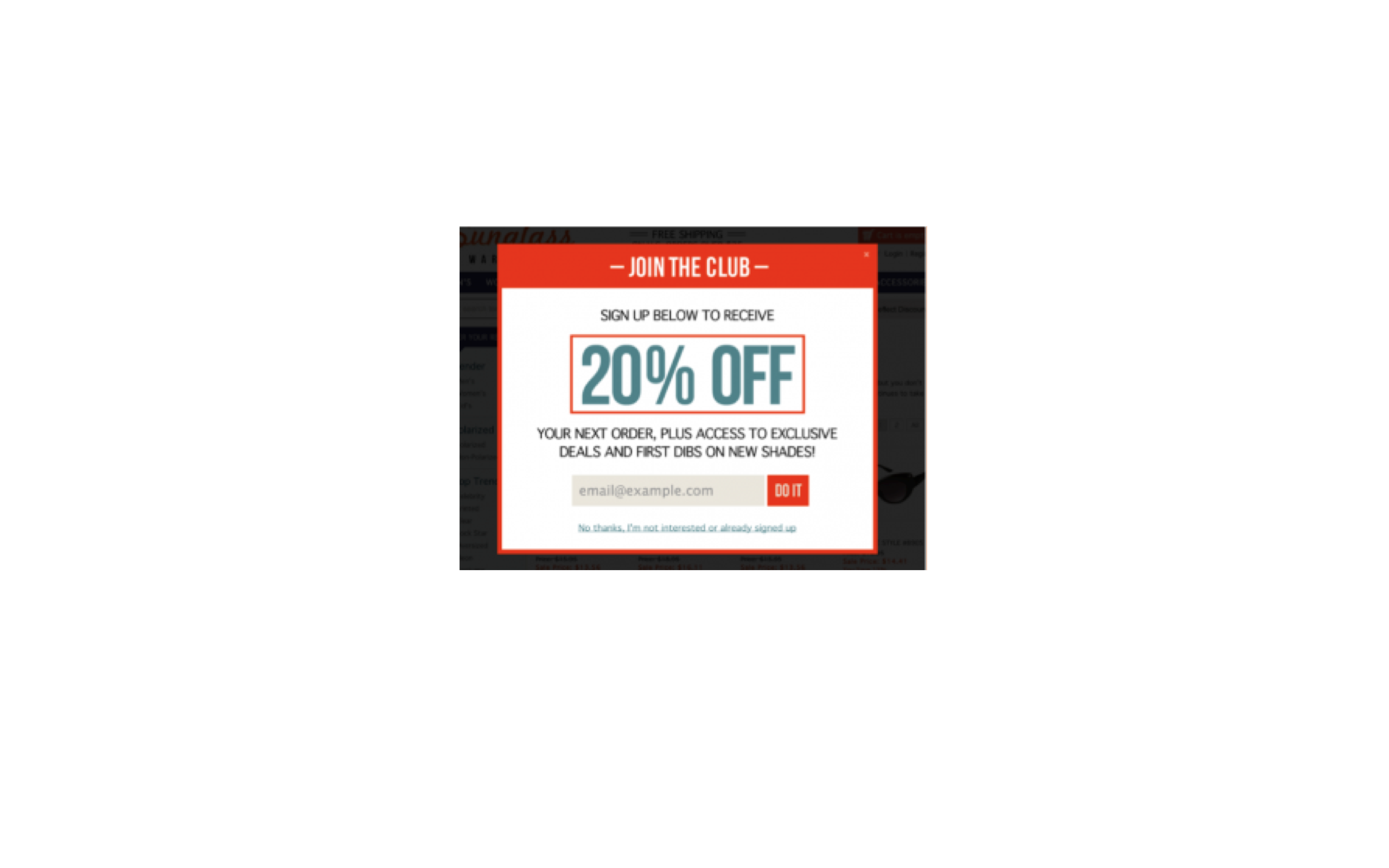 The image above expresses that using a simple ‘do it’ can be sufficient. It is not longwinded nor is it complex. The essential phrase ‘do it’ advices the viewer to enter the email address, suggesting that like the phrase the process will too be short, snappy and over with in a tick.
LESSON TWO: BE EXCITING, IMPERATIVE AND COMMANDING
Vibrant and contrasting in colour
Though best CTA are in colour, commanding the visitor to complete an action. Smith (2014) states the most effective CTA’s are one that use contrasting colours and vivid. For me to be able to conclude if Smiths research is correct. I will look at evaluating a few CTA’s, which I have received in my mailbox in the last few days.
Contrasting Colours
Ann summers

Normal Colour
River Island
 So Is Smith, Right?
Debatably, yes. Clear from the examples above, I am able to say that a CTA which uses ‘contrasting colours’ are more appealing to the eye. In comparison to the ‘normal colour’ CTA. Smith (2017) notes entire idea behind a CTA button which should draw the reader’s attention straight away. An example of this is the Ann summers CTA which uses contrasting colours, compared with the River Island normal colours CTA. Focusing on Ann summers CTA they only use blue, black and white as their contrasting colours. As the background is blue and has a white CTA. This means when you focus your eyes on the CTA your eyes will instantly focus on it, working to make you click it. In contrast to this, the River Island CTA chosen to use a variety of colours. But the main problem with the CTA is that the button is also in same way the same as the background white. As the background fades in to the image that is also white. Thus, button is not clear enough to stand out and fails to grab your attention.
LESSON THREE: USE CONTRASTING COLOURS
LET RECAPE THE THREE BIG LESSON LEARNT:
- LESSON 1: USE BUTTONS
- LESSON 2: BE EXCITING, IMPERATIVE AND COMMANDING
- LESSON 3: USE CONTRASTING COLOURS
You can also look at CTA’s positioning
Above the fold
Ecommerce pundits have long preached the importance of keeping the CTA above the fold (McEnroe 2014). Per McEnroe, the rational behind placing the CTA above the fold is ‘clear enough’. Not only will visitors of the website will immediately notice the CTA and click on it if it is at the top of the landing page, but theoretically there is also less chance of visitors either missing the CTA or existing the page before reaching the CTA.
At the bottom of the page
According to a study by Ciotti (2013), less content above the fold can actually encourage individuals to scroll to the bottom of the page. In relation to these findings, it would therefore be suggested that to increase the conversion of a landing page and encourage more content to be read, the CTA would be more beneficial if placed below the fold.
Effectively, placing the CTA lower down the page leaves the reader with more time to read and digest the content on the page before making their decision. Observed by Burstien (2012), placing a CTA below the fold, near the bottom of a page had a 20% better conversion rate as opposed to placing it above the fold. Furthermore, discovered by Goldenberg (2012), simply moving the CTA below the fold lifted the conversion rate by 304%.
AIDA
Conceptually, AIDA is based upon the notion that a visitor progresses through a series of linear steps before they make any decision to take action. So what does AIDA stand for? AIDA stands for Attention, Interest, Desire and Action.
- A: Attention- Attention of the visitors can be captured through a eye-catching and punchy headline.
- I:Interest- Interests of the visitors can be captured through many forms of content and media. This can range from videos to pictures and games.
- D:Desire –Naturally, visitors will only visit your website and continue to browse if the content appeals to them. Therefore, desire is created though the use of relative and relatable content and features on the website.
- A: Action – Finally, a strong call to action completes the process of steps. When all of the above three elements (AID) are satisfied, the call to action acts as the final straw in the process of persuasion.
Check Out This Video!
The Most Effective CTA’s
Like, Share and Comment below with your thoughts!
Follow me on Twitter for more useful Digital and Social Marketing Information @Brightondigita1
References:
- Academy, H. 2015. Call-to-Action Best Practices. Available from: https://knowledge.hubspot.com/cta-user-guide/call-to-action-best-practices [7 May 2017].
- Burstein, D. 2012. 5 Common Call-to-action Errors | MarketingExperiments Blog: Research-driven optimization, testing, and marketing ideas. Available from: http://www.marketingexperiments.com/blog/marketing-insights/call-to-action-errors.html [7 May 2017].
- Ciotti, G. 2013. 5 Landing Page Conversion Killers. Available from: https://unbounce.com/landing-pages/conversion-killers/ [7 May 2017].
- Gardner, O. 2013. Where’s the Best Place to Put Your CTA? [Case Study]. Available from: https://unbounce.com/conversion-rate-optimization/landing-page-cta-placement/ [7 May 2017].
- Moth, D. 2014. Email marketing CTA design: five good vs. six bad examples. Available from: https://econsultancy.com/blog/64997-email-marketing-cta-design-five-good-vs-six-bad-examples/ [7 May 2017].
- Shewan, D. 2016. 11 Kick-Ass Call to Action Examples, and Why They Work | WordStream. Available from: http://www.wordstream.com/blog/ws/2014/10/20/call-to-action-examples [7 May 2017].
- Smith, J. 2017. 6 Characteristics of High-Converting CTA Buttons. Available from: https://www.crazyegg.com/blog/high-converting-cta-buttons/ [7 May 2017].
Is the conversation rate of your website killed due to your slow website? Can this have an impact on sale and profits? And how can this be change to bring it back to life?
Each second matters:
Akamai 2009 study showed that from 1,048 online shoppers interviewed, the loading time is a major contributing factor to webpage abandonment. As 47% website users expect the load time of a website to be under 2 seconds. Thus Moth 2012 states that 40% of users will abandon the page, if it takes more than three seconds to load. As well as this 52% of online customers stated that it is import for website to load quickly to retain customers. In addition to this around 88% of customers are not likely to return to shop on a website after a dissatisfied experience (Akamai 2009). Thus will also share their dissatisfying experience with other the study from Akamai 2009 showed that 64% of shoppers will choose to go somewhere else.
Why does performance matters:
Users prefer to navigate themselves around the structure of a website with ease. The structure of a website is mainly the understanding of links amongst the several pages and nodes, that user’s essentially uses to direct themselves to reach their desired location (Galletta 2006). Fundamentally, users are challenged with a decision on each page of the site, and at each point they calculate the possibility of any delay in accomplishment to their desired location. Proven through previous studies, Johnson and Payne (1985) notes that visitors of websites develop strategies to limit their cognitive thinking processes in attempting to seek “low cost” strategies. Whether a conscious or unconscious decision, sites that offer lower cost options- lower total loading time and effort- will in return be preferred over sites with a higher cost (Galletta 2006). Prior research confirms that long delays lead to frustration (Doherty and Kelisky 1979), dissatisfaction (Lee and MacGregor 1985) and giving up (Nah 2002). Negative impacts are strongest when delays are longer than expected (Galletta 2006).
Website speed for your SEO (Search Engine Optimisation):
Equally thinking that just by effecting users experience is the worst it can get. Well search engines such as Google penalised slow website speeds in their search results (Moth 2012). Thus Google thinks that website speed is considered to be dynamic factor for a website. Since 2012, Moth uncovered in 2011 google had incorporated website speed within its ranking factors. Although Google had announced that it would affect fewer than 5% of queries, thus businesses should force on their quality of their website then on its performance; loading speed still remains a ranking factor as part of Google’s algorithm. Therefore, the faster your website the higher the ranking (Costill 2014). But this certainly should not be taken in to consideration.
Soo what causes loading websites to load slowly?
1.Un-Optimised Images
Un-Optimised images impact 90% of Alexa 1000 websites. These are images that can be reduced in size exclusive of any visual effect to your users. These are usually PNG and JPEG images that have extra data included for comments or because they contain an inefficient DEFLATE compressor. PNG should be used for icons or logos, but JPEGs work better as photos (Costill 2014).
What can you do to fix this?
- As there is extra data in PNG files are unnecessarily large. Images can be reduced in sized, there are many tool which can aid this such as TinyPNG (https://tinypng.com). Using such tool help keep the quality of the image while reducing the size of the file.
- Similarly, JPEG files contain useless extra information making them too big, however using tools to minims the size of the image and still keep the quality of the image the same JPEG-mini can be used (http://www.jpegmini.com).
2.Widget/Plugin Overload
Using widget/plugin is not a problem within a website, however using too many can reduce the load time. As well as this it can also cause security issues, therefore check what widgets/Plugin are in use and those which are not being used make sure to deactivate them and remove them. As this will improve the load of the site plus improve the security of the website (Echosurge 2015).
What can you do to fix this?
- Test your plugins on various browser platforms and mobile devices
- Do not over use ‘plugins’. When together and unneeded all they do is slow the loading time of your website.
- Check your plugins folder and see the plugins that you are actively using. The ones that you are not using you can deactivate and delete. Most of the time, even if your plug in is not in use, it can slow the loading time of your site.
3. Server location
Everything you have done so far has helped increase the website speed; but the load time is still slow? Therefore, just optimising images plus removing widget and plugin is not enough. Where the Location of the server is in regards to where users has an impact to the performance of the site.
What can you do to fix this?
- Applying a CDN
- Is the website more popular in Wales, but the main server located in Scotland, using a CDN will enable the content of your website on a server in Wales.
- CND (Content Delivery Network Closer) contacts the server geographically means that when the users in wales opens the website, the content will load quicker if the server is situated closer to them.

- Image Source: http://premium.wpmudev.org/blog/top-cdn-services-to-make-your-wordpress-site-blazingly-fast/
- Think about using Max CDN to use a CDN to the server, it is recognized as one of the most well-known and popular CDN that powers the likes of the Next Web (Wilson, 2014).
4.Slow Hosting Provider
Slow hosting providers can affect the performance of your website, as if your website is a free website. As theses providers can place your website on a sharing server. This may not affect your site if it isn’t popular and doesn’t have large traffic to your site. However, if your website is popular and has high number of users traffic per day, then your website can benefit from using a hosting provider which can place your website on its own server (Echosurge 2015).
5. Here are a few tools you can consider using to test and increase your website speed:
- P3 (Performance Plugin Profiler: (https://wordpress.org/plugins/p3-profiler/)à if you use WordPress this is defiantly the one you should use!
- Web Page Analyser: (http://www.websiteoptimization.com/services/analyze/)
- Pingdom Website Speed Test: (http://tools.pingdom.com/fpt/)
- Google Analytics: (http://www.google.com/analytics/ce/nrs/?utm_expid=71218119-7.lBgmrTO8R3uEDwsxNxa_Nw.2)
- Webpage Test: (http://www.webpagetest.org)
The speed of the website is important, no matter on the size of the business small or large. ‘Therefore, the faster the loading time of the website, the more likely customers are to return back the site and use your services again.
- Here are link to videos that can help improve the performance to your website speed:
- The image below shows the result for Komal Beauty website after running the test.

The results shows a summary of the overall performance of the website for Komal Beauty, also shows and indicates how to speed up the site.
This breaks down the website in to the following areas of the site;
- Performance insights
- Response codes
- Content size by content type
- Requests by content type
- Content size by domain
- Requests by domain
- File requests
How has your website features affected your website?
Once you have improved its flaws
Have your customers been happier?
Have your sales increased?
Like, Share and Comment below with your thoughts!
Follow me on Twitter for more useful Digital and Social Marketing Information @Brightondigita1
References:
ARAGON, K.
10 Ways to Speed Up Your Website – and Improve Conversion by 7%
In-text: (Aragon 2017)
Your Bibliography: Aragon, K. 2017. 10 Ways to Speed Up Your Website – and Improve Conversion by 7%. Available from: https://www.crazyegg.com/blog/speed-up-your-website/ [15 April 2017].
COSTILL, A.
How Important is Site Speed in 2014? | Search Engine Journal
In-text: (Costill 2014)
Your Bibliography: Costill, A. 2014. How Important is Site Speed in 2014? | Search Engine Journal. Available from: https://www.searchenginejournal.com/seo-101-important-site-speed-2014/111924/ [15 April 2017].
ISHAM, M.
5 Common Causes of Slow Website Performance – Zoompf Web Performance
In-text: (Isham 2013)
Your Bibliography: Isham, M. 2013. 5 Common Causes of Slow Website Performance – Zoompf Web Performance. Available from: https://zoompf.com/blog/2013/04/top-5-causes [15 April 2017].
MOREY, R.
Top CDN Services to Make Your WordPress Site Blazingly Fast (and More Reliable)
In-text: (Morey 2017)
Your Bibliography: Morey, R. 2017. Top CDN Services to Make Your WordPress Site Blazingly Fast (and More Reliable). Available from: https://premium.wpmudev.org/blog/top-cdn-services-to-make-your-wordpress-site-blazingly-fast/?utm_expid=3606929-101.yRvM9BqCTnWwtfcczEfOmg.0 [15 April 2017].Top of Form
MOTH, D.
Site speed: case studies, tips and tools for improving your conversion rate
In-text: (Moth 2012)
Your Bibliography: Moth, D. 2012. Site speed: case studies, tips and tools for improving your conversion rate. Available from: https://econsultancy.com/blog/10936-site-speed-case-studies-tips-and-tools-for-improving-your-conversion-rate/ [15 April 2017].
PLUS, G.
How Loading Time Affects Your Bottom Line
In-text: (Plus 2017)
Your Bibliography: Plus, G. 2017. How Loading Time Affects Your Bottom Line. Available from: https://blog.kissmetrics.com/loading-time/ [15 April 2017].
PLUS, G.
Speed Is A Killer – Why Decreasing Page Load Time Can Drastically Increase Conversions
In-text: (PLUS 2017)
Your Bibliography: PLUS, G. 2017. Speed Is A Killer – Why Decreasing Page Load Time Can Drastically Increase Conversions. Available from: https://blog.kissmetrics.com/speed-is-a-killer/ [15 April 2017].
WEEKS, J.
Slow Kills: 5 Ways to Speed Up Your WordPress Website
In-text: (Weeks 2017)
Your Bibliography: Weeks, J. 2017. Slow Kills: 5 Ways to Speed Up Your WordPress Website. Available from: http://echosurgemarketing.com/slow-kills-5-ways-to-speed-up-your-wordpress-website/ [15 April 2017].
All hail the weekend!
Email Marketing
We all receive Junk/spam email (cold email) every day. My inbox is always under attack full of pointless marketing emails from companies trying to either sell me something I have no interest in or gain my attention to click and check out offers and click my way in to purchasing them.
My email address is one of many addresses that are saved on these companies mailing list, trying to inform me about an offer for a limited time only! Come on, this is just a tool used to draw me in to purchasing what they are selling, even if I am not in need of it. Our minds are made to think of purchasing or even checking these offers out, so they are able to lure us in to making impulse purchases without thinking.
So what is the trick to email marketing? You must be thinking why is this so important?
The trick is for organisations to get to know their customers or at least make the emails feel as if they understand their customer needs and mastering the strategy in place to achieve this. They do this well by sending “EXCLUSIVE FOR YOU” offers even though they are forwarded to a thousand others.
As I am able to relate to this, personally I do not open emails from companies unless they grab my attention or feel like they are personally related to something I am interested in.
Emails can be sorted in to categories, the two types of emails are inbound and outbound. Inbound emails are used by organisations to gain customer feedback in order to improve on their services they provide and also find out customer interests, to improve on how they target customers with email marketing and how to make them more personal.
On the other hand, outbounds are cold emails known as spam/junk emails that are not personal to the receiver but just sent to gain click rates and contain third party advertisements. These emails are not legal and have a ban as they are not to be sent within the EU.
Moyle (2014) shows that Big organisations spend a high amount of their marketing budgets on their websites, which are up to 36% of their budgets. This is to make sure the websites are user friendly and work to match their customer needs. However, no matter how much they spend on marketing their websites and trying to gain a bigger market share.
One of the main issues that organisations face and struggle with is the conversion/life cycle of customers, due to this there has been an increase in abandoned shopping carts. These business are facing more and more difficulties to bring back the customers that have items in there online basket in order to increase sales and tackle the issue of the abandoned baskets. The Report published by IBM (2011) stated that over 60% of online shoppers leave their purchases half way or just leave the website after making it to the payment sections and don’t return, forgetting about their abandoned, cart not making a purchase.
Email marketing is seen to have a high return on investment (RIO) as it is seen to be a lot faster, direct to gain a response to engage with customer and shows high investment rate return. As well as being able to target a wide range of customers just from sending one email and not forgetting that it is also free.
Looking at my emails from the start of this blog until now – I have received 7 emails which are not in my interest what so ever!
Analysing patterns- everyone reads thinks differently and their eyes focus to navigate them through the page. When I open emails the pattern I used is a Z-pattern (Zig Zag Pattern) where my eyes look and search the whole page, by looking at all 4 quadrants. This help not miss important information while reading. Shane (2016)

An email which grabbed my attention was from Pizza Express used an engaging subject line’All hail the weekend!’.
This email is short, clear and has a displays a call to action button ‘GET YOUR VOUCHER’ this in order to engage with people and to play with consumer’s minds by using the headline as ‘get together this weekend’ and grab their attention by offering 25% off, two course for £9.95 or three for £12.95. This gets the user to click through to the landing pages to get the offers such as they use ‘get your voucher here’ having the images above this help navigate the eye down to click on and get the voucher. As well as this the email advertises food products that are available on sale this also get people to click and try get them to purchase. After getting you to click on the landing page they are able to get you to find the nearest Pizza express, get you to browse through their menu and even book a table online to make your experience better and not have to wait. The landing page uses the similar colours, imagery and text. This help show consistency which works well and effectively and decrease the drop off rate.

Do you want to read more? Follow me on twitter @Brightondigita1
References
Bring notes on two of these articles:
Ellis-Chadwick, F., & Doherty, N. F. (2012). Web advertising: The role of e-mail marketing. Journal of Business Research, 65(6), 843-848.
Shane (2016) CHINESE USER EXPERIENCE – how we read on the web. Available at: http://daoinsights.com/chinese-user-experience-how-we-read-on-the-web/ (Accessed: 3 November 2016).
Aufreiter, N., Boudet, J. & Weng, V. (2014) Why Marketers should keep sending you emails [Online] <http://www.mckinsey.com/business-functions/marketing-and-sales/our-insights/why-marketers-should-keep-sending-you-emails#> [Accessed 3rd November 2016]
Rospigliosi, A. (2016) ‘Email Marketing’. [Lecture notes] Brighton: University of Brighton Business School, Unpublished
Hernandez, A., & Resnick, M. L. (2013, September). Placement of Call to Action Buttons for Higher Website Conversion and Acquisition an Eye Tracking Study. In Proceedings of the Human Factors and Ergonomics Society Annual Meeting (Vol. 57, No. 1, pp. 1042-1046). SAGE Publications.
Ellis-Chadwick, F., & Doherty, N. F. (2012). Web advertising: The role of e-mail marketing. Journal of Business Research, 65(6), 843-848.
Hello world!
Welcome to your brand new blog at University of Brighton Blog Network.
To get started, simply log in, edit or delete this post and check out all the other options available to you.
For assistance, visit our comprehensive support site and check out our Edublogs User Guide guide.
You can also subscribe to our brilliant free publication, The Edublogger, which is jammed with helpful tips, ideas and more.