The Best Way To Present And Position Your Call To Action (CTA)
You may be thinking:
What is a successful CTA?
What does it look like?
Does your current CTA work effectively to draw your customers attention?
Where should a CTA be place? Above the fold? Below the fold?
Using AIDA on the bottom on the page?
Surrounded between all the clutter on your website?
This blog post explain’s any questions and problems to do with CTA’s on your website. I will be looking to explore the different forms, language and appearance of effective and ineffective CTA’s. Looking at the DO’s and Don’ts.
Let me explain:
What is a CTA?
A CTA is known as a Call To Action, which is a button or can be presented as a link that is placed within a website aiming to aid potential customers to fill out forms, buy products or book/purchase a service. Hubspot Academy (2015) states that there should be a direct link amongst the content on your website and what the customer purpose is to find. The landing pages should contain implausible deals within it that customers find attractive enough to push them to fill out a form. A CTA can be seen as an action used to persuade customers to, gain a free consultation, book a service or make an appointment.
What then are the characteristics of an effective CTA?
1.They are Buttons
According to Smith (2017) CTA’s are Buttons:
They should not be considered to contain long chunks of text
- They are not Hyperlinks!
- They are not Black holes!
However, the CTA should be considered to be so irresistible that it should not be hard to make it more than just a ‘button’.
 THIS IS WHAT I MEAN! ONE CLICK & ONE ACTION CTA’s should not have long paragraphs!
They are for customer to be able to complete an action which you have set them. Smith (2017) says that customer don’t want to read long chunks of text or click on an unknown hyperlink, as they wouldn’t be aware of what they are in for. Thus, wouldn’t complete the action.
Smith (2017) notes the brain partakes a ‘circuitry and although the brain has ‘elasticity’ to contain new and more information, it does not like doing unfamiliar things. As humans, we all have certain ways of doing particular things. Such as if we were to go on a journey to university/work and there were road works going on. We would look for an alternative route, but wouldn’t be happy with disruption and change. Similarly, Smith (2017) states the same holds for CTA buttons. since using the internet, we have been trained to click on buttons. thus we see a button our instinct is to click it.
Hollister- https://www.hollisterco.com
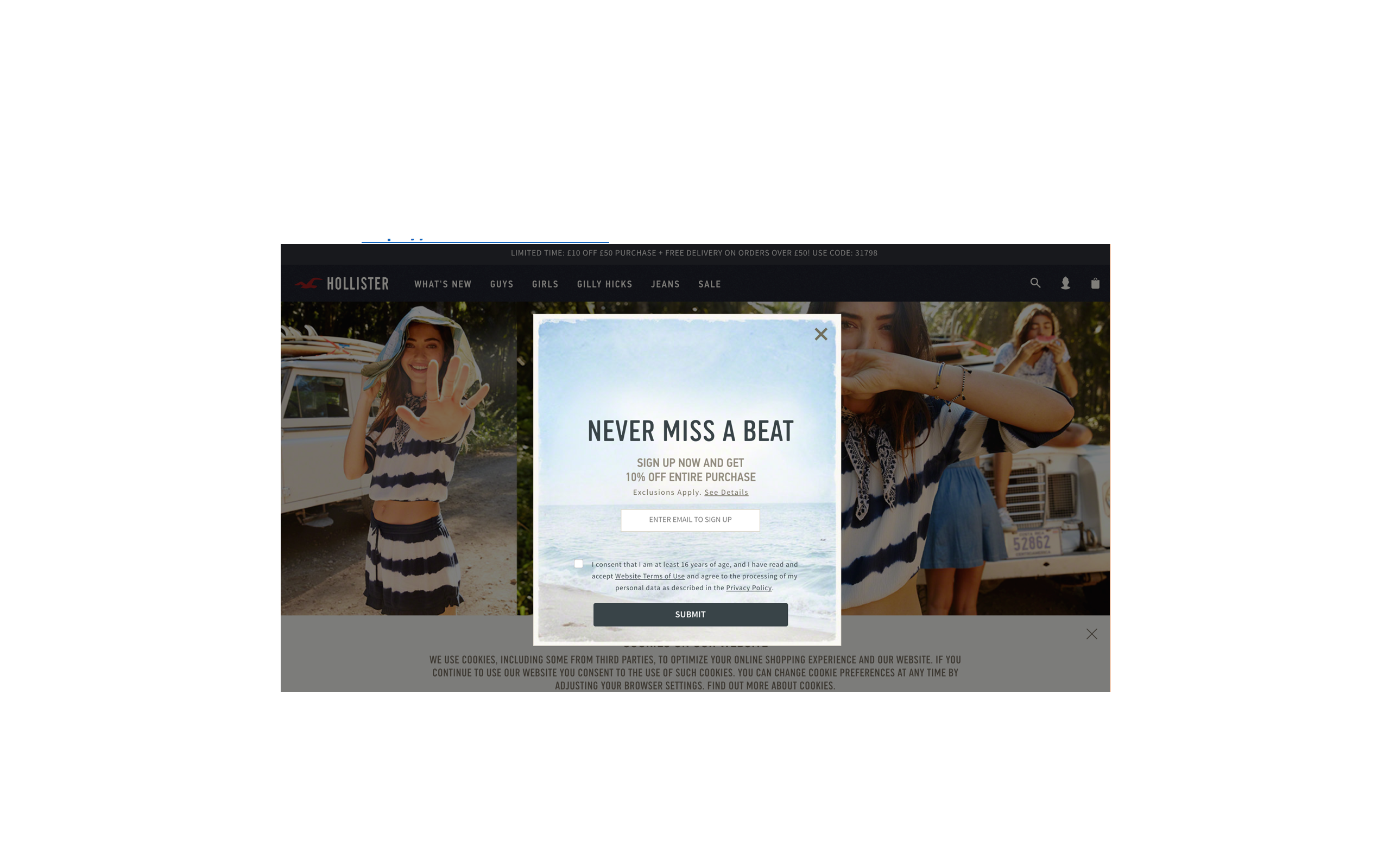 Although customer want a CTA which excites them, they want something to click on. Hollister using a limited amount of CTA’s such as ‘Shop the trend which engages customers to check out the new fashion line and a CTA ‘never miss a beat’ to get customer to sign up to receive 10% of their purchase. But this is a long process to sign up to receive only 10% off. However, their website is limited with buttons, and there isn’t a clear call to action. As well as this I don’t know if I want to click on to the new trend then suddenly the CTA pops up trying to make me sign up. In conclusion Smith (2017) states ‘buttons are what make people click and conversions happen’.
LESSON ONE: USE CLEAR BUTTONS
2. Eye catching
Though one may instantly believe that the attractiveness of a CTA depends upon its colour, font or size, in actual fact this is not the case. One extremely important factor of any CTA is its ‘verbiage’, notes Smith. Short, sharp and snappy language is what an effective CTA is built upon.
Though it may be assumed that the biggest appeal of a CTA is its color, font or size – In actual fact it is not. The verbiage is a vital factor of any CTA – the shorter and snappier the language is, the more sharp and effective it is for it to be more eye catching (Smith, 2017)
Komal Beauty uses a Wix template, it has a nice background, nice background song and all images load to a high quality. The problem with the website is that the call to action is so dull that its actually non-existent.
What does Komal beauty website look like, and what is the problem?
So here is a screen shot of the landing page and Contact page….  Looking closely at the landing page, between all the vibrant colours, texts and images, the only CTA Komal Beauty has is the ‘contact’ link. The link takes you onto the contact form where customers can leave their name, email, number and a message in order to book an appointment.
What has Komal Beauty done wrong?
Analytically, the landing page of this website is very weak given there is nothing eye catching which is going to be grabs customer’s attention. Not only are prices or offers not seen to inform customers about the treatments that are available but there is also no call to action such as any ‘click here’ or ‘book appointment’. However, there is a contact option which arguably is not striking enough as there are no imperatives or commands. Unlike any of the above examples, the CTA on ‘Komal Beauty’s’ website states ‘contact’. Now I am not being unenthusiastic, however the phrase ‘contact’ doesn’t actually cause any fireworks to happen. There are no imperatives and no commands.
What is meant by imperatives and commands?
I have no intention to tell you need to portray yourself as a dictator.
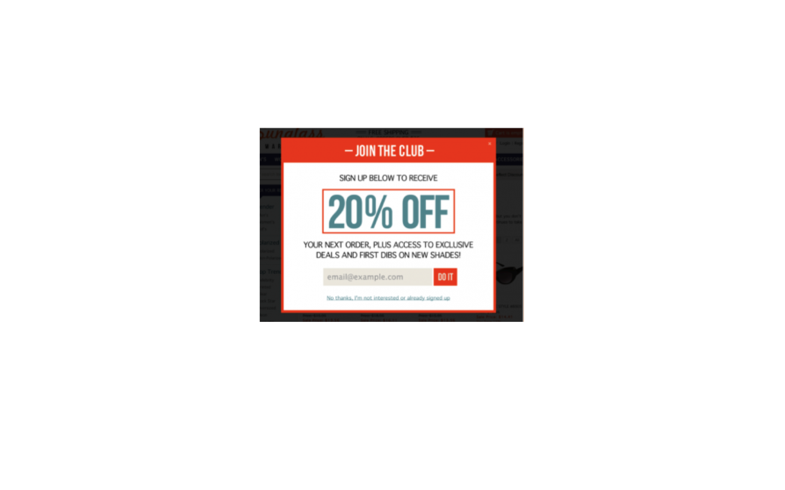 The image above expresses that using a simple ‘do it’ can be sufficient. It is not longwinded nor is it complex. The essential phrase ‘do it’ advices the viewer to enter the email address, suggesting that like the phrase the process will too be short, snappy and over with in a tick.
LESSON TWO: BE EXCITING, IMPERATIVE AND COMMANDING
Vibrant and contrasting in colour
Though best CTA are in colour, commanding the visitor to complete an action. Smith (2014) states the most effective CTA’s are one that use contrasting colours and vivid. For me to be able to conclude if Smiths research is correct. I will look at evaluating a few CTA’s, which I have received in my mailbox in the last few days.
Contrasting Colours
Ann summers

Normal Colour
River Island
 So Is Smith, Right?
Debatably, yes. Clear from the examples above, I am able to say that a CTA which uses ‘contrasting colours’ are more appealing to the eye. In comparison to the ‘normal colour’ CTA. Smith (2017) notes entire idea behind a CTA button which should draw the reader’s attention straight away. An example of this is the Ann summers CTA which uses contrasting colours, compared with the River Island normal colours CTA. Focusing on Ann summers CTA they only use blue, black and white as their contrasting colours. As the background is blue and has a white CTA. This means when you focus your eyes on the CTA your eyes will instantly focus on it, working to make you click it. In contrast to this, the River Island CTA chosen to use a variety of colours. But the main problem with the CTA is that the button is also in same way the same as the background white. As the background fades in to the image that is also white. Thus, button is not clear enough to stand out and fails to grab your attention.
LESSON THREE: USE CONTRASTING COLOURS
LET RECAPE THE THREE BIG LESSON LEARNT:
- LESSON 1: USE BUTTONS
- LESSON 2: BE EXCITING, IMPERATIVE AND COMMANDING
- LESSON 3: USE CONTRASTING COLOURS
You can also look at CTA’s positioning
Above the fold
Ecommerce pundits have long preached the importance of keeping the CTA above the fold (McEnroe 2014). Per McEnroe, the rational behind placing the CTA above the fold is ‘clear enough’. Not only will visitors of the website will immediately notice the CTA and click on it if it is at the top of the landing page, but theoretically there is also less chance of visitors either missing the CTA or existing the page before reaching the CTA.
At the bottom of the page
According to a study by Ciotti (2013), less content above the fold can actually encourage individuals to scroll to the bottom of the page. In relation to these findings, it would therefore be suggested that to increase the conversion of a landing page and encourage more content to be read, the CTA would be more beneficial if placed below the fold.
Effectively, placing the CTA lower down the page leaves the reader with more time to read and digest the content on the page before making their decision. Observed by Burstien (2012), placing a CTA below the fold, near the bottom of a page had a 20% better conversion rate as opposed to placing it above the fold. Furthermore, discovered by Goldenberg (2012), simply moving the CTA below the fold lifted the conversion rate by 304%.
AIDA
Conceptually, AIDA is based upon the notion that a visitor progresses through a series of linear steps before they make any decision to take action. So what does AIDA stand for? AIDA stands for Attention, Interest, Desire and Action.
- A: Attention- Attention of the visitors can be captured through a eye-catching and punchy headline.
- I:Interest- Interests of the visitors can be captured through many forms of content and media. This can range from videos to pictures and games.
- D:Desire –Naturally, visitors will only visit your website and continue to browse if the content appeals to them. Therefore, desire is created though the use of relative and relatable content and features on the website.
- A: Action – Finally, a strong call to action completes the process of steps. When all of the above three elements (AID) are satisfied, the call to action acts as the final straw in the process of persuasion.
Check Out This Video!
The Most Effective CTA’s
Like, Share and Comment below with your thoughts!
Follow me on Twitter for more useful Digital and Social Marketing Information @Brightondigita1
References:
- Academy, H. 2015. Call-to-Action Best Practices. Available from: https://knowledge.hubspot.com/cta-user-guide/call-to-action-best-practices [7 May 2017].
- Burstein, D. 2012. 5 Common Call-to-action Errors | MarketingExperiments Blog: Research-driven optimization, testing, and marketing ideas. Available from: http://www.marketingexperiments.com/blog/marketing-insights/call-to-action-errors.html [7 May 2017].
- Ciotti, G. 2013. 5 Landing Page Conversion Killers. Available from: https://unbounce.com/landing-pages/conversion-killers/ [7 May 2017].
- Gardner, O. 2013. Where’s the Best Place to Put Your CTA? [Case Study]. Available from: https://unbounce.com/conversion-rate-optimization/landing-page-cta-placement/ [7 May 2017].
- Moth, D. 2014. Email marketing CTA design: five good vs. six bad examples. Available from: https://econsultancy.com/blog/64997-email-marketing-cta-design-five-good-vs-six-bad-examples/ [7 May 2017].
- Shewan, D. 2016. 11 Kick-Ass Call to Action Examples, and Why They Work | WordStream. Available from: http://www.wordstream.com/blog/ws/2014/10/20/call-to-action-examples [7 May 2017].
- Smith, J. 2017. 6 Characteristics of High-Converting CTA Buttons. Available from: https://www.crazyegg.com/blog/high-converting-cta-buttons/ [7 May 2017].