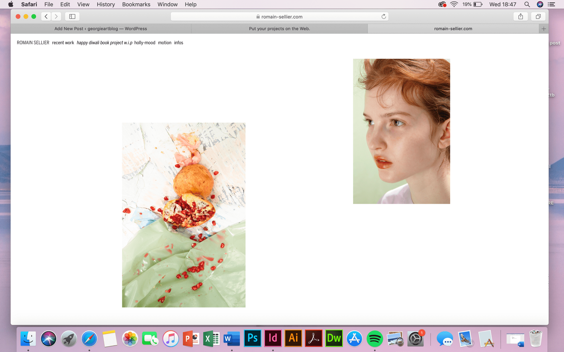
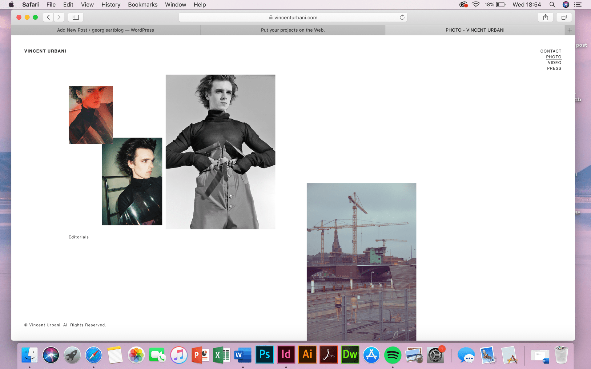
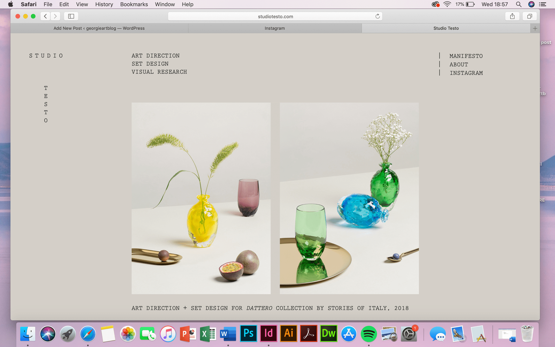
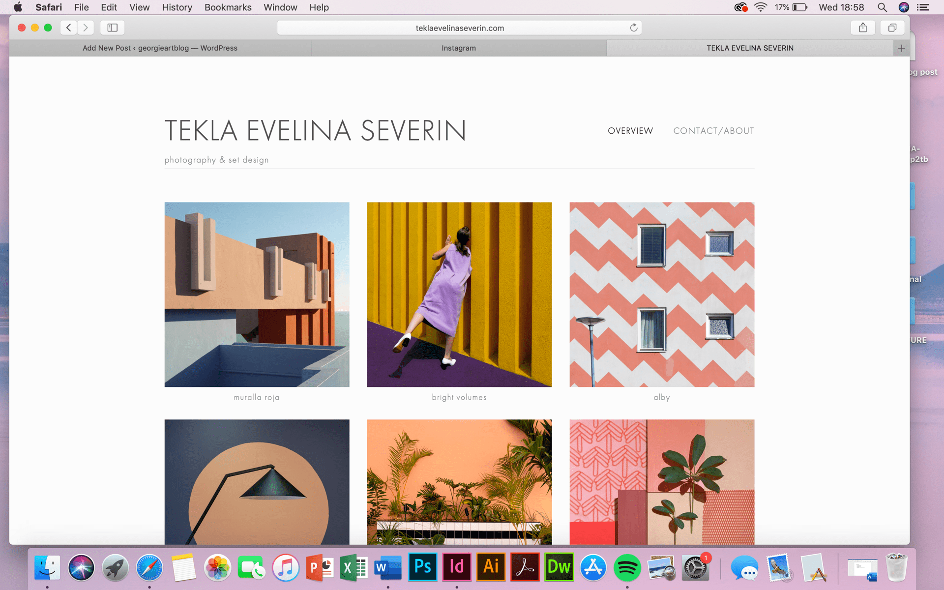
In order to create a website which I feel reflects my work in an engaging and successful way, I began by exploring various different websites. I looked into their layouts and how their websites worked in terms of navigation to gather some initial ideas. I looked on cargo collective, square space and additional websites to help. I chose to document these 4 websites because I liked their layouts, particularly the simplicity and the appreciation for white space. I think they look professional, crisp and contemporary. The minimalistic layout is something I would therefore like to mimic in my final online portfolio (website.) I think it would be an appropriate aesthetic and style considering my visuals and my design/ layout which is often a little Scandinavian looking.
sources:
- “David Duchon-Doris”. Fr, 2019, https://davidduchondoris.fr.
- “Oak”. Com, 2019, http://oakthenordicjournal.com.
- “TEKLA EVELINA SEVERIN”. TEKLA EVELINA SEVERIN, 2019, http://www.teklaevelinaseverin.com.
- “Studio Testo”. Com, 2019, http://www.studiotesto.com.
- “VINCENT URBANI”. Com, 2019, https://vincenturbani.com.
- “Romain-Sellier.Com”. Romain-Sellier.Com, 2019, https://romain-sellier.com.


