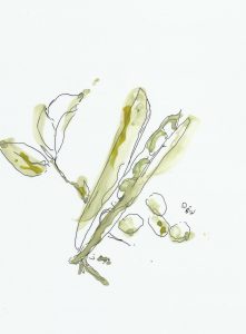
The illustrations displayed are those that I have created for peeled magazine. The food illustrations are for the recipes in the magazine, whilst the figures is for the article ‘mind, body and soul.’ I am particularly pleased with the food illustrations as I feel they will work well as part of a layering layout behind a layer of brown paper with an altered opacity to achieve the correct effect.


