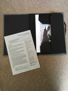
For my Portfolio, i found it difficult to do research because i already knew how i wanted it to look: very simple. The reason behind is when i was thinking about me as a brand and what i wanted to portray and what my work already looked like, the things that stood out were: Understated, Neutral Colours, Elegant, Minimal. Any shoots i’ve styled ive always kept the styling very simple and minimal and i noticed that the general colour scheme running through my work was greys, browns, beige and some blue. And so i wanted my branding to display this. Therefore the research i did was limited because the aesthetic i was going for was so plain.
Font was a big decision because i needed something that was simple and elegant but still bold and would stand out. I like sans serif fonts and love the Balenciaga logo, Mark and I scrolled through loads of fonts during a tutorial and helped me decide on Gotham. perfect.
Wherever i have used this font i have avoided black as its a bit too strong, instead using very dark grey, with the exception of my postcards where i used a dark brown as it matched the image better.
I used Gotham throughout all my branding and also Arial for some text on my website and CV. I know everyone bashes Arial but its actually really nice, its almost identical to Helvetica which every raves about! Especially since Off-White have created a whole brand around Helvetica, using the font to label all of their garments, its become a signature look for them.
I used a consistent colour palette of dark grey throughout.
I didn’t want to write about my shoots because i wanted to keep the mystery and give people the chance to wonder and imagine their own narrative. And after all if i’m in interview and my interviewer wants to know about the concept of the shoots i have the opportunity to explain in my own words at the time. I think that’s better aswell because it can lead to a conversation about the work and a more genuine response.
I chose this portfolio case (and size a4) because i wanted something that was easily portable and not too complicated, something simple to just grab and take to interviews, easy to look at, easy for me to carry and easy to replace if the cover wears out over time. I chose the grey colour to match my branding, and also because it was a it less harsh than all black which would have been too serious and a bit boring.
I printed my images at Repographics on coated 160gsm paper, this is thick enough paper so its sturdy. Since my portfolio is loose sheets it seemed a good idea to print on thicker paper. I left a wide border around all images for a clean look, but kept each page simple so its all about the image. I added credits to any collaborators at the bottom along with what my role was in the shoot.
I took my portfolio with me to the interview i had at Holmes Production, I felt very confident with it by my side, happy that it was a good representation of me. I did get the internship and looking forward to it a lot, and will be updating my portfolio after, ready to apply for more industry experience!

