
Uncategorized
PORTFOLIO- LINKED IN PROFILE


PORTFOLIO- UPDATED CV


CV- UPDATING MY CV
-Clean design
– Don’t clutter it up
– Don’t pad it out with over design and information • It’s design represents your creative talent.
– Have a QR code to your website or Instagram
– Should match all of your other banding.
– Have a downloadable version on your website.
My CV needed updating as I have since developed new skills, experience and some of my desired future employment aspirations have changed. I changed minor details such as the font my name was in at the top of my CV so it would match the rest of my other branding and resembled my logo. I also added a QR code to my website, this was to make my CV appear professional and interactive. It also allows the employer viewing my CV so quickly access a large variety of my work online from their mobile device. I then altered some of the text which outlined my interests, skills and background. This was becuase it orignally described my passion for wanting to work at a modeling agency for my placement year internship, however since undergoing that I now have hopes to gain a job in the industry after completeing my degree. I then added some more skills which I have gained in my final year at university and completed my CV by adding the company i worked at for my intership and what my duties were. I also added some of my recent portrait photography to show some of my style and standard of work. What stands out about my updated CV is it is a lot more informative, visual such as now having a QR code and images of my work and fuller because i have added more work experience. I feel my CV says a lot about myself through the way i have designed it and information i have provided. It states I am a postive, creative and determined individual but i also believe it shows that trhough the images i have chosen to show and the use of a QR code. I feel reassured by my updated version quality because it looks professional, clear and outlines my best qualities. I also feel i have matched it to my branding my using my logo, keeping it minimal and not to extravgrant but also adding imagery which showcases my photography. Overal the feedback recieve on my CV has been positive, it is clear, organised and to the point but also has some exciting and interactive features and visuals. Although it could be experimented with furhter or made more creatively, I feel it is consistent and matches my brand indentity.
PORTFOLIO- POSTCARD

portfolio- Designing My Business Cards


I designed three different business cards and experimented with layout, images, compostion and themes. For the front of the first business card i place a strong photograph from my recent works in the centre, leaving some space around the sizes as a white border and my name in a large font at the top of the card. I wanted to carry phone my theme of minial which i feel i excuted on my social media and website so my brand identity flowed. I use one image on the front of business card so if will give people a taste of my photographic style and skill but also not give away to much infomation and hopefully keep people wanting to see more. For the back of the card i decided to design it landscape so the card would have to be flipped to be read. I kept the theme minimal but also kept the kodak portra theme from the image used on the front and photoshopped it as a border for the back of my business card. I like how this portrayed an element of my style of photography but also made my profession clear in a creative way. It also added some colour and exctiement to the business card. I like the way it cropped the important text on my card and gave the impression of a film camera. I then placed my logo and ‘photographer’ underneath in the centre of the page, aligning slightly more to the right. I purposely made my logo slightly larger so it was the main focus and made my name memorable. I think it is important to state your profession on your business card so people are clear of what field you work in. I then added my contact details such as email, instagram, phone number and QR code of my website. The QR looks professional and enables people looking at my card to be interacive and quickly access a large variety of my work on their phones.
After designing my first business card i felt condient to practice making another one and to add some improvements. For my second business card i decided to kept the card in portrait as a lot of my work is photographed this way making it easier for my images to be viewed correctly. I deicded to use an image i felt was strong and also showed my street style photography and styling talents. For the back of the business card i kept it portrait and used another image from the same shoot to compliment the image of the front and show a different style such as close up portrait shot. I then cropped the image into a cirlce shape and placed my initals on top to add a interesting shape and creative elemet to my business card. it also makes the back of the busoness card look more excting and full. I then added my contact detail and professions. I also added theinstagram logo next to my account handle for people who may not be aware what social media it is for and a QR code in red for quick access to my website and to add more colour which compliments the images used. For this business card i woud print it with a glossy finish to the image is in good quality and the card has a professioanal, clean feel to it.
For my final business card i wanted to add some more of my photography work so make the business card more visually striking and visual. To do this i added 4 images with kodak portra boarders onto a black background to appear as a film strip. I like how this allowed a variety of images to be seen at once and enable to showcase more than one of photographs at once. For the back of the business card i stuck of my originail theme of keeping it minimal and place my logo at the top and contact details at the bottom. I like how the white space in the middle kept the card minimal but still enable the card to have all the correct contact information i needed. I added a small tocu hof colour with the instagram symbol to and to indicate which social handle it was for and kept the QR code black to mathch the front fo the card.
portfolio- business cards
– Appropriate font, shape, size
– Suitable design
– Consistency throughout brand, website, social media, business card
– Make it indvidual
– Contact details
– Social Media handles
-QR code
– Job title
– Texture, colour, design
– Easy to read
– Images
portfolio- my social media insights


When switching my instagram account to a professional one i am able to access ‘insights’. The insights can show me how many people have visited my profile, liked posts, commented, saved or interacted with the account. This helps we remain aware of which type of content is recieving the post postive feedback and it tracks how i am expanding my online presence and plaftorm overtime.
portfolio- How do i use social media


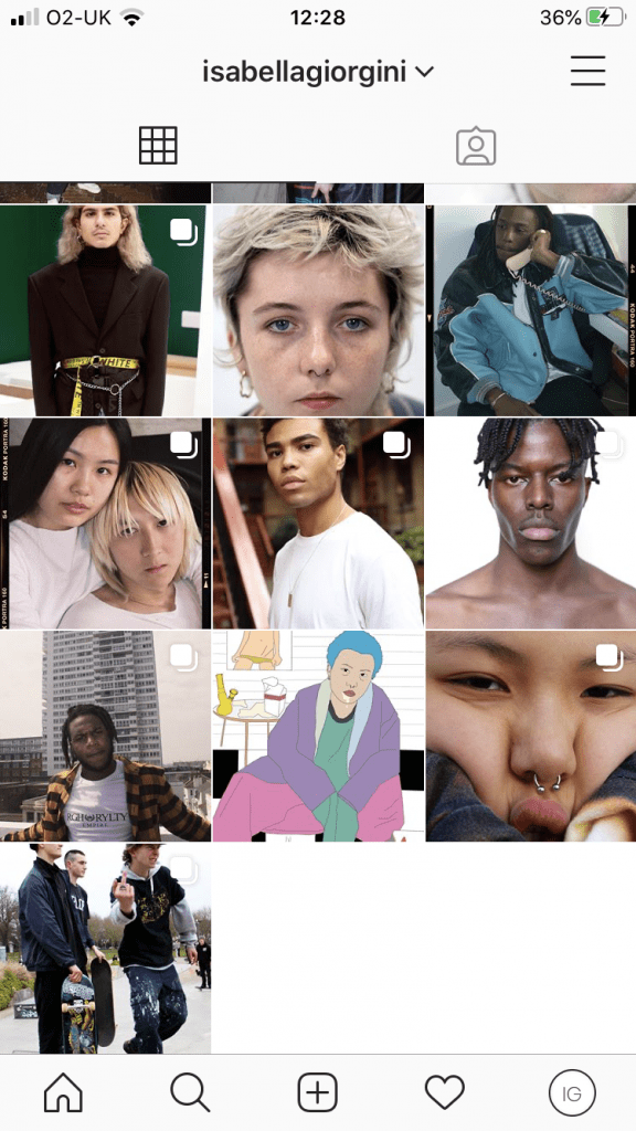
Young adults, espesically other classmates and students who are creatives or have similar interests such as photography and styling are my audience.After researching other photographers social media accounts, instagram is often their only platform along with their website. Being a photographer and stylist i feel instagram is only the platform i will use as it is based on images and visuals. I feel i can use features such as stories or captions when i want to communicate with my audience or share important infomation. I also feel instagram is the platform most of my audience will be familiar with using and will be more active on than sites such as twitter and facebook. It is also easy for people to contact me, share my photography,scout models and make connections.
As soon as i have new content i will post it, sometimes i will post more than once in one day and if i want to share a lot of images from the same shoot i will use the ‘multiple post’ feature so i do not post too much at once.My instagram account strongly carries through my brand identity and maintains up to date. I feel I am posting my content in a way that forms a structured, organised page by uploading images from the same shoot at the same time so they appear together on my page in the grid layout. I am engaging well with my audience by following people back. If i was to imrpove my instagram i feel i would need to work on my captions and make more use of the story feature.
My audience is enaging with me through following and liking my posts. When originally making my page it took me a while to gain follows and i am yet to receive comments but i am commenting on our peoples posts and liking them in the hope they will come across my page and do the same.
Once my brand developes I will reach out to key influencers on instagram such as models or model agencies and work with them. As my work is very portrait based i feel if models re post photographs from shoots it will gain me a lot of exposure and followers to help support and buld my instagram further. Tesitng with modeling agencies may mean my work is posted and tagged on their instagram which may make me recieve more work with other agencies and increase my followering and reputation.
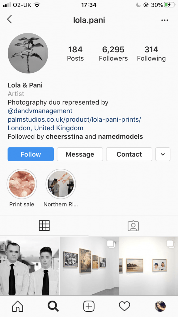
portfolio- lola and pani

Lola and Pani are a more well known photography duo, i consider them a competitor as their work often captures youth culture which is a similar to mine. I think their audience is young adults with an interest in art and photography.Instagram is the only platform they use alongside their website but their work also features on another account @dandvmanagement who they are represented by. They post often, every few days but share less on the instagram story feature. They engage with their audience by liking comments on their posts but rarely reply back.However the captions on their posts often include ‘thank you’ to other people, for example id magazine for featuring their work or galleries whcih have given them spaces to showcase their work. They also keep their audience up to date with print sales or inform them when a print has sold out by posting. They tag their models instagram accounts in their posts and sometimes post their names in the captions.