Digital Marketing

Author: Beth Young

(APP)ealing to your customers “anytime, anywhere”; How a branded app will increase customer engagement and retention

A branded app by definition is ‘software that is downloadable to a mobile device and prominently displays a brand identity throughout the user experience’, (Bellman et al, 2011).

By creating a branded app, firms can take advantage of “anytime, anywhere” engagement, which can ‘promote consumer engagement and loyalty’, (Kim, Wang & Malthouse, 2015).

However, if the app isn’t received well by customers, then it could have detremental effects to the brands image.


This blog is a summary of the tips and risks involved when creating a branded app to increase customer engagement…

  1. Make sure the CUSTOMER REMAINS CENTRAL TO EVERY DECISION

No matter how much time you put into developing the perfect app, if your customer doesn’t enjoy/engage with it then they are likely to abandon it.

  • Firstly it’s important to understand what your target market wants from your app through market research!

For example…According to a study by Bellman, et al., ‘apps with a user-centered style’ are more effective since this focuses attention on the user, and encourages personal connections with the brand, (2011).

And Dillard et al., suggest encouraging engagement by ‘providing a chat box for customer service’, creating an open line of communication, (2012).

  • If the app succeeds in fulfilling the customer’s needs, then it will encourage ‘flow’, (Csikszentmihalyi, 1975). Flow occurs when a customer is so heavily engaged with a platform they lose track of time/awareness of any other external factors.

… The more the customer enjoys the app, the more likely they are to return due to their commitment towards the brand, resulting in ‘increased purchase and loyalty’ (Evanschitzky et. al., 2012).

Tip: Simplicity is key!.. A study by Levenson, (2016) emphasises the importance of ‘the principle of least effort’ .. in other words, it highlights how customers prefer a simple journey through an app, including sign up, log in, and purchasing pages.


In the figure below, Fang highlights the affordances of a branded app, showing the inputs that increase overall customer loyalty, and the resulting effects, (2018).


  1. Utilizing PUSH NOTIFICATIONS

Push notifications are a fundamental channel for communicating with the customer. According to a study by Urban Airship, ‘sending even more (high value) push notifications can increase app retention rates by 3 to 10 times’, (2017).

  • Furthermore, the same study suggests that personalised notifications, for example using a customers name or favourite product, are much more likely to improve customer retention in the long term, since a personal relationship has been established.

The theory of effective frequency suggests users will be more likely to return to the app/think of the brand when browsing since they have been exposed to it more often. As confirmed by Schmidt, et al., ‘massed exposures in advertising enhance the repetition effects on recall’, improving customer retention, (2015).

  • Push notifications also present the opportunity for in-depth, complex analytics, identifying click-through rates, interaction times and user behaviour..all key for making improvements.

Tip: Different types of push notifications should be previously A/B tested to suit your target market..

Learn how to A/B test here

  1. Related image

(Source: Moovweb)

3. Create a strong MOBILE VALUE PROPOSITION

A value proposition is what differentiates your app from competitors and is likely to be the main/unique reason your customers will stay engaged.

  • Make sure your aims are focused and your whole team is aligned with them.

Meritt introduces the idea of simply using the phrase, ‘My brand’s mobile app helps users [detail the unique value, utility and relevance it offers]’ and filling in the blanks, (2019).

If you’re having trouble defining your value proposition, watch this short video..

With every new venture, there comes some RISKS..

 1. The risk of APP ABANDONMENT

  • An article by Chen et al., identifies the main reason for app abandonment as being the abuse of push notifications. The study explains how users felt ‘affected by information overload and intrusiveness’ from some push notifications, (2019).

(To avoid this: Make sure you do your market research and communicate to the customer throughout the app development, both before and after launching. A/B testing is also key.)

  • In addition, a survey in 2016 suggests another ‘major reason for app abandonment is that customers do not tolerate even a single bug in an app’, (Wang, et al.).

TO NOTE…when evaluating other secondary sources it must be acknowledged that the type of consumer group will impact behaviour. Therefore, the results may not directly correlate to your target market, and further research into the exact market may have to be conducted.

(However, first impressions are still key, and so pilot testing your app prior to the launch is the perfect way to catch any glitches.)


2. Impact of APP DISENGAGEMENT

  • In a study by NorthWestern University, ‘research shows, if consumers disengage from your app, that means they may disengage from your brand and purchase less than they did before downloading the app’, (2019).

(To avoid this: Again, always utilise all your market research so that you are creating suitable content to meet customer needs & DO NOT rush the development stages as there’s no point taking risks!)


..So don’t waste the opportunity to get your “brand in the hand” and engage your customers, (Sultan and Rohm, 2005).


References:

  1. Bellman, S., Potter, R.F., Treleaven-Hassard, S., Robinson, J.A. and Varan, D., (2011). The effectiveness of branded mobile phone apps.Journal of interactive Marketing25(4), pp.191-200.https://doi.org/10.1016/j.intmar.2011.06.001 
  2. Chen, J., Tran, A. and Nguyen, T. (2019). Understanding the discontinuance behavior of mobile shoppers as a consequence of technostress: An application of the stress-coping theory. Computers in Human Behavior, 95, pp.83-93. https://doi.org/10.1016/j.chb.2019.01.022.
  3. Csikszentmihalyi, M. and Csikszentmihalyi, I., 1975.Beyond boredom and anxiety (Vol. 721). San Francisco: Jossey-Bass.
  4. Evanschitzky, H., Ramaseshan, B., Woisetschläger, D., Richelsen, V., Blut, M. and Backhaus, C. (2011). Consequences of customer loyalty to the loyalty program and to the company.Journal of the Academy of Marketing Science, 40(5), pp.625-638.https://doi.org/10.1007/s11747-011-0272-3
  5. Eyal, N., 2014.Hooked: How to build habit-forming products. Penguin UKpp.4.
  6. Fang, Y. 2018, “An app a day keeps a customer connected: Explicating loyalty to brands and branded applications through the lens of affordance and service-dominant logic”, Information and Management. https://doi.org/10.1016/j.im.2018.07.011 .
  7. Levenson, H. (2016).Why are Mobile App Users Abandoning your App?. [online] Webanalyticsworld.net. Available at: https://www.webanalyticsworld.net/2016/08/why-users-are-abandoning-your-mobile-app.html(Accessed 13 Feb. 2019).
  8. Levenson, H. (2018).The Principle of Least Effort: An Integral Part of UX | Appsee Blog. [online] Appsee Blog. Available at: https://blog.appsee.com/the-principle-of-least-effort-an-integral-part-of-ux/(Accessed 13 Feb. 2019).
  9. MBA Skool-Study.Learn.Share. (n.d.).Effective Frequency Definition | Marketing Dictionary | MBA Skool-Study.Learn.Share.. [online] Available at: https://www.mbaskool.com/business-concepts/marketing-and-strategy-terms/13155-effective-frequency.html(Accessed 12 Feb. 2019).
  10. Meritt, A. (2019). 4 simple strategies of becoming an even better mobile marketer. [Online] Available at: https://www.urbanairship.com/blog/four-simple-steps-to-becoming-a-better-mobile-marketer(Accessed 11 February 2019).
  11. Salvesen, A. (2015).https://people.com/. [online] PEOPLE.com. Available at: https://people.com/chica/lin-manuel-miranda-vanessa-nadal-love-story/(Accessed 14 Feb. 2019).
  12. Schmidt, S. & Eisend, M. (2015), “Advertising Repetition: A Meta-Analysis on Effective Frequency in Advertising”, Journal of Advertising, vol. 44, no. 4, pp. 415-428.
  13. Sultan, F. and Rohm, A., 2005. The coming era of” brand in the hand” marketing: The growing popularity of cell phones and other hand-held mobile devices has opened up new marketing possibilities. MIT Sloan Management Review47(1), pp.83-91.
  14. medill.northwestern.edu. (2019). What’s to Lose? The Dangers of One Bad App – The Medill IMC Spiegel Research Center. [online] Available at: https://spiegel.medill.northwestern.edu/branded-app-roi/dangers-of-bad-app.html(Accessed 14 Feb. 2019).
  15. Sundar, S.S., Oh, J., Kang, H. and Sreenivasan, A., (2012). How does technology persuade?: theoretical mechanisms for persuasive technologies. InThe Sage handbook of persuasion: Developments in theory and practice(pp. 388-404). SAGE Publications Inc.
  16. Urban Airship. (2017).New Urban Airship Study Reveals App Publishers that Don’t Message Users Waste 95 Percent of their Acquisition Spend. [online] Available at:https://www.urbanairship.com/company/press-releases/new-urban-airship-mobile-app-retention-study(Accessed 12 Feb. 2019).
  17. Wang, B., Kim, S. and Malthouse, E.C., (2016). Branded apps and mobile platforms as new tools for advertising.The new advertising: Branding, content, and consumer relationships in the data-driven social media era2, pp.1-39.

Critical Audit of the Gymshark Website

Gymshark Ltd. as a company attract a specific target market through their image and branding. Unlike other gym-wear companies, Gymshark has solely grown from social media, and remains heavily based around the increasingly popular phenomenon of using influencers as a marketing tool, giving them the title of ‘GymShark Athletes’.

(Source: Gymshark Instagram, 2018)

In the era of millennial marketing, social media remains at the forefront of many campaigns, and their website is the perfect example of this. An article by Forbes discussing millennial marketing identifies, ‘inspire them to act’, as one of the eight main strategies, (2017). GymShark aims to inspire, with their slogan, ‘be a visionary‘, in the centre of their landing page. The website appeals to millennials by using only young, athletic models, as well as more physical attributes such as their landing page and site being mobile-friendly.

(Source: Gymshark Instagram, 2018)

They have inevitably caused significant market segmentation through their specific branding. By segmenting the market to attract a younger customer with interests in fitness, they are relying heavily on appealing to such a small percentage of the market.


Competitors

Competitors such as ‘Lulu Lemon‘ and ‘Adidas‘ appeal to a much wider audience through their website branding, using a more diverse range of models/bodies/demographics, and age.

(Source: Adidas.com)

Despite this, GymShark have excelled in their approach, with 7.2M visits to the webpage so far this year, (similar web, 2018).

The site is set out with a ‘user centred design’, (Preece, 1997). It is clear, with pragmatic ads, and a user-friendly online chat option, allowing customers to engage with a GymShark representative. Both competitors  have also taken this approach.

The site differentiates itself through the GymShark central page, creating an effortless opportunity for customers to experience ‘flow‘, (Csikzentmihalyi, 1997). GymShark central is a hub for sharing journeys, blog posts, and more on the website, where the user – most likely fitness orientated – can get lost in a world of GymShark. Competitors, ‘Lululemon‘ or  ‘Adidas‘ who both attract a larger customer base do not have anything like this on their main site.

( Source: Gymshark.com)

The importance of designing specific web environments, leads to responses including ‘enjoyment, purchase, and satisfaction’, (Mckinney, 2004).

The GymShark desktop page offers an extra option for express checkout, yet this feature is not offered on the mobile platform. If Gymshark integrated this feature for their mobile customers, they could engage with a wider customer base, potentially increasing sales. As according to Bullock, ‘the more quick and easy to use your website is, the more likely customers are to return’, (2018).

With such an influence over social media it would be easy for them to measure the success of any changes by checking the difference in comments or social shares.


Analytics

Their site analytics as according to similar web, (2018), show almost half of their traffic is from search, with 98.77% of this total being organic searches. Such a high proportion of organic searches suggests their social media campaigns and influencer impressions are a success. Unlike competitors, all of their sales – aside from their very occasional pop-up shops-  are solely conducted online, which has a colossal impact on increasing web traffic.

(Source: Similarweb, Nov 2018)

GymShark’s website bounce rate is currently 27.83%, (2018). This is the lowest by far in comparison to  both competitors – Adidas being 48.02% and LuluLemon at 33.47%.  According to a blog by Peyton, a bounce rate under 30% is ‘indicative of a well built, professionally designed website that is meeting its users’ needs’, (2014).

With such specific segmentation, three very possible web personas can be formed.

1 (Lily) 

  • Young woman, 20
  • Frequent Gym User – Runner
  • Fitness lifestyle
  • Introduced to GymShark through GymShark influencer she follows online

2 (Tom) 

  • Young man, 23
  • Frequent Gym User – Bodybuilder
  • Saw another man at the gym, wearing full GymShark outfit

3 (Jess) 

  • Young woman, 18
  • Starting fitness journey
  • Saw Viral Promo vid

These persona’s will all have their individual customer journeys through the website.

As seen on all three journeys, the website is a gateway to open communication with customers through future email marketing, introducing users to the ever-growing world of GymShark.


References:

  1. Bullock, L. (2018). Why your website is not converting into sales – and what to do. [online] LilachBullock. Available at: https://www.lilachbullock.com/website-converting-sales/#usability [Accessed 8 Dec. 2018].
  2. Csikszentmihalyi, M. (1997). Finding flow in everyday life. New York: BasicBooks.
  3. https://www.similarweb.com/website/gymshark.com#search
  4. McKinney, L. (2004). Creating a satisfying internet shopping experience via atmospheric variables. International Journal of Consumer Studies, 28(3), pp.268-283.
  5. Millennial Marketing. (2018). Who Are Millennials | Millennial Marketing. [online] Available at: http://www.millennialmarketing.com/who-are-millennials/ [Accessed 8 Dec. 2018].
  6. Oppland, M. (2018). Mihaly Csikszentmihalyi: All About Flow & Positive Psychology. [online] Positivepsychologyprogram.com. Available at: https://positivepsychologyprogram.com/mihaly-csikszentmihalyi-father-of-flow/ [Accessed 10 Dec. 2018].
  7. Peyton, J. (2014). What’s the Average Bounce Rate for a Website?. [online] Rocketfuel2014. Available at: https://www.gorocketfuel.com/the-rocket-blog/whats-the-average-bounce-rate-in-google-analytics/ [Accessed 12 Dec. 2018].
  8. Pixlee. (2018). Definition: What is a social media influencer?. [online] Available at: https://www.pixlee.com/definitions/definition-social-media-influencer [Accessed 4 Dec. 2018].
  9. Preece, J. (2000). Online Communities: Supporting Sociability, Designing Usability. 1st ed. Lincoln; United Kingdom: John Wiley & Sons.
  10. Support.google.com. (2018). Bounce rate – Analytics Help. [online] Available at: https://support.google.com/analytics/answer/1009409?hl=en [Accessed 10 Dec. 2018].

The Role of E-mail Marketing – Pretty Little Thing Example


According to a study examined by Chadwick and Doherty, there are many different tactics used within email marketing in order to draw in customers from the email to the landing page of the website, and the whole way through the process until they have completed the transaction.

There are of course many ways of completing this process, and companies are having to become more creative with every email they send.

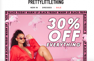
I have chosen to examine  a personal email I have received from Pretty Little Thing (PLT), which is attempting to market the brand to me, and includes an abundance of executional tactics.

The first tactic visual to myself as a customer is the use of personalisation within the subject line, with the use of my first name, ‘Beth’. According to Chadwick et al., this concept has been ‘developed from print advertising’ , and attracts the customer as they feel the content of the email is personal to them, therefore making it seem more important, (2012). The subject line is the first point of contact and acts as the trigger to encourage customer click-through.

Once clicking to open the email, it takes you directly to the open email. The open face of the email is striking with the combination of a bright pink background, repetition of the logo and the moving animation in the middle of the screen.  Animation, again, is another widely used technique and adds some excitement to the email. As well as this, it is a low cost, high impact addition to their marketing campaigns.


The main body of the email is image heavy, and contains minimal text. The content is based around the product that they are marketing – clothes. Therefore, they have decided to use the space to their full advantage and showcase what they label as their ‘hot right now’ pieces. This keeps the email current and entices the reader by showing fashionable pieces, that other customers are buying. Furthermore, the use of the ‘30% OFF EVERYTHING’ as a large image is unmissable when opening the email. PLT have done this as again a large discount will trigger a customer to click through to their website and possibly purchase.

Finally, when scrolling further down to the bottom of the email, PLT provides the customer with ways to follow and get in touch. They have visualised an image of a polaroid, and showcased through the use of a rotational animation, four poignant images that highlight their new collections directly from their instagram. This feature not only encourages the consumer to follow through to look at these clothes on the website, but also get in touch and follow their social media. To make it even easier they have included a hyperlink that consumers can use to follow them. The use of linking alternative social medias is extremely important for brand conscious companies, as they are once again growing their outreach, and are then able to market on even more platforms.


I am a Business with Economics student, studying Digital Marketing at Brighton Business School.

‘Jagger & Stone’ – Critical Website Analysis & Personas

Jagger & Stone


Jagger and Stone  is a small start up clothing company based in Australia. Since they are in the first stages of growing their company their website does not have as much content as a worldwide renowned company, for example ASOS. I will define the role of the website, highlight important segments on their website, define their main web personas, and offer suggestion to help improve their customer traffic.


Role of the website

The website is for promoting and modelling their clothes. They have pages of pictures with their prices, stock levels and collections. As well as this, customers are able to purchase their clothes through the website using a third party checkout company or PayPal.

Important customer segments

The main target customer segment is young women approximately 16-30 who are fashion conscious.

Key Personas – used to increase usability and customer centricity

Main Persona 

  1. Attributes; Female,  Typically between 16-30 age gap, Fashion orientated
  2. Stereotypes/Design Targets;  Follows trends, likely to be tech savvy and therefore browse on both their laptop and mobile (on-the-go). Predominantly based in Australia as that is where the start-up company is based. However, Jagger & Stone is widely publicised on social media and is therefore worldwide.
  3. Scenarios; – Scenario A, the persona is merely information-seeking. They have logged onto the website to browse. The website therefore has great affect as to wether this customer purchases and/or returns. – Scenario B, the persona is a first time buyer. The main importance in this scenario is customer retention to make sure they come back. For example, Jagger and Stone could send them a follow up email with a promotion for their next purchase. – Scenario C, the persona is a returning buyer. In this circumstance they have likely enjoyed their website and goods and have returned through loyalty. Even though J&S have already achieved that retention from them, they must make sure not to take it for granted, as then they will lose their future custom. It may be beneficial to keep their email contact for future promotions.


My suggestions to help grow their website

I think it would be beneficial to add more sections/content to their page to help its growth, as it’s very minimal at the  moment with not too much for customers to browse through. Customer’s are likely to get easily bored and disconnect themselves from brands who are not regularly updating their content – especially in the rapidly changing fashion industry.

I also feel it would be beneficial to them as a start-up business to have a promotional pop-up to join their mailing list when logging onto the site. It is well known that companies can best promote their products through emails, to share any updates, new collections etc. However, it is also apparent that customers are more likely to click on and respond to emails that they have opted in to receiving – instead of just spam.


I am a Business management student studying at the Brighton Business school.

IKEA & The socializers ; Becoming a truly socially intelligent operation

who forms a part of the chain?

  1. IKEA a multinational corporation, with over 160,000 employees, 365 stores, in 42 countries.
  2. The Socializers define themselves as a global group of  like minded people that help pioneer social change within companies.
  3.  Brandwatch is a social media monitoring company who gather social data and provide deep insights on consumer opinions.


SuMMary of the case study

  • IKEA, although already a successful multinational organization felt they were out of touch with consumer feedback on social media.
  • In order to fix this connection, they employed the Socializers insight.
What can you learn about the application of data to marketing?
  • It’s difficult for a big multinational company to share data throughout a company seamlessly without the help of a third party; e.g. Brandwatch.
  • As technology is ever-growing, and tech becomes fundamental to a companies outreach and growth, social data must be utilized to benefit their marketing.
what can you find out about Brandwatch?
  • Highly customizable platform for social-media.
  • Gathers millions of online conversations to help brands analyze social data in order to make ‘data-driven business decisions’.
  • Used by over 1000 brands worldwide, including Sky, British Airways & Pepsico.
  • Won awards for its technology and renowned corporate culture.
Other comparable services
  • There are many comparable services to Brandwatch; including, Sprinklr, AI powered, customer insights, Talkwalker, NetBase
IKEA; The Listening Hub

I am a student of Brighton Business School.

Hello world!

Welcome to your brand new blog at University of Brighton Blog Network.

To get started, simply log in, edit or delete this post and check out all the other options available to you.

For assistance, visit our comprehensive support site and check out our Edublogs User Guide guide.

You can also subscribe to our brilliant free publication, The Edublogger, which is jammed with helpful tips, ideas and more.

Copyright © 2024 Digital Marketing

Theme by Anders NorenUp ↑

Skip to toolbar