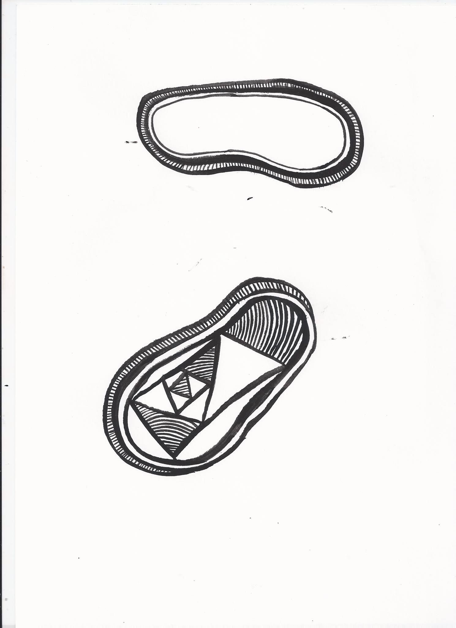
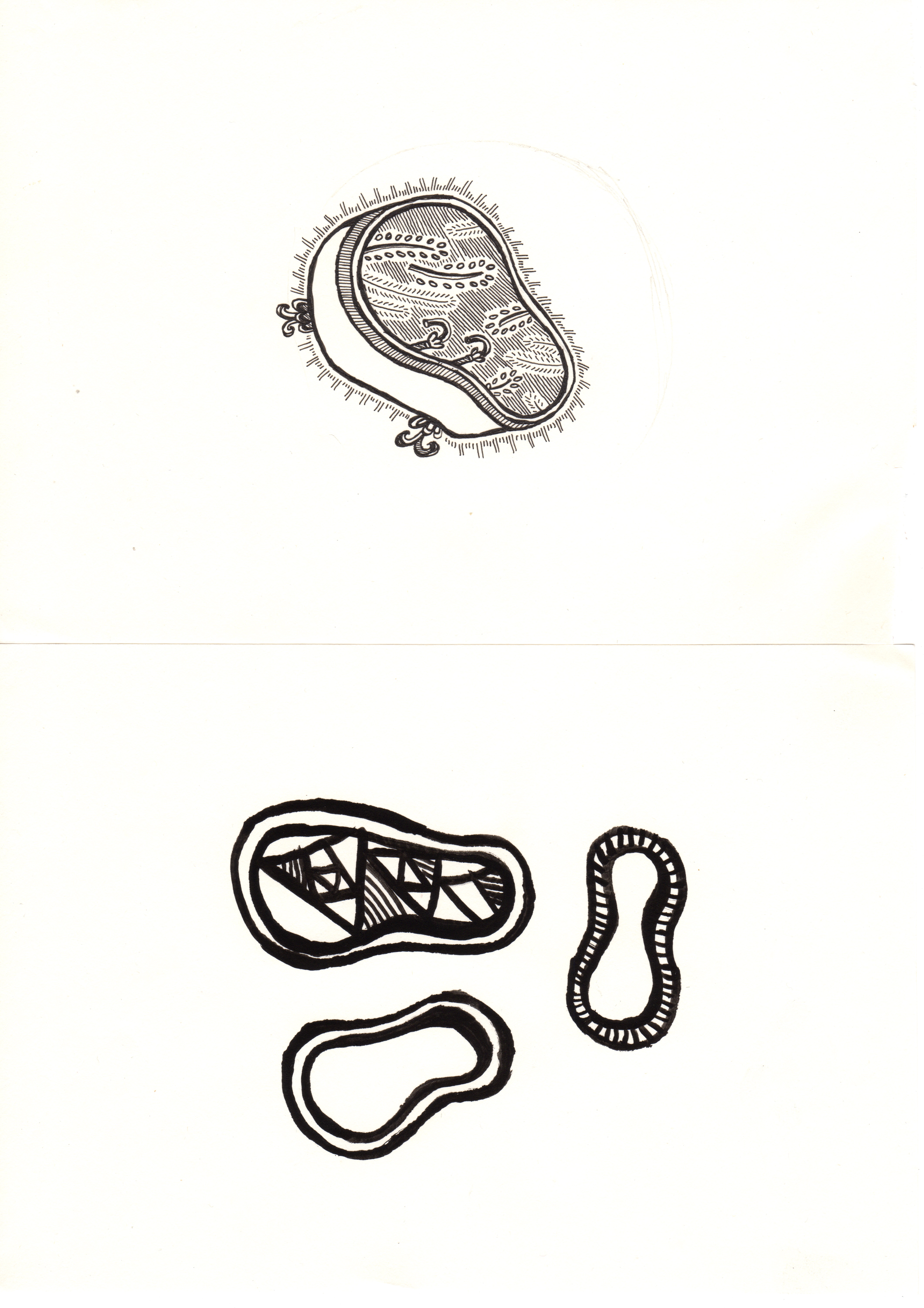
As I was working with quite abstract concepts, I decided to think about abstraction, from my previous drawings of the Baths; I firstly started by eliminating some of the pictorial quality, and focusing on the shapes and forms of the baths. In my work so far, I have often struggled to use colour, so usually stick to grey scale, I wanted to challenge myself, so I contacted a colour palette that I wanted to re create these abstract patterns in. The colour Palette I chose was mainly warm pink and yellow toned colours, I wanted it to add warmth to the black ink patterns I had already drawn, to kind of mimic the premise of the origional bath drawing, about replacing the warmth of the bath for human contact. 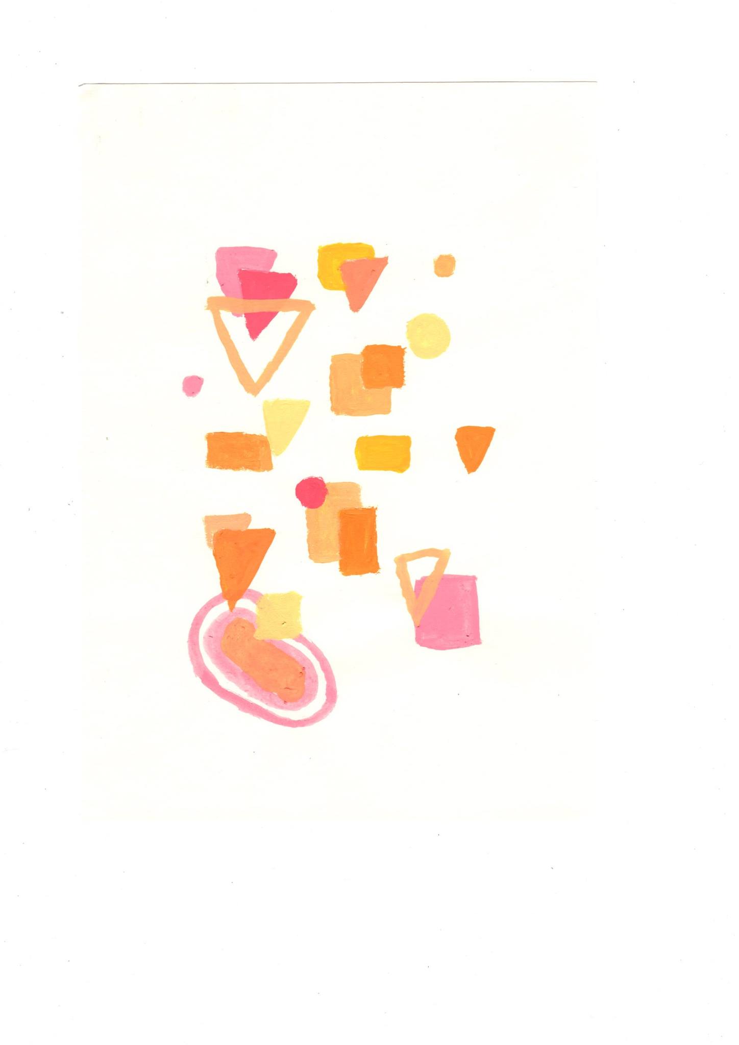
