What does an Effective CTA look like? Is the CTA on your website effective? Does it successfully draw the attention of your buyers? Where should it be placed? Above the fold? Below the fold? At the bottom of the page: using AIDA? Embedded in an amongst all the clutter on your website?
This two part blog will aim to solve all your questions and problems regarding the CTA’s on your website. Part 1 will analyse the form, language and appearance of effective and ineffective CTA’s, followed by some Do’s and Don’ts. And Part 2 will aim to analyse the most effective and ineffective positions to place your CTA’s, again followed by some Do’s and Don’ts.
Now you are probably wondering what I am on about… what is a CTA?
A Call To Action (a.ka. CTA) is a button or a link that is placed on a website that aims to drive prospective customers to fill out a form, buy the product or book a service. It is usually the link between the normal content on your site that your customer has visited to find, and a landing page with some incredible offers on it that is interesting enough to drive your customers to complete a short form (Hubspot Academy, 2014). They are actions that would persuade a customer to, book a service, make an appointment or gain a free consultation.
What then are the characteristics of an effective CTA?
- They are Buttons
Smith (2014), states that CTA’s are buttons. They are not long chunks of texts, they are not hyperlinks or black holes. The call to action should be so overwhelming that it should not be hard to make it more than just a ‘button’.

This is what I mean! One button, one click and one action. There should be no long paragraphs. At the end of the day you want your customer to complete the action that you have set. You do not want them to read long chunks of texts or click on unknown hyperlinks- both which they would probably end up not completing (Smith 2014).
As Smith notes, the brain has a ‘circuitry’ and although the brain has ‘elasticity’ to contain new and more information, it does not like doing unfamiliar things. Foras long as we have been on the earth, we as humans have had a certain way of doing things. For example, if the journey to work was block and you had to take diversions, although you would follow the new route, you would damn right be unhappy about the change. Stated by Smith, the same holds for CTA buttons. Since the development of the Internet, we have been trained to click on buttons. If we see a button we know exactly what to do.
- Funkypigeon.com

Why it doesn’t work
Whilst customers want a CTA that is exciting, they want to click on a button. I don’t at all intend to say that funkypigeon’s website is at all rubbish, but there are no buttons. The CTA utilised by Funky Pigeon is effective, as it does not ask you to ‘sign up’ or do anything that may result in a long process and states that delivery is ‘free’ on the purchase of two or more cards. However, I do not actually know where to click! Do I click on the big red circle? Or do I click on the separate links above? At the end of the day as Smith firmly states, ‘buttons are what make people click and conversions happen’.
LESSON LEARNT: HAVE BUTTONS
- They are eye-catching
Though one may instantly believe that the attractiveness of a CTA depends upon its colour, font or size, in actual fact this is not the case. One extremely important factor of any CTA is its ‘verbiage’, notes Smith. Short, sharp and snappy language is what an effective CTA is built upon.
As awful it is so say, I have a website and oh is it so terribly bad. In my honest opinion, if I were a customer and I wanted to find a beautician to get me ready for my wedding, I don’t think I would book myself. My website is created on a Wix template. Now don’t get me wrong… Wix templates are good! I have a nice background, I have a nice background song and all my images load to a high quality. The problem with my website is that the call to action is so dull that its actually non-existant.
What does my website look like, and what is the problem?
So here is a screen shot of my landing page…
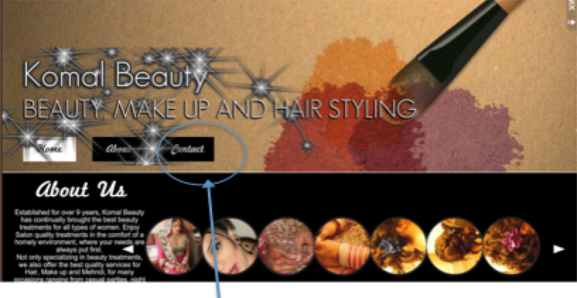
If you look closely at my landing page, amongst all the vibrant colours, texts and images, the only CTA I have is the ‘contact’ link. The link takes you onto the contact form where customers can leave their name, email, number and a message in order to book an appointment.
What has Komal Beauty done wrong?
Critically, evidenced through the screenshots the CTA is very poor. On the landing page there is no effective and eye-catching subject line, in return failing to draw the customer’s attention. There is no offers posted that once again fails to inform the customer with the treatments that are currently being provided. As the name suggests, essentially a Call to Action’s primary purpose is to encourage the reader to perform a particular action; such as ‘click here’, ‘click here to book an appointment today’. Unlike any of the above examples, the CTA on ‘Komal Beauty’s’ website states ‘contact’. Now I am not being pessimistic, but the term ‘contact’ doesn’t really cause any fireworks to happen. There are no imperatives and no commands.
What do I mean by imperatives and commands?
I don’t mean that you have to portray yourself in the same way as a dictator would.

This image demonstrates that a simple ‘do it’ is enough. It is not lengthy nor is it complicated. The imperative phrase ‘do it’ commands the viewer to enter the email address, suggesting that like the phrase the process will too be short, snappy and over with in a tick.
LESSON LEARNT: BE EXCITING, IMPERATIVE AND COMMANDING
- They are vibrant and contrasting in colour
Although most CTA are in colour and do command the visitor to complete an action, Smith notes that the most effective CTA’s are those with a vivid and contrasting colour. In order to assess whether Smiths findings are true, I shall in turn evaluate a few CTA’s that I have received in my emails over the past view days.
Normal Colour
River Island

Contrasting Colours
Ann summers

Is Smith Right?
Arguably, yes. Evident from the examples above, I am able to say that the CTA’s that use contrasting colours do stand out as opposed to the ‘normal’ colours ones. Smith notes that whole idea behind a CTA button is that it should draw the reader’s attention straight away. For example, compare the contrasting Ann Summers CTA to the River Island CTA. Anne Summers have only used contrasting colours blue, black and white in their CTA. The background is blue and only the CTA is white. Thus when you look at the CTA, you instantly see the button and go to click on it. On the other hand, River Island have used variety of colours in their CTA. The problem with their CTA is that the CTA button is white and their background consisting of an image also fades away to a white colour. As both the background and button are white, the button just seems to fade away and fails to grab the visitor’s attention.
LESSON LEARNT: USE CONTRASTING COLOURS
OKAY… lets summarise where we stand right now. Throughout this blog we have learnt 3 big lessons…
- LESSON 1: USE BUTTONS
- LESSON 2: BE EXCITING, IMPERATIVE AND COMMANDING
- LESSON 3: LESSON LEARNT: USE CONTRASTING COLOURS
This finally finishes this blog, please watch the video below where Strategist Wilfred Hirst talks about CTA buttons!
REMEMBER! Keep watching out for Part 2, where I will cover the best position for your now fantastically created CTA’s!
References:
Gardner. O, (2013), Where’s the best place to put your CTA? [Case Study], Retrieved April 24, 2015, from, http://unbounce.com/conversion-rate-optimization/landing-page-cta-placement/
Hubspot Academy, (2014), Call-to-Action Best Practices, Retrieved April 24, 2015, from, http://knowledge.hubspot.com/cta-user-guide/call-to-action-best-practices
Moth. D, Email marketing CTA design: five good vs. six bad examples, Retrieved April 24, 2015, from, https://econsultancy.com/blog/64997-email-marketing-cta-design-five-good-vs-six-bad-examples/
Shewan. D, (2014), 11 Kick – Ass Call to Action Examples, and why they work, Retrieved April 24, 2015, from, http://www.wordstream.com/blog/ws/2014/10/20/call-to-action-examples,
Smith. J, (2014), 6 Characteristics of High Converting CTA Buttons, Retrieved April 24, 2015, from, http://blog.crazyegg.com/2014/10/16/high-converting-cta-buttons/