Final thoughts

This has been a long road with lots of work along the way, but as a result I feel like I’ve grown as a teacher and a materials creator and evaluator. I’ve gained a wider understanding and experience of ELT materials, and been able to think of things from a completely different perspective thanks to discussions with my coursemates and under Paul’s guidance.


I thought it would be interesting to go back to my very first post and see how my perceptions have changed over the last few of months. Here’s what I wrote with some added notes:


Materials should

  • have flexibility – I’m actually quite torn on this now. I think the combination of things I want from materials is somewhat idealistic, and in reality you need to compromise on some things unless you’re willing to make everything from scratch yourself ever time. This point links greatly to having digital copies of materials that you can make changes to without sacrificing too much time, and can come back to at a later date deciding how you want to use them.
  • have a purpose
  • be fit for purpose
  • stretch and challenge the learner – This is still a must for me. Appropriately challenging materials are what is needed to build my students’ skills, supporting and guiding them on the way to proficiency.
  • not be so boring/dry that they dissuade learner – I think this is a must too, but it isn’t always possible to think of a way to make a grammar point or study skill exciting. For my students I think that’s ok from time to time – sometimes academia isn’t that exciting(!!) and that too is something they have to learn.
  • be relevant to learners – this is perhaps easier in EAP since there is a very clear focus on getting students ready for university. That being said, it isn’t always the same for every student depending on level, discipline…
  • be well laid out and clear – I think the point I’ve learned most on here is that I should think more about my use of image.

Additionally based on our discussions, materials should

  • be digitally available – perhaps I take this for granted? Yes, we have coursebooks, but we also have a wealth of digital in house materials on file. I’ve been thinking about this aspect more in terms of VLEs and the form materials should be available to students. I think VLEs can be great things but they need to be easily usable by students and teachers alike. I’ve used Blackboard and Moodle for years and have seen many advances in their usability, but they still leave a lot to be desired on both sides. A key part of this is the demand on digital literacies of both parties if they’re to be fully taken advantage of. How is a teacher to be expected to be materials designer, web designer and (sometimes) programmer all in one? I’d love to have had the opportunity to explore this more in the course, but it has really inspired me to look into this a bit more and come up with ways to implement this technology (that has become an important focus of my college) in a friendlier, more principled way.
  • be culturally acceptable – I think this one is a little more open for me than for some of my coursemates teaching abroad in terms of topics that can be covered because students also have to integrate British society and because I have mixed-nationality classes. Obviously they are introduced in as objective a manner as possible so as not to offend, and with focus more on making students (more) aware. I guess my favourite question is ‘Is this the same in your country?’ to promote cultural awareness.
  • be up to date – yes! I can’t believe I didn’t think of this one myself. In EAP and skills teaching ‘up to date’ might not mean the same as it does in EFL – fortunately I don’t come across the problem of having to explain what a cassette is to my class before teaching a lesson on ‘new technologies’ very often. I think the main issue related to this is that our coursebooks no longer fully reflect the assessments our students are going to take because of changes made to the curriculum. – I’ve recently spent a good while updating materials for some of the modules I teach and realised that the creation and adaptation of materials is never really over. The key word of this course has been CONTEXT, and of course this changes from year to year, day to day, class to class…I realised this most when I made subtle but important changes to a lesson taught to two classes at different times of day – only a couple of hours apart!
  • have instructions – yes and no. One criticisms of our in house coursebook is that the teachers’ notes are unhelpful, but when I make my own materials, I have it clear in my mind how they are going to be used so I don’t tend to write many instructions on the sheet given to students. A little hypocritical perhaps! – This came most into focus when writing and adapting my own worksheet for the course. I still haven’t fully resolved this point in my mind and am starting to think that I don’t really need to. In some situations, instructions are great, in others they’re inhibitive. I think the example we saw in English Unlimited with the many adaptations and suggestions in the teacher’s book is perhaps the best compromise. In terms of writing my own materials for use by other teachers, depending on the context (there it is again) and the aims of the particular lesson, I’d probably still prefer to use few student-facing instructions.
  • Recycle – yes! Always a good idea. – This depends on what the materials consist of. If it’s a coursebook, yes of course. This principle no doubt came from a tendency to rely on materials put together for an entire programme. Since not all courses adopt this, I suspect it’s an area where most of us had been supplementing. It’s actually my college’s new ‘USP’ of a new set of coursebooks for out pre-foundation course. I haven’t had chance to try them out properly yet, but I hope they’ll do this point justice.  
  • Be varied – yep.


The last two points lead me to my biggest take away point of the course – materials evaluation. My two posts on materials evaluation and the taxonomy of tasks really brought together what teaching is all about – giving our students the best, most appropriate teaching and materials we can in a principled fashion. I’m pretty excited that my company is launching a review of our coursebooks! We’ve got a focus group coming up where we’ve all been asked to give our opinions. It’s surprisingly open, but not actually a review of the current books, more a wish list for future ones. It makes me wonder whether there’ll be some serious materials creation opportunities coming up…


So my plan from here is to

  • Get working on my ideas for the college VLE – there has to be a way to make it work better for everyone and be more than file storage.
  • Test out my process presenting idea using the tech available – so far Aurasma has proven a bit too ‘clunky’ and the more reliable QR codes have been more reliable in the drafting and revising process. I’m hoping to test other potential uses of Aurasma in the near future. I’m convinced that tech should only be included if it adds something to the classroom in terms of extra learning opportunity, but not just for the sake of it or at the expense of the teacher’s sanity!
  • Digital literacy is the way forward – perhaps it has greater importance in EAP (I’m not sure) as students are expected to research and produce essays and presentations that have great demands in terms of technological ability.

Infographics

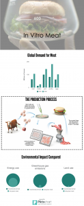
I just created this infographic for a lesson introducing my students to the topics for their assessments.  It was really easy to make and the students seemed to get a lot out of them (I also used some pre-made ones that I found online as part of an introduction pack consisting of an infographic, a video – QR codes I love them! – and an article).  They were also a different way of presenting information to students and gave them chance to practise data interpretation and language for trends that they’d learned in a previous module.  Additionally, students wanted to know how I’d made it – an additional skill they can take away with them and can use at university in the future.

in-vitro-meat

Leveraging

Leveraging is a process whereby a paper-based material is adapted for tech-based learning.  In my college we use a Moodle-based VLE, so I thought I’d see what I could so with the worksheet I created.

First I tried to create a ‘book’.  It wasn’t very useful other than to display the materials at which point it would be the same as simply uploading a PDF of the file.

The ‘Page’ function didn’t work out much better.  It only really allowed me to rebuild the worksheet which would make it ‘easier’ to update in the future.  I’d say this isn’t really easier than updating the original file and re-uploading.

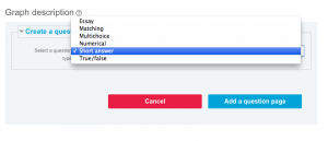
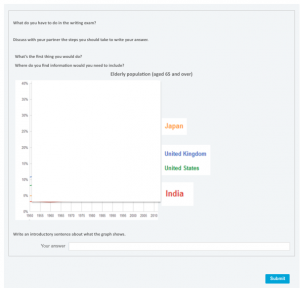
The ‘lesson’ activity is probably the best option here.  You can set up the page just as you would in a Word document (this is quite time consuming if you’re leveraging).  The best part of this is that you can add different question types along with answers for students to see and compare to their own.

Screen Shot 2016-05-26 at 10.24.07 PM

In the end it looks pretty similar to the worksheet I made in Word.  Not bad, but a bit tricky at first and a little ‘clunky’.

Screen Shot 2016-05-26 at 10.31.43 PM

Taxonomy of tasks

Here I talk about the taxonomy of tasks Jade and I developed for the ‘Task Design and Evaluation’ session, and how we applied it to SpeakOut Intermediate.

You might also want to have a closer look at the framework we came up with so you can also find them in the gallery below.  Enjoy!

A few extra thoughts

It was actually quite good fun to work out a different way to approach evaluating a coursebook (I love spreadsheets!).  I don’t however think it’s complete.  By applying this taxonomy to other coursebooks I’m sure that we’d come across different activity types to add to the list on our key.

Although I don’t suggest that this is an objective method for evaluation, it is much more detailed than the one Jade, Abdullah and I created earlier in the term (see my post on Materials Evaluation).

In combination with other methods of evaluation (like our first effort), we begin to get a bigger, perhaps more complete view of a coursebook.  Of course, ideally they should be applied to a whole book, not just one unit like we did here.  Additionally due to the subjective nature of evaluation, the frameworks would also be completed independently by a number of teachers.


Teaching Narrative Tenses 2: the Post-It Timeline

Most teachers will at some point have used Post-Its in their classroom. Whether they’re used for a game of Who am I?, to review vocabulary or as a classroom management technique, these versatile office staples are a favourite with a good few of my colleagues. I think this is my new favourite use for them.

Inspired by my previous post ‘Teaching Narrative Tenses: that Time I would have Killed for Cuisenaire Rods’, when reviewing narrative tenses with the same group, I also decided to recycle and refine the student-created timeline using the humble Post-It. As I said in the same previous post, the story told in Speak Out Intermediate wasn’t particularly accessible to my students, so this time I decided to use a video that would clearly illustrate the events. This helped the students to have a clearer idea of the sequence of events, they were also able to refer back to it to help in creating the timeline. For this, I used the augmented reality app Aurasm.

Here’s a rough outline of the lesson up until Post-It timelines:

  • Students given screenshots from the video. In pairs, arrange and tell story.
  • Watch video. Tell story.
  • Dictagloss of my version of the story. This ended up being changed to a slower read through while students took notes and retold the story orally. They picked up on the TL from their own stories.
  • Students given printed copy of story to read.
  • Language focus.students identify tenses from the text.

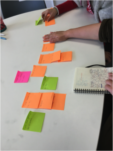
Post-It Timelines

  • Students given Post-Its with verbs from the story. I made sure these were colour-coded to help students to identify the tenses/for clearer visual effect.
  • In pairs, referring to video and written story, students arrange the Post-Its into a timeline. T can offer extra guidance/ask questions to focus students’ attention during this activity. 
Students explaining their PositIt timeline

Students explaining their PositIt timeline

  • Students had to then explain their choices and how the actions linked together. Some specific questions were needed at this point. The intention had been for students to look at each other’s timelines, but this wasn’t possible as the pairs finished creating the timelines at different stages. Since the idea was to help the students to understand the TL more, I wasn’t afraid to let this overrun, and the next task is flexible enough to allow for this eventuality.
  • Following this, each pair had to tell/write the story for another different video.  Students had to complete this for the following lesson.

The next lesson

In the following lesson, the class reviewed the TL by retelling the story and highlighting the links by recreating the timeline.

PostIt timeline on the board with added detail

PostIt timeline on the board with added detail.

Pairs then revised the writing they had prepared for homework, and wrote their own PostIts with the verbs from their story. They then gave the story and PostIts to the other pair who was able to successfully create a timeline, identifying the order of the actions and links between them. Students then checked the story (and use of TL) using the videos.

One pair's story recreated as a PositIt timeline

One pair’s story recreated as a PositIt timeline.

The follow up, homework was for SS to write a story about a time they worked in a team using the TL. Students showed a much better understanding of the TL than from the first lesson on narrative tenses and reported that they felt more confident in using the language thanks to the Post-It Timelines technique (I didn’t even have to pay them!).


Designing a worksheet

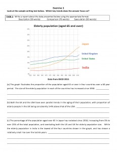
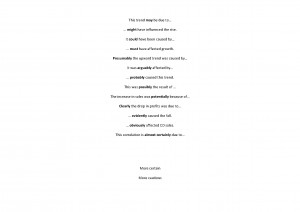
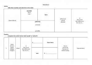
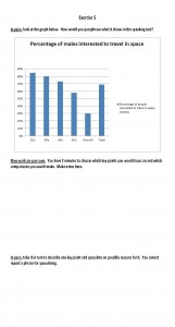
This week we had to make a worksheet, so I decided to work on one that I’d already used with a class and had created myself about a month or two ago. This worksheet was created for a class of students at a pathway College, so they’re working on their English and study skills ahead of joining the university. This worksheet is for the Language for Study 2 module where the exam involves describing a graph and speculating on the reasons behind the trends. In the formative exams, my students had difficulty speculating on reason for the results shown in the graph. So this worksheet was created with that in mind, and for the students to practice and review the language needed to fulfill this part of the assessments. This task is conducted both orally and written so the worksheet needed to reflect this.   I also wanted to use this as an opportunity to remind the students of what is the best approach to this part of the exam.
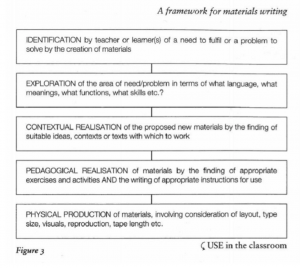
So in this analysis of how I put together the worksheet the first time and it changes that I made before version 2, I’m going to refer to the Jolly and Bolitho (2011) framework for materials writing below. This framework shows how to work through creating materials in a logical fashion from identification of the problem that needed to be solved by the materials, through exploration, contextual realisation, pedagogical realisation, and finally physical production of the materials.

Jolly and Bolitho framework (

Jolly and Bolitho framework (2011)

I think that in hindsight when I first created these materials I did go through the stages.

  • As I described above I identified a need based on the students performance in the formative exams.
  • I then explored how students could solve this problem by focusing on the use of modals and adverbs for cautious language.
  • The realisation of context was actually really easy because the context would of course be exam
  • The pedagogical realisation was equally easily identified because this would also be closely related to their exam, and more so because I wanted students to also focus on their approach to the exam.
  • In terms of physical production the lesson had these materials:
    • a PowerPoint presentation;
    • a worksheet with the graph and description but missing the speculation (worksheet 1);
    • some cards for the board which contained adverbs and modals used for cautious language;
    • a second worksheet on which to record this language (worksheet 2);
    • another worksheet that looked like the oral exam task to use to practise the language.

Edit: After reading Dan’s blog on this topic, I realised that this is definitely not the process I would always take when creating materials.  It normally starts at different points in the process and jumps between the steps, but generally I think all would be covered at some point.

The original materials


Presentation Worksheets

Worksheet

Worksheet 1

Worksheet5

Cards for the board (printed large, one phrase on A4)

Worksheet2_Page_1

Worksheet 2

Worksheet3_Page_2

Worksheet 3

The first version of the worksheets was not designed to be worked through independently, but to form part of a lesson that had additional parts and instruction that did not appear on the worksheets.   In the delivery of the lesson with the first worksheets there were a couple of issues which needed to be addressed when reworking the work sheets, for example the inclusion of gaps for students to complete with the speculation lead to some confusion when first students just had to read through what was written on the paper. They were anticipating having to write something based on the lines but this didn’t fit with the instruction. This reiterated the importance of layout and how it contributes to students’ understanding of what to do, and guides them through the tasks.

So the first thing I did when rewriting was to make notes on the original version of changes that I’d like to make. These included

  • adding parts of the PowerPoint presentation and board activity to the worksheet,
  • adding boxes around certain sections to make them clearer,
  • changing fonts,
  • adding clearer staging of the activities in response to the issue mentioned above.

I set out to complete this exercise with creating an improved worksheet in mind, but I found myself hating the process and the result. I felt that it really took away from the lesson as a whole.  By adding the extra instructions and by streamlining the lesson into one form of material, I felt that the communicative/interactive element had been entirely lost and as such the materials lost their focus on the main aim of providing practice for both written and oral exams.   As a teacher I would truly hate to use this new worksheet in class, and as a student I would wonder why I wasn’t completing this at home for independent study.

After reaching this conclusion I wanted to get the opinions of my classmates, but given the format of the workshop that week and the detailed look it would require as well as my classmates’ limited knowledge of my context and the exams involved,  I didn’t find this fruitful as I’d hoped.  Some did comment that the second version was ‘decidedly clearer’ and I would agree that when seen outside of context (and not having created the materials) it might be. I also found that some of the additions and revisions would work well alongside the original combination of materials.

The updated version

I reached the conclusion that a worksheet does not have to be the entire lesson. It can be just a part of it.  Of course this means that it would require teaching notes that the original version had. So my original worksheet may not be ‘pick up and go’ like many of those produced by my classmates, but it is suited to my teaching style, the needs of my students, the aims of the lesson.  I also find that guiding students using a PowerPoint means that I have more control over the speed in which they move through the tasks as well as what they are focusing on at any specific time (I can imagine this new version being printed double sided and the whole first page being ignored/the tasks undone by students eager to look at page 2). Barbara suggested the PowerPoint is actually a form of worksheet. I would agree, and tend to prefer this method, particularly when teaching an approach or process such as this where I want to closely monitor the steps students are taking.  I think it’s a good idea to provide a shorter – perhaps more concentrated – takeaway document for the students to keep and easily review at a later stage, but not make that the focus of the whole lesson.

The next step was to evaluate my worksheet using the frameworks that we designed in week 3. Check out it out to see how it fared.

Evaluation - My worksheet_Page_1

Interesting to note that in my original and even revised versions of this worksheet, it would score low for the criteria ‘Do the visuals and overall aesthetic engage and motivate learners?’ (and I was probably being a little generous due to bias – let’s face it, a graph isn’t exactly engaging and motivating to most people even if it is the basis of their exams!). Thinking back to my analysis of the use of image in the Skills for Study series (see my post on Images), I appear to have produced materials that aren’t much more visual. This raises a question I’ve asked before: is this simply because there are too many other things to think about? I know that when I was creating my worksheet – and probably more generally when I create materials – yes, layout was important, but did I really think about my use of colour and including visuals? It was probably the last thing on my mind, but since colour printing is still seen as a luxury, aren’t materials suitable for black and white photocopying more useful? You can see that even in the original version of my worksheet where the graph is in colour, I cut up the key so that it matched up with the lines to make it photocopy-friendly. I don’t remember thinking about it too much at the time, but it sure does make a difference…

Adapting and Supplementing 2

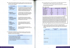
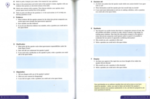
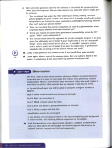
Following my post about reasons for adapting and supplementing materials, here’s how I adapted a couple of pages from Fletcher, C., (2012), Skills for Study Level 3, Cambridge: Cambridge (pp68-72).

Background

The students were upper intermediate to advanced.

Part of the assessment for this module is a poster presentation on one of the following subjects

  • in vitro meat
  • artificial intelligence
  • tourism
  • globalisation
  • entertainment media.

In the previous lesson students had their formative poster presentations, where they were required to produce a poster and present their introduction and at least one of their key points (argument – counter-argument – refutation), give a short conclusion, and to answer questions from the audience formed of their classmates.

Prior to using these materials, students were encouraged to reflect on the posters they created and their performance in the formative presentations (or their classmates’ performance if students did not give a presentation). They also looked at posters produced by last year’s students, and saw a video of a good student presentation.

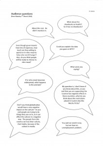
The purpose of these materials was to focus on the types of questions students could/should ask following presentations as the questions posed by audience-members in formatives were not always relevant or constructive, some were quite pointed and mean.

The original materials


A+S1

A+S2

A+S3

Adapted and supplemented materials

PowerPoint Presentation

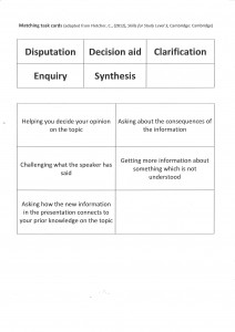
Handout 1

Handout 1

Handout 1 (supplementary material) to add personalisation using students’ own questions from the previous session and to highlight the relevance of the lesson.

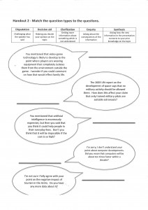
Handout 2

Handout 2


Handout 2 (adapted) an extra task to raise students’ awareness of the types of questions they could (be) asked after their presentations and to add a kinesthetic element.

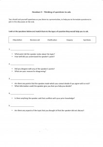
Handout 3

Handout 3

Handout 3 (adapted) – same task as in coursebook with different layout.

Handout 4

Handout 4

Handout 4 (adapted) – simplified version of what is found in the coursebook, selecting the most pertinent parts and removing the listening task which I feel requires students to focus on too many things at once, clouding the purpose of the lesson.

Students then wrote questions for the presentation they had watched earlier on PostIts.  This meant that the subject was much more relevant to them.  Since I had them look back at the notes from watching the presentation and the poster while coming up with questions, this was perhaps a little more realistic than the listening from the book, and more relevant as it was a student’s video.

How it went

Having taught the lesson first with the course book and supplemented practice, I reworked the coursebook content into a more user-friendly and personalised set of worksheets and activities. The reaction of the students in the two classes from my point of view was night and day. The new version was one of my lesson observations for Teaching and Reflection, and was well received both by the observer and the students (I think!).


Video in the classroom

I remember when I was at school video in the classroom normally meant that it was the end of term and the big TV was being wheeled in to keep us quiet for an hour or two while we watched Blackadder and pretended we were doing so for its ‘historical accuracy’. The only real use of video for educational purposes I remember was the BBC series that a dedicated teacher must have videoed at 3am. Video facilities were far less advanced than those we have today. With access to the internet and a projector in every classroom, it’s now much easier to find anything we want.

I’ve always been a fan of using video with , mainly to provide a variety of authentic input materials, but video is also real in that it is multi-modal. Even when teaching in France, where we had two portable projectors between 15 teaching staff, unreliable electricity in the 15-year-old ‘temporary’ port-a-cabin classrooms and classes of up to 40, I found a way to use video. Video is a great resource when you have an almost monolingual class. Sure they might be able to understand you the teacher, but they need exposure to real English that isn’t automatically graded or of your own variety of English. My favourite video-based lesson was one I made for students at the Political Studies Institute around Nick Clegg’s tuition fee apology. That 2’30 video could be exploited in so many ways – and not just by me, by satirists, journalists, bloggers, politicians – it truly was a gift.  I used it

  • without the sound – what’s going on?
  • for meaning
  • for interpretation of events prior to the apology
  • language focus – correcting a transcript (colloquial vs formal language)
  • reaction to it/discussion about it

(The video had also been subtitled as ‘honest’ and turned into a song that was later sold on iTunes, both of which I used in class).

The session was really interesting seeing all of the different ways others had come up with to exploit video in the classroom, here are a few of my favourites

  • guess what happened next
  • guess what just happened – facial expressions and emotion
  • how to… – for process descriptions
  • story-boarding – narrative tenses
  • video-telling (Jamie Keddie)
  • narrating or putting a voice to a silent film (I love the BBC Walk on the Wild Side videos for this).

It’s amazing what can be done with video, and the free, easy-to-use software out there makes it accessible to most teachers.  For this session though, I looked at augmented reality in the classroom and using student-created videos.


Aurasma__CTA_PAGE_Positive_Col

AR and student-created videos

Recently we’ve been doing formative exams including poster presentations by the students that were videoed for our records. We like to use them in class to that students can recognise how they can improve ahead of their finals. One area for improvement for most students was the interaction between their poster and their presentation: for many there seemed to be a large disconnect.  In Paul Driver’s workshop we saw how augmented reality was used to embed video in posters around the college. This was my inspiration for this project.  Using Aurasma Studio, I set up the students’ videos to pop up when they held their Aurasma phone app over their poster. This created a clear connection between their poster and what they were saying.

Working in pairs or groups of three, the students assessed how effective their posters were in supporting the audience through their presentation, and then other elements such as clarity and development of their arguments, use of sources etc.

The students seemed to appreciate the use of their videos through the app. Since their poster acted as the trigger for the video, they were able to take them away with them. It was much easier (once I’d figured out how to shrink a video file size – super easy when you know how) than emailing each student separately and allowed more movement and interaction in what would have otherwise been a very still, individual, screen-focussed task.

The use here was quite simple but I think it can be developed into something much more interesting and useful.  What excites me about the project here is the possibility to give students something that their poster presentations hadn’t had previously: a real, wider audience (not just the teacher for the purpose of assessment) and longevity. Previously, at the end of term, weeks of work in the form of posters and videos were rolled up and filed away, but with AR the project could live on in the form on a mini-exhibition.

It also brings in the idea of digital literacy and how we can encourage our students to engage responsibly with technology and to build skills that may be useful in a world where communication is increasingly technology-based.


Edit: I’m currently working on a project when Aurasma is used to apply the principles of process-writing to presentations (process presenting?).  I’ll write a post on it once it’s advanced a little further.


A picture speaks a thousand words…but does it help?

Images (help us to) communicate

There is evidence of pictures being used to communicate and educate long before language emerged, so their potential for use in the language classroom is evident. What’s more, we live in a multi-modal world where meaning is gleaned from text and image working together.

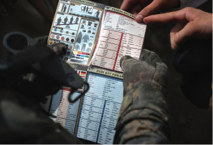
This session made me think of a friend of mine who works in recruitment for the Royal Navy. Part of her job involves running a project with A-level language students where they need to communicate with one another without using English and none of them speak each other’s language. The final product is a pointy-talkie: a picture book with the word for the item in several languages. These have been used in the military since World War II (possibly before but there’s remarkably little to be found on this!) and continue to be used today.
A US military pointy-talkie used in Afghanistan (the photo was issued by the United States Army and is in the public domain. More information available at https://commons.wikimedia.org/wiki/File:Defense.gov_photo_essay_090807-A-1211M-006.jpg)

A US military pointy-talkie used in Afghanistan (the photo was issued by the United States Army and is in the public domain. More information available at https://commons.wikimedia.org/wiki/File:Defense.gov_photo_essay_090807-A-1211M-006.jpg)

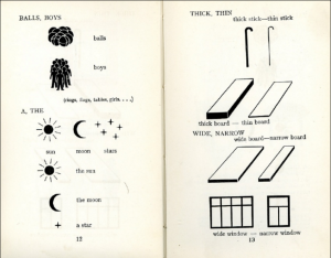
Paul also mentioned the International Picture Language (1939) by Otto Neurath in collaboration with Marie Neurath which I suspect will have been linked with (perhaps inspired) the pointy-talkie.

Screen Shot 2016-05-17 at 2.24.39 PM

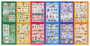
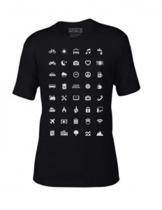
There are now several versions – in paper, app and even t-shirt form – that help tourists to communicate around the world even when they don’t speak the language.

From Kwikpoint.com

From Kwikpoint.com

The IconSpeak t-shirt was made by ex-US military. Available here: https://iconspeak.world/

The IconSpeak t-shirt was made by ex-US military. Available here: https://iconspeak.world/

The meaning of these icons and images in all of the examples above only becomes clear when combined with the text (or other images in the case of the kwikpoint pointy-talkie).  Images alone are not necessarily an effective form of communication, but in combination with text, the two can support each other.  Since we use a combination of written, spoken and visual cues to help us to communicate and to interpret the world around us, we should do the same in our classrooms.

The importance of visuals is something that has come up in many of our discussions prior to this session, mainly thanks to Jade who is particularly interested in this area and has made me realise that it’s an area that I should consider more. I mentioned that it was one point we had much of our discussion on during the Materials Evaluation task but didn’t go into why at the time so I’ll give a brief summary here.

Part of the process in creating our evaluation framework was to take our list of criteria and prioritise them by choosing our ‘top 10’ non-negotiables. You can see here that under the sub-heading of aesthetics, there’s only one vote for motivating aesthetics. That was Jade. Anything to do with aesthetics hadn’t entered into my, nor Abdullah’s, top 10. Following our lengthy discussion, I realised that it wasn’t that I didn’t think that aesthetics were important, it’s that I’d prioritised other things over them, not realising that even the presentation of the materials – which I do see as being incredibly important (see my post on adapting materials) – should be included in this area.  It’s not just about colourful pictures, it’s about mind-maps, tables, giving students sufficient space to write, not over-crowding the page, using relevant images to

  • enhance interest and motivation (affective)
  • attract and direct attention (attentive) (Duchastel, 1978)
  • facilitate learning by showing something difficult to convey in words (didactic/explicative)  (Duchastel, 1978)
  • help less-able learners (supportive)
  • facilitate memory (retentional) (Sless 1981).


Interpretation: blessing or a curse?

Rabbit or duck?

Rabbit or duck?


I have of course used images in the classroom – exams are even based on them the IELTS exam, one of our internal language modules is assessed on the student’s description and interpretation of a graph, CAE uses images to prompt students’ speaking, every end of term exam at the Political Studies Institute requires students to write an analysis of a political cartoon… Activities including interpretation or uncoding of an image allow students to employ higher order skills which are required in many areas of our day-to-day lives. (This makes me think of Paul Driver’s Invaders activity – well worth checking out.) But as we saw in class, our interpretations of images are largely based in our own knowledge, experience and beliefs, so these tasks can be very challenging for students. This makes me think of my other love: classical reception theory. I won’t go off on a long and rambling tangent here (even though I’d love to), but reception theory involves analysing what contributes to our understanding of a work (in any medium), what comes from the creator of the work and, perhaps more importantly, the audience and any/all contributors in between (things like our society, beliefs, knowledge and life experience…). The way I interpret an image (or a painting, a play, a film…) will likely be completely different from the way someone with a different background and experience to me will interpret it, and both will be different from how the original work was intended.

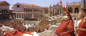
The Fall of the Roman Empire (1964).

The Fall of the Roman Empire (1964).

This scene of a Roman parade had been/could be interpreted as

  • Rome – what it represented at the time: a celebration of victory and/or demonstration of power
  • Ancient Rome – what we today see as Rome, what we have been taught about what Rome was and all that we believe Rome represented (imperialism, power, victory, violence, excess…)
  • Nazi Germany – the golden age of Ancient World films (post WWII) meant that such scenes were often interpreted as (and sometimes presented as) representations of the hubris of Nazi Germany
  • The USA – the second wave of sword and sandal films was released in the early 2000s and seen to be a reflection of/reation to the military action taken by the USA (imperialist tendencies?)
  • The EU – Brexit campaigners have recently likened the EU to Nazi Germany’s quest to rebuild Rome (thanks for that one Boris Johnson), clearly showing how these layers build up and our perceptions and interpretations can be manipulated by experience and belief. [On an interesting Classics note, BJ is a Greek not a Roman.]

In some situations this flexibility of interpretation could be excellent grounds for a discussion or employing decoding and visual literacy skills, but could equally lead to a difficult situation or to students each understanding something completely different. The point being that an image must be carefully considered if it is to help, not hinder, communication and understanding. The interplay between text and image is what is perhaps most useful to us as teachers.

Use of images in EAP coursebooks

In EAP, it can be easy to brush images aside in favour of content and making sure that materials achieve their aims.  As I mentioned in my post on materials evaluation, aesthetics (beyond being clearly laid out) came quite far down my list of priorities when evaluating or creating materials.

Images 6

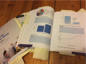
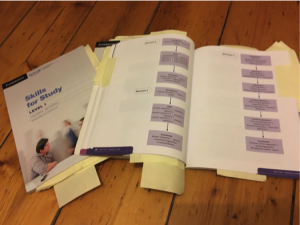
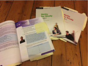
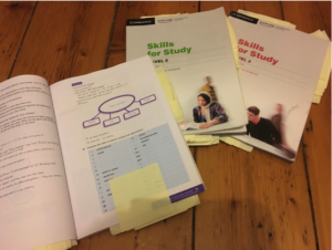
Out of interest, I looked at the Skills for Study series that we use in our college and analysed the functions of the images included.

Functions:

  • Affective – enhancing interest and motivation
  • Attentive – attracting and directing attention (Duchastel, 1978)
  • Didactic/explicative – facilitating learning by showing something difficult to convey in words (Duchastel, 1978)
  • Supportive – for less-able learners
  • Retentional – facilitating memory (Sless 1981)

The first thing to note is that while your typical EFL text book is full of images and colour, in the Skills for Study series the use of image is sparse, particularly in the first 2 levels. I wonder whether this is for similar reasons as to why aesthetic came so far down my list of priorities when evaluating materials – there are simply too many other considerations that would come first.


Decorative image?

Decorative image?


Didactic and retentional

Didactic image


Didactic images used to show mistakes when creating graphics.

Didactic images used to show mistakes when creating graphics.


Didactic images showing essay structures

Didactic images showing essay structures


Affective image or decorative?

Affective image or just decorative?

The use of images is overwhelmingly in the form of tables and charts rather than pictures. These could infrequently be termed as affective (students may see the interpretation of these as relevant to their future studies).

Any pictures are in the majority decorative rather than supportive or didactic, although there is the odd mind map or illustrative image.

There are very few attentive or retentional images.

An average page

An average page

I think a lot more images could be added to help students to engage with the materials differently.  Although the general layout seems to have been set out with functionality in mind, have a look at what I did with an exercise from the third book in the series (also in my post about adapting materials). I think it makes it more approachable and less uniform in terms of format.  Which do you prefer?

Exercise rejigged

Exercise 3b reworked