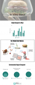
I just created this infographic for a lesson introducing my students to the topics for their assessments. It was really easy to make and the students seemed to get a lot out of them (I also used some pre-made ones that I found online as part of an introduction pack consisting of an infographic, a video – QR codes I love them! – and an article). They were also a different way of presenting information to students and gave them chance to practise data interpretation and language for trends that they’d learned in a previous module. Additionally, students wanted to know how I’d made it – an additional skill they can take away with them and can use at university in the future.
ELT Materials
Thoughts and ideas about what to use in the classroom

