This week we had to make a worksheet, so I decided to work on one that I’d already used with a class and had created myself about a month or two ago. This worksheet was created for a class of students at a pathway College, so they’re working on their English and study skills ahead of joining the university. This worksheet is for the Language for Study 2 module where the exam involves describing a graph and speculating on the reasons behind the trends. In the formative exams, my students had difficulty speculating on reason for the results shown in the graph. So this worksheet was created with that in mind, and for the students to practice and review the language needed to fulfill this part of the assessments. This task is conducted both orally and written so the worksheet needed to reflect this. I also wanted to use this as an opportunity to remind the students of what is the best approach to this part of the exam.
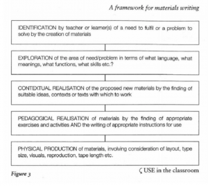
So in this analysis of how I put together the worksheet the first time and it changes that I made before version 2, I’m going to refer to the Jolly and Bolitho (2011) framework for materials writing below. This framework shows how to work through creating materials in a logical fashion from identification of the problem that needed to be solved by the materials, through exploration, contextual realisation, pedagogical realisation, and finally physical production of the materials.

Jolly and Bolitho framework (2011)
I think that in hindsight when I first created these materials I did go through the stages.
- As I described above I identified a need based on the students performance in the formative exams.
- I then explored how students could solve this problem by focusing on the use of modals and adverbs for cautious language.
- The realisation of context was actually really easy because the context would of course be exam
- The pedagogical realisation was equally easily identified because this would also be closely related to their exam, and more so because I wanted students to also focus on their approach to the exam.
- In terms of physical production the lesson had these materials:
- a PowerPoint presentation;
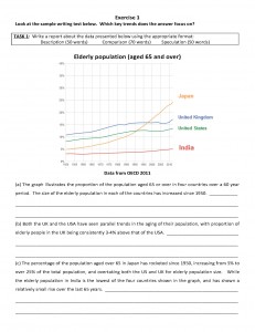
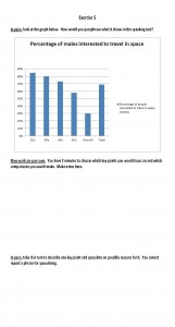
- a worksheet with the graph and description but missing the speculation (worksheet 1);
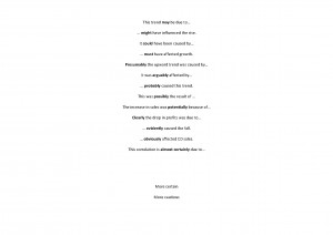
- some cards for the board which contained adverbs and modals used for cautious language;
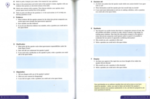
- a second worksheet on which to record this language (worksheet 2);
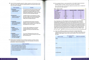
- another worksheet that looked like the oral exam task to use to practise the language.
Edit: After reading Dan’s blog on this topic, I realised that this is definitely not the process I would always take when creating materials. It normally starts at different points in the process and jumps between the steps, but generally I think all would be covered at some point.
The original materials
Presentation Worksheets

Worksheet 1

Cards for the board (printed large, one phrase on A4)

Worksheet 2

Worksheet 3
The first version of the worksheets was not designed to be worked through independently, but to form part of a lesson that had additional parts and instruction that did not appear on the worksheets. In the delivery of the lesson with the first worksheets there were a couple of issues which needed to be addressed when reworking the work sheets, for example the inclusion of gaps for students to complete with the speculation lead to some confusion when first students just had to read through what was written on the paper. They were anticipating having to write something based on the lines but this didn’t fit with the instruction. This reiterated the importance of layout and how it contributes to students’ understanding of what to do, and guides them through the tasks.
So the first thing I did when rewriting was to make notes on the original version of changes that I’d like to make. These included
- adding parts of the PowerPoint presentation and board activity to the worksheet,
- adding boxes around certain sections to make them clearer,
- changing fonts,
- adding clearer staging of the activities in response to the issue mentioned above.
I set out to complete this exercise with creating an improved worksheet in mind, but I found myself hating the process and the result. I felt that it really took away from the lesson as a whole. By adding the extra instructions and by streamlining the lesson into one form of material, I felt that the communicative/interactive element had been entirely lost and as such the materials lost their focus on the main aim of providing practice for both written and oral exams. As a teacher I would truly hate to use this new worksheet in class, and as a student I would wonder why I wasn’t completing this at home for independent study.
After reaching this conclusion I wanted to get the opinions of my classmates, but given the format of the workshop that week and the detailed look it would require as well as my classmates’ limited knowledge of my context and the exams involved, I didn’t find this fruitful as I’d hoped. Some did comment that the second version was ‘decidedly clearer’ and I would agree that when seen outside of context (and not having created the materials) it might be. I also found that some of the additions and revisions would work well alongside the original combination of materials.
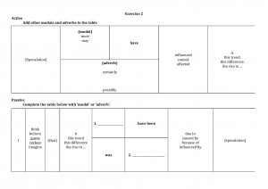
The updated version
-

-
Page 1
-

-
Page 2
I reached the conclusion that a worksheet does not have to be the entire lesson. It can be just a part of it. Of course this means that it would require teaching notes that the original version had. So my original worksheet may not be ‘pick up and go’ like many of those produced by my classmates, but it is suited to my teaching style, the needs of my students, the aims of the lesson. I also find that guiding students using a PowerPoint means that I have more control over the speed in which they move through the tasks as well as what they are focusing on at any specific time (I can imagine this new version being printed double sided and the whole first page being ignored/the tasks undone by students eager to look at page 2). Barbara suggested the PowerPoint is actually a form of worksheet. I would agree, and tend to prefer this method, particularly when teaching an approach or process such as this where I want to closely monitor the steps students are taking. I think it’s a good idea to provide a shorter – perhaps more concentrated – takeaway document for the students to keep and easily review at a later stage, but not make that the focus of the whole lesson.
The next step was to evaluate my worksheet using the frameworks that we designed in week 3. Check out it out to see how it fared.

Interesting to note that in my original and even revised versions of this worksheet, it would score low for the criteria ‘Do the visuals and overall aesthetic engage and motivate learners?’ (and I was probably being a little generous due to bias – let’s face it, a graph isn’t exactly engaging and motivating to most people even if it is the basis of their exams!). Thinking back to my analysis of the use of image in the Skills for Study series (see my post on Images), I appear to have produced materials that aren’t much more visual. This raises a question I’ve asked before: is this simply because there are too many other things to think about? I know that when I was creating my worksheet – and probably more generally when I create materials – yes, layout was important, but did I really think about my use of colour and including visuals? It was probably the last thing on my mind, but since colour printing is still seen as a luxury, aren’t materials suitable for black and white photocopying more useful? You can see that even in the original version of my worksheet where the graph is in colour, I cut up the key so that it matched up with the lines to make it photocopy-friendly. I don’t remember thinking about it too much at the time, but it sure does make a difference…


