Video in the classroom

I remember when I was at school video in the classroom normally meant that it was the end of term and the big TV was being wheeled in to keep us quiet for an hour or two while we watched Blackadder and pretended we were doing so for its ‘historical accuracy’. The only real use of video for educational purposes I remember was the BBC series that a dedicated teacher must have videoed at 3am. Video facilities were far less advanced than those we have today. With access to the internet and a projector in every classroom, it’s now much easier to find anything we want.

I’ve always been a fan of using video with , mainly to provide a variety of authentic input materials, but video is also real in that it is multi-modal. Even when teaching in France, where we had two portable projectors between 15 teaching staff, unreliable electricity in the 15-year-old ‘temporary’ port-a-cabin classrooms and classes of up to 40, I found a way to use video. Video is a great resource when you have an almost monolingual class. Sure they might be able to understand you the teacher, but they need exposure to real English that isn’t automatically graded or of your own variety of English. My favourite video-based lesson was one I made for students at the Political Studies Institute around Nick Clegg’s tuition fee apology. That 2’30 video could be exploited in so many ways – and not just by me, by satirists, journalists, bloggers, politicians – it truly was a gift.  I used it

  • without the sound – what’s going on?
  • for meaning
  • for interpretation of events prior to the apology
  • language focus – correcting a transcript (colloquial vs formal language)
  • reaction to it/discussion about it

(The video had also been subtitled as ‘honest’ and turned into a song that was later sold on iTunes, both of which I used in class).

The session was really interesting seeing all of the different ways others had come up with to exploit video in the classroom, here are a few of my favourites

  • guess what happened next
  • guess what just happened – facial expressions and emotion
  • how to… – for process descriptions
  • story-boarding – narrative tenses
  • video-telling (Jamie Keddie)
  • narrating or putting a voice to a silent film (I love the BBC Walk on the Wild Side videos for this).

It’s amazing what can be done with video, and the free, easy-to-use software out there makes it accessible to most teachers.  For this session though, I looked at augmented reality in the classroom and using student-created videos.


Aurasma__CTA_PAGE_Positive_Col

AR and student-created videos

Recently we’ve been doing formative exams including poster presentations by the students that were videoed for our records. We like to use them in class to that students can recognise how they can improve ahead of their finals. One area for improvement for most students was the interaction between their poster and their presentation: for many there seemed to be a large disconnect.  In Paul Driver’s workshop we saw how augmented reality was used to embed video in posters around the college. This was my inspiration for this project.  Using Aurasma Studio, I set up the students’ videos to pop up when they held their Aurasma phone app over their poster. This created a clear connection between their poster and what they were saying.

Working in pairs or groups of three, the students assessed how effective their posters were in supporting the audience through their presentation, and then other elements such as clarity and development of their arguments, use of sources etc.

The students seemed to appreciate the use of their videos through the app. Since their poster acted as the trigger for the video, they were able to take them away with them. It was much easier (once I’d figured out how to shrink a video file size – super easy when you know how) than emailing each student separately and allowed more movement and interaction in what would have otherwise been a very still, individual, screen-focussed task.

The use here was quite simple but I think it can be developed into something much more interesting and useful.  What excites me about the project here is the possibility to give students something that their poster presentations hadn’t had previously: a real, wider audience (not just the teacher for the purpose of assessment) and longevity. Previously, at the end of term, weeks of work in the form of posters and videos were rolled up and filed away, but with AR the project could live on in the form on a mini-exhibition.

It also brings in the idea of digital literacy and how we can encourage our students to engage responsibly with technology and to build skills that may be useful in a world where communication is increasingly technology-based.


Edit: I’m currently working on a project when Aurasma is used to apply the principles of process-writing to presentations (process presenting?).  I’ll write a post on it once it’s advanced a little further.


A picture speaks a thousand words…but does it help?

Images (help us to) communicate

There is evidence of pictures being used to communicate and educate long before language emerged, so their potential for use in the language classroom is evident. What’s more, we live in a multi-modal world where meaning is gleaned from text and image working together.

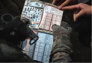
This session made me think of a friend of mine who works in recruitment for the Royal Navy. Part of her job involves running a project with A-level language students where they need to communicate with one another without using English and none of them speak each other’s language. The final product is a pointy-talkie: a picture book with the word for the item in several languages. These have been used in the military since World War II (possibly before but there’s remarkably little to be found on this!) and continue to be used today.

A US military pointy-talkie used in Afghanistan (the photo was issued by the United States Army and is in the public domain. More information available at https://commons.wikimedia.org/wiki/File:Defense.gov_photo_essay_090807-A-1211M-006.jpg)

A US military pointy-talkie used in Afghanistan (the photo was issued by the United States Army and is in the public domain. More information available at https://commons.wikimedia.org/wiki/File:Defense.gov_photo_essay_090807-A-1211M-006.jpg)

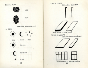
Paul also mentioned the International Picture Language (1939) by Otto Neurath in collaboration with Marie Neurath which I suspect will have been linked with (perhaps inspired) the pointy-talkie.

Screen Shot 2016-05-17 at 2.24.39 PM

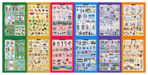
There are now several versions – in paper, app and even t-shirt form – that help tourists to communicate around the world even when they don’t speak the language.

From Kwikpoint.com

From Kwikpoint.com

The IconSpeak t-shirt was made by ex-US military. Available here: https://iconspeak.world/

The IconSpeak t-shirt was made by ex-US military. Available here: https://iconspeak.world/

The meaning of these icons and images in all of the examples above only becomes clear when combined with the text (or other images in the case of the kwikpoint pointy-talkie).  Images alone are not necessarily an effective form of communication, but in combination with text, the two can support each other.  Since we use a combination of written, spoken and visual cues to help us to communicate and to interpret the world around us, we should do the same in our classrooms.

The importance of visuals is something that has come up in many of our discussions prior to this session, mainly thanks to Jade who is particularly interested in this area and has made me realise that it’s an area that I should consider more. I mentioned that it was one point we had much of our discussion on during the Materials Evaluation task but didn’t go into why at the time so I’ll give a brief summary here.

Part of the process in creating our evaluation framework was to take our list of criteria and prioritise them by choosing our ‘top 10’ non-negotiables. You can see here that under the sub-heading of aesthetics, there’s only one vote for motivating aesthetics. That was Jade. Anything to do with aesthetics hadn’t entered into my, nor Abdullah’s, top 10. Following our lengthy discussion, I realised that it wasn’t that I didn’t think that aesthetics were important, it’s that I’d prioritised other things over them, not realising that even the presentation of the materials – which I do see as being incredibly important (see my post on adapting materials) – should be included in this area.  It’s not just about colourful pictures, it’s about mind-maps, tables, giving students sufficient space to write, not over-crowding the page, using relevant images to

  • enhance interest and motivation (affective)
  • attract and direct attention (attentive) (Duchastel, 1978)
  • facilitate learning by showing something difficult to convey in words (didactic/explicative)  (Duchastel, 1978)
  • help less-able learners (supportive)
  • facilitate memory (retentional) (Sless 1981).


Interpretation: blessing or a curse?

Rabbit or duck?

Rabbit or duck?


I have of course used images in the classroom – exams are even based on them the IELTS exam, one of our internal language modules is assessed on the student’s description and interpretation of a graph, CAE uses images to prompt students’ speaking, every end of term exam at the Political Studies Institute requires students to write an analysis of a political cartoon… Activities including interpretation or uncoding of an image allow students to employ higher order skills which are required in many areas of our day-to-day lives. (This makes me think of Paul Driver’s Invaders activity – well worth checking out.) But as we saw in class, our interpretations of images are largely based in our own knowledge, experience and beliefs, so these tasks can be very challenging for students. This makes me think of my other love: classical reception theory. I won’t go off on a long and rambling tangent here (even though I’d love to), but reception theory involves analysing what contributes to our understanding of a work (in any medium), what comes from the creator of the work and, perhaps more importantly, the audience and any/all contributors in between (things like our society, beliefs, knowledge and life experience…). The way I interpret an image (or a painting, a play, a film…) will likely be completely different from the way someone with a different background and experience to me will interpret it, and both will be different from how the original work was intended.

The Fall of the Roman Empire (1964).

The Fall of the Roman Empire (1964).

This scene of a Roman parade had been/could be interpreted as

  • Rome – what it represented at the time: a celebration of victory and/or demonstration of power
  • Ancient Rome – what we today see as Rome, what we have been taught about what Rome was and all that we believe Rome represented (imperialism, power, victory, violence, excess…)
  • Nazi Germany – the golden age of Ancient World films (post WWII) meant that such scenes were often interpreted as (and sometimes presented as) representations of the hubris of Nazi Germany
  • The USA – the second wave of sword and sandal films was released in the early 2000s and seen to be a reflection of/reation to the military action taken by the USA (imperialist tendencies?)
  • The EU – Brexit campaigners have recently likened the EU to Nazi Germany’s quest to rebuild Rome (thanks for that one Boris Johnson), clearly showing how these layers build up and our perceptions and interpretations can be manipulated by experience and belief. [On an interesting Classics note, BJ is a Greek not a Roman.]

In some situations this flexibility of interpretation could be excellent grounds for a discussion or employing decoding and visual literacy skills, but could equally lead to a difficult situation or to students each understanding something completely different. The point being that an image must be carefully considered if it is to help, not hinder, communication and understanding. The interplay between text and image is what is perhaps most useful to us as teachers.

Use of images in EAP coursebooks

In EAP, it can be easy to brush images aside in favour of content and making sure that materials achieve their aims.  As I mentioned in my post on materials evaluation, aesthetics (beyond being clearly laid out) came quite far down my list of priorities when evaluating or creating materials.

Images 6

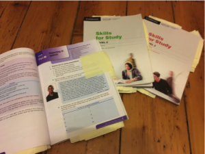
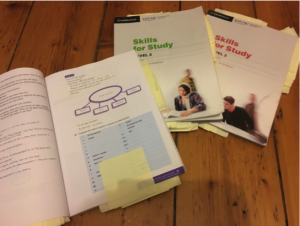
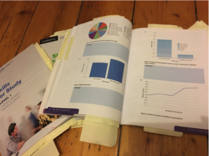
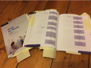
Out of interest, I looked at the Skills for Study series that we use in our college and analysed the functions of the images included.

Functions:

  • Affective – enhancing interest and motivation
  • Attentive – attracting and directing attention (Duchastel, 1978)
  • Didactic/explicative – facilitating learning by showing something difficult to convey in words (Duchastel, 1978)
  • Supportive – for less-able learners
  • Retentional – facilitating memory (Sless 1981)

The first thing to note is that while your typical EFL text book is full of images and colour, in the Skills for Study series the use of image is sparse, particularly in the first 2 levels. I wonder whether this is for similar reasons as to why aesthetic came so far down my list of priorities when evaluating materials – there are simply too many other considerations that would come first.


Decorative image?

Decorative image?


Didactic and retentional

Didactic image


Didactic images used to show mistakes when creating graphics.

Didactic images used to show mistakes when creating graphics.


Didactic images showing essay structures

Didactic images showing essay structures


Affective image or decorative?

Affective image or just decorative?

The use of images is overwhelmingly in the form of tables and charts rather than pictures. These could infrequently be termed as affective (students may see the interpretation of these as relevant to their future studies).

Any pictures are in the majority decorative rather than supportive or didactic, although there is the odd mind map or illustrative image.

There are very few attentive or retentional images.

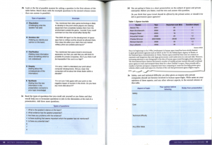
An average page

An average page

I think a lot more images could be added to help students to engage with the materials differently.  Although the general layout seems to have been set out with functionality in mind, have a look at what I did with an exercise from the third book in the series (also in my post about adapting materials). I think it makes it more approachable and less uniform in terms of format.  Which do you prefer?

Exercise rejigged

Exercise 3b reworked


Creating a Materials Evaluation Framework

In the third session of ELT Materials, we broached the topic of materials evaluation. To some extent this is what we as teachers are required to do every day as we choose which materials (books, games, videos or whatever form they may come in) we’re going to use with our students. Often these are decisions based on intuition, which in turn is based on experience of using the materials or similar previously in our careers, recommendations from colleagues. Like many of my coursemates, and many other EFL teachers I am prescribed coursebooks by my institution. Although the coursebooks were produced by teachers and writers within the company and with our specific students in mind (which should mean that they are tailored to our students’ needs as well as those of the teachers), the feeling within the department is that they aren’t really fit for purpose. The topics covered sometimes  over-complicate the language point or skill being taught, and the teachers’ notes are frequently unhelpful. These books are used across the company and it seems that our department isn’t the only one that has doubts over their effectiveness. I don’t know if an in-house formal evaluation of the coursebooks has ever been done, but if not it’s a real shame. It is quite surprising when it seems so obvious to me that materials evaluation is a tremendously important part of teaching; a view that seems to be shared by many of my colleagues and coursemates.


This week, after researching the topic of materials evaluation and evaluation frameworks, Jade, Abdullah and I created our own, used it to evaluate English Unlimited B1+ Intermediate and presented our approach and findings to the class. Coming from vastly different teaching contexts, we decided to see how far a universal framework was possible. Although the research we read about suggested that a universal framework was not possible or useful, we were really interested in identifying evaluation criteria we all thought were important, independent of our different contexts. That is not to say that we failed to recognise the importance of context on such exercises. Our recognition of the importance of context is found in the formulation of the framework itself and its requirement for more qualitative responses from evaluators. Check out the presentation of our framework in the video below (2 parts).

References

Johnson, K., et al. (2008) A step forward: investigating expertise in materials evaluation. ELT Journal 62 (2): pp.157-163.

McDonough, J. and Shaw, C. (1993) Materials and Methods in ELT: a Teacher’s Guide. Oxford: Blackwell.

McGrath, I. (2013) Teaching Materials and the Roles of EFL/ESL Teachers: Practice and Theory. London: Bloomsbury.

Roberts, J. T. (1996) Demystifying materials evaluation. System 24 (3): pp. 375-389.

Tomlinson, B. (2012) Materials development for language learning and teaching. Language Teaching 45 (02): pp. 143-179.

Tomlinson, B. (2013) Materials evaluation. In: Tomlinson, B. (ed). Developing Materials for Language Teaching. (2nd ed) London: Bloomsbury. pp.21-48.

Adapting and Supplementing Materials

In my first post (Materials Now – Why am I here?’) I mentioned that I’ve been designing materials since the very start of my career, it was almost entirely down to the necessity to

  • better cater for my students’ needs
  • allow for the fact that students only have an hour and a half of class a week, ie to reduce them to the essentials or to make them suitable for self-study
  • fit the language point or skill to my students’ specialism(s)
  • further exploit the material ie by additionally focussing on a language point or vocabulary
  • personalise the topic
  • provide authentic material
  • provide up-to-date material (particularly at the Political Studies Institute where the focus was largely on current affairs).

In some cases, when starting a course from scratch with little to no resources, it was a case of creating materials to actually have materials.

In my current context, the reasons behind my adaptation and supplementation of materials aren’t as extreme in need but have been similar, with the addition of having to make the coursebook work. Since students are required to buy the book, we are required to use it. This has involved making different sections of the coursebook work together in order to fully cover a point. Fortunately our module coordinators provide an overview with a list of carefully selected pages from the book, but then we have to figure out how to make it work together. Although this can be done quite successfully, on more than one occasion, the book has failed to present the point in a clear enough manner, or with concrete enough examples and practice for the point to be made sufficiently (a flaw which likely arises from the very tight deadlines the writers had to work under). This has led to some on-the-spot adaptation and some reworking of the content. I’d say that the main difficulty in using this coursebook is that there is simply too much stuff to go at. It needs to be simplified and presented in a way that is more manageable for the students and the teachers. This is what I did in my post on Adapting and Supplementing Materials 2.


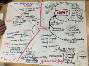
Here are some thoughts from the class as to how and why we adapt and supplement materials.

Our group's thoughts

Our group’s thoughts

As with previous discussions, the amount of overlap in our ideas is notable. This almost begs the question as to why – if we’re all adapting our materials in similar ways – aren’t materials being created and supplied that way? I say ‘almost’ simply because I doubt that our ways of doing each of these things or produces similar final products. And if one requirement of materials we use is for them to be flexible (as I mentioned in my post on Principles and Frameworks), wouldn’t that flexibility be almost entirely removed if coursebooks did everything for us? Similarly, if the materials really were all singing and all dancing, wouldn’t they be self-study materials?

I guess that this might be the way things are heading since adaptive learning is a major focus of educational technology.  I do wonder though whether it will be successful only when used alongside a teacher.  The aim of adapting and supplementing resources is to provide the best, most appropriate materials for our students, and an app is only capable of seeing data, not what might be going on in the real classroom or real world (assuming that the app isn’t the only form of input).  It will be interesting to see whether tech is capable of recognising students’ needs to the same extent as an experienced teacher.  For now our jobs appear to be safe: most apps purporting to involve adaptive learning seem to apply it predominantly in how frequently language is recycled; and if there’s no motivation to learn, whatever the fancy app can do is insignificant.