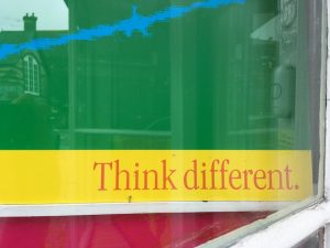
Primrose Path prints“Brands not products!” became the rallying cry for a marketing renaissance led by a new breed of companies that saw themselves as “meaning brokers” instead of product producers. What was changing was the idea of what – in both advertising and branding – was being sold. The old paradigm had it that all marketing was selling a product. In the new model, however, the product always takes a back seat to the real product, the brand, and the selling of the brand acquired an extra component that can only be described as spiritual. Advertising is about hawking product. Branding, in its truest and most advancedincarnations, is about corporate transcendence […] a line was drawn between the lowly price slashers and the high-concept brand builders. The brand builders conquered and a new consensus was born: the products that will flourish in the future will be the ones presented not as “commodities” but as concepts – the brand as experience, as lifestyle.— Naomi Klein, No Logo, Flamingo, 2000Canon markets a new camera by naming it the ‘Rebel’; Burger King tells us that “Sometimes You Gotta Break the Rules”; Apple in its ‘Think Different’ campaign says “Here’s to the misfits, the rebels, the troublemakers”; Nike uses the Beatles’ ‘Revolution’; Vanderbilt perfume is sold with “Break the rules. Stand apart”; Hugo Boss tells us “Innovate Don’t Imitate”; Swatch celebrates “The Art of Changing”. Consumerism is no longer about “conformity” but about “difference”. Advertising teaches us not in the ways of puritanical self-denial, but in orgiastic, never-ending self-fulfilment. It counsels not rigid adherence to the tastes of the herd but vigilant and constantly updated individualism. We consume not to fit in, but to prove, on the surface at least, that we are rock ‘n’ roll rebels, as rule breaking and hierarchy-defying as our heros of the 60s.
— Thomas Frank, ‘Why Johnny Can’t Dissent’ in The Baffler, number 6, 1995, reprinted in Emigre, number 49, winter 1999
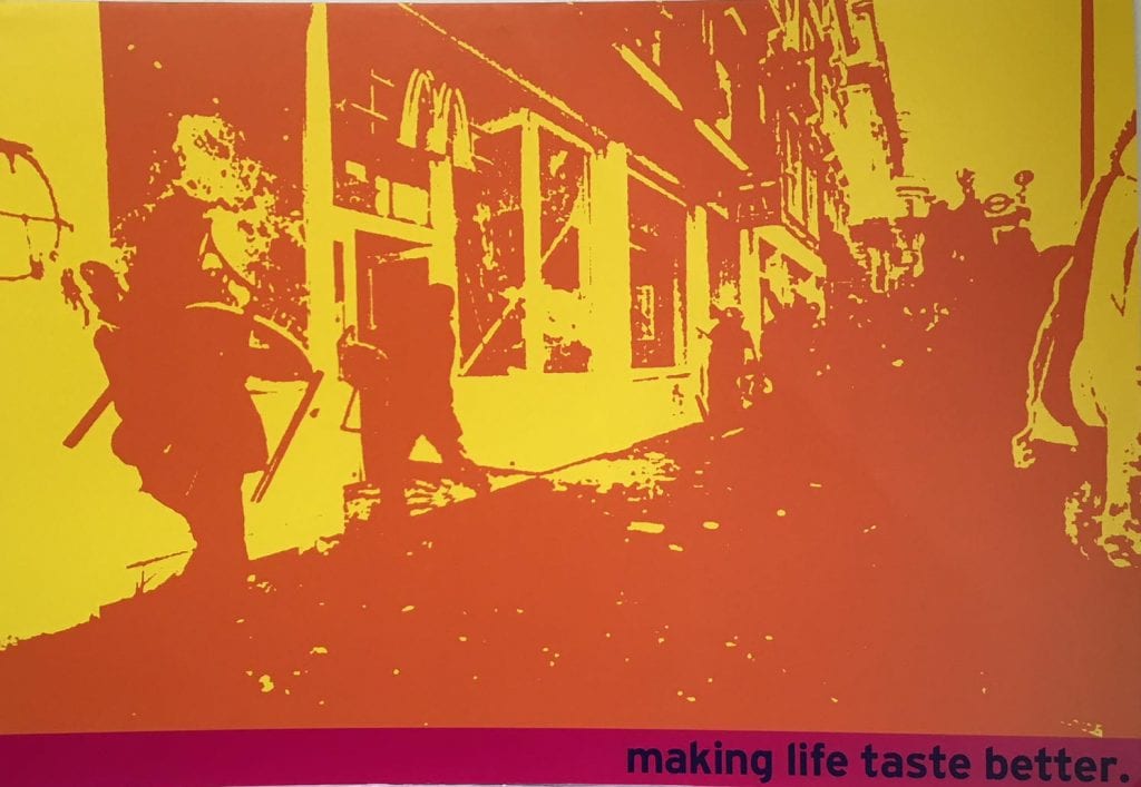
AimsOne reason for this project is as an attempt to reveal and scrutinise the often unacknowledged political ideologies that operate within the overlapping territories of culture and commerce. These Primrose Path prints are just one possible outcome that result from such a process. Here I have chosen to draw upon art, advertising and design to make work that is purposefully hybrid.In 1971, Jerry Rubin, a founding Yippy (Youth International Party) wrote a book outlining his ideas for radical social change influenced by the worldwide upheavals of the late 1960s. It was titled Do It: Scenarios of the Revolution. In 1981, the Nike Footwear Corporation employed leading advertisers McCann Erickson to increase sales of trainers and introduced the world to their marketing slogan, “Just Do It”.This coexistence of almost identical ideas for propagating what can appear to be contradictory and mutually exclusive belief systems is testimony to the enormous power and confidence of capitalism to subsume, co-opt and appropriate the dissident, rebellious and oppositional. As George Melly said in 1971 of his recently published book’s title, Revolt into Style at the Oz magazine trial in June to August of that year (concerning number 28 of May 1970, the ‘schoolkids’ issue), “Each pop culture begins as a revolt, is seized upon by entrepreneurs, packaged and turned into style.” Or Charles Shaar Murray, writing within that contested magazine: “If you can’t ignore it, take it over, package it and sell it back to itself […] What can you do with your street-fighting ideals if the very people you want to fight against can package street-fighting, put it into posters, records and books and sell it back to you at enormous profits?”This work displayed here, Primrose Path prints, seeks to examine the seeming contradictions of early 21st century capitalism in which the means for promoting consumerism recuperates the trappings of dissidence to perpetuate goals at apparent odds to its interests. Where ‘greed was good’ it is now replaced by ‘caring’ and ‘sharing’. It used to be about ‘conformity’ whereas the maxim we’re sold now is ‘do your own thing’ and ‘go your own way’. Wholesome square-jawed manly men, soap powder comparing housewives, Milky Bar kids, girls cooing next to their mums doing the washing-up with Mild Green Fairy Liquid are replaced by gay couples, black, asian, and Jewish people and overtly recalcitrant kids. The Oxo family, once a paradigm for happy is now happily dysfunctional. Multiply-pierced punky types wearing leather bondage gear form the cast for a tyre advert. Sex, of all sorts, is no longer taboo but has bolted out of the closet and put to use as an indispensable part of the arsenal attempting to sell us everything from ice-cream to pension schemes. Conspicuous consumption is replaced by care for the environment. Ostentatious displays of luxury are replaced by cool minimalism. Products cannot be merely good for you, they have to be good for your soul. The outré is now in. So much so that it has become the new orthodoxy and anything styled in a vaguely old-fashioned way is done so with a nod and a wink, positioned with a knowing and distancing irony. Simultaneously the very act of being sold to, once one of the covert dark arts – practiced by Vance Packard’s The Hidden Persuaders – is now out in the open for all to see, admire and become complicit with.These changes in the form and content of advertising should be seen in the context of current political, social and cultural conditions. Advertising now adopts strategies of persuasion that chime with the times. It has moved on, is more ‘sophisticated’, no longer reliant on the hard-sell or the pack shot. Mad Men have had their day. Indeed the most ‘successful’ advertisements are often those with a complete absence of product placement. Films, after all, can do this so much better with cars, clothes, perfume or sunglasses tarred positively by association with a leading actor who most accurately conveys that product’s ‘brand values’. Advertising now sells ‘attitude’ and opts for edginess’.MethodsThree A0-size (841 × 1189 mm) landscape format digital colour prints examine the dual strategies of today’s leading edge’ marketeers: emphasis on brand (not product) and ‘rebellion’ (not conformity). The work shown here takes images from key moments of rebellion where the boundaries of what is legally permissible are breached and activists feel, perhaps if only for a fleeting moment, they have the upper hand. Recent history provides several such moments. This work chooses three and links each with a different text. From left to right: a low-resolution highly pixelated image of an event at which CCTV cameras monitoring the streets below were decommissioned by activists; the second print uses a photograph of the poll tax riot in Trafalgar Square of 31 March 1990 taken by David Hoffman; the third print shows another event – part of the alter-globalisation movement – where a McDonalds window is being smashed and graffiti added. At the crucial moment where control seems seized away from the controllers and the world appears turned upside down, this work asks – is that really the case? Each image is ‘subverted’ or turned into an ‘advertisement’ by adding one of several well-known straplines (in adverts, usually placed close to the company logo). In so doing, the work asks questions about the limits of protest due to capitalism’s capacity to take that which is regarded as most ‘dangerous’ and render it a lifestyle option.The juxtaposition and treatment of each image with its accompanying text is intended to create a ‘third effect’, an effect that couldn’t work were the two elements kept separate. This is the term Wilson Hicks, the Life magazine picture editor came up with in his book Words and Pictures. (New York: Harper & Brothers, 1952) He felt that words and pictures together were the building blocks of what we now call photojournalism. But, he said, the cardinal sin for any text that accompanies a picture is to tell the viewer what they can already see. Let photographs do what they do best: show people things. Then, make sure the words add another punch. Something not explicit within the image. That is the aim here. To look at the unfamiliar through the lens of familiarity (and vice versa) and to create new and different readings brought about by recontextualisation.A singular moment is frozen in time within a camera. Some of these are lost or ruined; others are hidden or censored; others still are cropped, flopped or ‘treated’ by some means; while still others are chosen for use and put into the public domain. Out of all the possible versions in all the cameras (digital, analogue, still, moving image) recording that event by different people, in different places and at different times, it may be just one particular image that endures and reverberates long after the event itself has passed. When this happens – an image transcending the rush and flood of everyday news stories – it can acquire iconic status. The black and white photo of a screaming Vietnamese girl running naked down the road, with arms outstretched, imprints itself indelibly on our memory, colours our view of history, becomes our view of history. There are several such moments within each of our lifetimes. Such images are profoundly political. They transform us and subsequent events may, at times, be transformed by our responses to the image itself. It is the intention of this project to look at and interrogate such images and to examine some of the aesthetic components that make up what might define ‘iconic’: form, composition, colour and graphic treatment.It is the intention here too to examine the verbal language of advertising. Where once supposedly definable objectives – whiteness in clothes for instance – dictated the unique selling point of a product, we are now confronted with messages that seem to be simultaneously less specific while also promising everything: “Coke adds life”. At the same time, oppositional movements often use many of the same language tics: Mexican Zapatista’s “¡Ya Basta!” (Enough is enough!) could very easily be appropriated by any corporation to give their brand that desirable edgy quality. The succinct, sound-bite nature of these new aphorisms are used and explored here.When leafing through a copy of James Main Dixon & Thomas Nelson’s English Idioms I came across “The primrose path: the pleasant and alluring road which leads to destruction”. This seemed apposite, so I have titled this project Primrose Path prints.HistoryThis text is an updated version of the original written in August 2000 to accompany the first showing of this work. It was part of an Art Circuit Touring Exhibition curated by artist Peter Kennard called Look out: art / society / politics and included artists Jananne Al-Ani, Tony Bevan, Stuart Brisley, Mohini Chandra, Mat Collishaw, Cornford & Cross, Willie Doherty, Noel Douglas, Leon Golub, Carlos Guarita, Richard Hamilton, Tim Head, Tom Hunter, Glenys Johnson, Peter Kennard, Maggie Lambert, Jenny Matthews, Gustav Metzger, Martha Rosler, Souheil Sleiman & Mai Ghoussoub, Nancy Spero, Christopher Stewart, Nick Wapplington, Emmanuelle Weackerle and Krzyztof Wodiczko. The show appeared at Wolverhampton Art Gallery (16 September – 11 November 2000); Bluecoat Gallery, Liverpool (21 November 2000 – 11 January 2001); Pitshanger Manor Gallery, London (18 January – 3 March 2001) and Wolsey Art Gallery, Ipswich (17 March – 13 May 2001).

Primrose Path – Peter Brawne
Peter Brawne June 2018


