Transactional: Landing page has clear ‘Join Us’ button – to allow for swift process to payment.
Service oriented / relationship building: Landing page has clear ‘Get In Touch’ button – to allow for communication with the company. ‘Our difference’ tab and Blog provides more conversational approach to sharing information.
Brand building: Landing page promotes wellness, motivation, passion through the uses of imagery and text. ‘Our difference’ tab allows for insight into company – building brand image.
- Important customer segments
Geographics – offline (gym) and online website
Demographics – 18-55, male and female, families, working/ middle/upper class – prices begin from £100 a month.
Behaviour – usage patterns – want to gym 3-5 days a week – flexibility – classes – personal training – individual sessions – swimming – sports – spa
Psychographics– full time work – healthy – need time to relax – busy – mum – family
Webographics – high web experience, UK, laptop, daily, health/fitness/weightloss/toning/spa, mobile/laptop, during lunch break, after 5pm.
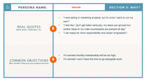
Persona name: Katy Hannah
What is their demographic information? 26, Female, Single, No Kids, Flat
Background: Enjoys movies, wines, festivals,
What is their job and level of seniority? Marketing Developer – Middle Class
What does a day in their life look like? Healthy breakfast, work from home on some days, midday meetings, gym class, food shopping, healthy dinner, netflix.
What are their pain points? What do you help them solve? Feel inadequate, not comfortable with body, looking for flexible fitness, wants personal involvement with others i.e classes
What do they value most? What are their goals? Friendship, films, ambition. Wants to run own personal marketing company, wants to slim down dress sizes, wants to find a family and settle down.
Where do they go for information? Cosmopolitan, BBC news, The economist, Daily Mail, Social Media – Mix of authoritative and friendly resources.
What are their most common objections to your product/service? Expensive, not many locations, membership cannot transfer from location to location.
Keyword research – skincare, spa, weightloss, exercise, diet, healthy, quick, shred, 90 day fitness plan,
How we help: flexibile gym membership, varying on time, day, variety of class conducted and equipments.
Marketing message: Here for you when others are not – reliable friend – escape the day – relax in the spa
- Critical analysis of Virgin Active website : https://www.virginactive.co.uk. Links to the resources used:
On approach the landing page is a vibrant red (eye catching) with an implicit call to action -“Find your workout – join us – get in touch”. For the technologically savvy this website is easy to use, but for those older it could be argued that the layout is not simple but rather overwhelming. Before seeing any real content you are asked for action – which is something you may not want to do if you are a new user and unfamiliar with the site function.
Humour – “we use cookies, not the chocolate chip kind”. Humour is useful to create a more friendly conversational vibe, key in relationship building.
Site Layout – As you scroll down the site more information appears. This is easy to use for the tech savvy, but for those not computer literate could be overwhelming. It creates a crowded, busy, feel not beneficial for a site wishing to relax.
Shortcuts are available at the bottom of the screen for easy user reference. Grey font on a dark background allows for a reprieve from the red and easier accessibility. Business partners are also linked at the bottom via the use of their logos to provide for a marketing stream.
“GET OUR LATEST FITNESS TIPS & NEWS” The website provides direct links to the company’s Facebook, Twitter and Youtube account. This allows for quick and easy access to social media platforms and valuable for customer engagement and brand image.
Headers at the top of the page when hovered, provide images for customer engagement and ease of use. This makes the site more interesting and provides a ‘quick look’ into the sites contents.
Consistent colour theme, fonts and text throughout the site.
Site contains sign up/sign in option for personalized service. This is a great way to attract and retain customers as well as recieve invaluable marketing information.
Blog option allows for further interaction and content between the consumer and user.
Overall the site is considered to be modern with a fresh, updated look. It is quick and easy to use with graphics and visuals to make the experience more engaging. This technique whilst seeming effective could be considered cluttered by non tech savvy users and as result could potentially be isolating a market/consumer type.
Written by Rochelle Garcia-Rodriguez – Bsc (Hons) International Business student.


