Chosen Email:
Critical Evaluation
Would you ever open the email? – Yes
When/why? – I would open the email when I was completely available. This is because the email is for marketing purposes only.If the email had involved information regarding my recent purchase then I would open the email on the go. I would open the email because although it is marketing based, it contains some benefit to myself the reader, this is the incentive to get a free birthday gift.
Is there any personalisation? – No but the email is advancing onto this. i.e in order to create a personalised experience with free birthday gifts, the consumer needs to submit this information.
Template/design? – The design is simple with large user friendly text. This makes for a great viewing experience. The colours used are feminine, pastel and attractive to my demographic. Below the main email content, the email tactically includes headlines such as ‘new arrivals’ and ‘best sellers’ – a great way to further market their product portfolio. There is also a feature at the bottom of the email to unsubscribe from the reading list if you so choose.
Call to action? – The call to action is a ‘BLOW OUT THE CANDLES >>>’ banner presented above the birthday cake prompting the user to click.
Use of images? – The use of imagery is attractive and makes the email interesting. The colourful birthday cakes features moving flames on the candles to enhance user experience
Critique
What is good, what works well? – The use of colours and imagery are perfect for my demographic. I would consider my demographic to be female, 18-24, girly girl. The candles with the moving flame graphic are a great addition to the email, making the email attractive and interesting. The email also contains an informal text tone which aids in building a rapport with the consumer, as well as creating a friendly and approachable ‘vibe’.
What is less good, how does this compare with guidelines from lecture 3, and your reading? – The email could have considered personalisation. This could have been done via the subject header or even the first line of the email. For example the current subject line is “Tell us your birthday for a sweet treat…” when it could be changed to “Rochelle, tell us your birthday for a sweet treat…”
What could be improved? – More value could be delivered in the email, for example tips and tricks about makeup, or even perhaps information about the special birthday gifts on offer.
Landing Page:
Landing Page Link? – https://tartecosmetics.com/EU/en_GB/welcome-email-birthday-form.html?contact_eid=1a839f96-1c16-4854-ac3e-0bc1e766167e&utm_campaign=trigger%20postpurchase%20em0%20bday&utm_medium=email&_bta_tid=19950337905476402930932196245391620133267729894690781176629049684548615018530394084184417035182864195645&bxid=1a839f96-1c16-4854-ac3e-0bc1e766167e&utm_content=trigger&utm_source=bronto
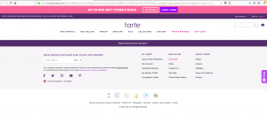
What does it offer? – It would appear that the ‘call to action’ link is faulty. When the link is clicked, the site has no main text body and only the header and footer are presented.
What does it do? – As of present not what it had intented. However you can still surf through the site due to the remaining header and footer.
Calls to action? – As there is no main text body the main call to action would be the banner present above the header. This banner adertivises the ‘cyber monday’ sale with the discount code. The call to action therefore is to utilise the promo code and make a purchase.
Personalisation? – None present.
Critique? – The company need to review email attached links, this link however could have ‘expired’? If so the company need to look into avoiding this problem, as essentially once the link is broken, the email marketing content is useless and remains a waste of resources. However, contradictingly you could argue that this email would still ‘market’ the company through the use of branding, imagery and appereanc ein your mailbox. The reader could then go on to google ‘Tarte birthday’ to see if the link would appear, but generally consumers are lazy and so the leads you would loose due to this link area would be considered substantial.
How could it be better? – The link should be fully functioning, main body should be present, as should personalisation.
Academic Finding – (based on the work of: Hernandes and Resnick, 2013)
It could be argued that the original email features an ‘Inverted Pyramid Pattern’. This is because “the top of the page is designed to present the greatest quantity [of text] with an expectation for the longest gaze duration” (Hernandes and Resnick, 2013). This is made apparent in Tarte’s email, as ‘Birthday cake anyone?’ is the largest size and source of text at the top of the email, before the text funnels down.The email is designed to ensure that the user gazes at the top of the email and slowly browses down, as represented in the diagram below.
(Image sourced from Hernandes and Resnick, 2013)
References
Hernandez, A. and Resnick, M.L., 2013, September. Placement of call to action buttons for higher website conversion and acquisition: An eye tracking study. In Proceedings of the Human Factors and Ergonomics Society Annual Meeting (Vol. 57, No. 1, pp. 1042-1046). Sage CA: Los Angeles, CA: SAGE Publications.
Created by Rochelle Garcia-Rodriguez, a Bsc (Hons) International Business student.


thanks its very useful