Website Analysis: ASOS
ASOS is an online fashion retailer which sells clothes online, from its own home lines and from a variety of different brands. In this article we will conduct a brief website analysis of the ASOS website.
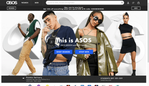
(Source: asos.com)
Review of Homepage Elements
- Logo is positioned at the top left of the homepage, which could be considered fairly small, however the brand name is also shown in the centre of the homepage in the phrase saying ‘This is ASOS’, so the brand name is obvious.
- From the homepage graphic it is easy to understand that the website sells clothes
- Secondary Links to ‘shop women’ and ‘shop mens’ are easy to find at the centre of the page, highlighted in a blue box, as well as at the top corners of the screen.
- At the bottom of the homepage are all the forms of payment that are accepted, and links in the form of icons for the different social media’s that ASOS can be found on. This adds extra value to the homepage and also provides the customer with extra information
- Other secondary links are found at the bottom of the homepage, which are all categorised, making it easier for the user to navigate to the page that they need.
- Terms and conditions, Privacy and cookies and accessibility statements links are found in small text at the bottom of the homepage.
Colour scheme
- Consistent Black and white colour scheme throughout all the pages of the website
- ‘Clean’ looking pages due to colour scheme. White background allows images of photos to be as clear as possible.
- Not distracting
- Splashes of colour when showing promotional offers, adds personality and charisma to website.
Usability Assessment
- Site organisation is appropriate as it allows the customer to find information easily
- The page layout of each page is consistent
- Text links are often in the form of hyperlinks. They are not underlined but do turn a different colour, eg. blue, or become highlighted when hovered over to indicate that they take you to. different page.
- Tabs and bars (navigational elements) are consistently positioned and formatted across all pages.
- Site map couldn’t be found
- Contents of the website for specific categories of clothing found at the top of the homepage
- Liquid webpage design
- Search bar easily found at the top of all pages in the site
- Images and multimedia are only to support site messages and show what the site offers.
- Font size and colour allows all of the text used on the site is easy to read.
From the Analysis, its clear to see that their website has been thoroughly thought out from a marketing perspective and is clear and easy to use for customers.
If you want to check out the ASOS website for yourself here is a link
https://www.asos.com/