Looking at the colours for the album schedule. I used the colours that connected with the photos from Korean and of TEN from the show. I want the spreads to connect through the use of colour there for i chose the colour palette that stands out on each page but for it to also flow as a whole piece. Having this palette created shows all the colours together, and it shows that they work together through tones and brightness. These colours showcase the colours seen across Korea and the photos i have included. Its warm selection and connects with the album cover and concept of richness and culture.

 Colour scheme palette created with – https://coolors.co/
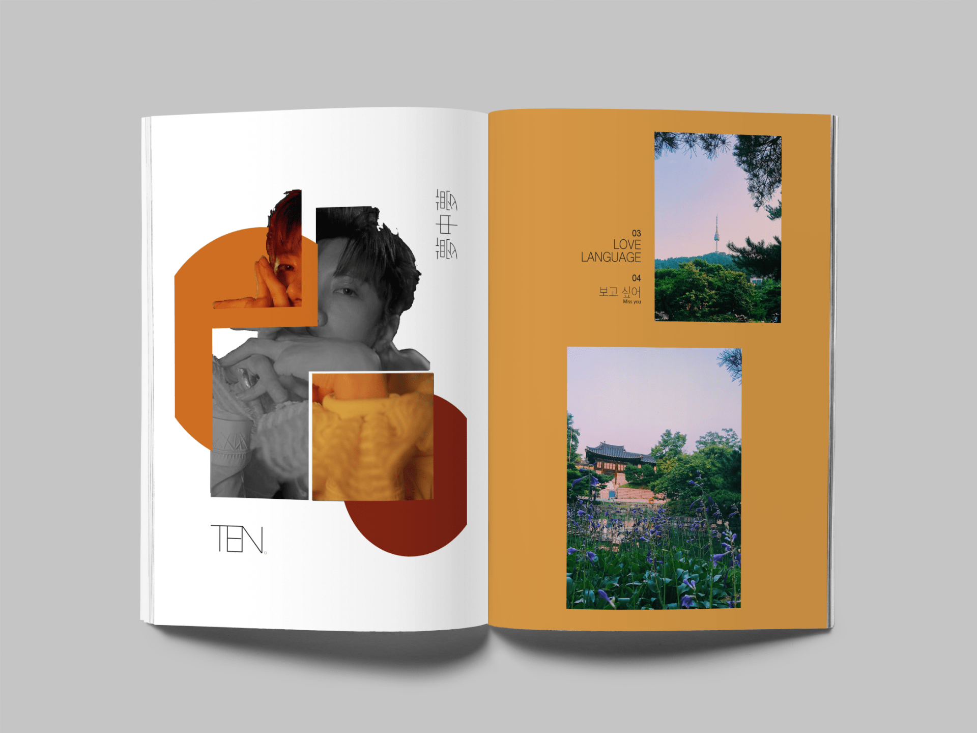
I re worked the colours on the spreads as i had feedback from Chris saying the colour needs to match the message. Looking back at it, the colour was dull and didn’t stand out there for i reviews the palette and changed it to a brighter orange which i think has a happier vibe to it and works with the lyrics of the song. It so works a lot better as it makes the Korean text stand out more for an easier read.
I also brightened up the yellow on the following page again as i looked at it again from Chris talking about conveying the message. The brighter yellow represents the sun and summer time, which is what the photos are all about. The beauty of Korean landscapes and the strong colours seen within the flowers and sky. The brighter yellow also still works with the collage on the paring page. The page feels brighter and makes the pictures stand out more.


