
This week, the focus of my investigations in materials for language learning and teaching was the potential of infographics. I began with Amy Balliett’s ‘Infographics Fundamentals‘ on lynda.com, in which she begins by explaining the importance of visual communication with the example of the globally recognisable ‘careful the floor is slippery’ sign. You are most likely picturing the one right now. What makes this stand out as such a strong example of visual communication is the way the message of a present situation, associated danger and consequence of that danger is conveyed with only minimal recourse to linguistic resources. She makes the important point that infographics and visual communication are not synonymous with each other – rather, the former is an example of the latter and, whilst the popularity of infographics and demand for them in the world of business continues to grow, there are many other examples of visual communication, this ironic graffiti-depiction of Ronald McDonald warning against the dangers of heart attack, spotted on the streets of Bogota in 2010, being a case in point.
As with materials in general, we can approach the use of inforgraphics in two different ways, choosing either to make the best use of what already exists or to create our own from scratch to serve specific purposes. Nik Peachey, teacher, blogger, materials writer and technology guru, has written a number of posts which offer helpful guidance on both. With the limited time available to use, we decided to divide up the labour. Alex took on the the task of desiging an infographic from scratch and I explored the world of existing info graphics with a focus on how they might be put to use in the classroom. Inspired by Nik Peachey’s, I decided to create a pinterest board to keep track of useful info graphics, which you can see below.
Follow Alison’s board Teaching resources on Pinterest.
So if infographics are great because they speak to us first and foremost in the language of images, there must surely be a wealth of opportunities for us to use them in the classroom. Nik Peachey has a useful post which suggests some generic activities that could be applied to an infographic of your choosing. I love the flexibility of these ‘materials’, the freedom they give me to pick something that would suit the interests of my learners, something that would fit in with, or lead in to, the topic under discussion or something connected with whatever is going on in the wider world. One of his suggestions was ‘peer created questions’, or getting the students to create questions to ask each other based on an infographic they had read. I could imagine this working with this ‘breakfasts around the world‘ infographic from ChefWorks. Everyone could read the first section, on the health benefits of breakfast and top ten foods, before splitting into groups to read about the different countries. They could then formulate questions to ask and regroup to find out about the breakfasts from other places. The familiar topic with non-abstract themes, simple language and clear visuals would make this a good candidate for use with lower level learners. I love the idea that an infographic would make it possible to use authentic materials with a group for whom a full newspaper article or TED talk might be too challenging. The topic also lends itself to a range of follow up activities. Learners could research breakfasts in other countries and report back to each other or compare the typical meal in their home country with what they eat here.
On to some of my own ideas for the rest of this post. I thought this infographic, which compares the lives of Charles Dickens and Jane Austen was interesting because it was produced by Cambridge University Press. One thing I took from ‘Infographics Fundamentals‘ was how valuable infographics have proven themselves to be in the business world. The course seems to be tailored towards designers hoping to profit from this popularity. I didn’t realise, initially, that education publishers such as CUP are actively producing and publishing infographics, but my very first pinterest infographic research session brought this to my attention. The other point to make is that Charles Dickens / Jane Austen is not targeted towards English language learners, and I suppose there are reasons why a teacher might not view this as a relevant choice. Are these stalwarts of GCSE English literature appropriate choices for learners of a global language? It raises questions about the extent to which culture should be taught along with language, and indeed, whether Jane Austen and Charles Dickens represent the kind of culture that we’re talking about. But putting these lofty questions aside for one moment, I thought this infographic had big potential as a means of teaching the language of comparison. I’m thinking of the type of thing required (as one example) by the ‘long turn’ in the Cambridge Main Suite exams, in which the candidates compare and contrast two pictures. One problem my learners run into frequently is falling into description of what they can see rather than comparison of what the pictures represent. I wonder if an infographic like this that clearly presents the differences between two comparable things might help get around this problem. I’m going to test it out with my current Cambridge First class and see.
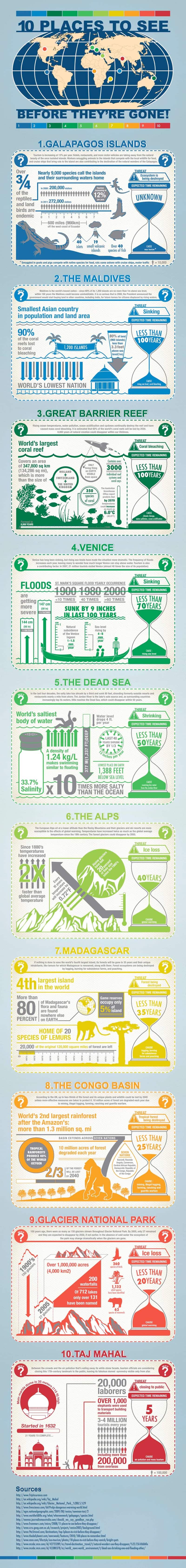
An entirely different activity could stem from my last choice for this post, ‘10 places to see before they’re gone‘ from Daily Infographic. I think this could lead in to a ranking discussion, where the learners debate which sites should take greater priority for preservation. Agreeing, disagreeing, modifying opinion and reaching agreement are all functions which could be practised here. I am thinking about my Cambridge exam classes again, who in part 3 of their speaking paper have to demonstrate their ability to do these things through often farcical tasks which can lack the controversy required to bring out this language. Having said that, this type of task could be adapted to most topics and most levels. An alternative way of using this infographic would be as a context for the language of cause and effect. Learners could read about three or four of the places each before regrouping and reporting to others. Then, they could work in those groups to describe the causes and consequences of each situation. For those who need to produce essays or give presentations showing their understanding of this type of language, I think this could be useful practice.
Obviously, this is a drop in the bucket in terms of what can be accomplished with infographics. I plan on adding more potentially useful infographics to my pinterest board with notes on how I plan on using them. I haven’t talked about Alex’s insights gained from the process of creating an infographic from scratch – something I also intend to have a go at when time permits. Most importantly, I want to try out some of these ideas with my learners. A lot of questions remain unanswered though. What is the best way for the learners to access the infographics? The long-line form of lots of infographics means that they would not display easily on an interactive whiteboard. The same problem would apply to printing hard copies. The learners could access them on their own devices, but this raises issues of wifi accessibility and the questionable assumption that they come with devices suitable for this. Has anyone tried using infographics in class? Let me know in the comments if you have any ideas, links or experiences to share.
Hi Alison!
I really enjoyed you presentation on infographics. Excellent ideas!
Also, I recently came across a blog post by Nick Peachey about interactive infographics. Perhaps you can take your ideas even further.
Here is the link to his blog http://nikpeachey.blogspot.co.uk/
Thanks for the feedback, Anna, and the link. I tried out one of the tasks in my First Certificate class the other week – I should write a post I suppose! Where can I find your blog?
Hi Alison! It’s http://blogs.brighton.ac.uk/annaneileltmaterials
Hi Alison,
What an inspiring read! I was really keen to find out about infographics after your presentation in our TE714 session. I am slowly making my way through all the links you included.
Interestingly, I too instantly thought of my two FCE classes. I would love to trial this with them next week and will make sure to keep you posted. I agree with infographics being a perfect visual prompt for Parts 2-3 for the Speaking Paper but also for Reading and Listening. Couple of my afternoon FCE students really seem to struggle with identifying key points of either inputs in parts mentioned above. As Infograghics focus on conveying only the most important messages in the most efficient ways, using those in class can put students on the right track to recognising what type of information is worth stressing.
Though I am still to explore Amy Balliet’s course on lynda.com I watched one of her short presentations on Infographics on YouTube (https://www.youtube.com/watch?v=1SFF2f9jCfM) and found it absolutely fascinating that, indeed, this is the new way of getting our ( and our students’!). message across.