PROJECT RELFECTION

Overall I have learned lots of things through this project. This is the first time I works in different position such as photographer, art director and stylist and graphic designer. Also i learn to manage time in advance and  make detail plan before I have a photoshoot. I have hard time to organize my  ideas because the idea i based on is quite psyche theory. I am not major in psychology so I don’t think I should put lots of text about this into my Zine. I prefer to transfer my perspective into images or illustration. I most satisfied with attaching leaflet i put inside the Zine as I want my reader to have interaction with it.

This is my first time working with Indesign, which took me lots of time to practice first but gradually i know all the basic enough to make my Zine. I also research about the layout, how the text and image affect the meaning I want to transfer. In this Zine, I try to use different fonts to represent various people because my interview was anonymous. Also this somehow make the reader feel the sympathy because it doesn’t point out any specific name.

If i can do that again, i would like the include article about how audience expect the celebrities to be and their real life.  I also want to have a video or interview. Because I did 3 photoshoots which took me much times to edit. I want to do more gatefold (open pages) in my zine or include different types of paper such as print on brown paper or transparent paper.

The result I receive is not bad, i found it interesting and difficult at the same time to manage all the content and the the edit for the Zine. I really enjoy this project and I hope I am able to make my own Zine in the future.


Movie Research- Editing

I would like to include some movies related to my theme. I have researched and watched some of them.

For the first chapter Persona, I chose the movie Blackswan 2010 and Persona 1996. The movie Blackswan is a good example of a person suffer from the inflation of their social mask, the main actress totally lost herself and cannot figure out what is real what is fake.  I haven’t watched the PERSONA 1996 but i read the review about it and it totally fit with my theme.

The second chapter I choose Joker 2019 and Dark City 1998. Joker, this man is put in the situation where he has to deny, forcefully suppress his own Shadow. It is denying as well as holding onto this , becoming the Joker is a great liberation for him. Dark City is more like science fiction but it is also talk about how people change and what affect them.

The third Anima/animus. I put 500 days of summer and Eternal sunshine of the spotless mind . These two movie all talked about a man refuse their anima and imagine another perfect match but they didn’t take care of that girl well

The last chapter is The Self. I choose How to become myself 2007 this is a Japanses movie talking about accepting yourself. Also Brave is also a good example for this.

I editing most of my work in Photoshop and Indesign. For illustration I made in Procreate. I also Download free font and use it in Procreate then transfer to Indesign.


Zine research- Reflection

I have looked at the layout of different zine and magazine to learn how they set up and organise text and image. In this Brick Magazine, i can see they are very mimimal in layout with black or white text. But I think it very effective especially with short paragraph. This is what I can apply for my Zine

However, I love colour so I definitely use various typography and colour in the text as well as the background.

Brick Magazine

https://www.dazeddigital.com/music/article/31467/1/brick-magazine-will-have-you-re-think-hip-hop-culture-asap-ferg-vince-staples


Another example I am looking at is Jiani Lu for the combine of my Zine. I can see that she made this booklet handmade and it consists of folding paper and leaflet. I really want to include those in my Zine as I want my reader interact with it. Therefore, this is a good example for me to learn.window farms information design infographics book print Urban Agriculture urban farming binding saddle sewn Hand Bound Graphs illustrations vectors icons

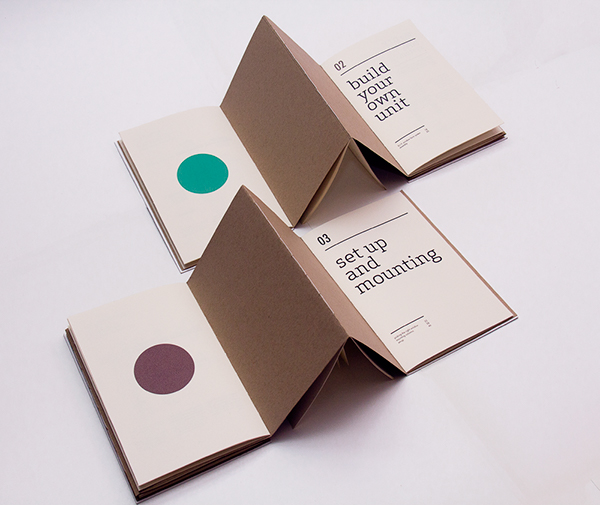
However, there is no print company can do it for me, they just able to make them seperately. Therefore , I choose to print the folding paper/ leaflet seperate then I will attach it inside my Zine. I want to have a page with WHO AM I in reverse and I will have mirror paper for reader to read it. However, the place I bought the paper is not exactly what i need, so I still just leave it there and maybe my reader can read it with their phone. That is one of my biggest regret.

I feel like the process of printing is more exhausted for me. I want to use different type of paper depends on the page, but i don’t know how to do that. I just adding different type of leaflet inside. One more lesson that I learned before printing is check the work several times to make sure every page is good.

ANIMA/ANIMUS and Self Photoshoot

According to Jungian Theory, the animus is a male image in the female’s psyche, whether the Anima is female traits in a man’s psyche. The Anima consists of sensitivity, empathy, patient. If a male represses his anima, can cause him to become malformed, sentimentality, hysteria and possessiveness. The Animus on the other hand, consists of aggressiveness, courage, strength of conviction and a desire for achievement. If a woman ignores or rejects her masculine tendencies, she will experience anger, ruthlessness.

I feel like the Anima/Animus is quite complicated to delivery through photo, I just simplify them by taking pictures of fruits/vegetables to represent the indevisable of Anima/animus.

Here is the page for my Anima/Animus.

For the Self photoshoot, I was inspired by Chiron Duong by his slow shutter speed ghosting images. Also I want to use slow shutter speed to present the BECOMING A WHOLE. The shooting i made in the studio went so well, although i hope I can do it in a bigger areas, maybe I should try to do a photoshoot outside. I also took some photos with mirror which I can use these for the first chapter. I really like the outcomes. The moving images are a bit pixelated but I think I can fix that in the Photoshop.


Shadow photoshoot

With this chapter, shadow contains life instincts, sometimes it is not bad but due to the surrounding area that person live in, these characters are considered bad so that they have to repress it inside.

I got the idea for the photoshoot from the painting The Last Supper by Leonardo Da vinci and I will ask my friends from Vietnam do this shoot for me as this required 13 models. I called face-time with them at the shooting day.Unfortunately the studio is not big enough to make a landscape shoot, so I decided to have group photo only and some portraits of 12 characters.

The result went out quite nice, this is the first time I do a remote shoot and the photographer is another person. I feel a bit worried and nervous at the beginning but it turns out quite good. I am very grateful that i have my friends helping me and all the models are doing so good even though this is their first time.

Eventhough there weren’t enough 12 people as I planned but i think it is not the big problem. I think the edit come out very good, it looks like a poster.

PERSONA PHOTOSHOOT

I was inspired by photographer ELizaveta her work which distort human’s face and boy. Persona is the face that a person show to the society, and how the society expects  you. By looking through the glass, we can see the model’s face is different, this shown that what we see the person outside is not exactly what they are. I did this shoot with my flatmate by using existing glass bottle we had to make her face changes. I will layer these images with the responces I got from questionnaire. I felt very satisfied with these images, they are all look so cool.

At first I want to do portrait and then embroidery another face on the model but I don’t think I have enough time for it, so i just come up with this ideas.

Here we can see that the water which represent the society makes her face changes.

Draft Zine- Week 7

I make a mock up for the gatefold to attach into my Zine. This week I almost finish my Zine. There are some problems that i concerned is the printing and the layout in Indesign. I have to ask tutor Chris to figure out how I organise the leaflet.

I also print out the draft for my Zine but unfortunately it is too big to attach in here so I just put an image.

gatefold Z fold

I also make sure that the QR code for my spotify playlist is working

Fashion Illustration & Imaging week 6- Zine Research

This week I learned to make a animation gif. I have done a simple gif on Procreate but this is the first time I did with the real stuff. It was such an interesting experience however I realized the quality will be better if i have a tripod to make my phone stands still for the whole process. I am trying to add this gif into here but unfortunately it is not working so i export it as a video.

My_Stop_Motion_Movie

My_Stop_Motion_Movie(1)

At this stage I don’t think I will make a Gif for my Zine but this is such a interesting thing that I can use for my future project.

The second GIF i did, after cutting the face I feel like i can do that for my Chapter 3 Anima/Animus by cuting and layering man face and woman face. I did it by using procreate.

I have tutorial with tutor Ali on Friday and I showed her my sketchbook and all the photoshoot. She gave me some advice about I should make a flatlay to organise my pages first. I need to talk with Chris about some problem I have in Indesign.


Fashion Illustration & Imaging week 5

I learned different types of typography and how they affects the work.

I saw this page in the photography journal in library. I like how they put various typography in one page which makes the page more appealing. The colour of the page is very bright which goes very well with black word.

I had second book binding workshop today. This one i think it is easier than the last one and also it looks more elegant.

I did draft page in Indesign with different typography and images. I think i should put colour underneath because the black and white seems quite boring to me.

I also learned to make gradient colour page.