Case Study: ASOS & their e-mail life cycle

An e-mail address is usually individual thus making it more common to a mobile number than a post code. E-mail addresses can be linked closely to the customer lifecycle using response data alongside Recency, Frequency & Monetary (RFM) data (Roe, 2011). Every e-mail sent to potential, existing, or previous customers is an opportunity to provide value and possible sales conversion. This blog will look at the conversion cycle using ASOS as an example with the use of their e-mails.

1. Incentive E-mail
According to Neely (2014) incentives can help to double opt-in rates and personally, they help persuade me to make a purchase! Incentives should be relevant to the user, valuable and easy to digest. The table below shows various incentives you could use:

Click image to enlarge
7- Table

So onto ASOS… I receive frequent incentive e-mails from them which is the start of the lifecycle.

7- Asos (3)

This particular e-mail caught my attention. The Call-To-Action is clear- there is a sale on so view it! Having looked on the website and not purchasing anything immediately, I was actually sent a follow up e-mail offering an extra 10% off sale items. This then lead to placing an order.

2. Order Confirmation

7- Asos (4)

After placing an order, an e-mail is automatically sent confirming the details of this. According to Marketing Metrics (2010, cited by Return on Behavior 2010) the probability of selling to an existing customer is 60 – 70%, which means once a customer has made a purchase, they are more likely to place another order. This could be encouraged by including a promotional code for their next purchase for example. ASOS give the details of the order but do not offer anything extra but they include their social media links in the hope of attracting more followers.

3. Despatch Confirmation

7- Asos (5)

During the despatch confirmation, a link is presented to entice the customer to look on the site in the hope of placing more orders! There is also the option to track my order at this point. To be more personalised, ASOS could recommend items to go with those already ordered in the hope of encouraging more sales from existing customers.

A successful despatch e-mail should:
• Allow for easy tracking of the order
• Suggest potential items for future sales
• Allow an option for recommending to a friend

4. Local Delivery Courier Confirmation

7- Asos (1)

5. Delivery Confirmation

7- Asos (2)

The last two e-mails have been sent on behalf of ASOS by the courier company Hermes. This improves customer service as I like to know when I am likely to receive my delivery and if I am out I like to know one of my housemates has signed for it! Being able to track my order from despatch to delivery helps build my trust with the company as I know my order will actually be delivered and I know exactly where it is. With these little extras, they all help to make me want to shop with ASOS!

Improvements

According to Baymard Institute (2014) 67.45% of online shopping carts are abandoned. I think ASOS could benefit from sending an extra e-mail to their users reminding them of the content they added to their basket and abandoned. New Look do this and it actually does work as often I add items to my basket then forget to checkout as I get distracted doing something else!

7- New Look

Pointers for shopping cart abandonment e-mails:
• Clear Call-To-Action to encourage click through rates
• Main message in text format, as some servers block images
• Remind the user of the items they wished to purchase
• Remind the user of any incentives i.e. sale, free delivery, money off
(Macdonald, 2013)

Mohammadi et al. (2013) emphasise on the importance of using all the customer information available to focus on personalisation so the customer is more engaged with the e-mail and can actually relate to the content. ASOS do not personalise their e-mails with all the information available as for example, they never use my name and when companies use personalisation it makes me feel like the e-mail is intended for me and not just a generic one. Therefore when creating a e-mail campaign consider what information about your customer you have and how you can use this to build a good relationship.

For further reading, Roe (2011) looks at the five steps of a e-mail life cycle (http://bit.ly/1J8dqCh).

References
Baymard Institute, 2014. 29 Cart Abandonment Rate Statistics. [Online]
Available at: http://bit.ly/1Gw6xHh
[Accessed 26 April 2015].
Macdonald, M., 2013. 4 Ecommerce Transaction Emails You Should Be Optimizing (And How to Do It). [Online]
Available at: http://bit.ly/1JIEpB3
[Accessed 26 April 2015].
Mohammadi, M., Malekian, K., Nosrati, M. & Karimi, R., 2013. Email Marketing as a popular type of small business advertisement: A short review. Australian journal of basic and applied sciences, 7(4), pp. 786-790.
Neely, P., 2014. Using Incentives to Grow an Email List. [Online]
Available at: http://bit.ly/1Dnzu4M
[Accessed 23 April 2015].
Return on Behavior, 2010. 50 Facts about Customer Experience. [Online]
Available at: http://bit.ly/1EuLm95
[Accessed 26 April 2015].
Roe, T., 2011. The five stages of the email lifecycle. [Online]
Available at: http://bit.ly/1J8dqCh
[Accessed 21 April 2015].

Integrating mobile and social media with e-mail campaigns

This blog has been influenced by the research of Ross (2011) who is the creative strategist at e-Dialog International. He explains how the digital revolution means that mobile and social are now the most essential tools for marketers.

With the digital marketing industry being a rapidly changing one, I think it is important for companies to keep up to date with the latest technologies as their competition will be doing this! This includes the use of mobile marketing and social media.

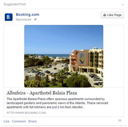
E-mail campaigns still tend to be the less intrusive form of marketing, as I personally am still finding cookies very intrusive as I may have been looking at a holiday on Booking.com’s website and then when I go onto Facebook, there is an advert for it (And nowadays I tend to find an e-mail in my inbox as well). Although intrusive, this is clever marketing in my opinion, so definitely worth considering in a marketing strategy.

7- Booking

So what are the top tips for integrating social and mobile into email marketing campaigns?

1. Rendering is key

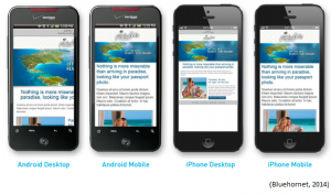
It is essential for your customer’s to be able view the e-mail correctly as what is viewed on a desktop will vary to that of a smaller phone screen! The Call To Action may be placed differently meaning it may not be as successful as initially thought. E-mails can be designed to open in different formats depending what device is used to open the e-mail, advances in HTML coding allow us to do this (Bluehornet, 2014).

Click image to enlarge
7- Mobiles

The smart phones above are capable of rendering e-mails intended for desktops but they still require scrolling and zooming-in for example, it is therefore much better to adapt e-mails intended for mobile user’s to optimise their use. It is easy to delete an e-mail due to a lack of readability. Having a mobile intended e-mail will eliminate these issues so consider this when creating an e-mail campaign (Bluehornet, 2014)!

Click image to enlarge
7- Pizza express E-mail

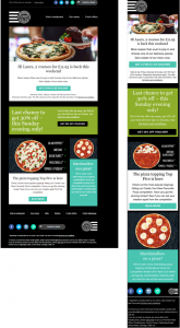
Although the majority of the content is the same in these two e-mails from Pizza Express, the mobile friendly e-mail has been adjusted to suit the mobile phone screen. This is shown in the right hand image. Pizza Express render their e-mails to ensure their customers always view it in the best possible layout and size. There are some differences which can be seen above but the CTA’s tend to be in the same place where attention is drawn to them. To improve, I think the mobile intended e-mail should also include links at the top to different parts of the website such as their menu and fresh offers.

2. Suitable Call To Action (CTA)

Often the Call To Action will vary depending on what device a user is using. For example for a university project I am looking at airlines and an e-mail opened on a desktop compared to a mobile may vary as users are less likely to book immediately on a mobile through the website but more likely to use the company’s app. Kurt Geiger always ensure their social media links are integrated into the e-mail… Recognise these symbols?

7- KG

Each links to a different platform of social media enabling the user to share contents for example.
Integrating social media into e-mails may mean the CTA being to share content within that e-mail with their friends on social media. A CTA is the key connector between consumers and content and so is a key component of your campaign and also the campaign’s return on investment (Russell, 2012). Therefore it is important to get this right!

3. Integrate activity

To ensure success both the e-mail campaign and social media should be consistent with the marketing strategy. Launching a great new mobile app for your brand is not going to generate the desired result if no customers are driven to download it through a targeted to mobile device email campaign. So how is this done? The first step in creating a brilliant integrated campaign is often facilitating internal inter-departmental discussions (Ross, 2011).

Following these tips could really help with a mobile e-mail campaign and in my recent project at University, I have been considering this and realised how many elements there are to a e-mail campaign and to social media business success!

For further reading on mobile rendering, Bluehornet (2014) provides an excellent read into the considerations that need to be made (www.bit.ly/1D2ANpF).

References
Bluehornet, 2014. Responsive Design For Mobile Rendering, Minnesota: Digital River Inc.
Ross, E., 2011. How mobile and social can integrate with email. [Online]
Available at: http://bit.ly/1FXWHv1
[Accessed 19 April 2015].
Russell, K., 2012. Five Must-Have Elements of an Awesome Mobile Marketing Call to Action. [Online]
Available at: http://bit.ly/1OuBttl
[Accessed 19 April 2015].

Top Tips to Improve your Facebook Page!

With the number of Facebook users increasing steadily, it is an excellent platform for companies to market their business and many have already taken full opportunity of this (Levy, 2010). It is interesting to see which of those are successful and which need some work. This blog will explore the different elements to a Facebook business page and the potential disadvantages.

5- Facebook users

(The Guardian, 2014)

Use of photos

Treadaway and Smith (2012) suggest that you use positive images on your Facebook page to influence positive thoughts to the user which could increase click-through rates or even sales! Setting the “Photo and videos I’m tagged in” option to “Everyone,” or maybe just fans of the could help form a closer relationship between your customers and your page (Blue, 2011).

Thomas Cook are good with positive photo uploads, as they often upload photos of scenery that they know will make users want to be on holiday, especially when they are in an office working! This is a good way to generate interest in holidays…

5- Thomas Cook

With the above example, they seem to be using the image to generate a network effect of probably gaining more followers as they only wish their users to like the post. I think they could improve this by including a link to their website where holidays can be searched and booked as when I see that photo, I want to look at holidays!

Use of features

There are many features on a Facebook page that a business can use to help with their strategy.

A Facebook page is a good way of promoting different applications associated with a company… That is if the links work!

5- Easyjet1

EasyJet promote different links as shown above, however, the links actually don’t work. They would be really useful in generating traffic towards these areas and possible sales and so this is why it is key to ensure everything works on the page! The Apps section can be used to link to the actual app download or to other social media pages for example.

Thomas Cook use this section well as it works…

5- Thomas Cook2

Frequency of posts

According to Abraham (2014) TrackMaven, an intelligence software for digital marketers, found that posting to Facebook before and after working hours resulted in an increase in news feed visibility and engagement (such as clicks, likes, shares, and comments). It depends on who your followers are as to when it is best to post as different groups of people will vary their online time, which can be identified using analytical software.

Achieving the right number of posts is also important as if you post too little, users may miss your content and if you post too much, users may stop following. Pages that post all the time on my newsfeed soon get “unliked”, especially when it is irrelevant content just being posted for the sake of it!

I reckon 1 or 2 posts a day is enough but it really depends if you have something useful and relevant to post then do it. If not then don’t! There is a feature of automatic scheduling which could be used to ensure the posts are posted at ideal times.

Once an ideal time and number of posts has been determined, consistency is key!

Problems with Facebook

5- Easyjet2

This was posted to promote their Mobile App, yet as users are free to comment anything, and so a customer has complained. In this instance, easyJet have responded providing the information to answer the complaint, even though I personally don’t think a response was needed! It would be very difficult to respond to all comments which can leave customers feeling dissatisfied. Not the way you want them to feel!

5- Boohoo

With fashion retailers, a Facebook page allows for reviews to be posted about the service provided and of course, if it is negative it may be shared and can easily go viral. With the above examples to Boohoo, the customers are disappointed with the service provided and anyone is free to see this and as a potential customer this would put me off ordering from them. It is so important to manage the page carefully and reply to these problems to ensure they are sorted and leave the customer satisfied.

Facebook (2015) provide an interesting page on business pages and how to make the most out of them. A good read if you are creating a Facebook business page (http://on.fb.me/1F7gts5).

References

Abraham, I. A., 2014. Facebook business page: post times & frequency. [Online]
Available at: http://bit.ly/1DdIw4l
[Accessed 21 April 2015].
Blue, G., 2011. How to Create an Effective Company Facebook Page. [Online]
Available at: http://bit.ly/1D638dp
[Accessed 20 April 2015].
Facebook, 2015. How To Use Facebook for Business Marketing. [Online]
Available at: http://on.fb.me/1F7gts5
[Accessed 20 April 2015].
Levy, J., 2010. Facebook Marketing. 2nd ed. Indiana: Pearson Education Ltd.
The Guardian, 2014. Facebook: 10 years of social networking, in numbers. [Online]
Available at: http://bit.ly/1GaUIWX
[Accessed 20 April 2015].
Treadaway, C. & Smith, M., 2012. Facebook Marketing: An Hour a Day. 2nd ed. New Jersey: John Wiley & Sons.

What to consider when creating a viral e-mail campaign

When creating a viral e-mail campaign it is essential to think about different components of this method of digital marketing. Outlined in this blog are the factors I think are most important when creating an e-mail campaign.

Subject Line
The subject line is key as this will normally determine whether a user will open an e-mail or not. It must therefore entice the reader to open it!
Take these examples from my recent inbox (Click the image to enlarge):

4- Table

From the examples above, I am not always influenced by the sender as out of the New Look e-mails I only opened one. I appear to be more influenced by the incentive offered in the subject line or by personalisation as I feel the e-mail will be more tailored to my requirements.

Layout
The Call To Action (CTA) is very important so it needs to stand out and correlate with the landing page. Ideas of what to include in the CTA are urgency, value and price. Hernandez and Resnick (2013) researched into how the placement of CTA buttons can impact a user’s decision on whether to complete their e-commerce experience. They explore different user scan patterns and identify that users tend to follow the visual hierarchy of the page when deciding a scan path.

So personally I feel I use the Z-pattern, as shown below with an example e-mail from easyJet:

4- Easyjet

This would be successful to easyJet as using this scan pattern means I view the landing page (Number 2) and so it is more likely I will click on this and at least look at flights.

A less successful e-mail is those that I receive from Monarch…

4- Monarch

With Monarch, I would see the links to their blog but this does not take me to where I can complete a purchase. The landing page leads to their blog, which unfortunately I am not so interested in as when I visit the Monarch site, it is to book flights at a good price! I would end up skipping the Top Destinations to visit in April, which is the main part of the e-mail of interest to me!

Someone who scans with an F pattern as described by Nielson (2006) would have worked well here as they would have seen all the key parts, yet this tends to be more for when the e-mails are text heavy.

It is therefore important to match the design of the page to the pattern of the user, which may not be the same for everyone!

Incentives
Offering incentives is a really good way of enticing users and is definitely a way to catch my attention! I am more likely to complete a purchase or browse the website if I am offered an incentive.

4- Feel Unique

I have just received this e-mail from Feel Unique offering money off my next purchase and they know this will work as I have been a customer for a while and so after writing this blog, I will be purchasing from them. Why does this work so well? They have essentially, “gotten to know me”… They what will make me click on the link.

4- Vision Direct

Another incentive is that of Vision Direct, I frequently order contact lenses and eye drops and they know this so have offered me free eye drops with a spend of £50. I don’t normally spend over £50 but due to the free incentive I bought extra lenses! Once again, they know what I purchase.

This emphasises the importance of getting to know your customers so that every e-mail sent to them can interest them and make them want to click the links an hopefully make a purchase!

As part of my University project, I shall be creating an e-mail campaign and will be bearing all this mind as I will be personalising the e-mails and ensuring the subject lines entice the reader to open them! The CTA shall be key in these e-mails so I shall test several layouts to see where the CTA is best placed!

Further reading can be found in an interesting article by Ellis-Chadwick and Doherty (2012) on the role of e-mail marketing.

References
Ellis-Chadwick, F. & Doherty, N. F., 2012. Web advertising: The role of e-mail marketing. Journal of Business Research, 65(6), pp. 843-848.
Hernandez, A. & Resnick, M. L., 2013. Placement of Call to Action Buttons for Higher Website Conversion and Acquisition: An Eye Tracking Study. Proceedings of the Human Factors and Ergonomics Society Annual Meeting, 57(1), pp. 1042-1046.
Nielsen, J., 2006. F-Shaped Pattern for Reading Web Content. [Online]
Available at: http://bit.ly/1GxqKPC
[Accessed 10 April 2015].

To opt-in or opt-out? How the wording of a question alters our responses

This blog post has been influenced by the research of Bellman et al. (2001) in which they investigate why people sign up to permission based e-mails. From this, I will explore the advantages and disadvantages of permission based emails and why it is important not to trick users into signing up, as other companies do.

I receive multiple permission based e-mails daily and sometimes wonder, when did I sign up to these?

In a survey conducted by Bellman et al. (2001) 134 respondents were asked whether they wished to receive more health surveys by either an opt-in or an opt-out statement.

3- Research

The way the question is asked clearly makes a difference to the response of the user as 48.2% of respondents were willing to receive more surveys from the opt-in statement whereas only 3.7% were as willing from the opt-out statement.

Interesting, so it seems the more positive the question is worded the more likely someone is to opt-in!

So what are some different examples of how companies get users to sign up to receive extra content…

3- Skype

Skype use a opt-in statement so the customer can decide if they wish to be e-mailed and if they do, to just tick the box.

3- Vouchercloud

With Vouchercloud, the tick box is also an opt-in statement, thus showing how companies use opt-in statements to convince users to sign up.

3- Easyjet

Easyjet, on the other hand, use an opt-out statement, which I personally find more negative so would therefore prefer an opt-in statement! I would also then be more likely to sign up to the e-mails.

Think carefully about the wording of your opt-in or out statements as this could be the difference between someone like myself clicking YES or NO!

So this leads onto some of the advantages and disadvantages of direct e-mail marketing:

Advantages
– Comparing to other methods of digital marketing, most people only skim blogs and skip through social media posts whereas e-mails wait in the user’s inbox
– Committed users have to actually sign up to permission based e-mails
– According to McCormick (2015) the cost of e-mail marketing is relatively low as there are no printing of mailing costs
– E-mail marketing allows tracking so the effectiveness of the campaign can be measured

Disadvantages
– Some users view permission based e-mails as spam and be unresponsive (Benchmark, 2015)
– There are often delivery failures where the e-mail does not reach the customer’s mailbox

Overall, I’d say the advantages outweigh the disadvantages and especially for small firms, it is an excellent opportunity to market product information at a lower cost.

Further reading can be found in research by Mohammadi et al. (2013) on e-mail marketing as a popular type of small business advertisement.

References
Bellman, S., Johnson, E. J. & Lohse, G. L., 2001. On site: to opt-in or opt-out?: It depends on the question. Communications of the ACM, 44(2), pp. 25-27.
Benchmark, 2015. Opt-In Email Marketing Vs. Bulk Email Spam. [Online]
Available at: http://bit.ly/1FnbTH5
[Accessed 09 April 2015].
McCormick, M., 2015. Advantages & Disadvantages of Email Marketing. [Online]
Available at: http://bit.ly/1Fr8CBh
[Accessed 9 April 2015].
Mohammadi, M., Malekian, K., Nosrati, M. & Karimi, R., 2013. Email Marketing as a Popular Type of Small Business Advertisement: A Short Review. Australian Journal of Basic and Applied Sciences , 7(4), pp. 786-790.

Five steps to improve your customer relationship with e-mail marketing

Research by Hasouneh & Alqeed (2010) measures the effectiveness of e-mail direct marketing in building a good customer relationship and I thought this a relevant and interesting topic to investigate further. This blog will explore the steps to take to improve your customer relationship with e-mail marketing.

I think direct e-mail marketing needs to be timed correctly and include relevant content to the customer.

1. Godin (1999) explores the steps to permission marketing and starts by saying that a free incentive should be offered which should prevent the user from ignoring the e-mail.

For a recent example, with Snapfish I was first offered 50 free prints for registering…

2- Snapfish

This appears a good incentive but I didn’t actually complete the free order, as I signed up to Snapfish to create personalised cards not to print photos. As they didn’t ask when registering what I was interested in, they wouldn’t have known this. Perhaps they ought to consider this and include a tick box on the registration to identify what service their customers are most interested in.

Remember to find out what your customers are actually interested in!

2. After gaining the attention of the customer through an incentive, this is now the opportunity to inform them about your product. Every step must be useful, interesting and relevant.

With Asos, they often e-mail me about their products so this is probably them sending useful, interesting and relevant content trying to make me purchase!

2- Asos

Again, make sure you know what your customers are interested in so that what you send is suitable, as this is more likely to lead to sales!

3. The third step involves reinstating the incentive as these expire quickly so the incentive may need to be altered to meet the demands of the customer.

With New Look, I have been a customer for a while so after initial registration I was then offered 20% off in a future e-mail after not ordering for a while as this incentive was more likely to entice me in!

2- New Look

In the past they have offered me free delivery which doesn’t really entice me so now they know to offer money off and I am much more likely to browse their website and purchase!

4. After this, it is important to gather more permission based information from the customer. Mohammadi et al. (2013) emphasise on the importance of using all the customer information available to focus on personalisation so the customer is more engaged with the e-mail and can actually relate to the content.

eBay area company normally quite good with personalisation.

2- eBay

The e-mail is personalised to my username and normally the products displayed are related to what I am watching or what I have been searching. In this case, eBay didn’t take the opportunity to do this as with the above items, I have no interest in any of them so it would have been more beneficial to me and eBay to send relevant content!

5. Finally, this is all used to turn the situation into a profitable one for both parties and as Godin (1999) states, you may now live happily ever after by repeating the process and selling the customer more and more products.

How many times do I shop online with New Look or Asos for example? Well, the more incentives I get, the more I shop!

For some extra reading, Goodman (2014) explores the ways to increase direct mail marketing response rates in the following post, interesting read: http://bit.ly/1DVhZIL

References:
Godin, S. (1999). Permission marketing: Turning strangers into friends and friends into customers. Simon & Schuster
Goodman, K. (2014). 9 Steps to Increase Your Direct Mail Marketing Campaign Response Rates. [Online] Available at: http://bit.ly/1DVhZIL [Accessed 2 April 2015]
Mohammadi, M., Malekian, K., Nosrati, M., & Karimi, R. (2013). Email Marketing as a popular type of small business advertisement: A short review. Australian journal of basic and applied sciences, 7(4), 786-790.