May
2018
Social Media Research
Following on from my website research I decided to also look at how they artists presented themselves on social media.
I looked at a couple of the same artists as previously, comparing the coherence of how they display their work and aesthetic on social media where it’s a lot more difficult o be creative and unique showcasing your personality due to the conformity and basic layout each persons account must have.
Alongside these I looked at agents and companies who represent creatives and how they post on their instagrams. Using the grid design to their advantage.
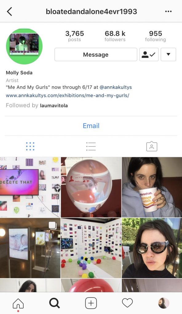
Molly Soda
Molly Soda’s is quite interesting as I a mixture of her personal life intertwined with her work. This is get her style and I feel really promotes her work and her approach to art. I feel however it’s not as professional or obvious she is a fully fledged artist as even though it follows her brand identity, it’s not as clear what’s personal and what’s work.
Her grid has no layout she clearly posts as she wants, letting the photos speak for themselves with no clear format design. She also has an instagram handle that is not her name therefore difficult to search and not an obvious name you would search for when looking for her profile.


Maisie Cousins
Maisie Cousins sticks to a simple biography including her representation and website which I think is important, the simplicity of it allows for easy navigation being clear this is her work account. There’s no obvious grid format but have a satisfying appearance, she doesn’t just share a single image but by sharing multi-image posts she allows more visibility on one post.
I think the simplicity of her bio is important with the multi-image posts as you’re able to get more exposure on a single post. If you were to pay for an Instagram sponsored post using the multi-image is a more affordable way to maximise exposure with only paying for one post.


Laura Carlin
Laura Carlin has no Instagram presence, she has a decent following considering she has no posts however does have a biography which states her website and dialling area. This is not something I will take inspiration from as I feel it’s not taking advantage of the free exposure you can get through Instagram if you use it the correct way. Carlin is reasonably well known artist however doesn’t utilise Instagram to further her reach or presence.

Aesthetica Mag
Aesthetica Magazine have a clear format, maximising the grid creating satisfying and clear layout. By using the 3 photos width of the grid to post multiple photos all relating either in their aesthetic or from the same artist/editorial/feature it gives enough of an insight into that work to create intrigue.
I really like the thought in the layout of Aesthica Mags Instagram as I think it gives it depth and creates an originality to a layout that’s very uniform. Doing this format isn’t completely original however doing it well and using images together that work is what really brings this style to life.


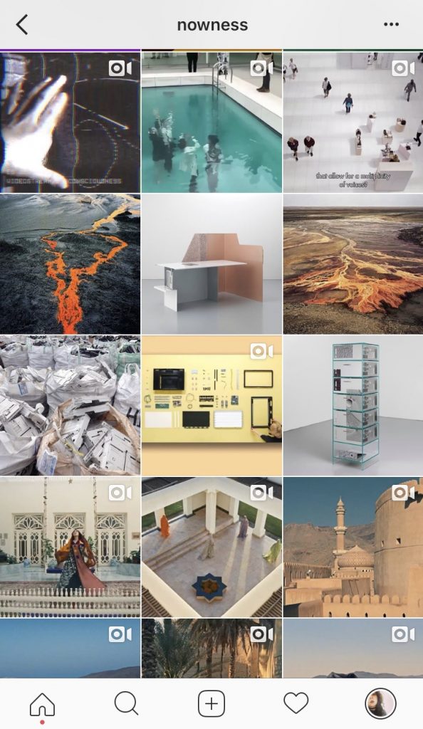
Nowness
Nowness tend to post a lot more videos compared to static art, they don’t necessarily use their grid to display a clear format style however they do take into consideration the tones/colours/brightness of their photos subtly arranging them to give a satisfying aesthetically pleasing layout. When posting Nowness decides on a theme or genre which will then foreshadow the following so many posts following that concept. I like this style as it’s something different and not often done on Instagram, using it almost as online instalments of artists as if a gallery changing the exhibition every weekly.


Bernstein & Andruilli
Bernstein & Andruilli are agents representing various artists, they use the grid layout similar to Aesthetic Mag by posting 3 images across the grid width that all relate to each other and work well together. This allows for a lot of different styles of work to be posted but to not have a chaotic jumble feel to it. Mixing different aesthetics together which doesn’t allow for the work/artists to be appreciated or seen as their own entity. Bernstein & Andruilli give each artist their own row which I think also shows a fair representation of each, allowing each the same amount of space and exposure.


Machine-A
Machine-A is similar to Bernstein & Andruilli in the fact they’re agents representing artists however the similarity ends there with their Instagram styles. Machine-A doesn’t have a clear style or format when it comes to showcasing the artists they represent. They don’t have a set way in which they posts, just posting artists randomly and only usually doing one post per artist at a time. The overall grid is quite nicely presented, giving a pleasing arrangement, the mixture of work following no themes or concept in their posts, I don’t like inconsistency and randomness is the layout of this grid. I think as they’re showcasing a variety of different artists work they should make the difference in Work and each artist clearer. They don’t let each artist be seen in their own right which I don’t feel gives them fair representation.


Summary
From my research I want to try and stay simple but have a original personal touch, I want to focus on my grid layout leaving my biography quite simple with just my website and location. I want to incorporate a structured layout which doesn’t necessarily appear effortless but more memorable.