Call To Action Buttons – A Gutenburg Goldmine?
According to Moyle (2014) large commercial firms pay around 36% of their advertising budget on website design alone, yet IBM (2011) published a report stating that 62% of online purchases are abandoned before the ‘Call to Action Buttons’ (CATB’s) are used. But why is this? Hernandez may have found the answer. Whilst there is obvious importance in the ‘style’ and ‘layout’ of a website, there seems to be an exact science in the placement of CTAB’s. The simple fact is that the reader’s brain will switch off if the CTAB isn’t immediately obvious, and so may never complete the purchase.
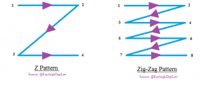
Apparently, every time we view a webpage, our eyes move in a specific pattern in an attempt to ascertain the relevance of the page. For example, some use the ‘Z Pattern’, quite literally starting top left, moving right, down to the bottom left, and finishing bottom right. This is typically used when scanning a webpage for ‘navigation menu’s’, or the ‘Zig-Zag Pattern’ starting top left, used to scan large volumes of information for specific topics or key words. Whilst both are effective methods, the former misses large chunks of the webpage, and the latter simply takes too long.
Hernandez states that this is the reason for the astonishing ineffectiveness of the CTAB’s on company websites that are simply never used to complete a purchase. If the CTAB is placed outside of the Z Pattern, then it will never be seen, or if it’s surrounded by volumes of text, the reader (using the Zig-Zag Pattern) will get bored and never get as far as CTAB. However, the solution may not be so far fetched.
The Gutenberg Model suggests that information should be ranked in order of importance, and placed in a diagonal line across the page, starting top left, down to bottom right. And this appears to be the big winner, with far more CTAB’s used on pages following this pattern than any format. This means more CTAB’s will be found by customers, more purchases will be completed, and companies ultimately make more money.
But does this work for everyone? What pattern do you follow when you first see a webpage? Please leave your comments below!
Kayleigh McChambell
Want to read more? Follow me on Twitter: @KayleighDigiLaw
Key Words: Big Data Drive, Gutenberg, Call To Action, CTAB, Website Layout,
Reference: Hernandez, A., & Resnick, M. L. (2013, September). Placement of Call to Action Buttons for Higher Website Conversion and Acquisition An Eye Tracking Study. In Proceedings of the Human Factors, available at: http://pro.sagepub.com/content/57/1/1042.abstract


