What is the best way to present and position your Call To Action (CTA)? Lessons for creating, presenting and positioning CTA’s with examples: Part Two: Is the position of your CTA killing your sites conversion rate?

Last time you were reading my blog, we learnt three vital lessons regarding the creation and appearance of effective and ineffective CTA’s.


  • LESSON 1: USE BUTTONS
  • LESSON 2: BE EXCITING, IMPERATIVE AND COMMANDING
  • LESSON 3: LESSON LEARNT: USE CONTRASTING COLOURS


According to Wolf (2013), one of the most important steps in improving the conversion on a sites landing page, is designing a successful call to action. In conjunction with the characteristics discussed in part 1, the position of the call to action is also very important.


Part 2 now aims to analyse the most effective and ineffective positions to place your CTA’s, again followed by some Do’s and Don’ts. In this blog post I will consider the following areas for where to place the CTA on a website landing page:


  • Above the fold
  • Below the fold using the concept AIDA


Above the fold

Ecommerce pundits have long preached the importance of keeping the CTA above the fold (McEnroe 2014). Per McEnroe, the rational behind placing the CTA above the fold is ‘clear enough’. Not only will visitors of the website will immediately notice the CTA and click on it if it is at the top of the landing page, but theoretically there is also less chance of visitors either missing the CTA or existing the page before reaching the CTA.

Here is an example of a CTA that is placed above the fold…

kcf;ejqbc

Though one may suggest that theoretically it is advised to place a CTA above the fold, in today’s revolutionising digital age where behavior has evolved, a change may be in need. Per Gardener (2013), since the evolution of Facebook and MySpace ‘scrolling has become second nature’. Individuals are familiar with the notion of scrolling to the bottom of a page and to just ‘put’ in simple terms a CTA before they know any information, would be considered as running before you can walk.


Irrespective of the advancements in the digital age, if you wish to place your CTA above the fold, Gardner’s ‘5 – point punch’ will defiantly help you to make it as effective as possible.


jvwebdc;de


Gardner notes that success behind having a CTA above the fold stems from 5 simple steps.

  1. A powerful and descriptive headline
  2. A Complimentary supporting sub header
  3. A brief benefit statement
  4. An urgency or special offer statement
  5. A CTA that describes exactly what you’ll get


Essentially, if you follow these 5 simple steps your CTA above the fold will not be any less successful that it being placed anywhere else on the landing page.


Below the fold

According to a study by Ciotti (2013), less content above the fold can actually encourage individuals to scroll to the bottom of the page. In relation to these findings, it would therefore be suggested that to increase the conversion of a landing page and encourage more content to be read, the CTA would be more beneficial if placed below the fold.


lkch'dljbdjbvkjd

Essentially, placing the CTA lower down the page leaves the reader with more time to read and digest the content on the page before making their decision. Observed by Burstien (2012), placing a CTA below the fold, near the bottom of a page had a 20% better conversion rate as opposed to placing it above the fold. Furthermore, discovered by Goldenberg (2012), simply moving the CTA below the fold lifted the conversion rate by 304%.

cbjkd;jk

Conceptually, AIDA is based upon the notion that a visitor progresses through a series of linear steps before they make any decision to take action. So what does AIDA stand for? AIDA stands for Attention, Interest, Desire and Action.

  • A: Attention- Attention of the visitors can be captured through a eye-catching and punchy headline.
  • I: Interest- Interests of the visitors can be captured through many forms of content and media. This can range from videos to pictures and games.
  • D: Desire –Naturally, visitors will only visit your website and continue to browse if the content appeals to them. Therefore, desire is created though the use of relative and relatable content and features on the website.
  • A: Action – Finally, a strong call to action completes the process of steps. When all of the above three elements (AID) are satisfied, the call to action acts as the final straw in the process of persuasion. It is here at this point where all the characteristics that were evaluated in part 1 come into action.


Ultimately, it is all about the enticement. Logically, placing the CTA below the fold provides the viewer the time to digest all the relative information, enticing him even more to click on the CTA. However, placing the CTA above the fold immediately grabs the attention of the viewer and prevents users from missing the CTA. Is it therefore YOUR decision on there you choose to place the CTA. There is truly no right or wrong answer. It’s your choice!


Heres a short video that comments what a CTA, what its benefits are and where a business should place their CTA on their website…


So are you ready to create your fantastic and perfect CTA? You now know where to position your CTA and moreover how to create the perfect appealing CTA button so…. DO IT!


References:

Burstein. D, (2012), 5 Common call-to-action Errors, Retrieved April 24, 2015, from, http://www.marketingexperiments.com/blog/marketing-insights/call-to-action-errors.html


Ciotti. G, (2013), 5 Landing Page Conversion Killers, Retrieved April 24, 2015, from, http://unbounce.com/landing-pages/conversion-killers/


Gardner. O, (2013), Where’s the best place to put your CTA? [Case Study], Retrieved April 24, 2015, from, http://unbounce.com/conversion-rate-optimization/landing-page-cta-placement/


Goldenberg. G, (2012), How a landing page with the Call-to-Action below the fold outperformed an Above-the-fold variant by 304%, Retrieved April 24, 2015, http://contentverve.com/how-moving-the-call-to-action-below-the-fold-generated-a-304-lift/


Hubspot Academy, (2014), Call-to-Action Best Practices, Retrieved April 24, 2015, from, http://knowledge.hubspot.com/cta-user-guide/call-to-action-best-practices


Kissmetrics, Why “the fold” is a myth – And where to actually put your calls to action, Retrieved April 24, 2015, from, https://blog.kissmetrics.com/why-the-fold-is-a-myth/


McEnroe. G, (2014), Above or Below the fold: Where to place your CTA?, Retrieved April 24, 2015, from, http://www.veinteractive.com/blog/20140721/above-or-below-fold-where-place-your-cta


Moth. D, Email marketing CTA design: five good vs. six bad examples, Retrieved April 24, 2015, from, https://econsultancy.com/blog/64997-email-marketing-cta-design-five-good-vs-six-bad-examples/


Shewan. D, (2014), 11 Kick – Ass Call to Action Examples, and why they work, Retrieved April 24, 2015, from, http://www.wordstream.com/blog/ws/2014/10/20/call-to-action-examples,


Smith. J, (2014), 6 Characteristics of High Converting CTA Buttons, Retrieved April 24, 2015, from, http://blog.crazyegg.com/2014/10/16/high-converting-cta-buttons/


Waldron. J, Above or Below the fold what should go where?,Retrieved April 24, 2015, from, http://www.markitwrite.com/fold-go/


What is the best way to present and position your Call To Action (CTA)? The Lessons of creating, presenting and positioning CTA’s with examples: Part One

What does an Effective CTA look like? Is the CTA on your website effective? Does it successfully draw the attention of your buyers? Where should it be placed? Above the fold? Below the fold? At the bottom of the page: using AIDA? Embedded in an amongst all the clutter on your website?


This two part blog will aim to solve all your questions and problems regarding the CTA’s on your website. Part 1 will analyse the form, language and appearance of effective and ineffective CTA’s, followed by some Do’s and Don’ts. And Part 2 will aim to analyse the most effective and ineffective positions to place your CTA’s, again followed by some Do’s and Don’ts.


Now you are probably wondering what I am on about… what is a CTA?


A Call To Action (a.ka. CTA) is a button or a link that is placed on a website that aims to drive prospective customers to fill out a form, buy the product or book a service. It is usually the link between the normal content on your site that your customer has visited to find, and a landing page with some incredible offers on it that is interesting enough to drive your customers to complete a short form (Hubspot Academy, 2014). They are actions that would persuade a customer to, book a service, make an appointment or gain a free consultation.


What then are the characteristics of an effective CTA?


  1. They are Buttons

Smith (2014), states that CTA’s are buttons. They are not long chunks of texts, they are not hyperlinks or black holes. The call to action should be so overwhelming that it should not be hard to make it more than just a ‘button’.

jscbdjsc

This is what I mean! One button, one click and one action. There should be no long paragraphs. At the end of the day you want your customer to complete the action that you have set. You do not want them to read long chunks of texts or click on unknown hyperlinks- both which they would probably end up not completing (Smith 2014).


As Smith notes, the brain has a ‘circuitry’ and although the brain has ‘elasticity’ to contain new and more information, it does not like doing unfamiliar things. Foras long as we have been on the earth, we as humans have had a certain way of doing things. For example, if the journey to work was block and you had to take diversions, although you would follow the new route, you would damn right be unhappy about the change. Stated by Smith, the same holds for CTA buttons. Since the development of the Internet, we have been trained to click on buttons. If we see a button we know exactly what to do.


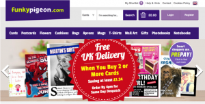
  • Funkypigeon.com  

cjlbs;cjbs

Why it doesn’t work

Whilst customers want a CTA that is exciting, they want to click on a button. I don’t at all intend to say that funkypigeon’s website is at all rubbish, but there are no buttons. The CTA utilised by Funky Pigeon is effective, as it does not ask you to ‘sign up’ or do anything that may result in a long process and states that delivery is ‘free’ on the purchase of two or more cards. However, I do not actually know where to click! Do I click on the big red circle? Or do I click on the separate links above? At the end of the day as Smith firmly states, ‘buttons are what make people click and conversions happen’.

LESSON LEARNT: HAVE BUTTONS


  1. They are eye-catching

Though one may instantly believe that the attractiveness of a CTA depends upon its colour, font or size, in actual fact this is not the case. One extremely important factor of any CTA is its ‘verbiage’, notes Smith. Short, sharp and snappy language is what an effective CTA is built upon.


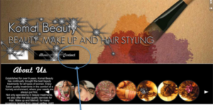
As awful it is so say, I have a website and oh is it so terribly bad. In my honest opinion, if I were a customer and I wanted to find a beautician to get me ready for my wedding, I don’t think I would book myself. My website is created on a Wix template. Now don’t get me wrong… Wix templates are good! I have a nice background, I have a nice background song and all my images load to a high quality. The problem with my website is that the call to action is so dull that its actually non-existant.


What does my website look like, and what is the problem?

So here is a screen shot of my landing page…

Screen Shot 2015-05-01 at 15.18.39

If you look closely at my landing page, amongst all the vibrant colours, texts and images, the only CTA I have is the ‘contact’ link. The link takes you onto the contact form where customers can leave their name, email, number and a message in order to book an appointment.


What has Komal Beauty done wrong?

Critically, evidenced through the screenshots the CTA is very poor. On the landing page there is no effective and eye-catching subject line, in return failing to draw the customer’s attention. There is no offers posted that once again fails to inform the customer with the treatments that are currently being provided. As the name suggests, essentially a Call to Action’s primary purpose is to encourage the reader to perform a particular action; such as ‘click here’, ‘click here to book an appointment today’. Unlike any of the above examples, the CTA on ‘Komal Beauty’s’ website states ‘contact’. Now I am not being pessimistic, but the term ‘contact’ doesn’t really cause any fireworks to happen. There are no imperatives and no commands.


What do I mean by imperatives and commands?

I don’t mean that you have to portray yourself in the same way as a dictator would.

jbc;bcjs sw

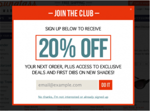
This image demonstrates that a simple ‘do it’ is enough. It is not lengthy nor is it complicated. The imperative phrase ‘do it’ commands the viewer to enter the email address, suggesting that like the phrase the process will too be short, snappy and over with in a tick.


LESSON LEARNT: BE EXCITING, IMPERATIVE AND COMMANDING


  1. They are vibrant and contrasting in colour

Although most CTA are in colour and do command the visitor to complete an action, Smith notes that the most effective CTA’s are those with a vivid and contrasting colour. In order to assess whether Smiths findings are true, I shall in turn evaluate a few CTA’s that I have received in my emails over the past view days.


Normal Colour

River Island

djvb;bejo'qdk


Contrasting Colours

Ann summers     

jdbvcqdvbdoqubv                                 


Is Smith Right?


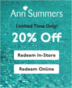
Arguably, yes. Evident from the examples above, I am able to say that the CTA’s that use contrasting colours do stand out as opposed to the ‘normal’ colours ones. Smith notes that whole idea behind a CTA button is that it should draw the reader’s attention straight away. For example, compare the contrasting Ann Summers CTA to the River Island CTA. Anne Summers have only used contrasting colours blue, black and white in their CTA. The background is blue and only the CTA is white. Thus when you look at the CTA, you instantly see the button and go to click on it. On the other hand, River Island have used variety of colours in their CTA. The problem with their CTA is that the CTA button is white and their background consisting of an image also fades away to a white colour. As both the background and button are white, the button just seems to fade away and fails to grab the visitor’s attention.


LESSON LEARNT: USE CONTRASTING COLOURS

OKAY… lets summarise where we stand right now. Throughout this blog we have learnt 3 big lessons…


  • LESSON 1: USE BUTTONS
  • LESSON 2: BE EXCITING, IMPERATIVE AND COMMANDING
  • LESSON 3: LESSON LEARNT: USE CONTRASTING COLOURS


This finally finishes this blog, please watch the video below where Strategist Wilfred Hirst talks about CTA buttons!


REMEMBER! Keep watching out for Part 2, where I will cover the best position for your now fantastically created CTA’s!


References:


Gardner. O, (2013), Where’s the best place to put your CTA? [Case Study], Retrieved April 24, 2015, from, http://unbounce.com/conversion-rate-optimization/landing-page-cta-placement/


Hubspot Academy, (2014), Call-to-Action Best Practices, Retrieved April 24, 2015, from, http://knowledge.hubspot.com/cta-user-guide/call-to-action-best-practices


Moth. D, Email marketing CTA design: five good vs. six bad examples, Retrieved April 24, 2015, from, https://econsultancy.com/blog/64997-email-marketing-cta-design-five-good-vs-six-bad-examples/


Shewan. D, (2014), 11 Kick – Ass Call to Action Examples, and why they work, Retrieved April 24, 2015, from, http://www.wordstream.com/blog/ws/2014/10/20/call-to-action-examples,


Smith. J, (2014), 6 Characteristics of High Converting CTA Buttons, Retrieved April 24, 2015, from, http://blog.crazyegg.com/2014/10/16/high-converting-cta-buttons/


Is your Website speed killing its function? Tips, Tricks and Examples that will help bring life into the conversion rate of your website

Is your slow website speed killing its conversion rate? Can your website speed have an effect upon your sales and profits? And what can you do to bring it back to life?


Every second counts:


Studies show that loading time is a major contributing factor to page abandonment. Not only do 47% web users expect the loading time of a website to be under 2 seconds, but 40% of web users abandon a web page if the loading time exceeds 4 seconds (Moth 2012). More surprisingly an astounding 79% of shoppers who are dissatisfied with the performance of a website are less likely to buy from the same website again (Akamai 2009).


Why performance matters:


Individuals prefer to navigate themselves around the structure of a website with ease. The structure of a website is primarily the arrangement of links between the various pages and nodes, that a user must use to navigate themselves to reach their desired location (Galletta 2006). Essentially, users are faced with a decision on each page of the site, and at each point they evaluate the probability of any delay in getting to their desired location. Demonstrated through previous studies, Johnson and Payne (1985) notes that visitors of websites develop strategies to limit their cognitive thinking processes in attempting to seek “low cost” strategies. Whether a conscious or unconscious decision, sites that offer lower cost options- lower total loading time and effort- will in return be preferred over sites with a higher cost (Galletta 2006). Prior research confirms that long delays lead to frustration (Doherty and Kelisky 1979), dissatisfaction (Lee and MacGregor 1985) and giving up (Nah 2002). Negative impacts are strongest when delays are longer than expected (Galletta 2006).


Website speed for your SEO (Search Engine Optimisation):


Even if effecting user experience isn’t bad enough, slow website speed can also cause your site to be penalized by Google’s search engine results (Moth 2012). For starters, Google thinks that website speed is a vital factor to any site. It may even be considered that they have a slight obsession over it. This is not breaking news. In 2012, Moth found that since 2011 Google had incorporated site speed into its ranking factor. Although it was stated by Google that it would impact fewer than 1% of queries and that website owners should still be concerned with the quality of their site rather than the performance; page speed remains as a ranking factor in Google’s algorithm, so the faster your site the higher the ranking (Costill 2014). So, although it is one of the factors, it certainty is not one that should be ignored.


“Slow Kills: 5 ways to speed up Your Website”


What causes your website to load slowly?


  1. Unoptimised Images

Impacting 90% of the Alexa Top 1000, unoptimised images are those, which can be reduced in size without any visual impact to your user. These are usually PNG and JPEG images that either have extra data included in them for comments, or because they contain an inefficient deflate compressor (Costill 2014).


How can you fix this?

  • Due to the extra data in them, PNG files are unnecessarily large. Such images can be reduced in size using tools such as tinyPNG (https://tinypng.com) that aids to reduce the size of the file without changing or reducing the quality of the image.
  • Alike PGN files, JPEG files are also needlessly big. Once again by using tools such as JPEGmini (http://www.jpegmini.com), you can reduce the size of the image without compromising the image quality.
  • Remember, in order to gain maximum image optimisation use your images correctly! PNG files are best when used for logos and icons, whereas, JPEG files are more preferable for photos. By ultilising your images correctly you can often with no hassle reduce file savings as large as 80% (Isham 2013).


  1. Unnecessary and Incompatible Plugins, Browsers and Apps

Plugins are often the best part of using website platforms such a WordPress, but often many websites have far more than needed. Take Flash for example: it is not compatible with most mobile devices and some website browsers (such as Google Chrome). If you know that your visitors are more likely to open your website on platforms such as Google Chrome or mobile devices, then consider removing Flash plugins. [If you want to find out what platforms your customers use the most, consider using Google Analytics]. At the end of the day you want your visitors to have the best possible experience, so always test your site on different browsers and devices (costil 2014).


How can you fix this?

  • Test your plugins on various browser platforms and mobile devices
  • Do not over use ‘plugins’. When together and unneeded all they do is slow the loading time of your website.
  • Check your plugins folder and see the plugins that you are actively using. The ones that you are not using you can deactivate and delete. Most of the time, even if your plug in is not in use, it can slow the loading time of your site


  1. The server is located far away from the visitors of the site

Is your website is popular? You have done all that you can to increase the website speed; however it still has a slow loading time? Simply optimizing images and removing plugins is not enough. Where your server is in relation to its visitors can have a big impact upon the performance of your website, notes echosurge.


How can you fix this?

  • Implement a CDN

If you know that your site is popular in Scotland, and your server is located in London, a CDN will allow your content to be stored on a server in Scotland. CDN stand for Content Delivery Network Closer access to a server geographically means that when the visitors in Scotland open the site, the content will load faster and sooner as it the server will be geographically closer to them.

e;gfekbj


Image Source: http://premium.wpmudev.org/blog/top-cdn-services-to-make-your-wordpress-site-blazingly-fast/


  • Consider using MaxCDN to implement a CDN onto your server. It is recognised as one of the most well-known and popular CDN that powers the likes of the Next Web (Wilson, 2014).


  1. Slow Hosting Provider

Have you done all the steps above and your website is still slow? You may want to consider changing your website provider. Most free providers may place you on a sharing server, notes echosurge. If your website is not hugely popular, or if you don’t have much traffic this may in actual fact not be a big problem. However, if you are aware that your website is popular and you have a substantial amount of traffic per day, then consider using a hosting provider that places you on your own server.


Here are a few tools you can consider using to test and increase your website speed:


As you can see, website speed is a important factor for any website, whether large or small. The faster the loading time of your website, the happier your customers and the better your profits.


How has your website features affected your website? Once you have improved its flaws, have your customers been happier? Have your sales increased? Like, Share and Comment below with your thoughts!


References:


Costill. A, (2014), SEO 101: How Important is Site Speed in 2014, Retrieved April 24, 2015, from, http://www.searchenginejournal.com/seo-101-important-site-speed-2014/111924/


Echosurge, Slow Kills: 5 Ways to Speed up your WordPress Website, Retrieved April 24, 2015, from, http://echosurgemarketing.com/slow-kills-5-ways-to-speed-up-your-wordpress-website/


Galletta. D, Henry. R, McCoy. S, Polak. P, (2006), When the Wait Isn’t So Bad: The Interacting Effects of Website Delay, Familiarity, and Breadth, Information Systems Research, Retrieved April 24, 2015, from, http://butlercommonplace.org/pbiswiki/images/0/0c/Galletta_et_al_(2006_-_ISR)_Website_Delay,_Familiarity,_and_Breadth.pdf


Isham. M, (2013), 5 Common Causes of Slow Website Performance, Retrieved April 24, 2015, http://zoompf.com/blog/2013/04/top-5-causes


Kissmetrics, (2015), How loading time affects your bottom line, Retrieved April 24, 2015, from, https://blog.kissmetrics.com/loading-time/


Kissmetrics, (2015), Speed is a killer- why decreasing page load time can drastically increase conversions, Retrieved April 24, 2015, from, https://blog.kissmetrics.com/speed-is-a-killer/


Moth. D, (2012), Site Speed: case studies, tips and tools for improving the conversion rate, Retrieved April 24, 2015, from, https://econsultancy.com/blog/10936-site-speed-case-studies-tips-and-tools-for-improving-your-conversion-rate/


Wilson. R, (2014), Top CDN Services to make your WordPress site Blazingly Fast (and More Reliable), Retrieved April 24, 2015, from, http://premium.wpmudev.org/blog/top-cdn-services-to-make-your-wordpress-site-blazingly-fast/


Where should I place my Social Media Icons? An evaluation into the best location for the icons: with examples from various websites

How many times have you been scrolling on a website wanting to go onto their website and you cannot find their social media Icons? Then all of a sudden you’re your almost at the point of giving up, to your surprise you find the icons nestled at the bottom of the webpage. It is clear that most websites are doing it all wrong.


Social media now represents a widespread source of information; it has fundamentally changed the tools and strategies that companied use to communicate with its customer, elucidating that the roles between the company and the consumer are now reversed as control now lies with the customers (Mangold & Faulds 2009). Depicted through various studies, 93% of social media users now believe that companies should have precedence on social media websites, whilst 85% of users also believe that companies should interact with customers via Social Networking Systems (Michealidou & Siamagka & Christodoulides 2011).


With this in mind it is vital first to establish the importance of these icons…


  1. Convenience and Ease of use


Social media fundamentally connects people to other people who value their opinion. Simply clicking a button to share content is exceedingly convenient. In this day and age where individuals are bombarded with information, the precious time that is saved is greatly appreciated and valued by the visitors of the site. In return retaining their attention and keeping them on the webpage (Kundu: 3987).


  1. Social Stimulus


Social media icons have been around for a while now (Ewer 2014). Though in the beginning they were not much of use and no one really knew their importance, today with the uproar in social media marketing they are just as important as any other button. People who are connected with each may share similar interests and hobbies and social share buttons on websites in return facilitate easy share options. The benefit for businesses is that the easy share facility encourages a wide spread awareness of the business amongst its customers. The specific number of people that have shared the content usually complements the social share buttons, that as a result influences visitors to believe that the content that they are reading or watching is of high quality and worthy of re-sharing (Kundu: 3987).


Kaushal Beauty:

Screen Shot 2015-05-01 at 14.59.37

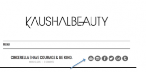
Kaushal Beauty has placed their social media icons at the top right hand side of the site. Small and grey in colour as opposed to the white background, these social media icons are effective and easy to notice. They directly allow the site to take the customer to the companies, Instagram, Facebook, Twitter and YouTube pages with great ease. However, though convenient in its use, there are 6 different icons on the page and arguably this may be one too many. Noted by Moon (2014), too many buttons may result in confusion for the visitors and can negatively impact the speed of your website, slowing and reducing down the traffic.


Eastern Arts Beauty:


Screen Shot 2015-05-01 at 14.59.57

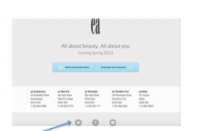
Unlike Kaushal Beauty, Eastern Arts has utilised the bottom footer of the webpage to locate the social media icons. Although it is noted that placing the social media icons at the bottom of the website can reduce the effectiveness of them, for this specific webpage no scroll is required. In return of not having to scroll down and the visitor being exposed to only one webpage, arguably it is no less effective than to having the icons in the top right hand corner. Furthermore, noted by Coffin (2013), having too many buttons also makes the region look cluttered and confusing.


So where is the best position for these vital networking buttons?


According to Mohan, for web pages, it is best that the social media icons are placed at the top of the page in the header region that is most clicked, viewed and used by the visitor. Essentially, it would be useless for the icons to be placed at the bottom of the webpage, when most customers would probably have given up finding the icons by then. Elucidated by the middle image in the eyetracking study (below), the dominant reading pattern on a website is in the shape of an F. The user as demonstrated by the image below, reads the whole of the beginning section, skims to the middle where it is read fully, and leaves the webpage briefly skimming the last section. The heat map sensor on the image portrays that the dark red areas indicate the most looked areas.


oidbfoe


Evidence by the second image, the most valuable position of the buttons would be in the top right hand corner of the webpage as the heat map sensor is dark red in those areas. As the visitor’s eyes move there the most, the position of the buttons would as a result increase and utilise the social presence the most effectively.


Here is a short clip that comments about the importance of social media Icons!

Final Top tips:


  1. Social Media Icons do work! So do use them!


  1. Position your Social Media Buttons at the top right corner of your website: Evidenced by the heat map sensors, the most viewed area by visitors is the top of the webpage. Place your buttons where they are exposed the greatest whilst at the same time providing visitors with ease of use.


  1. Pick a noticeable button: Ultimately, the more noticeable the button the higher the chance of the visitor sharing the content that will consequently lead to more traffic back to your website.


  1. Position your button near the content that is being shared: It is important that the visitors know what they are sharing. They do not want to share content that is not useful to them or to anyone on their network. Unwanted content may result in a reduction to traffic on your website.


  1. Don’t have too many social media buttons: It is important that you only have the necessary links and no more, as this may decrease the loading time of your website also make your site look cluttered. Consider only using the most important social media icons.


  1. Include the buttons on every landing page: By having the buttons on every page, visitors can easily share the specific content on the various landing pages.


  1. Distinguish between the social media buttons: Various social media sites have various buttons with various functions. For example, whilst Facebook may have a button that posts a post notifying that you have ‘liked’ the content on the webpage, another button may ‘share’ the content on the webpage. Noted by Coffin, it is essential that the buttons are accompanied by text such as ‘like’ and ‘share’ to prevent any confusion and for ease of use.


References:


Coffin. D, (2013), 4 tips for using social media buttons, Retrieved April 15, 2015, from, http://webmarketingtoday.com/articles/4-Tips-for-Using-Social-Media-Buttons-2/


Ewer. T, (2014), Determining the Best Placement for your social media icons, Retrieved April 15, 2015, from, http://www.codeinwp.com/blog/determining-best-placement-social-media-icons/


Kundu. S, Why social Sharing Buttons are so Important, Retrieved April 15, 2015, from, http://codeboxr.com/blogs/why-social-sharing-buttons-are-so-important


Michaelidou. N, Siamagka. N.T, Christodoulides. G, (2011), Usage, barriers and measurement of social media marketing: an ex- ploratory investigation of small and medium B2B brands, Industrial Marketing Management, 40(7), pp.1153-1159, Retrieved April 15, 2015, from, https://dspace.lboro.ac.uk/dspace-jspui/bitstream/2134/15705/4/IMM10_806R%20Michaelidou%20Siamagka%20Christodoulides.pdf


Mohan. A, (2013), Importance of Social Media icons and their position on websites, Retrieved April 15, 2015, from, http://www.contentcrossroads.com/2013/07/social-media-icons-and-their-position-on-websites/


Moon. G, (2014), The best place to put social media buttons on your blog, Retrieved April 15, 2015, from, http://coschedule.com/blog/social-media-buttons/


Nielsen. J, (2006), F-Shaped Pattern For Reading Web Content, Retrieved April 15, 2015, from, http://www.nngroup.com/articles/f-shaped-pattern-reading-web-content/


Zarook A, (2011), Where to put social media icons on website?, Retrieved April 15, 2015, from, http://www.zeeronsolutions.com/put-social-media-icons-website/

Small company? How and why you need social media to increase your brand awareness: using CocoWhite as an example

Recognised by Gelder (2005), brand recognition is more than mere brand awareness. What the brand means affects not only the consumers but also affects how the brand is considered in relation to other companies and their brands.


According to Kim & Ko (2011), social media can have a dramatic effect upon a brand reputation. It is very easy to under estimate the power of brand awareness especially for small companies. Where one would usually associate brand awareness with large multinational companies, in actual fact local companies also need brand awareness to increase their size amongst their customers. When someone mentions Zara and New Look as opposed to a small boutique in the Brighton lanes, the height to brand awareness is displayed (Roesler 2014). Successful businesses are aware that generating profitable sales goes beyond having to sell a product or a service, notes Gregorio (2014). Essentially, the successes of businesses rely on the effectiveness of their visibility and awareness of their brand or services with their target customers.


2

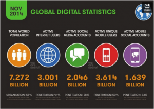
In todays age, with the rapid development of digital means of communication, small businesses can get even better visibility and exposure for their brands and services through social media platforms. Provided by the global statistics report in November 2014, in a population of 7.272 billion people, 3.001 billion people actively use the internet and an outstanding 2.046 people have active social media accounts. Having social media accounts provides any business whether small or large access to 2.046 billion potential customers. Thus with figures like these, businesses can simply not afford to overlook the benefits that social media can provide to their brand awareness (Gregorio 2014).

“Right here, Right Now”

Watch the clip below to truly understand the IMPORTANCE of social media in todays generation…


Now we have the statistics, care to see the affects of implementing social media to any business? Watch the quick video below…


Example: Cocowhite

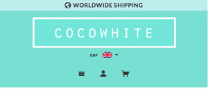
Untitled

So who are they?

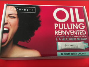
Cocowhite is a UK based, 100% natural health product company that began with a desire to promote healthy and balance lifestyles. It’s products originated on the back of a well-known practice called ‘oil pulling’ that was around many generations ago.


Brand Awareness: the ‘fad’ 

Untitled.pnged3qwd

Cocowhite are a brand that keeps appearing on celebrity social media accounts- mainly on instagram. Celebrities including stars from ‘The Only Way is Essex’ and ‘Geordie Shore’ regularly post pictures on instagram when using the ‘oil pulling’ product.


Scrolling through my instagram as I do on an everyday basis, to my surprise most of the pictures from the ‘celeb’ accounts contained at least one picture of this ‘Cocowhite’ product.

hv;hv; kjvilj gfwerg

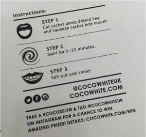
Intrigued and wanting to get the same ‘celebrity smile’, I popped over onto their website and decided to order myself some. When the box arrived home, I noticed that on the box beside the instructions was some text that said…


jv;iv;i

“TAKE A #COCOSELFIE & TAG @COCOWHITEUK ON INSTAGRAM FOR A CHANCE TO WIN AMAZING PRIZES! DETAILS: COCOWHITE.COM/WIN”


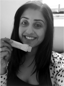
So here was my #cocoselfie…

hk;vhv;

What are they doing right?


In terms of brand awareness, Cocowhite is at the top of its game! The company’s #cocoselfie has created mayhem on the social networking platforms including instagram and twitter. It is has even sucked me into it! The company is aware that they key to increasing brand awareness is through the notion of ‘getting visual’. Noted by Hodkinson (2014), getting your content noticed in a noisy social media world requires an eye-catching subject matter. With the results of the prodict evident through the selfies (whitening of the teeth), promotion of the product couldn’t be any better.


Increasing brand awareness amongst young consumers is necessary for businesses looking to grow in the future. Fundamentally, if young consumers are not exposed to the brand at a young age, adapting at an older stage will be difficult and thus will create obstacles for the business. With ‘selifies’ being a new ‘craze’ in todays young generation, by leveraging the trend of ‘#selfie”, the visual content (selfies) instantly grab the attention of the target audience and increase the brand awareness of the company.


What a brilliant way to use social media to increase brand awareness…


So how can your businesses increase their brand awareness through social media sites? Here are my 5 top tips…


  1. Find the right market and platform:

There are so many different social media platforms and it is important that businesses choose the right platform. However, fortunately as each platform has its own search engine, it is advisable that you first find out conversations about your industry and target those markets and platforms.

h j ;kh ;jh

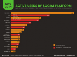
Depicted though the image above, the most actively used social media platform is Facebook, shortly followed by Twitter and Instagram. In terms of active users it would be advisable that small businesses consider using the social media platforms in the order above to maximize the effect of their brand awareness (Hodkinson 2014).


  1. Make it manageable:

There is no point having presence over all the social media platforms if you are not able to manage it well. In the assumption that as a business you already have so many things to do, it is right to assume that you wouldn’t be spending a lot of time composing tweets and updating Facebook statuses (Hodkinson 2014). Choose only two or maximum three social media platforms and make sure that you give it importance. More importantly, make sure that you are consistent! Make sure that the quality of your connections is high!


  1. Be friendly and conversational

There is no point updating statuses and composing tweets that in business languages on a social media network. Remember that the visitors on your page are normal people from various backgrounds; they are not all business professionals. Strike up conversations that are charming and friendly, which mentions customers and the nature of your product. Ultimately, you want customers to engage with your brand.


  1. Optimise your social content strategy

Once you have established presence over your social media networks, the next step involves optimizing the content on your network. To increase brand awareness, you want to post content on your network that your customers and visitors will be interested in. You goal is to make your content go viral, be liked, be shared and be commented on. This type of content can range from being humorous, controversial and visual. But remember, regardless to the content make sure that you provide your target audience the content that they want, not the content that you would like to see. Doing so involves one thing… RESEARCH. So understand your audience’s needs and preferences.


  1. Track everything!

It is important especially with regard to brand awareness that as a company you measure and track your strategy and presence on your social media pages. Many platforms offer engagement statistics. For example: Facebook offer insight as so how many people have visited your site and how many people have liked and shared the content on your page. In addition to the social tracking methods, you can also consider shortening your links using bit.ly and then using web analytics (such as Google analytics) to measure the number of clicks on the link.


There you go! So you have the why and the how behind marketing your brand awareness! Is the ‘brand awareness’ campaign for your company out of this world? Like, Share and Comment below with all your thoughts!


References:


Gregorio. J, (2014), How to boost Brand Awareness using social media, Retrieved April 22, 2015, from, http://cjgdigitalmarketing.com/how-to-boost-brand-awareness-using-social-media/


Hodkinson. M, (2014), 10 tips for increasing brand awareness with social media marketing, Retrieved April 22, 2015, from, http://www.influenceagents.com/matts-chat/10-tips-increasing-brand-awareness-social-media-marketing


Kim. A, Ko. E, (2011), Do social media marketing activities enhance customer equity? An empirical study of luxury fashion brand, Journal of Business Research, Elsevier, Retrieved April 22, 2015, from, http://kenanaonline.com/files/0081/81970/Do%20social%20media%20marketing%20activities%20enhance%20customer%20equity%20An%20empirical%20study%20of%20luxury%20fashion%20brand.pdf


Patel. N, (2014), How to build brand awareness for you business, Retrieved April 22, 2015, from, http://www.quicksprout.com/2014/07/25/how-to-build-brand-awareness-for-your-business/


Roesler. P, (2014), Why and How you should use internet marketing to improve Brand Awareness, Retrieved April 22, 2015, from, http://www.inc.com/peter-roesler/why-and-how-you-should-use-internet-marketing-to-improve-brand-awareness.html


The rise and success of Beauty Vlogging followed by suggestions to beauty companies to begin their own vlog posts: with an example from a current vlogger

Now that customers are armed with iPods, Blackberries and search engines, they have gained unprecedented control over the media and the content that they are exposed to (Singh, 2008). With the phenomenal growth in social media networking, the web has been spawned with self-styling individuals who have been able to make a name for themselves on video sharing websites such as Facebook, Instagram and blogs.


Illustrated by stories, narrative and experimental models, beauty video logging provides potential customers and intrigued individuals partially in the realms of fashion and beauty, the how-to-recipes in make-up and hairstyles (Moeran, 2006). Not only are make-up tutorials are amongst one of the most viewed videos on social media platforms, but the changing space in the media has allowed for a more interactive media amongst consumers (Mau 2014).


Why is vlogging so successful for small beauty businesses?


Driven by the fashion industry, fashion magazines and social media sites, fashion buyers are exposed to the practical and best application of makeup. Research suggests that customers value unique and personalized messages and marketers continue to seek opportunities that will deliver messages that are innovative and interesting (Singh 2008). Platforms including Instagram, Facebook and YouTube allow active members including make-up artists, hair stylists and beauty enthusiasts to create virtual looks whilst also subtly promoting their business and skills (Stefanic, 2010). Importantly, blogs offer companies the ability to connect with customers in a unique and personalized manner (Singh 2008).


First of all, according to viewers vloggers know their stuff. Videos on platforms such as Instagram provide a fantastic 15-second snippet as to the immense talent of the make- up artist. The videos provide the dramatic transformation of the client through the before and after journey. The videos are easy to understand, are user friendly and are portable. Essentially they can be watched anywhere and everywhere. For example: imagine a potential client planning her wedding. She knows that she needs someone to do her hair and make-up but doesn’t know whom to trust on her big day. She is briefly scanning her instagram on the train and to her surprise she scrolls onto a make-up artists instapage. On the page she is able to see the short tutorial clips that highlight the skills of the artist. The visuals may as a consequence persuade her to click onto the businesses website and book a make-up trial.


So what really are the pros and con’s for beauty vlogging for any beauty enthusiast or beauty business?


Pros


  1. It’s easy. Don’t just take my word for it! All that is needed is the registration of a social media site: Facebook, Twitter, Instagram and with the rise of social media, platforms are full of potential customers.


  1. Vlogs gives customers a reason to visit your website. A vlog can be updated regularly and the constantly updated vlogs (updates including videos, pictures and reviews) can draw customers to your website as they are able to witness your practical application and skills using make up.


  1. Anyone can land on your vlog! As noted by Mckeough 2011, the outreach on social media platforms is incredible! Your blog can be viewed by anyone, including any potential customer. Social media platforms can be accessed on smartphones and laptops all over the world, so when vloggers post something and just a fraction of their followers re-post it, “suddenly their followers see it’ says Ford. So who knows who may end up coming onto your website! (Mckeough 2011).


Cons

  1. A good vlog requires constant new updates. It is important especially with vlogging that new videos and update include new techniques and styles. Potential customers ultimately want to see that their chosen beauty business has artists that are versatile.


  1. The vlogs are a reflection of your business. Before the potential customer clicks onto your website, they view your pictures and videos on your social media pages. It is vital that the videos are pristine perfect as potentially one bad video can prevent individuals from going onto your company webpage. It is essential that the videos are made in a professional manner as they are another “facet of your business” says Ford (Mckeough 2011).


  1. Over-exposure. Too many videos and posts can lead to over exposure, says Wolf (Mckeough 2011). In a perfect world it would be brilliant to post videos on every client and project that you do, however, this is not the key to an effective digital marketing technique. As a beauty business, you want your clients to book you and not for them to learn all your mastered techniques.


Example of a successful Beauty Artist and her Vlogs:


  1. Kaushal Beauty


Kaushal Beauty currently has an Instagram, Facebook and YouTube Channel that all have links to her website. She effectively vlogs key hair and beauty techniques and tips to all her viewers. Entertaining her viewers with short videos of her make- up and hair skills and pictures of before and after of her clients and herself, Kaushal Beauty currently has 149,000 followers on her instagram that are able to view, like and comment on her posts.

k k2


Here’s a quick video of one of her quick YouTube posts:


What she does right: Kaushal Beauty posts snippets of her videos on platforms such as Instagram and Facebook and then in the caption places a link to her YouTube and Website account. As viewers watch the preview of the video they are consequently persuaded to go onto the link to view the whole video. In return this increases the amount of viewers on her YouTube channel and increases the traffic rate on her website.


So where should budding business start with respect to beauty vlogging?


Observed by Sykes (2014), a successful fashion and beauty vlogger should post a variety of content that largely falls into three categories: product reviews, tutorials and personality clips. A make- up artist may demonstrate a make-up tutorial or record a video during the beauty transformation of her client whilst talking about the products and the benefits of the products that he/she is using. During this clip, the vlogger would introduce whom they are, what look they are going to create and what occasion the look of their client is for. As the vlogger begins the transformation, they would go through each application step my step commenting on the form of application and the alterations that potential customers could be aware of (Sykes 2014). At the end of the video, it would be idea for the beauty artist to comment that her details were at the info part of the video, so that customers can contact her to book any further/ new appointments.


Final Tips:


  1. Be your creative and imaginative self and show your true personality


  1. Show all your best techniques through various videos to prevent over exposure


  1. Engage with your audience as they are your potential customers


  1. Post various elements of your work. Show your versatility!


  1. Link your website to everyone of your vlogs to encourage customer to visit your page to book their appointments.


  1. Finally, be active! Let your customers know about your vlogs and get them to share your content around, circulating amongst their friends. Remember, the greater the viewers the greater the chance of obtaining more clients.


References:


Bishop. S, (2014), Top 15 UK Youtuber Beauty and Hair vloggers, Intelligent Positioning Ltd, Retrieved April 15, 2015, from, http://www.intelligentpositioning.com/blog/2014/02/20-best-uk-youtuber-beauty-and-hair-vloggers/


Byrdie, (2014), 19 Secrets to Being a Successful Beauty Vlogger, Byrdie, Retrieved April 15, 2015, from, http://www.byrdie.com/beauty-videos-secrets-vlogging-blog-success-2014/slide4


Mau. D, (2014), How the Fastest-Rising Beauty Vloggers Found Youtube Seccess, Fashionista, Retrieved April 15, 2015, from, http://fashionista.com/2014/01/beauty-vloggers


Mckeough. T, (2011), The pros and cons of Blogging: What can a blog do for your business? We found out, Elle Décor,

http://www.elledecor.com/shopping/best-stores/news/a3383/the-pros-cons-of-blogging-a-70424/


Ramsey. G, (2006), Digital marketing strategies in the age of customer control, Retrieved April 15, 2015, from,

http://www.emarketer.com/Article.aspx?1003886&src=article_ head_sitesearch


Singh. T, Jackson. L, Cullinane. J, (2008), Blogging: A new play in your marketing game plan, Science Direct, Retrieved April 15, 2015, from, http://www.sciencedirect.com/science/article/pii/S0007681308000323


Sykes. S, (2014), “Making Sense of Beauty Vlogging”, Carnegie Mellon University,Theses. Paper 75.


An insight into Pinterest and its successful email marketing techniques.

It can be argued that the main goal to successful business marketing is building a strong, reliable and honest relationship with its customers. It is not one, which should be viewed upon as a matter of over complication.

Disputably, it is no different to a relationship that is established in person. As Mohammadi, Malekian, Nosrati and Karimi rationalize in the article ‘Email Marketing as a Popular Type of Small Business Advertisement: A Short Review’ email marketing involves strategic planning and the notion of setting realistic goals that purely aids to build and encourage customer loyalty and repeat business.

Take for example the first time you meet a customer face to face, you would unconsciously be soft spoken, gentle and immediately informative about all the main features rather than ‘waffling’ about uninteresting features. Essentially, your priority would be to keep the customers interest throughout the whole conversation. It’s only polite that you make the best use of their time and yours. Evidently, this begins to build a strong relationship with your customer beginning on optimistic terms. Inferred from the article if small businesses from a commercial perspective merely follow the same face-to-face nature through the media of e-mailing they could.

As reported by the article there are various ways in which small business can make e-mailing their customers successful. Whilst browsing through my emails today I noticed a few of the techniques from the article in practice.


Pinterest

Screen Shot 2014-10-30 at 14.41.07 

Email Marketing Tips for Permission-Based Contact:

A few days ago whilst being busy away creating a scrapbook for my boyfriend, I joined the company Pinterest. In actual fact all I was looking for was images of cut-outs I could make with scrap paper. To my surprise joining the website was a lot more of a longer process that I anticipated.

Referring back to the article, it is noted that before joining a website customers may be in the position where they have to confirm their email address before their subscription is fully validated. This notion relies upon the technique of permission- based email marketing. Mohammadi emphasises that you should only send a customer an email if they have granted the permission for you to do so. Arguably, small businesses if not granted the permission at first by the customer may be at harm for damaging their sender reputation and hurting their marketing efforts as a result of customers tagging your email as spam. By businesses sending emails to the new subscriber to confirm their email address, the double opt-in phrase ensures that they have a valid email address for the customer and proof that customer requested to receive email communications from you.

So does it actually work? Well… yes ‘arguably’. By confirming that the email address was valid and specifically mine, as a result, I have received another 4 follow up emails from the same small business. Therefore, from the perspective of the business it is a technique that works. As a result of the confirmation, the business is arguably safe guarded from sending any spam marketing email to invalid email address, which in turn does not damage their sender reputation. Furthermore, the business in this occasion ‘Pinterest’ were able during the customer – business relationship able to make me as the customer actually open and read one of their emails.


Keep the Message Relevant and Personal:

Another successful technique as commented by Mohammadi is the concept of personalising emails through triggered email marketing. For any small business it can be said that a key to a successful email marketing strategy is through building strong customer relationships. Any business by using all the automation tools and customer information that is available to them have the ability to really personalise the email that as a result entices the customer to read on, click on the links and in all actually read the email before deleting it.

Screen Shot 2014-10-30 at 15.35.35

A few days after my confirmation email, Pinterest sent me a follow up email that had links to the website with images that other people but moreover I was interested in. A few days before the email, I was busy away looking at spider-man images, pictures of the Bahamas and images of baby grow’s. As a result of searching for such things on the website, in the follow up email there were several links to ‘star wars party ideas’ and girls clothing. By keeping the messages personal (i.e. linking it to items that I have searched before the email was successful in its nature as it reminded me of what I was doing previously on the website. As a result I read the whole email and did not delete it as I intended it to keep it for future reference. Furthermore,  by also starting the message with a personalised line ‘Hello Komal’ it further made me feel as if the whole email was personally directed and personalised for me, in turn allowing me to feel as a valued customer.

As a result of the techniques noted above and many more, email marketing through the use of email communication increases awareness and leads and builds up relationships with prospective and existing customers. Essentially, small businesses are able to build a trust and are able to maintain an on-going dialogue with its audience.

BIG DATA!

Big Data: The Management Revolution by Andrew McAfee and Erik Brynjolfsson

My thoughts…

Big data. Why have it? What does it show? Is it really helpful? As a huge aspect of management and retailing big data allows companies and large organisations to truly find out what their customers needs and desires are. According to Andrew McAfee Erik Brynjolfsson it is because of big data that managers are able to find ways to improve their businesses and translate knowledge into performance.

Traditionally, retailers were incapable of delving into the minds of its customers. The ability to track purchases and see what products were popular was present, however, this is where the exploration met its end. Businesses were essentially unable to meet to each buyer’s expectations, as retailers could simply not access this sort of information.

The move to online retailing however, has truly made a break through in the world of retailing. With the power of data, online retailers are able to track the likes and dislikes of its customers and potential buyers. Retailers are now able to generate algorithms that make the process of online buying a one to one and personal journey. Online retailers are now able to predict what types of books customers would want to read next; an algorithm, which performed even better each time the customer, selects or ignores recommendations.

Companies such as Amazon inhibit a power that in one generation was not even dreamt about.

Big data is not just statistics and analytics. Big data is intelligence that companies can use to their competitive advantage. As of 2012, about 2.5 exabytes of data are created each day, a number that doubles ever 40 months.


To be continued…


URL LINK:

http://hbr.org/2012/10/big-data-the-management-revolution/ar

Blog Blogger Blogging!!

Welcome into the realms of a law student adventuring into the data encapsulated world of digital marketing.

As this is my first ever blog post i shall leave you with a quote to entice your minds on the importance of data in the world in which we live in.

“Statistics are like bikinis. What they reveal is suggestive, but what they conceal is vital.”

Hello world!

Welcome to your brand new blog at University of Brighton Blog Network.

To get started, simply log in, edit or delete this post and check out all the other options available to you.

For assistance, visit our comprehensive support site, check out our Edublogs User Guide guide or stop by The Edublogs Forums to chat with other edubloggers.

You can also subscribe to our brilliant free publication, The Edublogger, which is jammed with helpful tips, ideas and more.