2015’s Ultimate Web Design Hacks!

As stated in my earlier entry, good web design is crucial. As Miller (2014) so elegantly puts it, ‘if you look a mess, you will be perceived as one,’ this goes for web design too, if the website is a mess, who’s going to want to buy from it? Well thought out web design has the ability to improve communication and efficiency; it conveys messages effectively due to the heavy reliance on visuals that marketing centres around.

This blog sets out to illustrate the basic rules of design, applying them to the web, the key trends of 2015 that brands will need to consider, and finally some simple tips on what to avoid!

Design basics

Miller (2014) asserts that the very backbone of design success rests on the balance and symmetry of the site. The site must have proper framing allowing for a consistent white space, this contrast should allow the user with the ability to discern between subject and background.

The site should stay within your brand guidelines and be consistent with such guidelines. The issue here is that if this is a fairly unknown or new brand, who hasn’t really created any guidelines or a set feel yet this will be increasingly difficult. And also say that your brand has a bright colour scheme this may not be wise as in a study undertaken in 2014, Lake assessed that the use of bright colours was actually a reason for internet users not trusting a site. So perhaps a good alternative would be to have a toned down colour scheme relating to your brand. A brand who does this massively is OBEY, who’s black white and red brand theme is consistent throughout their site!

Obey

Miller also asserts that a fundamental factor to keep in mind is the legibility of the site, it needs to be legible and relevant to the message the brand is trying to convey. It’s also essential that you use readable typography. In Lake’s aforementioned 2014 study the lack of readable text was also a turn off, so it’s strongly advised that your think very carefully about the text used on your site.

However, somewhat of a caveat here, but its really not advised to have too much text on a site, users aren’t going to want to read it all, they’ll lose interest before too long.

It has to be stressed that the designer should know a few basics about copyright, they should never use any ones work without giving them credit or they’ll end up in a tricky legal position.

Miller advises to use stock photos on your site… Avoid this as much as possible, it’s only going to stop users from trusting your site (Lake, 2014), if you can use your own images of whatever product or service you’re providing. Doing so will make the company look more professional and trustworthy.

Perhaps the most important rule to follow is less is more! As Lovin found when he redesigned Buffer’s site in 2014, a cluttered site is off putting (Lake, 2014) and quite frankly a much less cluttered design looks sleek cool and sophisticated.

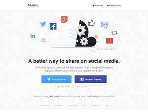
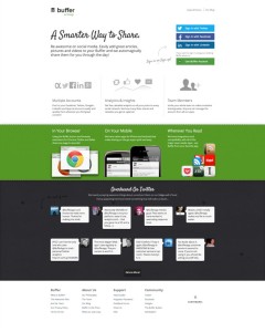
This is Buffers old landing page

Old Buffer

Compared to Buffers new and improved one

New Buffer

Recap:

  • Less is more.
  • Use your own images.
  • Use readable fonts.
  • Be consistent with the colour.
  • Know the law.


Trends of 2015 and how you can apply these to your site

Scrolling

The first big trend for web design in 2015 appears to be scrolling, according to Ratcliff (2014).

Scrolling is faster than clicking, it looks sleek and gives a much more modern feel to the site, which is something to aspire to (Lake, 2014). Ratcliff maintains that this method of web design is very good for story telling, so whether it would be of any use to businesses aiming to sell a product is debatable.

However, if we consider this example it appears that the scrolling trend can also work for product selling:

Scrolling 1

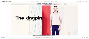
Further examples are documented with OBEY and Urban Outfitters of a product being promoted through scrolling, putting doubt to rest.

UO2 UO1

Modular scrolling

A second type of scrolling that is the trend for 2015 is modular scrolling in which the screen is divided, allowing the user to scroll individual columns at a time (Ratcliff, 2014). The question arises is there much point is this though however. The issue with it is that it’s likely to be vulnerable to technical issues or glitches where the columns don’t align. Is it really worth the trouble?

Parallax scrolling

Parallax scrolling is where background images move by the camera slower than foreground images, creating an illusion of depth in a 2D scene and adding into the immersion. When used too much parallax scrolling can be overwhelming which will put a user off of a website, as Lovin found out. However when used sparingly the use of it can add an element of depth (Creative Bloq, 2014).

Here’s Gameboys example of parallax scrolling in which they combine new trends with significant iconography to create a highly appealing site:

Parallax scrolling

If you’d like more, please check out Creative Bloq’s article on the 50 best uses of parallax scrolling.

The only issue with this is that although it looks good, it can be overwhelming as mentioned earlier and goes somewhat against the principle of less being more. Not only this but it’s not easy to do, leading to the business incurring costs on something that may be seen as overwhelming.

Shades of colour

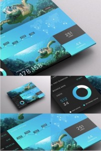
Now an interesting trend that Ratcliff predicts is that brands will pick one colour and then add various shades to it, offset with a neutral background, providing a real elegant feel.

SJQHUB really utilise this in their app, for quite a beautiful design (Lake, 2014).


Shades of colour

If you’d like anymore examples, follow this link!

This can be used alongside the concept of keeping to your brands colour scheme that Miller suggests. However this concept appears to be utilised heavily in apps and not so much on actual websites, so the jury’s out on how well it conveys!

Big Fonts

These are set to make a come back in 2015, compile this with your clear typography and short sentences and here you get a very captivating display.

Big Fonts

Ghost buttons

These are sleek. These are subtle. These are cool.

Ghost buttons are transparent buttons, but often are in a rectangular shape, bordered with a very thin line, containing light sans-serif fonts (Ratcliff, 2014). These are a good way to show the user that you’re fashionable and you keep it up to date.

Here’s an example of a ghost button

Ghost button


Responsive web design for bigger screens

More designs should be set for bigger screens according to Ratcliff and Lake. This enables more information to be conveyed on the page, offering more chance for recognition.

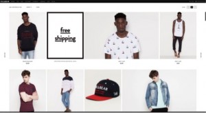
Here’s an example of Pull & Bears optimised site for bigger screens

Pull & BEar


I would avoid focussing on this however, it seems odd that both Ratcliff and Lake would place so much emphasis when many more users have been using mobiles and tablets. For a small company this is not advised, especially if they have a smaller budget, focus on mobile!

Recap:

  • Use ghost buttons to look sleek
  • Big text is in, but don’t go over board on the amount of text
  • Utilise shades of colour and play off the background
  • Consider creating a scrolling interface

What to avoid – some key ideas

In this section I’ve analysed Lake’s 2014 study of what makes web users distrust a website and summarised some of the crucial points.

  • Cluttered or too busy website, see Lovin’s struggle with Buffer in my earlier post
  • Too many ads or a non-standard ad formats – pretty self explanatory, although you need these to create revenue, overkill can be annoying, this results in a loss of sales if you’re an e-commerce site.
  • No about us page – how is the user going to know what you’re about if you don’t feature an about us
  • No photos of your actual business, and an excess of stock photos – takes the legitimacy away from your site.
  • Lack of a healthy social stream
  • Poor navigation and accessibility
  • Hidden information such as price, shipping costs, address, telephone number etc.

So essentially, you need to find a balance between the whole less is more approach that I’ve been harping on about through this entry and an approach that provides the customers with the information they need to trust a site.

Looking at OBEY

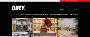
A great web design I noticed was that of Obey Clothing, they’ve really incorporated many elements to their site that have been mentioned in this entry

Obey

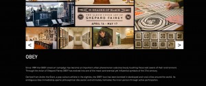
Obey facilitates clean and easy to read text, using big fonts where needed and provides an about me which can be used to identify the brand.

Obey About


As you can see OBEY incorporates a scrolling interface whilst maintaining their brands theme colour wise.

Obey .12

If you keep scrolling you see OBEY’s clearly organised articles, reducing the clutter on the screen.

Obey 3

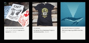
And here we have Obey utilising modular scrolling in which they interlink their social streams.

Obey4Obey No 5

What I don’t really like about OBEY’s site is that it’s quite dark and there’s perhaps an overload of data, however it does appear that they’ve stayed true to what their brand is about whilst keeping up with contemporary trends in order to create a nice site.

Looking at Urban Outfitters

Similarly to Obey, Urban Outfitters has also incorporated scrolling into their web design; They’ve to some extent used an orange shading to convey a very easy going and clean feel to the site; In some places they have ghost buttons, which is a nice addition; They’ve also used big fonts.

UO1 UO2 UO3


One thing to really take away from Urban Outfitters site is their simplicity, they really are following the trend of less is more. At the bottom of the page they have the hashtag #UOTrending, which like Obey incorporates social media elements to their site. All of this suggests that very much like OBEY, Urban Outfitters has followed the 2015 trends and is a fine candidate to emulate for your own web design.

Final Thoughts

Essentially the aim of this entry was to help readers to incorporate the key trends of 2015 web design with basic knowledge of what to strive for, without making a fundamental blunder which would cost web users trust! The principles were

For basic design:

  • Less is more.
  • Use your own images.
  • Use readable fonts.
  • Be consistent with the colour.
  • Know the law.

2015 trends:

  • Use ghost buttons to look sleek
  • Big text is in, but don’t go over board on the amount of text
  • Utilise shades of colour and play off the background
  • Consider creating a scrolling interface

What to avoid:

  • Cluttered or too busy website
  • Too many ads or a non-standard ad formats
  • Lack of a healthy social stream
  • Poor navigation and accessibility
  • Hidden information


References

Creative Bloq. (2014). 50 great parallax scrolling websites. Available: http://www.creativebloq.com/web-design/parallax-scrolling-1131762. Last accessed 21st April 2015.

Lake. (2014). 44 Reasons Why People Don’t Trust Your Site. Available: https://econsultancy.com/blog/64870-44-reasons-why-people-don-t-trust-your-website/. Last accessed 22nd April 2015.

Miller. (2014). Design Tips for Social Media Marketers. Available: https://blog.bufferapp.com/design-tips-social-media-marketers. Last accessed 21st April 2015.

Ratcliff. (2014). 17 Crucial Web Design Trends for 2015. Available: https://econsultancy.com/blog/65898-17-crucial-web-design-trends-for-2015/. Last accessed 22nd April 2015.
 

Web design still matters!

With the rapid growth of e-commerce over the last few years, with no signs of slowing down anytime soon, you’d think every business would have a carefully thought out website aimed at capitalising on such a big potential market, right? Wrong. More and more it’s apparent that poor web design is hindering potential success of a company, this is worrying. This blog post sets out the importance of high quality web design!

Why is design so important?

The first reason to consider is the increasing number of competitors that e-commerce now receives making quality web design paramount (Ghandour et al, 2010). DeLone and McLean (2003) maintain that a further reason for careful consideration of web design is that quality of the site will affect subsequent use, which in term determines benefits accrued the organization. Epstein (2004) asserts that the further benefits from good web-design are channel optimization, cost saving, customer loyalty and retention. However, you’ll have to keep in mind that if your business is offering a poor product good web design isn’t going to ensure all the sales in the world because customers simply may not want to purchase the product. Yet superb web design may be able to facilitate a way for sales to be made.

Not only this but studies have proven than content is actually less important than design for building trust with your audience. Briggs et al (2004) found that 94% of internet users said that web design was more important than the content on the site, with only 6% of users disagreeing. It’s clearly quite important, had that study been undertaken now where poor web design plagues the web a considerable lot less than in 2004 due to ever increasing technology the results may have been different. However, the point that remains is that web design and content go hand in hand, a visitor wont want to ready your sites content if the site in question is poor, and on the dame token, if the content is poor then the users probably wont care for how nicely the sites designed (Hendricks, 2015).

Accessibility and web design

Ultimately good web design should promote accessibility, but why does this matter? Accessibility is highly important to any business that wants to make their site a success, quite simply it’s key (Rosen and Purinton, 2004). A lack of accessibility will frustrate customers, making them less likely to buy. Not only this but a lack of accessibility will result in more time allocated to customers to reconsider their purchase, ultimately leading to a loss in potential sales for the brand (Romaniuk & Gaillard, 2007). Additionally, Stewart (2014) explains that one of the key drivers in attracting an older market to a site is accessibility. Put simply, a lack of accessibility due to poor web design can cost you sales, and lead your customers into the arms of competitors!

But does it really matter?

Web design really affects branding, the design of a site isn’t your brand in it’s entirety of course but it is one of the essential branding elements that helps build trust with your audience, (Hendricks, 2015). Lake broke down the key reasons that web users didn’t trust a site in 2014, amongst this list a key theme that just kept reoccurring was that the site was too dated, it was too cluttered, it had a poor look and feel, there was poor navigation an there was no about us page. What does this tell us? No one will trust your brand if your web design is poor, when no one trusts a brand then no one will buy from that brand, meaning that your brand has no sales revenue which is believe it or not a sure fire way to go out of business fast! So think about redesigning your site!

Ultimately branding is an investment that grows over time with the end goal of getting people to trust the brand. Brands are perceptions and brand elements such as names, logos, tag lines, trade marks and  packaging are short cuts to these perceptions (Spool, 2002). Meaning that if you want branding done properly, focus on your web design!

Recap:

Web design is so important because:

  • Of the vast number of e-commerce competitors.
  • It promotes accessibility, leading to more potential sales.
  • It can promote customer loyalty
  • It allows web users to trust the brand

Example of web design hindering the success of a brand

Buffer

In 2014, Lovin was tasked with redesigning Buffers, the social media flow managing site, home page. When analysing the site, Lovin noticed that the original site was somewhat bloated, which hindered its effectiveness. The site wasn’t bad, it explained the product, it outlined the key features of the product, backed up with a few exceptional user testimonials from Twitter. The issue with this is that it was almost too accessible, it provided lots of places for a user to get distracted & click away.

On the task of redesign Lovin sought out to reduce the possibility of distracted users. He did so by making the headline a short but efficient description of the brand it was something that could’ve been understood in 5 seconds, this simplified the process. Not only this he then changed the sign up/log in flow from a list of four possible ways to subscribe on the far side of the page, to a simplified way of logging in via Facebook or Twitter directly under the headline. He then went about compiling all what Buffer did with a new brand image, instead of an about page, yielding the website with a simpler feel.

Here’s the old landing page compared to the newer one:

Old Buffer New Buffer

But what does this all mean? Why does this matter to the success of the website?

Well, Lovin then tested how much this really affected the success of the site by sending 50% of users to the old site, and the other 50% to the new site in a 24 hour period.

Old site

New site
Page views 14,556 16,437
New Sign ups 762 994
Conversion rate 5.23% 6.05%


The results: Lovin’s new site received a 16% in new user conversion, which is quite frankly astounding to think that something as simple as an overcrowded landing page really hindered Buffers success for so long.

You may have noticed that a big factor in this redesign was decluttering the landing page, was this a one off or is this a common issue?

Buffer wasn’t the only company to find issues with cluttered landscape of a site, Jim Blankoff, the CEO of Vox Media stressed the importance of web design, stating in 2012 that many organisations are suffering from cluttered and bloated webpages. Morrissey adds that this is putting users off from revisiting, and explains that the reason for this was that websites are often designed by technologists and not designers, which ultimately hinders their success!

Examination of AIFF

AIFF apparel is an online independent brand offering their exclusive ‘AIFF’ branded T-shirts and sweatshirts. The brand targets the student streetwear market, and has found a predominant male following aged 18-22 in the UK.

AIFF’s online presence lacks great detail in terms of about page which can be seen to weaken the brand, unlike market leaders such as Obey or Brixton. Their site initially shows the logo in a very subtle way, in white on a coloured background, establishing some what of a brand identity, however.AIFF 1

AIFF 2AIFF 3

My gripe with the site is that it goes straight into showing products, it doesn’t offer anything, extra. The all white background looks unfinished and we have no idea who the brand is, personally, it wouldn’t encourage me to buy anything from the site. The web design could do with vast improvements!

Final thoughts

By now it should be blindingly obvious that web design is crucial to the success of your e-commerce business, obviously it’s not the ultimate saviour for a poor brand selling poor products. But what it does do is facilitate sales, and helps establish a brand! If your site is designed poorly, I’d suggest embarking in a journey towards better web design!

If you’d like to read more on Buffer’s redesign, click here.

References

Epstein, M. J. (2004). ‘Implementing E-Commerce Strategies: A Guide to Corporate Success After the Dot.Com Bust.’ Westerport: Praeger Publishers.

Ghandour, A., Deans, K., Benwell, G., & Pillai, P. (2008). Measuring eCommerce website success. ACIS 2008 Proceedings, 24.

Hendricks. (2015). Understanding The Full Impact Of Web Design On SEO, Branding, And More. Available: http://www.forbes.com/sites/drewhendricks/2015/02/11/understanding-the-full-impact-of-web-design-on-seo-branding-and-more/. Last accessed 21st April 2015.

Lake. (2014). 44 Reasons Why People Don’t Trust Your Site. Available: https://econsultancy.com/blog/64870-44-reasons-why-people-don-t-trust-your-website. Last accessed 16th April 2015.

Lovin. (2014). Lessons Learned From Redesigning the Buffer Homepage. Available: https://blog.bufferapp.com/lessons-learned-from-redesigning-the-buffer-home-page. Last accessed 15th April 2015.

Morrissey. (2012). Why Publishers Should Rethink Their Web Design.Available: http://digiday.com/publishers/why-publishers-should-rethink-design/. Last accessed 15th April 2015.

Sillence, Briggs, Fishwick, & Harris, (2004). Trust and mistrust of online health sites. In Proceedings of the SIGCHI conference on Human factors in computing systems (pp. 663-670). ACM.

Spool. (2002). Determining How Design Affects Branding. Available: http://www.uie.com/articles/design_and_branding/. Last accessed 21st April 2015.

Stewart. (2014). 6 More Tips to Attract and Keep Older Web Users.Available: https://econsultancy.com/blog/65346-six-more-tips-to-attract-and-keep-older-web-users. Last accessed 16th April 2015.

Romaniuk, Jenni and Gaillard, Elise: ‘The relationship between unique brand associations, brand usage and brand performance: analysis across eight categories’, Journal of Marketing Management, 23 (3/4) (2007), pp. 267–84.

Rosen, D. E., & Purinton, E. (2004). “Website design: Viewing the web as a cognitive landscape”. Journal of Business Research, 57(7), 787-794.

Here’s how to optimise your brands Twitter campaign!

Twitter attracts 288 million active monthly users, these users send over 500 million tweets back and forth everyday (Twitter, 2015). Using twitter can give a face to your otherwise faceless company, it can add a personal touch to promotions, it can provide you with insight into your customers minds, and it can provide you a way of reaching huge untapped potential markets by getting involved. And here’s how you can get a brand popular on twitter!

Social Conversation

According to Patel (2015) there’s an increasing trend of social communication between brands and social media users, meaning it’s a better time to capitalise on this growing trend now more than ever! Replying to users and getting back to them will make them feel valued (Stelzner, 2014), it’s a fantastic way to boost PR and it’s quick and easy.

Social Conversation doesn’t just mean tweeting to and in response to your current followers it includes other elements like following current trends and sharing your brands voice! This can be done via the use of hashtags, something which Twitter has really revolutionised social media with! By brands using hashtags they are expected to gain a 16% bump in retweets than if they hadn’t, according to a 2014 Twitter study.

A great example of brands utilising social conversation with hashtags was the hashtag known as #TheDress, which was somewhat of a phenomenon where a photo of a dress appeared to be black and blue to some people, whereas to others it was white and gold. Whether the dress was black or blue/white or gold was irrelevant, what really mattered was how brands capitalised on this!

The Dress FordThe Dress Tide  The Dress XBox

Palmer (2015) has compiled a list of lessons learnt from #TheDress when it comes to brands utilising social conversations:

– Make the most of your canvas, use the trends to promote your product, but have this done early.

– Keep an eye on the clock, timing is key and being late can prove fatal to the success of the campaign.

– Don’t try too hard, be engaging but be laid back about it, don’t ram the jokes down the users throats

If you’d like to see more discussion about #TheDress, click here. Additionally, if hosting a Twitter chat interests you, read Millers step by step guide.

Favouriting

Favourite someone’s tweet can make a user feel like what they said was valuable, as if it was appreciated, the user could then look at the page who favourited the tweet in question, if it interests them they might give it a follow, or better yet click on the brands website. This can be done by searching for keywords such as ‘street style’ and favouriting tweets relating to this, potentially reaching a larger target audience, obviously however, this can take considerable time so investing in apps such as Twitfox may be a good idea (Patel, 2015).

Twitfox allows you to enter keywords that you’d like to monitor and automatically like tweets with such keywords. By using this method Writingfloor received 467 followers from this in days, these followers visited their websites, and joined their communities giving them early criticism. However a word of warning, using an app like this may actually be disadvantageous, if the tweet favourited was negative there’s no way to monitor if you’re mass favouriting.

The use of images and videos

According to the aforementioned Twitter study upon what gets the most retweets, it would appear that including a picture or a video in your tweet will boost potential retweets by 35%(for pictures) or 28% (for videos), on average. So the use of pictures and videos is a surefire shortcut to your brands twitter success (Rogers, 2014). This doesn’t have to be particularly relevant to anything even being sold but still it’s a quick and easy way to generate more attention for your brand.

To see the full article on what engages users more on Twitter, follow this link.

American Apparel provide a very good example of using photos to get advertise your brand and products. This picture really promotes th shoes and the brand well, you have the vibrant yellow shoes contrasted against a bright blue sky in a way that looks effortless and natural Not only this but you also get to see the American Apparel logo, which is a nice touch!

Another great example is Adidas, they don’t push any particular product in this photo, but they promote the world cup, which their products will subsequently be used in, it was a great way to engage socially due to the mass excitement of the world cup and to subtly promote a brand.

If you look at AIFF Apparel’s tweet, I feel like it could have really utilised a photo or even a video, showing their new range, it would have been quicker for their followers, and got the point across like American Apparel or Adidas did!

Searching

Most users don’t know how to accurately use the Twitter search function. The search function will only find results for all terms included in the search, so searching ‘AIFF and OBEY,’ for example will only get tweets with the words: AIFF; and; OBEY, which may not really be what the user is looking for. However, using the advanced search engine you’ll essentially be able to search for either term specified in your search ensuring better results, (Gladstone, 2014)

A further tip for searches is to search phrases in quotations, ensuring you get the exact phase; note singular words do not need this!

Retweet

Users have no action to reply to a retweet meaning that you could be retweeting for no real reason, they can’t favourite it, nor can they reply automatically, so it’s somewhat futile for instant interaction.

Also if it’s a post that many people retweet you can become just a number, meaning that you’ve essentially clogged someone’s timeline, potentially discouraging them to no real avail. A good thing to do would be to Modify tweet, where the tweet starts with an MT and then puts the username, quotes the tweet and replies to the quoted tweet (Gladstone, 2014). Another option would be to quote tweet, which is a feature only available via the mobile app these days which essentially is the same as a MT. The issue with these two methods is that with 140 characters, quoting a tweet doesn’t leave much space to reply.

Here’s Gladstone’s example of a modified tweet:

SME example of MT

Interact with the fans

Interaction with users is key, replying to them and making them feel valued is a sure fire way to go from a public entity to a having a more personal connection with users. This works well whether you’re the Twitter account represents a brand or a personal brand, the closeness of the relationship turns a casual fan into somewhat of a brand ambassador who’ll push your brand onto other people giving you promotion via word of mouth. It’s effective and it’s free, it also provides the brand with a deeper insight into their target market, allowing them to angle a campaign more effectively.

Here’s an example of Radio One host Greg James having interaction with a fan:

BH GJ

On a similar note this can be done in reverse to create valuable cross promotion (Patel, 2015). By reaching out to celebrities via tweets, there’s a potential that they’ll write back. If this persists over time you may get some valuable promotion for your page, think about it if your page is promoted by someone with 2 million followers you have 2 million eyes on the brand! If you don’t believe me check out the success of pretty much any product promoted in Oprah’s Favourite Things!

Reply to the right audience

If you start the tweet with an @ only that user and then their followers will see it, meaning a very limited scope of potential users can see it. This is good for customer service, in which problems can be dealt with somewhat privately but it’s not ideal if you want people to actually see the response. Say its someone singing the brands praises, an advisable approach to use this as a marketing tool would be to say thank you in a subtle way that lets all your followers know about it, starting the tweet with a . or a ‘Thank you very much @ will do this (Gladstone, 2014).

Check out Gladstone’s example of this:

SME example of selective tweeting

Timing and Frequency

Now I personally am a huge fan for knowing how much to post on any social media site and then how frequently, Twitter is no exception to this. With the help of Social Bankers 2013 study, I’m able to guide you to the optimum posting time and frequency.

Their study highlighted that 3 tweets per day was optimal for maximum replies, however this seemed pretty minimal. Track Social (2013) also found that 3 tweets per day is the optimum for interaction per tweet, however if we consider the optimal number of tweets for interaction with followers overall their study suggested that tweeting up to 30 times per day would get the most interaction as a whole.


So for a personal page it looks like 3 tweets per day is a good benchmark,  but for a business site, anywhere up to 30 is advised!

But what time is ideal to tweet?

in 2014, Mongello undertook a study identifying the best times to post on social media, this is a great tool for not just Twitter, but for any social media platform your brand operates on

In this she suggested posting on weekdays, between 1-3pm. However, if you are planning on tweeting up to 30 times per day please have some discretion for your poor followers who probably don’t want a barrage of 30 tweets all at once!

Some further ideas to enhance the success of your Twitter page;

  • Use lists to organise your followers, it turns a wall of noise into an organised way of seeing what people are saying (Stelzner, 2014).
  • Share interesting discoveries from the net to you followers (Taparia, 2015).
  • Use humour to appeal to human nature, giving a face to the brand (Sprung, 2014).

Conclusion

The use of Twitter as a marketing tool cannot be underestimated follow the aforementioned tips in order to successfully market your brand on Twitter. Here’s a recap of the principles discussed in this entry:

  • Be interactive with your followers
  • Show your followers appreciation by quote tweeting and favouriting
  • Show your brands human side with humour, and share discoveries with your followers
  • Use lists to organise a somewhat confusing list of followers
  • Enhance your tweets with pictures and videos
  • Use hashtags to get capitalise on trending topics
  • Remember how to search effectively
  • Tweet up to 30 times per day for the most engagement, between 1-3 on weekdays is the optimal time!

Obviously Twitter cannot be the sole focus of your brands marketing campaign, but it’s a very big opportunity to capitalise on, in which this entry has summarised the ways in doing so.

References:

Gladstone. (2014). 7 Simple Twitter Marketing Tips. Available: http://www.socialmediaexaminer.com/7-twitter-marketing-tips/. Last accessed 16th April 2015.

Lee. (2014). Social Media Frequency Guide. Available: https://blog.bufferapp.com/social-media-frequency-guide. Last accessed 21st April 2015.

Mongello. (2014). Timing is Everything. Post Smarter Right Meow..Available: http://blog.sumall.com/journal/timing-everything-post-smarter-meow.html. Last accessed 21st April 2015.
Parker. (2015). How Brands Fit into #TheDress on Twitter. Available: https://blog.twitter.com/2015/how-brands-fit-into-thedress-on-twitter. Last accessed 16th April 2015.

Patel. (2015). 10 Digital Marketing Trends Of 2015 That Will Boost Your Strategy. Available: http://www.forbes.com/sites/neilpatel/2015/03/09/10-digital-marketing-trends-in-2015-that-will-boost-your-strategy/. Last accessed 15th April 2015.
Rogers. (2014). What Feuls a Twitter Engagement. Available: https://blog.twitter.com/2014/what-fuels-a-tweets-engagement. Last accessed 16th April 2015.

Social Bankers. (2013). Tweeting Too Much? Find Out the Ideal Tweet Frequency for Brands. Available: http://www.socialbakers.com/blog/1847-tweeting-too-much-find-out-the-ideal-tweet-frequency-for-brands. Last accessed 21st April 2015.

Sprung. (2014). 12 Twitter Marketing Tips From The Pros. Available: http://www.socialmediaexaminer.com/12-twitter-marketing-tips/. Last accessed 16th April 2015.

Stelzner. (2014). Twitter Marketing: How To Succeed on Twitter.Available: http://www.socialmediaexaminer.com/twitter-marketing-with-mark-schaefer/. Last accessed 16th April 2015

Taparia. (2015). 5 Effective Twitter Strategies You Don’t Know.Available: http://www.forbes.com/sites/nealtaparia/2015/02/24/5-effective-twitter-strategies-you-dont-know/4/. Last accessed 16th April 2015.

How your brand can boost its Facebook user engagement! Part 2!

This is Part 2 of a series which is set out to help businesses successfully brand themselves via Facebook in order to ensure the optimum levels of Facebook user engagement! Part 1 of this entry established that it’s important that your brand chooses a good username for their page, they should utilise the company logo as their profile picture, offering promotions via their cover photos, they must fill out the about page, providing links to their main sites and other social media outlets. The recommended posting frequency is at noon or 7 pm on Tuesday, Thursday, Friday and Saturdays, in which posts should be as interactive as possible. We now move onto Part 2 which discusses the various other ways to utilise Facebook as a valuable marketing tool.

Photos and videos

As Aaron Lee (2012) has aptly alluded to, a picture paints a thousand words and a Facebook photo is worth much more than that. The brain processes visuals 60,000 times faster than text, meaning there’s little better ways to grab users attention than by sharing photos, or videos on your page. These photos can be anything from promotional photos/videos or photos that are going to spark conversation and interactivity in a fun and creative way. According to TrackMaven, posts with photos receive 37% more interaction, than posts without! So using photos and videos is key!

Humans of New York provide an excellent example of this where they post photos with stories in the description, this has led to each day users sharing their own stories and photos on the page.

Humans of NY

Ikea created the perfect combination of promotion, Facebook branding, and photo uploads when they hosted a wedding for an Australian couple on Valentines day, kitted out with one of IKEAs newer ranges. They invited 80 random Facebook fans to the hour long ceremony, which they posted various photos of on Facebook. These photos showed off the wedding as well as showing off IKEA’s new range in a way that text never could.

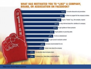
Obviously you wouldn’t only post irrelevant photos or videos but it’s a great way to add a human feel to your brand, making it more accessible for users and potential customers. Not only this but as 29% of users like a page on Facebook for fun and entertainment, according to Social Media Examiners study, this is a good way to play into these elements without increasing capital expenditure.

For more ways to enhance your experience via Facebook videos, see The Social Media Examiners guide to do so!

Competitions and exclusive experiences

Returning to that same Social Media Examiner study that has been scrutinised so much in this part and the former part of this blog, it was concluded that 36% of Facebook users who are associated with a brand, like the brand on Facebook in order to get a discount, freebie or a coupon; furthermore, 25% users like the brand to get access to exclusive content that the brand will provide; and a further 22% like a page due to recommendations by friends. But how do we utilise these three figures, you may ask. The answer is simple, a brand can utilise such opportunities by offering a contest where a number of shares will be rewarded by a coupon or a free product or something along those lines (Gunelius 2012). This will attract more likes to a page, thus attracting more users to visit the page, creating more interpersonal relationships and also opens a brand up to many more potential users and consumers of the product.

Obviously this is where exclusive content of the actual brand is key though, because if a plethora of potential consumers visit the page, but the page offers nothing of any real value, they’ll be turned off from liking the page and therefore giving the brand a bad reputation or at least limiting potential consumers.

IKEA’s bedroom makeover was a great example of this! In 2011 IKEA launched a competition giving fans a chance to win $10,000 worth of IKEA furniture in order to make over their bedroom. All fans had to do was explain on the IKEA Facebook why they wanted to make over their room, generating great user engagement. To further the engagement IKEA held a public vote to pick ten finalists, who IKEA was cut down to three. The three winners then had 90 seconds to grab as much furniture as possible from the store, really boosting PR and engagement in the mean time!

The only problem with competitions such as IKEA’s is that there would be no real way for a small company, who don’t have a big marketing budget to offer such promotions giving three fans £10,000 (for a British company) because the money just isn’t there.

Sales Pitches?

Now it’s obviously important to inform the users about upcoming products and sales, but there are certain issues and drawbacks that occur when the page is far too focussed on promoting their products (Karasiewicz, 2013). Being a pushy salesman is not going to bode well with users who are simply surfing Facebook in their spare time, it’s their social time, they shouldn’t have to be harassed with constant pitches! So the suggestion here is to ease up on the pushing of products, and be more personal, no more business jargon (Ganguly, 2015).

Lee (2013) maintains that you should put emphasis on your fans, and not your products, more emphasis on fans means that they’re more likely to buy products. But then again how is a fan likely to buy a product that hasn’t been promoted at all. The real goal here is to promote your products, but also to engage with fans, to create relationships.

Humanize the brand

Brands should act human on Facebook, it really makes the user feel as if he’s dealing with an actual person (which he is) as opposed to a faceless corporation. This shouldn’t be too hard to do considering brands are made up of actual human beings, but if you’re still scratching your head over this one, here’s some quick tips!

A way to optimize your brands Facebook liking potential is by signing posts, this is a great way to add a human face to the brand, it makes the user know that real people are posting this stuff as opposed to a faceless corporation as mentioned prior, making the brand ultimately more relatable (Ganguly, 2015). An example of this is Chipotle Mexican Grill, who sign posts with the writers name.

Signing posts

Another way to humanize the brand is to use humour in your brands posts, as long as it’s non offensive, this is a great way to entertain the users and therefore promote a healthier brand image (Ganguly, 2015). Although this can presumably be difficult to balance the humour that a poster would want to portray without conflicting with any social aims that a brand is trying to achieve. Also by playing humour too safe it may come off as not humorous at all, which really won’t do a brand any favours! But still it is worth keeping in mind that humour can lead to a more humanized brand.

One further way to do so would be to post some behind the scenes pictures according to Lee (2013). By doing this, you simply break all the corporate facade down of your brand and make it much more relatable. Here is a great example by Zappos. They shared a photo of one of their employees making pizza.

Recap:

  • Post 3-4 times per week, ideally at either noon or 7 pm on Tuesdays, Thursdays, Fridays and Saturdays.
  • Be interactive, stimulate conversations, tag, ask questions.
  • Be positive, but handle complaints swiftly and effectively.
  • Share photos and videos with users.
  • Engage in competitions, offer exclusive content.
  • Don’t over promote.
  • Humanize the brand with comedy or add personal touches.

Monitoring this success

The first thing what any brand would need to do to measure the success of their given campaign is to set goals, this could be for interactions, or likes, or shares, or direct messages, or whatever you feel is the best indicator of what your brand wants to achieve via Facebook.

Then what you can do is then reflect on this goal by using Facebook insights. Facebook insights provides metrics on how many followers you get in a specified period of time, breaking them down by demographic.

Here’s what Facebook Insights looks like

You could then consider what likes, comments and shares you get to measure the engagement!

A word of warning

Interactions can really fluctuate day to day, so it’s unadvisable that a brand would get too caught up on looking at the smaller picture. However, a more apt approach would be to look at the weekly progress, noting what works, what doesn’t work, thinking about how you can improve. By doing this you can really assess what your target market like to see if you notice how many interactions you get per post and on what topic, so not only do you get a more successful Facebook strategy it saves you a valuable insight into the minds of your target market, which allows you to focus your campaign more specifically on them. However, you’ll need to keep in mind that by recreating the same posts day in day out because they were successful once, will ultimately become stale, which will lose attention of your users. So keep it fresh but monitor progress!

When considering the success of your page, make sure you don’t get too caught up on likes and focus more so on the actual interaction a post receives. This allows you to look at the levels of feedback, making success easier to monitor, having happier consumers/likers is key, besides what’s better having someone raving about how good your brand or product is or just autonomously like it and never buy nor mention anything about it again.

Final thoughts

The strategies suggested in this series should help your brand increase its levels of interactivity, obviously there are many variables in the process, like with any marketing element, so success cannot be ensured. However, this guide should at least encourage brands to consider these points and craft them into their own strategy, which should ultimately prove beneficial. So remember:

  • Post 3-4 times per week, ideally at either noon or 7 pm on Tuesdays, Thursdays, Fridays and Saturdays.
  • Be interactive, stimulate conversations, tag, ask questions.
  • Be positive, but handle complaints swiftly and effectively.
  • Share photos and videos with users.
  • Engage in competitions, offer exclusive content.
  • Don’t over promote.
  • Humanize the brand with comedy or add personal touches.
  • Monitor interaction once a week and keep reassessing the strategy.


References:

DeChernatony, L. and McDonald, M.: Creating Powerful Brands, 2nd edn (Oxford, Butterworth Heinemann, 1998).

Ganguly. (2015). 9 ways to Humanize Your Brand with Social Media.Available: http://www.socialmediaexaminer.com/humanize-your-brand-with-social-media/. Last accessed 15th April 2015.

Gunelius. (2013). 10 Steps to Creating a Facebook Page that Gets Likes. Available: http://www.forbes.com/sites/work-in-progress/2013/01/18/10-steps-to-create-a-facebook-page-that-gets-likes/. Last accessed 15th April 2015.

Karasiewicz. (2013). 12 Do’s and Don’ts of Facebook for Business.Available: http://www.christiankonline.com/facebook-for-business-ebook/. Last accessed 15th April 2015.

Lee. (2013). 7 Tips to Humanize a Brand on Facebook. Available: http://askaaronlee.com/humanize-brand-facebook/#disqus_thread. Last accessed 21st April 2015.

Lee. (2012). 8 Surefire Ways to Increase Engagement on Facebook.Available: https://blog.kissmetrics.com/increase-engagement-on-facebook/. Last accessed 15th April 2015.Vahl. (2010). 10 Successful Facebook Marketing Examples. Available: http://www.socialmediaexaminer.com/10-successful-facebook-marketing-examples/. Last accessed 15th April 2015.

Romaniuk, Jenni and Gaillard, Elise: ‘The relationship between unique brand associations, brand usage and brand performance: analysis across eight categories’, Journal of Marketing Management, 23 (3/4) (2007), pp. 267–84.

How your brand can boost its Facebook user engagement! Part 1!

Is your brand using Facebook but has no idea how to successfully market itself? Are you struggling for likes or user engagement? In this two part series you’ll find the quintessential guide to boosting your brands user engagement on Facebook. This post first sets out the way in which the basic parameters of the site can be utilised in a way to assure likes, then the actual content of the posting and finally it will provide tips on how to monitor the success of your page!

Social Media Exam, Study

The site itself

The username

It’s key that a brand has a good username on Facebook, it should be identifiable and recognisable, which is essential to the success of branding (Dechanatory and MacDonald, 1998). Obviously it should be directly related to the company and allow for ease of access when it comes to searching for the brand (Gunelius, 2012).

It is also important to create a good ‘vanity URL’, which represents the brand, for the above reasons (Karasiewicz, 2013). The ‘vanity URL’ is where Facebook gives brands the option to create custom URLs, i.e. for this blog it would be www.Facebook.com/JosephDoddsDigitalMarketing, so it makes the page really easy to find if your have a good one! According to a study by the Social Media Examiner, 39% of users associated with a brand on Facebook, associate themselves with it in order to support the brand, if the brand isn’t easily identifiable then they would be able to associate.

The information on the page

Give the website in the about me as well as links to other social media, a brief description of what the brand is, perhaps angle the USP in this description to allow users to get a sense of who the brand is and what it offers before they have to commit to liking the page (Gunelius, 2012). A lack of information can prove fatal to attracting attention, let me pose this question, who would bother engaging with a brand when they have no idea who they are? The about me helps set the general message that the brand aims to convey, the more they do this the less time that customers contemplate purchases, meaning contemplate purchasing competitors products (Romaniuk & Gaillard, 2007).

According to Social Media Examiner, 21% of users like a brand to learn more about the company, whilst 34% like it to stay informed about the activities of a company, how can they do this with no accessible information? Simply put, a lack of information on the page itself will lose potential likes.

The cover photo and profile picture

Essentially the cover photo is the first thing that users will see if they click on a Facebook page (Gunelius, 2012), so it’s crucial that this is done right. The cover photo can be used to firstly identify the brand, then it can offer links to other social media as well as the brands website itself and thirdly it can show current promotions or future promotions that the brand has to offer, in the aforementioned study by Social Media Examiner, it was found that 33% of users want information on future products, 30% like a page to get information on upcoming sales, so this is a real opportunity to garner extra attention to the page. Additionally the profile picture should be the brands logo, once again to make it easily identifiable and recognisable (Gunelius, 2012).

If we take Business Insider for instance, you can see that their profile picture is a simple picture of their logo which is fairly identifiable, and the cover photo further reinforces the idea of corporate business by having people sitting at their desks. Saying that the page is slightly bland, perhaps if they had a more upbeat cover photo it would attract more engagement.

Recap:
  • Choose an identifiable username
  • Provide a descriptive about section
  • Use the brands logo as profile picture
  • Offer various promotional information via the cover photo

The posts:

The timing

The first thing to consider is how often and how frequently a brand should post on their Facebook, according to a study by Zorella (2012) the optimum posting frequency should be once every other day, although up to twice a day may also garner high levels of interaction for each post. In a 2012 study, Buddy Media concluded that posting once or twice per day will receive up to 40% more user engagement than posting three times per day. So it’s advisable to post about once per day to once per two days. However, InSight (2013) proposes that a brand post 2-5 times per day, this is not recommended as quite frankly it would spam users timelines, making them more likely to get frustrated with the brand.

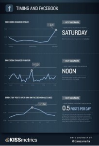
FBTiming

The optimum time of posting appears to be at noon everyday, according to Zorella’s study, with significant interaction also taking place at 7pm, so any brand is advised to post around noon, as 7pm may be out of office hours, especially if the brand is fairly small.

That same study suggests that Saturday is the best day to post to ensure user engagement, however this doesn’t really add much considering it’s advisable to post around 3-4 times per week. Other big days include Tuesdays and generally Thursdays and Fridays.

TrackMaven undertook a more recent study in 2014 where they analysed 5,804 Facebook pages. They found that the best time to post was later in the day, after work hours, they also found that off peak days such as Saturday and Sundays were the best days to post and similarly that Wednesday was the worst. 

With that being said, there’s a high amount of posts occurring the weekday, and personally, it seems odd that people would actually check their Facebook’s all that much after work, when I assume they’ll be busy socially. I’d still advise the midday posting!

So ultimately it would be wise to create a campaign in which posts will be sent out at noon on Tuesday, Thursday, Friday and Saturday.

Interactivity is key

As stated the key to success of a brand on Facebook is to create interactions with user, creating a personal bond with them. An effective way to do this is by asking questions according to Aaron Lee (2012), however this requires the users to want to answer the questions in order for it to be successful, meaning a significant relationship with users is required prior to actually get responses. Another consideration with this is the need to consider how open the questions should be, asking questions in which a yes or no answer can be provided isn’t going to give much back and forth between the brand page and the users.

According to a 2013 study undertaken by the University of Arizona, users post on Facebook to decrease their loneliness levels, even if they get no interaction. Now I’m not saying that a brand should post on Facebook because it feels lonely, I’m saying capitalise on this reasoning, if users use Facebook to decrease their loneliness, why doesn’t a brand help them do that, creating positive bonds with the user.

Karasiewicz (2013) maintains that a good way to promote interactivity or a healthy back and forth is through the use of Facebook tagging. The brand can tag users in posts, other pages, events or earlier posts in order to strum up interest. Where a brand tags users it creates a special bond with the brand and the ‘taggee’; where the brand allows a user to tag someone else it generates a higher level of potential likers to come and experience the brand; and when the brand tags other promotions it gets a great amount of cross promotion from doing so, so tagging is a win win scenario.

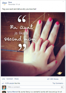
A great example of tagging success was documented by Dove encouraging their fans to share a story about someone who means a lot to the user and then tag them in the post.

av-dove

IKEA utilized this photo tagging opportunity in Autumn 2009, to promote their new store in Sweden. They uploaded 12 photos of the stores showrooms over 2 weeks, where users had the opportunity to win the products  by being the first person to tag their name on the photo, obviously resulting in thousands of users being exposed to the campaign.

 Karasiewicz explains the three ways to tag on Facebook with this video:

Short and sweet

Firstly your Facebook posts need to be positive. Kaplan (2009) warns the troubles of being too negative with posting, and promotes the use of a brand sharing more positive messages in order to lead conversations. Girls Who Code show a brilliant way in which they entertain their fans by offering fun games and promotions.

Girls who Code EG


With that being said there’s a certain amount of negativity that a brand will face on Facebook, as that’s simply the nature of the beast, you can’t please everyone however a brand should not avoid dealing with any negativity that comes there way, they should try to deal with it quickly and smoothly in order to prevent any further disruptions.

And then they need to be short. According to a Buddy Media study, a post of 40 characters or less will achieve the most interaction, not surprisingly however, these short posts are seldom used on Facebook!

A great example of a short but sweet post is Fortune magazine (below)

End of Part 1

As a quick recap, it’s important that your brand chooses a good username for their page, they should utilise the company logo as their profile picture, offering promotions via their cover photos, they must fill out the about page, providing links to their main sites and other social media outlets. The recommended posting frequency is at noon or 7 pm on Tuesday, Thursday, Friday and Saturdays, in which posts should be as interactive as possible. For a more detailed breakdown of a successful posting campaign click here for Part 2 of this entry!

For more examples of great social media usage, follow this link

References:

DeChernatony, L. and McDonald, M.: Creating Powerful Brands, 2nd edn (Oxford, Butterworth Heinemann, 1998).

Deters, & Mehl, (2013). Does posting Facebook status updates increase or decrease loneliness? An online social networking experiment.Social psychological and personality science, 4(5), 579-586.

Ganguly. (2015). 9 ways to Humanize Your Brand with Social Media.Available: http://www.socialmediaexaminer.com/humanize-your-brand-with-social-media/. Last accessed 15th April 2015.

Gunelius. (2013). 10 Steps to Creating a Facebook Page that Gets Likes. Available: http://www.forbes.com/sites/work-in-progress/2013/01/18/10-steps-to-create-a-facebook-page-that-gets-likes/. Last accessed 15th April 2015.

Karasiewicz. (2013). 12 Do’s and Don’ts of Facebook for Business.Available: http://www.christiankonline.com/facebook-for-business-ebook/. Last accessed 15th April 2015.

Lee. (2012). 8 Surefire Ways to Increase Engagement on Facebook.Available: https://blog.kissmetrics.com/increase-engagement-on-facebook/. Last accessed 15th April 2015.

Lee. (2014). Anatomy of a perfect Facebook post. Available: https://blog.bufferapp.com/anatomy-of-a-perfect-facebook-post. Last accessed 21st April 2015.

Romaniuk, Jenni and Gaillard, Elise: ‘The relationship between unique brand associations, brand usage and brand performance: analysis across eight categories’, Journal of Marketing Management, 23 (3/4) (2007), pp. 267–84.

TrackMaven. (2014). TrackMaven Facebook Guide. Available: http://trackmaven.com/resources/facebookguide/. Last accessed 21st April 2015.

Vahl. (2010). 10 Successful Facebook Marketing Examples. Available: http://www.socialmediaexaminer.com/10-successful-facebook-marketing-examples/. Last accessed 15th April 2015.

Has your brand created a strong Facebook presence? Here’s why you should do so immediately!

With 1.394 billion active monthly users, consuming 66% of all millenial’s across the world (Zephoria, 2015), Facebook has become an incredible tool for small companies to brand themselves in a way that’s cost effective and yet proves to be instrumental in the success of many brands. This blog examines the various reasons as to why any brand, whether it be small or large start using Facebook as a way of marketing such brand.

Interpersonal relationships?

The first pro to consider about Facebook’s marketing potential is Facebook’s incredible opportunity to create interpersonal relationships for its users, through means of poking, messaging commenting and sharing Facebook really provides a service unique to that of its social media counterparts. Using Facebook to create interpersonal relationships allows a brand to get to know it’s users, and thus its target market and its users/target market to get to know a brand. A real positive of this is that Facebook profiles can be seen to be fairly accurate depictions of the people they represent (Pereira, 2014), allowing a brand to get a much more personal insight into their target market. Of course this would require some amount of ‘Facebook stalking,’ of consumers, which would take a considerable amount of time, and is somewhat frowned upon, but then again, everyone does it, hey!

Additionally red flags arise as to how accurate someone’s Facebook profile actually is in regards to portraying the user, many Facebook users will often exaggerate certain aspects of their life, and withhold other information that they are less proud of. Thus perhaps it is more accurate to describe a Facebook profile as projecting the ideals that a user has, which may be more useful to a brand is it gives brands an insight as to how a consumer would like to be perceived. This bodes well for lifestyle or fashion brands, it gives them a chance to see what the customer what’s to be perceived as, meaning they can tailor their products/marketing to help the customer achieve this ideal.

One issue with the concept of creating more interpersonal relationships is that it takes time and effort on behalf of the brand, where there’s some doubt cast over how much an interpersonal relationship would actually boost sales (Pereira, 2014). InSite Consulting undertook a study in 2011, where they found that 22% of users who supported a brand on Facebook actually wanted to purchase the products promoted in the brand, however is this actually realistic and how frequently would they buy, suggesting that the interpersonal relationships will actually improve sales, contrary to Pereira’s doubt.

But does Facebook branding actually improve interpersonal relationships? You may ask, and the answer to that is yes. In that same study, mentioned prior, InSites Consulting identified that 50% of Facebook users were connected to brands, of this number 36% have commented on a brand, a further 42% had dialogued with a brand, 53% reacted to comments from the brand, meaning there’s a real chance of creating such links.

A great example of this is Qatar Airlines, who have identified through various research that many of their consumers are also big fans of football, in order to capitalise on this they often post about football, making their consumers much more responsive to questions and posts about the company.

Blog1.1

For more examples of brands creating interpersonal relationships through Facebook, click here

Doubts been cast over whether Facebook actually increases engagement… In an open letter to Facebook CEO Mark Zuckerberg, Elliot (2013) accuses Facebook of focussing too little on creating genuine engagement between companies and their customers. The reason for this was because Facebook only shows on average 16% of posts a brand will put on their followers timelines, limiting the relationships that actually are created from the use of Facebook. However, Owen (2013) argues that this is more to do with the advertiser and not the vehicle for advertisement, he argues that this may be down to poorly timed posts, or poor content. To some extent I can see where both parties are coming from, but ultimately Facebook is free to use and provides a unique way in which companies can connect with their customers.

Schaefer has an interesting article on why trust is important for social media marketers.

Facebook and its role in brand awareness

If this isn’t enough to convince you to use Facebook as a marketing ploy just look at the impact it has on brand awareness. The heavy use of Facebook builds brand loyalty whilst posing little financial burden (Coon, 2010), which is essential for a small companies who can’t afford financial risks. Not only this but the use of social media creates the aforementioned interpersonal relationships, creating a strong connection between customers and brand (Brexendorf et al, 2009). This results in more effective and accurate sales and revenue forecasts (Mehrabi et al, 2014). Mehrabi et al (2014) maintain that social media uses accrue the same advantages of face-to-face advertisement, however this claim appears unrealistic and perhaps far fetched. Ultimately such campaigns can make a brand viable in customers minds (Mehrabi et al, 2014).

What else can Facebook marketing achieve for branding?

A further study done by Business Wire (2012) examined what made users connect to a brand, – Being a consumer of the company (58%), seeking to receive discounts and promotions (57%) showing others that you like and support the brand (41%) being the first to have information about the brand (31%) and having access to online content (31%). With the amount of users who actually use the product it opens a brand up to a lot of potential criticisms along with a lot of potential praise, any criticism or complaint can be dealt with quickly and effectively, essentially nipping any potential bad press in the bud and keeping the customer base happy. A brilliant example of this is Next who successfully quashed any bad reputation they could have had with this disgruntled customer.

Blog1.2


Conclusion

Omitting Facebook branding from your marketing strategy is a huge missed opportunity, Facebook provides the ability to understand how they behave, increasing knowledge; brand awareness; promotion of social responsibility, in a cost effective manner.

With the importance of Facebook marketing being stressed, it’s crucial that a brand has a specific strategy, or else you’ll just be wasting your time and money on this promotion… Don’t believe me, watch Baer’s (2015) rant on the matter.

If this interests you any further, Forbes has a brilliant article which you can access by following this link, detailing the dangers of focussing too heavily on Facebook branding.


References

Brexendorf, Z., Sharp, J.M., & Kagioglou, M. (2009). ‘Improving business performance through developing a corporate culture.’ The TQM Magazine, (9) 3, 206–216.

Business Wire. (2012, July 31). ‘Constant Contact and Chadwick Martin Bailey study shows word-of-mouth key to success of daily deals.’

Coon, O. (2010). ‘Organizational Culture and Climate.’ In I. B. Weiner (Series Ed.) & W. C. Borman, D. R. Ilgen, & R. J. Klimoski(Vol. Eds.), ‘Handbook Of Psychology: Vol. 12: Industrial and Organizational Psychology’ (565-594).

Butt, J.G. Phillips (2008) ‘Personality and self-reported mobile phone use,’ Computers in Human Behavior, 24 (2) (2008), pp. 346–360

Elliot. (2013). An Open Letter to Facebooks CEO Mark Zuckerberg.Available: http://blogs.forrester.com/nate_elliott/13-10-28-an_open_letter_to_mark_zuckerberg. Last accessed 21st April 2015.

InSites Consulting. (2011, September 14). Social media around the world 2011. Retrieved Arpil 8, 2014 from slideshare.net/stevenvanbelleghem/social-media-around-the-world-2011.

Mehrabi, A., Islami, H., & Aghajani, M. (2014). ‘The Effect of Social Media Marketing on Customers’ Brand Loyalty.’ International Journal of Academic Research in Business and Social Sciences, 4(8), 480-495.

Owens. (2013). Forrester says Facebook is Failing Marketers, Here’s Why I disagree. Available: https://econsultancy.com/blog/63704-forrester-says-facebook-is-failing-marketers-here-s-why-i-disagree. Last accessed 21st April 2015.

Pereira, H., Salgueiro, M., & Mateus, I., (2014). “Say yes to Facebook and get your customers involved! Relationships in a world of social networks” Business Horizons, Vol 57, Iss 6, pp695-702

Social Media Examiner (2015). Available: socialmediaexaminer.com/10-successful-facebook-marketing-examples. Last accessed April 2nd 2015.

Zephoria. (2015). Top 15 Valuable Social Media Statistics. Available: https://zephoria.com/social-media/top-15-valuable-facebook-statistics/. Last accessed 21st April 2015.

Keyword research

AIFF Apparel is an independent clothing brand, that predominantly sells online via their website www.AIFFApparel.com. For a 2014 start up it has a fairly strong social media presence with thousands of followers on sites such as Twitter, Facebook and Instagram. It’s fairly difficult to find AIFF Apparel via Google, due to the mass of competitors the brand has. However, some keywords that could be used to describe the brand would be:

  • Independent
  • Urban
  • Clothing
  • UK
  • London


These terms have a huge search volume, so it’s important to identify the terms that will yield the best results.

  • 1,500,000 results: independent, mens, clothing, UK
  • 11,500,000 results: independent, mens, clothes, London, online.


In order to determine the optimal keywords to use, research was required to determine some of the market leaders in the areas and their use of keywords. It should be noted that a huge portion of AIFF Apparels sales have been men so far, so looking at brands such as Urban Outfitters, Asos and Route One may give some better insight as to the trends in this area:

  • Asos: discover, latest, largest online, fashion, offers
  • Urban Outfitters: discover, mens, latest, fashion, UK, 1000’s of offers,
  • Size?: offering, designing, casual
  • Route One: offers, huge selection
  • Obey: important, urban phenomenon, culture
  • Brixton: culture
  • Stussy: fresh


To be continued..

My thoughts on making sense of too much data.

Having watched Amy Webs video, ‘How I hacked online dating,‘ where she discusses her use of big data to crack the online dating scene, by breaking down algorithms and setting about collecting her own much smaller data, to yield best results. Here’s a summary of the material….

The video started off discussing a brief back history of Amy Webb’s troubled love life, shortly after she describes how she broke down the population of Philadelphia, then broke that down to find an ideal suitor. From the population of Philadelphia Amy had come to the realisation that on paper only 35 men were potential suitors in such a big city, showing that big data can sometimes be misleading. She shortly realised that she would have to proactively search for love, otherwise the chances of her finding a match were incredibly low. Thus Amy ventured into online dating, and noted that it followed a strict algorithm which is something thats not particularly new. She noted that for years people had been matchmaking with such an algorithm, but this was on a much larger scale due to much more accessible data than had been the case prior.**

One thing that Amy had mentioned was her aversion to filling out such forms on sites, leading to potentially incorrect or misleading data, in fact she had actually copied over her CV to the site for her bio, unsurprisingly this very formal CV was not very successful in terms of finding suitors. When she did get a suitor she had a string of comically unfortunate dates. With this in mind she realised that the algorithm was right, however what was wrong was her approach. Therefore in an attempt to reverse her luck she decided to reverse the algorithm. At first she started scoring her dates and made what can only be described as a wholly unsurprising statistic, the more alcohol that men had consumed on their dates, the more sexual they became. The point of this was so that she could get a real understanding of what she wanted, to refine her search, which would enable her to yield better results. This worked so from her study she had found her market.

However, one thing that she didn’t account for was her desirable mens lack of interest in her, meaning that she didn’t appeal to her target market. From this she went about tackling her data collection from two different angles, not just one, she created online dating profiles of men she wanted to pursue, and noted down what kind of women they attracted. From this she had a break down of catchwords and trends to be used in attracting her market. In the end she created a dating profile that was successful in attracting an ideal match, and she became appealing to him, her data breakdown and analysis resulting in her finding love.

Ultimately, the reoccurring theme from Amy’s experiment was the idea of taking a huge amount of data, such as the population of Philadelphia, and breaking it down in a way to identify her market. Once she identified her market she then identified how to saturate this market by reversing the data. From this it appears that relying on big data as a whole isn’t useful without any clear direction, by taking big data and frequently breaking it down much better results were yielded. A final point of impact was her aversion to be quantified in data charts, if a person is unwilling to provide accurate data then inaccurate results would occur, this could be prevented by assuring exactly what is the desirable result before going out to collect data.

To be returned to on a later date

http://www.ted.com/playlists/56/making_sense_of_too_much_data

Skip to toolbar