As I have previously booked a holiday online through Thomson, it required me to subscribe to their mailing list. In doing so I have since received a number of emails from Thomson inviting me to take advantage of their latest deals and offers in various e-newsletters and personalised emails. The most recent being their Hot October Deals newsletter.
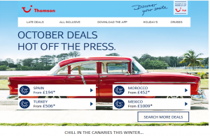
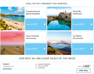
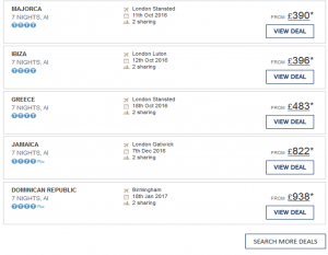
The email once opened shows the various deals they have on offer for the end of October or early Christmas breaks. It leads with a large picture banner and multiple blocks below enticing viewers to click each block to take them to a deal advertising that location. The excessive usage of pictures and buttons was obvious within this email. However, this is understandable and expected when booking a holiday, the aesthetics are one of the main factors in a customer’s choice, and would cause someone to open the email and enquire further.
The email therefore matches the Ellis – Chadwick study stating that the use of interactive elements in emails such as hyperlinks, images and tag lines are more enticing to customers than just text and therefore receive more clicks.
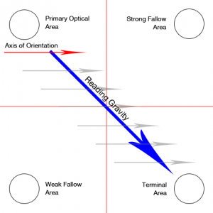
The placement of the various calls to action are also something to take note of. According to Hernandez and Resnick customers loose interest with their online baskets and due to poor navigation and the placement of various things on the website. The Gutenberg pattern was put forward in response to this. It tracks where on the page viewers make eye contact with the most.
Looking at the Gutenberg pattern it’s clear that Thomson have adopted it within their October newsletter. The call to action button is placed at the top of the page and at the point of fist eye contact. These calls to action are placed upon images of the destinations and combine with the Ellis-Chadwick theory to fully engage and encourage viewers to click.
Another thing you can expect from a Thomson email, and something that’s a must in modern email marketing, personalisation. Although this email I received was a newsletter and probably sent to the majority of their subscribers, most of the destinations advertised within my email are ones similar to the holiday package I booked with Thomson previously, both destination and price range. This email has clearly benefitted from my details that have been submitted and logged. This data Thomson now have has been put into this email to personalise it to my interests such as destinations and price range. On the other hand, in comparison to other personalised emails this one misses out some key areas. For example, the email doesn’t address me as an individual unlike others would by leading with “Hello James” or something similar.
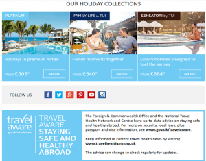
Another issue I had with the email was its length, I left the scroll bar in the far right of the first image to show how much scrolling is required to read the full email. This excessive scrolling could lead to a high bounce rate. However, that being said most of the important information was towards the top of the email and fits in with the Gutenberg model of eye contact and attention. It clearly encourages recipients of the email to book online as information about their stores was located at the bottom of the email, whereas hyperlinks to the website were a main feature within the header.
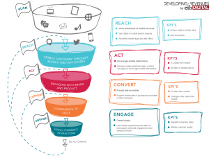
Finally, we can see this particular email finds its self at the bottom of the RACE funnel model.
As I am already a customer they have already reached, acted and converted me. Now this email very much fits into the category of engage by trying to retain me as a customer with new deals. The email is then trying to re-automate the funnel with publications and promotions so that the viewer will follow onto the website and book again. This is a factor that would contribute to me personally not opening the email as I would consider it as a batch email, not suited for me as an individual. Also an email is something that would encourage an impulse purchase, as a holiday is a large investment, an impulse purchase isn’t likely and therefore means this email goes in the trash.
Overall, I would say the email was successful in its needs. Its layout and design are easy to follow and much like the Gutenberg pattern I found myself making fist point of eye contact with the calls to actions and holiday adverts and would encourage me to book a similar holiday to one I had before, if I’m in the market for one. As this email is intended to existing customers only, it fits its purpose of being informative enticing for repeat business.

