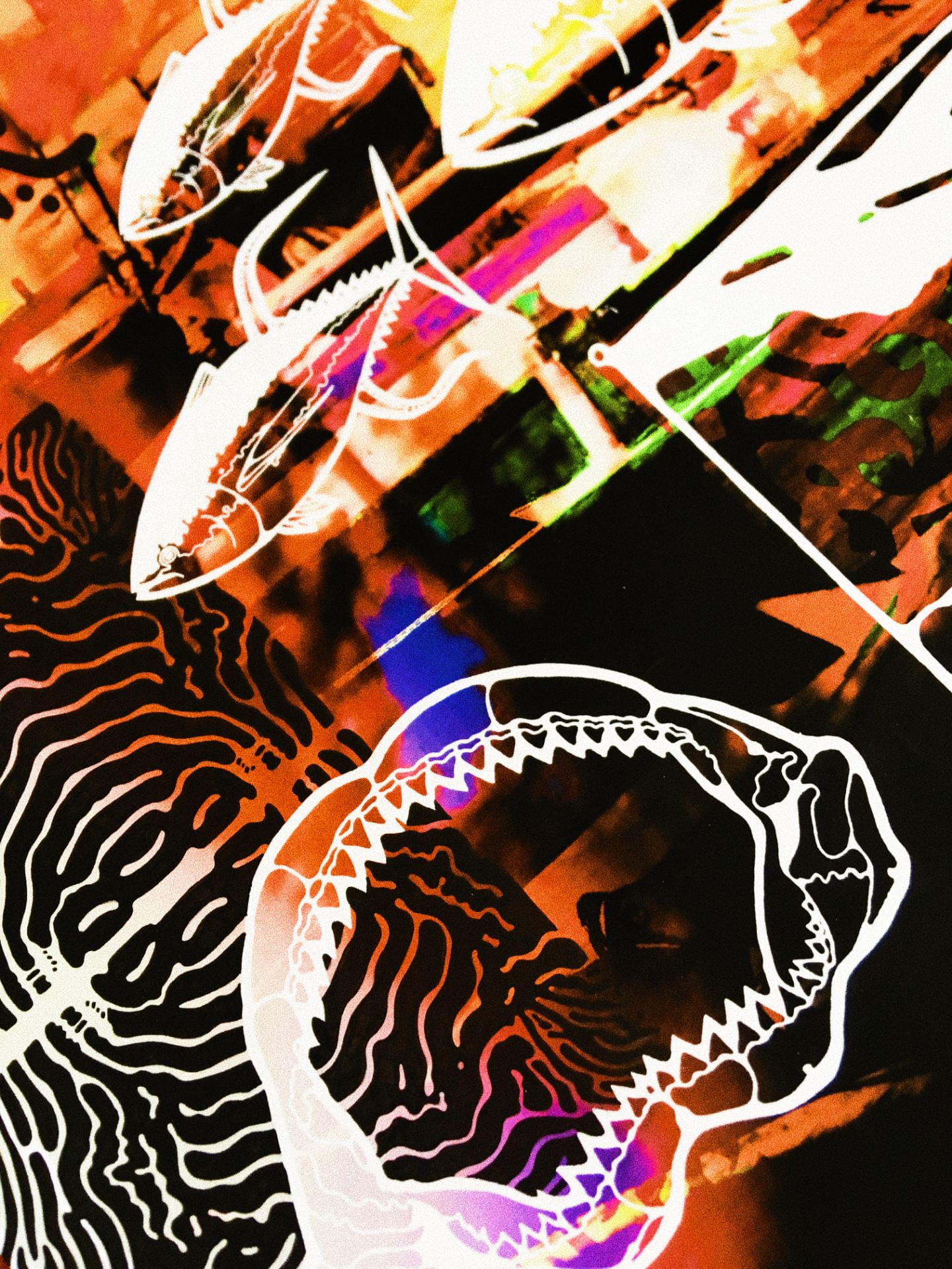
Commissions and other projects

This academic year has been an exciting one in which I feel like the work I have done on this course has begun to influence the way I work on projects outside of university. Mainly I have been trying to have a more freed up approach towards the work I create. Rather than jumping from A to Z and letting the work build upon itself to create stronger over all pieces.

Some of the things that I usually work on outside of uni are usually tattoo designs for friends which are fun to do and does gave me the idea of perhaps creating a look book and creating a pop up at a  tattoo parlour for people to come to but thats still a work in progress.

Some other more humorous commissions I have done is draw onto the back and front of a blank tambourine!

Another thing that I have always been passionate about since the beginning of my artistic journey has been drawing onto the surfaces of surfboards which then go on to be used for it purpose by their owners. I think this has always been the most fulfilling creative thing I do. This is probably cause I’ve always had such a close relationship with board sports growing up and to see a board doing what its supposed to do with my art accompanying is quite a rewarding feeling.

I’ve only managed to put my designs onto two surfboards this year but feel like they are my strongest yet as I feel like I take more into consideration the aesthetics of the board as well as the culture surrounding surfing and art.

Below is a base sketch for a commissioned board I did over the easter break. The client had an interest in the ocean as well as in Arabic geometrics and wanted a combination of the two.
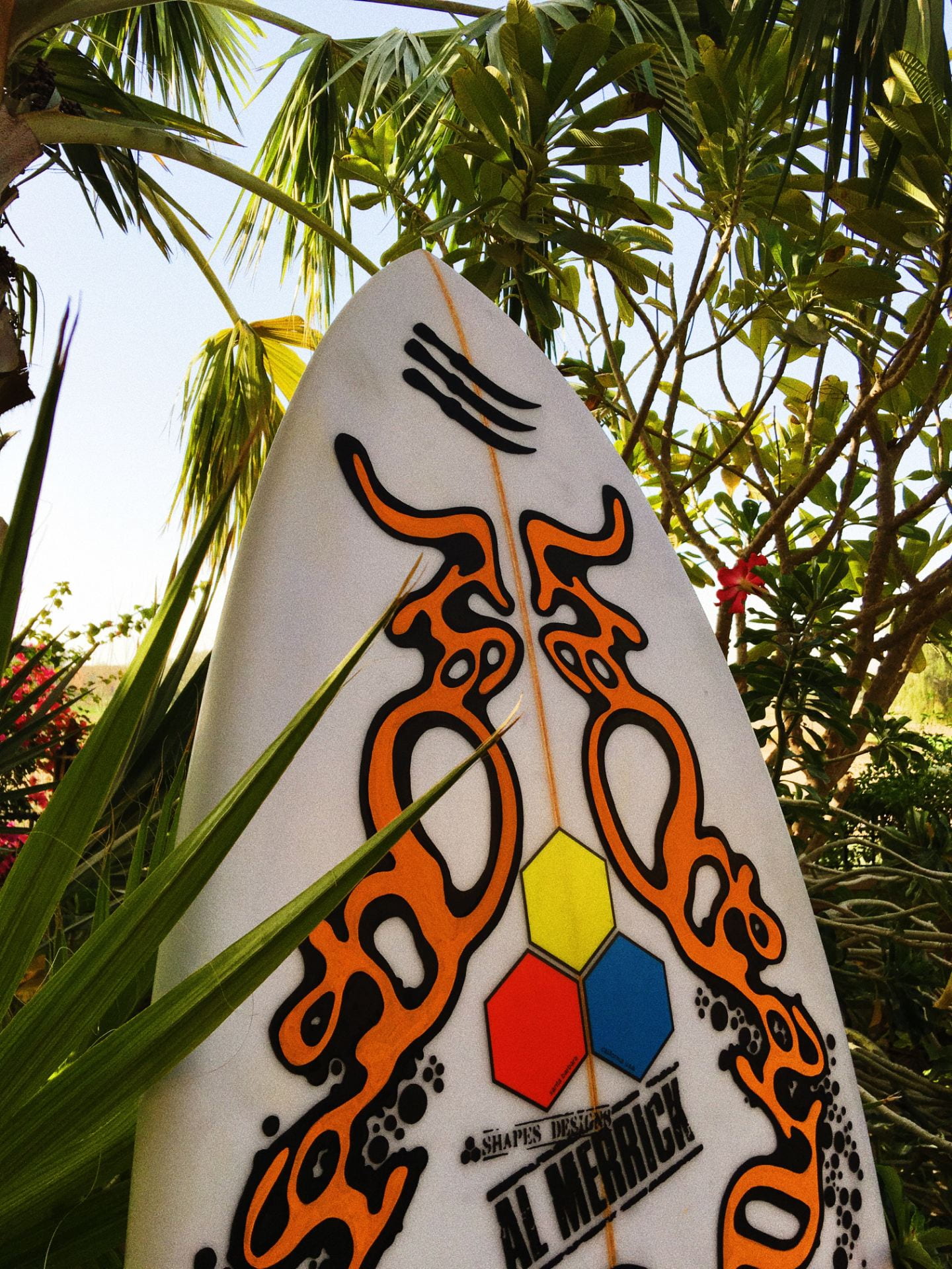
The board was originally completed with an orange finish but there was a last minute change of decision to make it a baby blue colour.

I’ve also begun attempting to create designs for a mural I will potentially be creating this summer for a film production companies office called Liquorice Productions. The brief was to create an urban looking mural that incorporated the companies slogan ‘Tastes like Liquorice’.

I then went on to create a few different designs to see what the client liked the most.

As the companies based in my home Dubai in the first design I incorporated a geometric pattern along with the companies colours of teals and light blues. Then with the words tastes, like and liquorice turned into patterns running from the top to the bottom of the design.

The second design had a different approach with more bold lines with a variety of interacting shapes and the words of the slogan more so adding to the shapes rather than having them flat colours.

The client chose the second design with the request to have the slogan more important so I then went on to have the slogan put right across the front of it.


A personal project that I have also been working on is creating my own brand. The idea is to call it Khali Wali, which is an Arabic phrase loosely meaning ‘Forget about it’. A term that has resonated with me in recent years and has helped me through previous struggles and has appeared in previous pieces of work. The original idea for this brand was for it to be a reflection of my upbringing in a Middle Eastern country which was spent in nature camping in the deserts, beaches and mountains experiencing the traditional cultures before there was that large western influence that is commonly known today. With this core idea I also want it to represent an outdoors lifestyle that also ties in a respect for nature.

As a first step I wanted to create t-shirts with khali wali written on the front with a design of three Jambiya daggers on the back as I had the idea of wanting some of the profits to go towards a good cause such as the World Wildlife fund and so forth.

However I dont want it to just be a clothing brand and feel like the aspect of putting designs onto various boards would also play a part in it.

All in all its an ambitious project that still needs a lot of thought and hours put into but I look forward to see where it goes!

Self Directed Project – Ashurbanipal and Mesopotamia

For this project we had the freedom to base it on a subject of our choosing. All whilst considering the form, format, process and medium to put towards the final product. I based my project during the era of Mesopotamia and special the most well known king of its time Ashurbanipal. On the British museum website it states…

“Ashurbanipal was king of the Neo-Assyrian empire. At the time of his reign (669–c. 631 BC) it was the largest empire in the world, stretching from Cyprus in the west to Iran in the east, and at one point it even included Egypt. Its capital Nineveh (in modern-day Iraq) was the world’s largest city. This is at a time when the Greek city-states (like Athens and Sparta) were still in their infancy and Rome was just a small settlement.

Ashurbanipal wasn’t modest about being the king of the Assyrian empire – he called himself ‘king of the world’! Quite a claim, but given the size of the empire, it wasn’t far from the truth.”

What fascinated me most about this king was the lion hunts that he took part in as further stated on the British museum website…

“As part of his military training, the young crown prince was taught to drive chariots, ride cavalry horses, and develop skills such as archery. He also learnt how to hunt lions. In Assyria lion hunting was a royal ‘sport’. Although this perhaps seems cruel to modern eyes, killing lions represented the king’s ability to protect his nation against all that was wild and dangerous in the world.”

On this basis I wanted to do my project about Ashurbanipal and his relationship with these lions. As it was also thought that lions were almost god like in their symbolism towards all things chaotic and evil.

These battles between Ashurbanipal and the lions was all documented on multiple series of reliefs which is a sculptural technique where the sculpted elements remain attached to a solid background of the same material.

-RESEARCH-

For my first hand research I looked into Assyrian ancient history as well as going to the British Museum in London to see these reliefs first and other sculptures first hand.

Whilst doing further research online I also found images depicting what Ashurbanipal’s kingdom might have looked like when it was in its full glory.

I was also looking at the language used during that time with many remains of clay tablets with script on it known as ‘Cuneiform’ which is one of the earliest languages known.

This gave me an idea of how I might start creating imagery for this project. As I wanted to depict the story of Ashurbanipal and the lions I thought it would be interesting to create illustrations as if they were themselves on fragmented tablets of clay.

At first I was just drawing from random imagery I found based on Assyria, more so just trying to figure out what kind of visual language I wanted to put out for this project as I knew I wanted to step away from the more realistic appearance of drawings from previous projects. I then wanted to create more of a narrative that showed this relationship between this king and these lions.

Whilst talking to a tutor we discussed how in these reliefs characters of more importance such as Ashurbanipal and lions were depicted in a more surreal way which may be because they wanted them to appear more god-like, where as commoners or other animals had a more realistic appearance to them. However, as the lions in the relief where shot by arrows or stabbed by a sword they became more realistic in appearance as shown in the images below.

I wanted to play around with that concept but instead of with realism I’d use colour as a way to purvey a beings importance within the story. More so the lion’s going from a god like symbol; to this mortal animal.

So with the colour I wanted to depict Ashurbanipal and the lion in more unnatural colours to show that they’re not of this earth. And to depict characters in a more realistic way by using a more neutral palette of colours.

And as the narrative goes along and you see the lion and Ashurbanipal battle, and as Ashurbanipal defeats the lion it returns to its more realistic appearance to show that it was always a mortal creature. Whilst Ashurbanipal retains his unnatural colouration.

I originally had the surreal looking lion with a red and brown main but whist I was putting the colour into the image of them fighting I decided to change the lions main to the same colour as Ashurbanipal’s own hair to create the feeling that they were like each other in this superiority.

I also wanted to convey the idea of the structure Ashurbanipal was wanting to maintain within his kingdom and the chaos that the lion brought with it in the backgrounds of these characters. With there being more order on the side that Ashurbanipal stood at; and more loose/less structured shapes on the lions side.

In this illustration after the lion has been defeated it returns to its natural colours. I also started drawing some of the foliage depicted in these reliefs as Ashurbanipal’s kingdom grounds are described to be like gardens or eden.

In this final illustration, I wanted it to represent what Ashurbanipal might have strived for in his vision. Being the lion defeating king who brought prosperity to his kingdom as well as to provide for his people, hence why the back ground depicts crops of wheat which are thought to be one of the first kinds of agriculture to appear on the world.


-Animations-

To bring more life to these illustrations I wanted to create some short animations which showed the interactions between Ashurbanipal and these lions. The first animation was going to be of a man shooting with a bow and arrow. And so I drew on 14 different pieces of tracing paper; layering them up as to see the motions of different components going on.

I then scanned these drawings into photoshop where I created a timeline out of each layer to make this animation.

I then wanted to animate a lion running towards Ashurbanipal.

I wanted to the lion animation to have a similar colour palette to the first photoshop colourations that I did of the lion. So when creating the frame animation I had to add additional layers to colour each individual shape that makes up the lion.

Lastly I wanted create something that had a combination of all the previous drawings I had done to create what would look like a relic of this story between Ashurbanipal and the lions.

I feel like this project worked well in trying to explain a story. I took it upon myself to try switch up the style slightly as well as expand my use of colour which is something I haven’t done a lot in previous projects but I feel like through this project it has allowed for more possibilities to my work in future projects.

Tell me about it – Fauna found in the Middle East

This project was about educating the viewer on a topic of my choice. The subject I decided to do this project on was the fauna (animals) that can been found in the Middle East. I chose this as I spent a majority of my childhood camping in the deserts, wadis and beaches there and wanted to inform the viewer on species they wouldn’t initially think lived in these environments.

The first thing I did was collect source material on a variety of animal found there as well as anatomical images such as of their skeletons as well as the patterns or colourations of these animals.


-SOURCE IMAGES/RESEARCH-

I then proceeded to create my own drawings through these images to create a visual language that would be anatomically correct but at the same time aesthetically pleasing and eye catching as to create a boldness to something that would come across as mundane.

(Along with drawing the animals I wanted to create some symbolism from shapes found as well as creating patterns from their given names as well as looking into Arabic geometric designs to further add to the final product)

After these drawings were made I scanned them into photoshop where I could further experiment with the juxtaposition of the imagery to create something that would jump out at the viewer.

(I further incorporated how the animal would be named in the local Arabic language as another way to create imagery.)


-VIRTUAL REALITY AND ANIMATIONS-

Once the posters were made I wanted to create another aspect to this project in which the viewer could interact with the posters and at the same time also learn something else about these species.

I decided that I wanted to create short animations of how these animals move and interact with their environment to give the viewer a sense of what this animal would be like if they were to see it in person.

The way I decided to create the animations was by collecting short video snippets of the chosen animals moving through their environment. I then put footage onto photoshop where I could move through it frame by frame drawing over the rough shape of the animal as well as to get a smooth animation as an outcome.


The sidewinder was the first animation I created working out the best way to draw over the images as well as working out the best frame rates for the animation.

I also put together other bits of imagery along with the animation to get a feel for what possible outcomes I could get with the final animations.


-FINALIZED ANIMATIONS-

Adding further backgrounds and layers to the animations I feel gives them a new level of depth and intricacy to them.

I also then added further aspects to the animations through premiere pro.

-VIRTUAL REALITY-

Through the use of the soft HP Reveal I was then able to couple up the posters with their animations.


-QR CODE WEBSITE LINK-

To give the viewer the option to read further into the animal that they’re looking at on the poster, I added a QR code linked to a website I made that give a description of the animal as well as some facts about where it lives and how it survives.


With this project I feel like I’ve managed to create a way of communicating information in an aesthetic and interesting way, with multiple ways for a viewer to interact with the body of work all whilst learning something new.