EVALUATION FMP

In this project I wanted to show my ability to incorporate a new concept into a brand, in a visual way, illustrating the collection and its main characteristics, coherent with the brand´s identity and style code, and to visualize a creative campaign that would promote a certain message and improve the brand`s presence and recognition amongst younger audiences. Throughout the project I have learned about the brand´s design philosophy and creative ethos, its marketing strategies and ways of promoting its products to a wide audience; these elements were essential when thinking about the new collection and concept. Taking into account the target demographic, I felt the theme, colours and silhouettes of the collection as well as the visual content on the website and different social media channels would be attractive to both young and mature audiences.

The idea for the concept was firstly taken from my own personal interest in the countryside and rural lifestyle; I am attracted by the colours and textures relating to the countryside, and clothing of rural communities, as well as artisanal products and traditional techniques. I then did research on the different Macro Trends for 2019 (Creative Manifesto, Purpose Full, etc) and felt that Common Ground was a relevant trend to consider for my project and a good starting point that would help me into conceiving the new collection. I looked at Key colours forecast for 2019 and Common Ground`s colour palette, accessories and footwear forecasts and analysis, in order to get inspiration and a clearer idea of what the mood and general characteristics of the collection would be. I did a lot of primary visual research, to get inspiration of colour combinations, as well as textures, fabrics and shapes.

I then created various mood boards and trend boards, which I developed throughout the project when I was getting new ideas and inspirations for colorsand prints. Overall, I am pleased by how the collection was illustrated; for the different shoots I did my best to follow the key colours, prints and general concept so that it would be visually coherent. Apart from looking at many of the brand`s collections, catwalk shows and look books, I also explored Marni`s promotional imagery such as advertising campaigns or branded catalogue images, and social media content to get an idea of the style of photography that would go well with the Marni`s brand identity.

The next step on my project was to create a store concept for Marni`s flagship stores, responding to the demands and desires of the new consumer for creative in-store experiences and e-motional design. I recreated the store on Photoshop and demonstrated an idea of how the interior would look. The stores would also include touch screens to provide faster information about the composition of different pieces.

For the promotion, I thought of a social media campaign and launch of a platform for Marni`s website, where different events and conversations relating to art and design would be announced, and where the creations of the audience that participated in the social media campaign would be uploaded. I thought this was a good idea as it engages the audience, and it is in harmony with Marni`s marketing efforts and involvement in the world of arts and crafts. Marni Create involves various collaborations with artists that will give talks and classes in specific flagship stores and in the Marni showroom in VialeUmbria

Another way of engaging the audience was through an event and installation in the showroom which will happen during the design week in Milan, where people will be able to discover more about the brand and immerse themselves in a new world. The Marni Botanical Garden was an idea I got that goes perfectly with the theme; nature and flowers have always been an intrinsic part of the Marni style code, and floral prints are used in many of the collections, so I thought it was a good way of representing the brand and the new collection to the audience. The Marni Dream Tree will become an installation made by the people who participated in the actiivity.

SOCIAL MEDIA PROMOTION

SOCIAL MEDIA CAMPAIGN

As a way of engaging the audience, I thought that Marni could launch a new space of discussion and stories about art and design on the website, and a social media campaign where creatives or art enthusiasts will post on their Instagram a professional collage, painting, photograph of a landscape, a magical place visited recently or an interesting and original picture, with the hashtag #MarniCreateand a caption; the selected images willbe shown in the screens of the stores and saved into the Marni website, with the name of the Instagram page of the artist/photographer and the caption.


MARNI CREATE WEBSITE PLATFORM LAUNCH

Marni Create will be a platform on the website where talks and debates (conversations), mainly about art, design and architecture. will be announced. These events will be held in the showroom in Milan, where various artists will be collaborating to give talks and master classes, share their views and expertise on topics relevant to the brand. The events will be accessible for everyone, with an interest in art and fashion.

This is an original way of improving the brand’s  recognition, while enforcing its values and ethos

STORE CONCEPT AND TOUCH SCREENS

(edited on photoshop)

Keeping in mind Marni’s target market, playful brand character and creative, colorful style code, as well as its appreciation of art -embedded in most of its designs and retail spaces-, I thought of maintaining the store’s minimalist elegance and sophistication, while also including certain decorative elements –colored metallic or PVC pots -, wooden structures and rails that would go with the  theme and thus with the collection.

The store concept and interior, designed by architect Paul Coudamy, will be displayed in Marni’s different flagship stores, such as the one in Milan in Via Montenapoleone; it will support the brand’s identity and will be coherent with Marni’s philosophy, core values and interest for crafts, materials and furniture design. This space will provide clients with a calming environment, unique in-store experience where the eye-catching and colorful clothes will stand out. The store will also be more accessible and appealing to younger audiences.

TOUCH SCREENS:

BRANDING


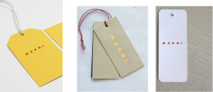
I did some testing, changing the color of the logo and using images on the typography; and thought of examples of swing tags and carrier bags that would go with the teme and with the aesthetic of the brand

Lookbook cover options

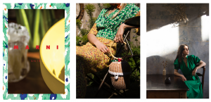
For the look book cover, I created various designs on Photoshop that would introduce the collection and give an idea of the style and color palette. Using some of the photographs I had taken in different moments and at different places places, I chose the ones I found were more coherent with the theme in terms of styling, mood and color, and to Marni’s brand spirit & identity. The first picture was taken in a boutique store in Brighton Lanes, the second one in the outside area of Café Rust, and the third one in the garden. I decided to put the logo in red, as I thought it created an interesting contrast with the images and it worked well with the prints and colors of the collection.

COLLECTION

The summer collection will include a variety of designs and accessories (PVC woven tote bags, clear PVC handbags, traditional baskets, satin head scarves, etc) as well as other products relating to the theme, suchas woven mules and accessories of solid wooden materials. Floral and abstract eclectic prints, painterly designs, embroidery and basketry are the main elements.

STILL LIFE SHOOTS AND VISUAL RESEARCH


KEY SILHOUETTES

Through WGSNs ‘design development´category, I could use some of the silhouettes I could find that I felt were relevant for the new collection and would make sense with the brands indentity. When choosing the colours and materials, I firstly looked at the Key colours forecasts for 2019 and 2020, then followed the mood of the Common Ground macro trend color palette and then opted for a more personal approach towards the brand, adding new colours that, combined together, would make a fun but elegant collection for SS19.

The key silhouettes are elegant, yet wide and comfortable, with loose and relaxed shapes. Volume is seen in skirts and dresses made of stiff, resistant fabrics that allow a space between the wearers body and the garment, such as viscose and silk taffeta, scuba and cotton poplin. The fabrics, like satin, crepe and cotton poplin, have been frequently used by Marni in previous collections.

(representation of silhouettes and range plan)

COLLECTION -COLOURS

Warm and baked yellows, bright oranges and cool dark greens, inspired by nature, will be core colors, seen in botanical and abstract floral prints of a psychedelic appeal, and in color block outfits; they will be combined with accented colours like earthy warm tones, reds and lavender violets, and styled with basketry and wooden accessories. In line with Marni’s colorful, eclectic vision and maximalist aesthetic, and following its more is more approach to print, the collection will thus focus on print clash, sumptuous colours and opulent patterns, bold shapes and volumes.